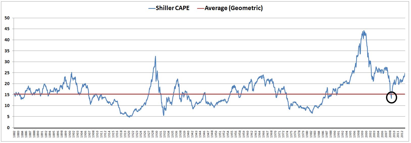
For most of history, the Shiller Cyclically-Adjusted Price-Earnings ratio (CAPE) oscillated in a pseudo sine wave around a long-term (130 year) average of 15.30. It spent 55% percent of the time above the average, and 45% of the time below–a reasonable result for a metric that allegedly mean reverts. Since 1990, however, the metric has only spent 2% of the time below its historical average–98% of the time above.
The metric’s failure to mean-revert over the last 23 years hasn’t been for a lack of reasons. The period covered three recessions, two stock market crashes, and one bonafide financial panic–the likes of which hadn’t been seen since the Great Depression. Even in the worst parts of the 2008-2009 crash–at levels that we now look back on with nostalgia as the “buying opportunity” of our generation–the metric failed to provide an accurate valuation signal. In an inexcusable blunder, it basically called the market “slightly below fair value” (see the black circle).
If we’re being honest, there are only two possibilities. Either the “normal” levels of the metric have shifted significantly upwards over the last few decades, or the metric is broken. There is no other way to coherently explain why the metric has consistently failed to migrate towards its long-term average, or spend any amount of time below it, as it should do every so often in bear markets.
Which possibility is it? In my view, both. The Shiller CAPE, as constructed by its proponents, utilizes inconsistent data. In this piece, I’m going to explain the inconsistency in rigorous accounting detail, and then share the results of a modified version of CAPE that eliminates it. I’m also going to illustrate the distortion that changes in dividend payout ratios create for CAPE. Finally, I’m going to taunt the bears (slightly facetiously) and argue that valuations have probably reached a “permanently high plateau”, to borrow the famously fatal words of Irving Fisher in October 1929.
There is no question that the current stock market is more expensive than the averages of certain past eras–the 1910s, 1930s, 1940s, 1970s, 1980s, etc. Looking forward, long-term equity returns will obviously be lower than they were in those eras. But the market is not as expensive as the Shiller CAPE suggests. Moreover, there’s no reason to think that the valuations of those eras–distorted by world wars (1914-1918, 1939-1945, 1950-1953), gross economic mismanagement (1929-1938), and painfully high inflation and interest rates (1970-1982)–were somehow more “appropriate” than current valuations. The valuations in those eras were “appropriate” to the circumstances of those eras; we live in different circumstances.
The Use of Reported Earnings: Inconsistently Measured Data
(Please note that the points below–related to accounting inconsistencies and dividend payout ratio distortions in the Shiller CAPE–are not new. Jeremy Siegel, legendary professor at the Wharton School of Business, has been raising them publicly since at least 2008.)
The Shiller CAPE was developed by Nobel Laureate Robert Shiller, the well-known originator of the Case-Shiller house price index. The metric is calculated by dividing an index’s inflation-adjusted price by the average of its inflation-adjusted annual earnings over the last 10 years.
But how does one define “earnings”? As far as the metric is concerned, the answer doesn’t matter, as long as the definition is consistent across time. If the definition is consistent across time, then apples-to-apples comparisons can be made between the metric’s present value and its prior values. The comparisons will give an accurate indication of how cheap or expensive the index is relative to its history, or to what is “normal” for it.
Unfortunately, the earnings data on Dr. Shiller’s website, which are used to build the Shiller CAPE, are not based on a consistent definition of “earnings” across time. The data are taken from S&P “reported” earnings, which are formulated in accordance with Generally Accepted Accounting Principles (GAAP). But the standards of GAAP have changed significantly over the last few decades.
One of the most important changes involves how “goodwill” is accounted. Conceptually, a company’s earnings can be thought of as the change in its book value before dividends are paid. When one company buys another, the purchase price is almost always higher than book value–usually multiples higher. But if the buyer pays a higher price for the company than its book value, then his own book value is going to fall in the acquisition. He’ll be parting with more cash than he’ll be receiving in net assets from the company that he’s taking in. To avoid the creation of an illusory loss, he is allowed under GAAP to add the difference between the payment price and the book value to his balance sheet as an intangible asset–called “goodwill.” This addition keeps his own book value constant, and prevents him from having to report an accounting loss.
In the old days, GAAP required goodwill amounts to be amortized–deducted from earnings as an incremental non-cash expense–over a forty year period. But in 2001, the standard changed. FAS 142 was introduced, which eliminated the amortization of goodwill entirely. Instead of amortizing the goodwill on their balance sheets over a multi-decade period, companies are now required to annually test it for impairment. In plain english, this means that they have to examine, on an annual basis, any corporate assets that they’ve acquired, and make sure that those assets are still reasonably worth the prices paid. If they conclude that the assets are not worth the prices paid, then they have to write down their goodwill. The requirement for annual impairment testing doesn’t just apply to goodwill, it applies to all intangible asssets, and, per FAS 144 (issued a couple months later), all long-lived assets.
The biggest disadvantage to FAS 142 is its asymmetry. When a company makes an acquisition that it later realizes was a mistake, as happened with Time Warner in its famous purchase of AOL at the peak of the dot com bubble, the company has to book a loss. In Time Warner’s case, the loss was a record $54B. But when a company makes an acquisition that turns out to be a huge success–for example, Google’s brilliant acquisition of Youtube–the company doesn’t get to book a profit. Youtube is still sitting on Google’s balance sheet today at cost, though it is probably worth 10 times the price paid on a fair value basis.
Now, FAS 142 may be a more accurate accounting standard than its predecessor, but that isn’t the issue for the Shiller CAPE. The issue for the Shiller CAPE is that the accounting standard is not being applied consistently across time. None of the “reported” earnings numbers used in the Shiller CAPE for years before 2001 were held to the harsh standard of FAS 142. But all of the “reported” earnings numbers used in the metric for years after 2001 were held to that standard. Consequently, any comparison between the present value of the metric and pre-2001 values is a comparison between inconsistently measured data points. The present values end up looking more expensive relative to the past than they actually are.
You might think that these accounting changes aren’t a big deal. But they’re a huge deal, especially in the present environment, where the prior 10 year period includes the aftermath of the Tech bubble and the earnings chaos of the Housing Downturn and Great Recession. These periods were littered with painful writedowns. In the fourth quarter of 2008 alone, writedowns were large enough to wipe out almost all of the earnings in the index. If the same standards had been applied during the painful recessions of the mid 1970s and early 1980s, or the M&A binge that followed, reported earnings would have been significantly lower.
We can visually observe the significance of the changes by comparing S&P reported earnings to Pro-Forma (non-GAAP) earnings measures. Bloomberg offers a time series of trailing twelve month earnings for the S&P 500 (T12_EPS_AGGTE) that dates back to 1954. The following chart shows the trajectory of this series alongside reported earnings.
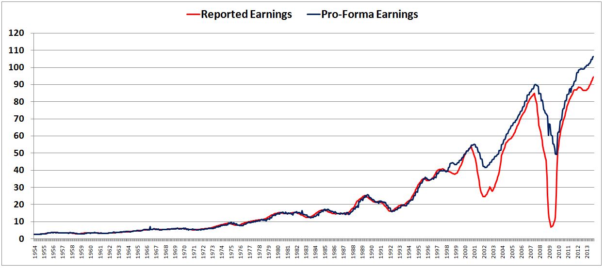
For most of history, the two series closely tracked each other. But since the beginning of the last decade, they’ve significantly deviated, especially in periods around recessions. The biggest reason for the deviation is the introduction of FAS 142, first implemented in 2001, near the break in the chart.
For a better picture of the sharpness of the deviation, the following chart shows the difference between reported earnings and Pro-Forma earnings divided by Pro-Forma earnings.
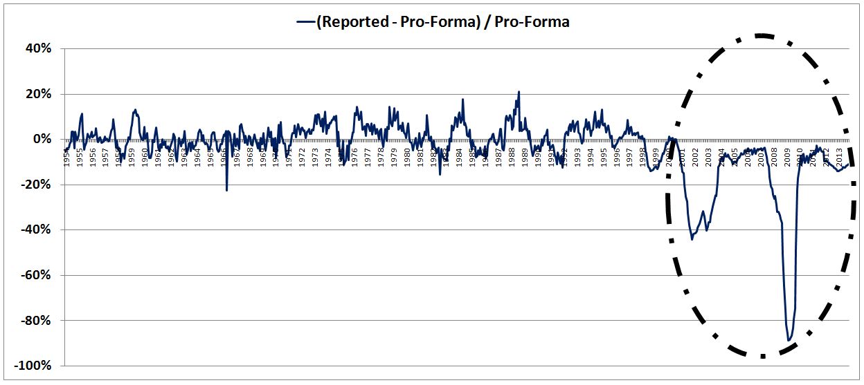
Some have proposed that we fix the problem by excluding recessionary periods from the metric. This would certainly help remove the penalty that the market faced from 2009 to 2012, when, purely by chance, its prior 10 year period included two big earnings recessions. But it won’t fix the problem of the inconsistent earnings measurement. The deviation that has emerged in reported earnings extends to post-recessionary periods as well.
Now, let me say one more time, I’m not arguing that Pro-Forma earnings are more accurate than reported earnings, or that FAS 142 (or 144) is inaccurate as an accounting standard, or that any other accounting change instituted since the late 1990s is inaccurate. The question is not a question of accuracy–it’s a question of consistency. The reported numbers are not consistent across time, therefore they cannot be used to build a reliable valuation metric.
We can confirm the inconsistency with a second source: profits in the National Income and Product Accounts (NIPA), aggregated by the Bureau of Economic Analysis (BEA) for all U.S. corporations (NIPA Table 1.12, Line 15). For most of history, there has been a reasonable correlation between NIPA profits and reported earnings for the S&P 500. As expected, the correlation has broken down over the last decade. The following table shows the correlations between NIPA Profits, Reported Earnings (GAAP), and Pro-Forma earnings for each completed decade back to 1954.
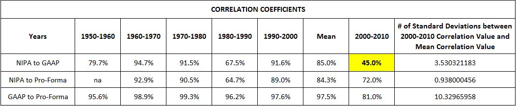
Notice that the correlation between NIPA and Pro-Forma seen in the decade 2000-2010 is roughly in line with the average correlation seen over the prior 5 decades–72.0% versus an average of 84.3%. In stark contrast, the correlation between NIPA and GAAP seen in the decade 2000-2010 is more than 3 standard deviations off of the average correlation seen over the prior 5 decades–45.0% versus an average of 85.0%. The substantial, isolated deviation between NIPA and GAAP in the decade 2000-2010 is conclusive proof that GAAP standards changed materially during the period.
Fixing the Shiller CAPE
The Shiller CAPE is one of the few metrics that provides a non-cyclical indication of market valuation. Such an indication is particularly useful during recessions, when the market’s true value is hidden by temporary corporate weakness.
There are other non-cyclical metrics that we can use to assess valuation–two examples are price to book (or Q-ratio) and price to sales (or market capitalization divided by GDP). But these metrics carry the disadvantage of being static with respect to profit margins. The Shiller CAPE, in contrast, is dynamic. To illustrate the difference with a relevant example, suppose that an economy sees structural reductions in its corporate tax rates and interest rates that lead to structurally higher profit margins and (deservedly) higher stock prices. Valuation metrics based on price to book and price to sales ignore the bottom line, and therefore cannot detect this change. In the presence of the higher stock prices, these metrics will forever show the market as “overvalued.” The Shiller CAPE, however, takes an average of earnings over time, and therefore will detect the change, especially if it is gradual.
Fortunately, we can fix the inconsistency in the Shiller CAPE by building the metric with the Pro-Forma earnings data set rather than the GAAP earnings data set. The following chart shows the Pro-Forma CAPE alongside the GAAP CAPE, going back to 1954 (to calculate the average earnings in the 10 year period prior to 1954, we used GAAP for both metrics, since the two were very close in that general era):
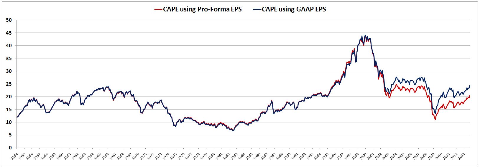
With the S&P at 1775, the GAAP CAPE is currently at 24.51, a frightening 60% above its historical (130 year) average of 15.30. The Pro-Forma CAPE, in contrast, is currently at 20.63, a more modest 19% above its historical (59 year) average of 17.35. To be fair, the Pro-Forma data doesn’t extend past 1954, and so the Pro-Forma CAPE average doesn’t include the depressed valuations of WW1, the Great Depression, and WW2, as the GAAP CAPE average does. But in terms of accuracy, that’s a good thing. As we’ll see later, the market dynamics of those eras are of little relevance to the present era.
The following chart shows Pro-Forma CAPE relative to its average since 1954.
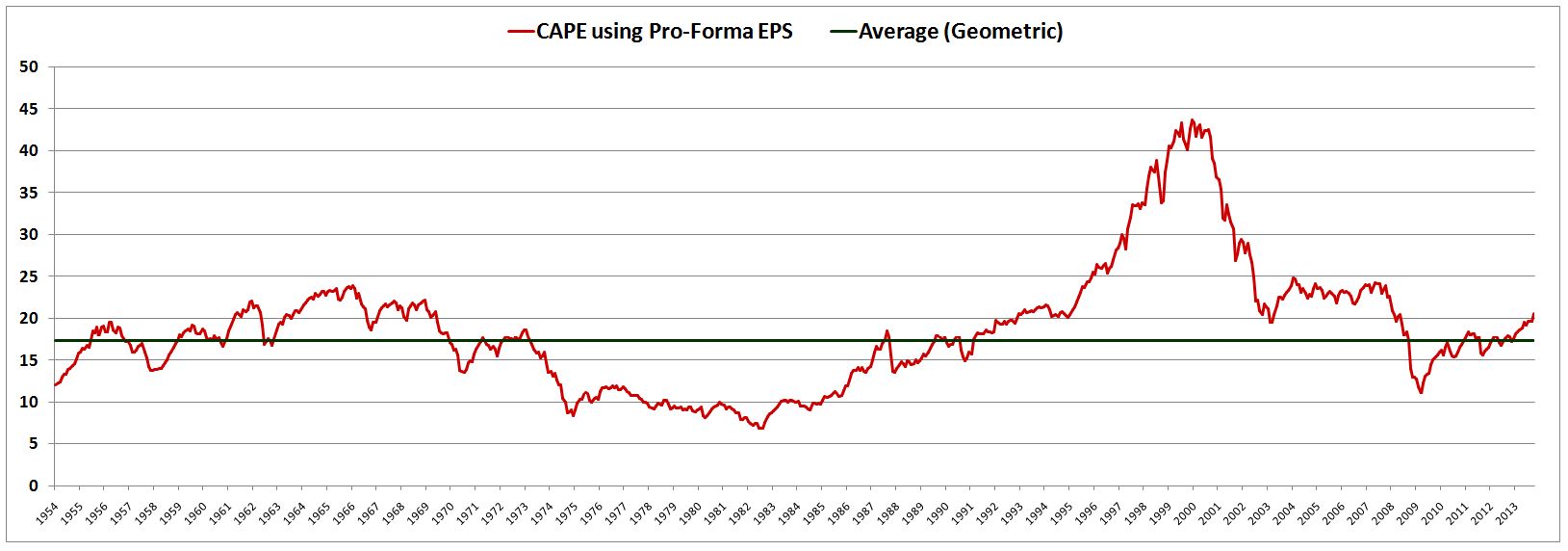
To get to fair value on Pro-Forma CAPE, we would need a garden-variety correction of 15%, down to around 1500 on the S&P. But to get to fair value on GAAP CAPE, we would need a plunge of 40%, down to around 1100 on the S&P. This difference has crucial implications for tactical investors. A bearishly-inclined investor who pulls out of the present market in the hope of seeing the S&P revert to its “fair value” of 1500 is at least being realistic (whether you agree with the tactical call is obviously a different question). But a bearishly-inclined investor who pulls out of the present market on the expectation that the S&P will revert to its “fair value” of 1100 is being ridiculous. It’s fine to make calls for those kinds of levels–we all know that shit happens in markets. But let’s not make them on the basis of considerations that are as fickle and unreliable as “valuation.”
Comparing the Predictive Power of GAAP and Pro-Forma Constructions
Proponents of the Shiller CAPE will argue that the true measure of a valuation metric is not whether it makes intuitive or logical sense, but how well it correlates with future returns. As shown in the table below, the Pro-Forma CAPE and GAAP CAPE exhibit essentially the same correlation with future returns. The reason is that they are very similar for most of the historical data set. They only begin to appreciably deviate from each other in 2001.
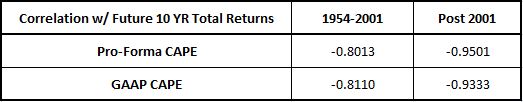
Notice that for the period after 2001, the Pro-Forma CAPE correlation with future returns is slightly stronger. We don’t have data on 10 year total returns past 2003, and so this fact doesn’t tell us very much–the size of the data sample is only two years. However, it’s clear that as additional 10 year total return data come rolling in over the next few years, the Pro-Forma CAPE is going to continue to outperform the GAAP CAPE. Since 2001, the GAAP CAPE has been notably unreliable as a predictor of future returns. The Pro-Forma CAPE, in contrast, has been quite reliable.
At the bear market low of spring 2003, when the market was a reasonably attractive buy, the GAAP CAPE called it 40% overvalued. The Pro-Forma CAPE called it 12% overvalued, in line with the respectable–but not spectacular–returns that it ended up producing.
At the panic low of March 2009, when the the market was a screaming buy, the GAAP CAPE called it a mediocre 15% undervalued. The Pro-Forma CAPE called it 40% undervalued–much closer to what we would expect from a historical bear market low, and consistent with the fantastic returns that the market subsequently produced (north of 20% annualized).
Notably, in March 2009, on a pro-forma CAPE basis, the market traded down to early 1980s valuation levels. That is something we would expect, given that the early 1980s recession and the 2008-2009 recession were of similar intensity (with the latter arguably more intense). But on a GAAP CAPE basis, the market didn’t even come close to reaching early 1980s valuation levels–to the contrary, it barely broke below the valuation highs of the 1980s.
Changes in Dividend Payout Ratios
When the corporate sector earns money, it can pay the money out to its shareholders as dividends, or it can deploy the money internally to generate growth in future earnings (via investment, acquisitions, and share buybacks). All else equal, the more the corporate sector favors dividends, the lower the Shiller CAPE will be. The more it favors deploying earnings into investment, acquisitions, and buybacks, the higher the Shiller CAPE will be. That’s just the way the math of the Shiller CAPE works out–to the extent that earnings growth is reflected in present valuation, it is penalized.
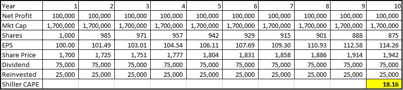
To illustrate, suppose that we live in a zero growth, zero inflation world in which all stocks trade at 17 times earnings. Consider a hypothetical company in this world that pays out 75% of its earnings as a dividend, and uses the other 25% to buyback shares on the open market. As shown in the table below (using dummy data), the company’s Shiller CAPE for the period will end up being 18.16.
Now, consider the ten year history of a second company that is identical to the first company except for one feature: it pays out 25% of its earnings as a dividend, and devotes the other 75% to buybacks (the ratios are switched from before). As shown in the table below, the second company’s Shiller CAPE for the ten year period will end up being 20.65.
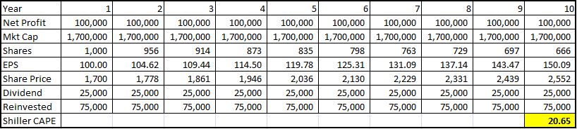
But these companies are identical in all respects–they have the exact same businesses and trade at the exact same P/E multiples–17. Why, then, does the Shiller CAPE for one of them end up being 14% higher than the other? The answer is that because the second company chooses internal reinvestment–buybacks–over dividends, it ends up with higher EPS growth over the period, and therefore a higher final share price (because they both trade at 17 times trailing earnings). Thus the second company ends up with a higher Shiller CAPE, even though its true valuation is the same.
The structure of the Shiller CAPE unfairly penalizes the corporate sector for reinvesting profit into EPS growth instead of paying dividends. But that is exactly what modern corporations do in comparison to corporations of the past: they provide a return to their shareholders by reinvesting profit rather than by distributing it. From 1954 to 1995, the S&P 500 dividend payout ratio averaged 52%, while the real EPS growth rate averaged 1.72%. From 1995 to 2013, the S&P 500 dividend payout ratio averaged 34%, while the real EPS growth rate averaged 4.9%.
To make comparisons between present and past values of the the Shiller CAPE, we need to normalize for differences in payout ratios. A crude way to do this is to note that at the current trailing twelve month P/E ratio–around 17–the difference between a 52% payout ratio (the average of 1954-1995) and a 34% payout ratio (the average since 1995) corresponds to around 1 point worth of Shiller CAPE. Taking 1 point off the current value of the Pro-Forma Shiller CAPE, we get an adjusted value of 19.63. On this basis, the market would need to correct to approximately 1550 to get back to its average valuation of the last 60 years. Unpleasant for longs, but hardly catastrophic. We were there just a few months ago.
A Permanently High Plateau
There is no external, divinely-imposed valuation level that the stock market has to take on. Rather, the stock market takes on whatever valuation level achieves the required equilibrium between those that want to get in it, and those that want to get out of it. At all times, every investor that wants to get in the market needs to connect with an investor that wants to get out of it. If there are too many that want to get in, and not enough that want to get out, the price will rise until the imbalance is relieved. If there are too many that went to get out, and not enough that want to get in, the price will fall until the same. The process is reflexive–investors want to get in or out based on where the price is and what it is doing, but they also make the price be where it is and do what it is doing, through their efforts.
For this reason, context–the set of environmental variables that shape investor outlook and risk appetite, and that influence the preference to be in or out, given the price–is crucial to normative claims about valuation. A valuation level that is “appropriate” in one context–adequate to achieve the required equilibrium–may not be “appropriate” in another.
Consider the following chart of the GAAP CAPE back to 1881:
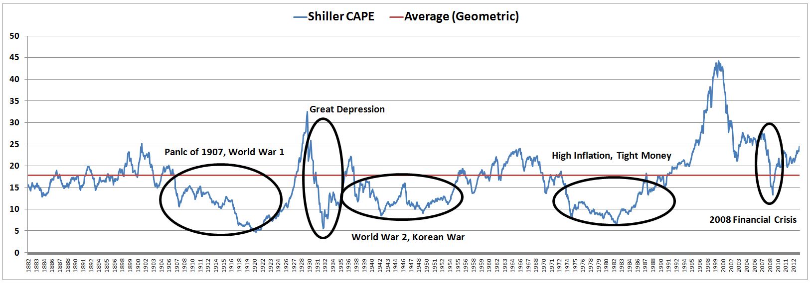
Notice that the periods of below-average valuation, circled in black, generally involved three different types of environments: (1) war (destructive violence between countries or within a country), (2) high inflation (with tight monetary policy and high interest rates), and (3) financial crisis (with debt deflation and deep recession). These environments, which we will call The Big Three, represent classic, recurring challenges for the stock market. They create fear, pessimism and malaise on the part of investors, and serve as catalysts for deeply depressed valuations. We can see their damaging effects not only in U.S. market history, but in the history of stock markets all over the world.
The major bull markets of this century and the last century were each preceded by at least one of The Big Three. The bull market of the 1920s, for example, began after the victory in World War 1, as the economy moved out of the severely deflationary downturn of 1920 and 1921. The 1930s bull market began at the end of the Great Depression, after FDR took office and ended the gold standard, allowing the Federal Reserve (Fed) to inject desperately needed liquidity into the financial system. The 1950s bull market began in the years after World War 2, as the country worked through inflation challenges and monetary policy disputes and successfully transitioned into a peacetime economy. The bull market stumbled during combat in the Korean War, and then moved into full speed after the armistice of 1953-1954. The 1980s bull market began in 1982, when Paul Volcker finally conquered inflation (or so the narrative goes), making it possible for the Fed to shift to a looser monetary policy. The 2009 bull market began at the resolution of the acute phase of the Great Recession, as the Fed and the Federal Government aggressively collaborated to stabilize the banking system and restart the economy.
Notably, each of the ensuing bull markets involved a sustained period in which the economy saw the opposite of The Big Three: (1) peace, (2) low inflation with low or falling interest rates, particularly at the short end of the curve, and (3) stable, expansionary growth in an environment of financial stability. It’s hard to think of any time in history when these three conditions were met and where the economy was not in a rising bull market, with a “natural” bias for higher valuations.
Granted, the market saw corrections (1962, 1987, 2011) and there will surely be corrections in this market going forward. But there were never bear markets of the magnitude that would be necessary to bring the current Shiller CAPE back down to its long-term historical average. The only real exception to this point was the 2001-2003 downturn. But in that period, the market was unwinding a legitimate investment mania. Valuations did not “mean revert”–rather, they fell from egregious, unconscionable levels to levels that were just “expensive.” Recall that the theme of war was a relevant catalyst for the move: there were the 9/11 terrorist attacks, the operations in Afghanistan, and the invasion of Iraq, the runup to which helped push the market to its ultimate low for the period.
Investors that are patiently waiting for the Shiller CAPE to “mean revert” from the elevated level that it has hovered at over the past few decades, towards its long-term average, are implicitly calling for at least one of The Big Three to recur (either that, or something new that markets have never seen). The dominant presence of The Big Three in market history is the very reason that the long-term historical average of the Shiller CAPE has the value that it has–without them, its value would be higher, in line with or above the levels of the current era.
But why do The Big Three have to recur? If they do recur, why do they have to recur with the same frequency and intensity? If they don’t recur, why does some other bad thing have to occur in their place? Why can’t human beings make progress?
Think optimistically for a moment. What if large scale war is a thing of the past? The suggestion might sound naive, but there is significant evidence to support it. The human species has become dramatically less violent and war-prone as it has advanced intellectually, technologically, and economically. In the modern era of globalization, the idea of two advanced countries–the U.S. and China, for example–fighting each other in a real, no-kidding war is almost inconceivable.
What if low inflation and low interest rates are a permanent fixture of the modern economy, rather than something temporary? Trend inflation has been falling for over 30 years. Population growth is slowing, society is getting older, and therefore there’s less of a need to build and invest for the future. The process of building and investing for the future–a process that puts pressure on the present supply of labor–is arguably the main driver of inflation in a normal economy.
The current lack of inflation is made worse by advances in technology that have reduced the marginal value of labor, and by a process of globalization that has created an excess supply of cheap labor internationally. Moreover, a decline in union influence has significantly reduced the bargaining power of workers. If workers don’t have bargaining power, wage-price spirals can’t occur, and neither can meaningful inflation.
The Fed has absolute control over short-term interest rates, and significant control over long-term interest rates. It sets the former, and influences the latter, based on the level of inflationary pressure that it sees in the economy. If structural changes in the economy mean that there isn’t going to be meaningful inflationary pressure going forward, then interest rates can conceivably stay low forever.
What if deflationary financial crises are once-in-a-generation events? What if each time we have such crises, policymakers and the community of economists learn valuable lessons about how the system works, so that they can avert future crises, or at least address them more effectively?
Once again, the historical evidence provides strong support for such a view. The 2008 crisis had all of the makings of a new Great Depression. In terms of the amount of unstable private sector debt that existed, the starting point was actually worse than the Great Depression. But unlike in 1930, policymakers in 2008 quickly arrested the downward spiral–fiscally, monetarily, and especially through their controversial actions to stabilize the banking system. Now, here we are, only a few years later, in an economy that is growing healthily, with output well above the prior peak, arguably on the verge of the strongest expansion the country has seen since the mid 1990s. That’s a remarkable achievement, a reason for admitting that progress in economic policymaking is actually possible.
The reason that policymakers were able to bring about a different outcome in 2008 than in 1930 is that the field of economics advanced dramatically in the interim period. Policymakers learned the lessons of the Great Depression, and emerged with a much better understanding of how the system works. The good news is that in the present crisis–to include what is happening in Europe and Japan–new lessons are being learned. These lessons will help to avert future crises (or at least lessen their severity).
If you asked me what the biggest long-term threat to the U.S. economy is, my answer would be demographics. Over the next few decades, as our economy ages demographically, it runs the risk of going too far on the low inflation front–and entering deflation, which would eventually lead to financial crisis. But, again, it’s important to anticipate progress. Japan is experimentally fighting the problem of demographic deflation as we speak. It is going to learn critical lessons that we will be able to draw from should we ever face a similar situation.
Deflation is an unacceptable condition for an economy. If it occurs, policymakers will attack it with increasingly extreme monetary policies: “whatever it takes.” These policies tend to provoke higher than normal valuations. And so, ironically, even if the U.S. does eventually enter a Japanese-style deflation, Shiller bears are unlikely to be vindicated for very long.
It sounds overly ebullient to propose, as Irving Fisher famously did, that stocks have reached a new era of elevated valuation. But the point needs to be taken seriously, as there are strong reasons to believe it. The historical record leaves no other option but to admit that something about valuation has changed. The market has spent more than 20 years at a historically elevated Shiller CAPE. A 20+ year period is way too long to dismiss as an “outlier.”
Instead of assessing the valuation of the current market by making casual comparisons to the markets of the 1910s, 1930s, 1940s, and 1970s, we need to make comparisons to markets that shared relevant similarities with our own. Examples include the market of the late 1950s and 1960s, the market of the 1990s (excluding the mania that emerged after 1997), and the post-bubble market of the 2000s (excluding the financial crisis). If the current market were “attracted” to any kind of valuation, it would be to the kind of valuation seen in those periods, which were marked by peace, low-inflation growth, easy monetary policy, and financial stability (as opposed to wars, inflation spirals, punitively high interest rates, and financial panics.)
The following table shows the average and peak Pro-Forma Shiller CAPEs for each of the periods:
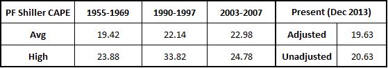
With the S&P at 1775, the current value of the Pro-Forma Shiller CAPE is 20.63. To compare the value with the 1955-1969 period, we need to adjust it for differences in the dividend payout ratio. From 1955-1969, the dividend payout ratio averaged 55%. At a P/E of 17, the difference between 55% and the current value of 34% amounts to roughly 1 point worth of Shiller CAPE. Subtracting, we get an adjusted Shiller CAPE of 19.63. That number almost perfectly matches the average for the 1955-1969 period, a period in which market valuations were generally fair and reasonable.
To reach the valuation high of the 1955-1969 period–23.88, which was registered in January 1966–the current S&P would have to rise to 2125. To reach the high of the 2003-2007 period, which was registered in January 2004, the S&P would have to rise by a slightly higher amount, to 2130 (note that there is no need for a dividend payout ratio adjustment in this case). To reach the high of the 1990-1997 period, which was registered in December 1997, the S&P would have to rise to 2900.
Admittedly, a call for Shiller CAPE to go to 33.82 and for the market to go to 2900 is pushing it–not a smart bet. But there’s no reason why the market shouldn’t at some point go back and touch the valuation peaks that it reached in the other comparable periods. It’s showing every sign of wanting to do so.
It’s also going to fall appreciably at some point, as all markets do, but it’s unlikely to fall in a way that would sustainably restore “historical averages” and vindicate Shiller bears. In their boycott, Shiller bears are making a blind bet on the mean reversion of a poorly constructed metric, without paying attention to context–the set of variables that drive the preferences of market participants to be in or out, and that determine the valuation that the market naturally gravitates towards. The outcome they are calling for requires the market’s context to return to the low points–war, tight money inflation, financial crisis–of prior eras. The reality of human progress reduces both the likelihood that such a return will occur, and, in the specific case of financial crisis, the intensity and duration of the pain that it would bring.