Suppose that you had the magical ability to foresee turns in the business cycle before they happened. As an investor, what would you do with that ability? Presumably, you would use it to time the stock market. You would sell equities in advance of recessions, and buy them back in advance of recoveries.
The following chart shows the hypothetical historical performance of an investment strategy that times the market on perfect knowledge of future recession dates. The strategy, called “Perfect Recession Timing”, switches from equities (the S&P 500) into cash (treasury bills) exactly one month before each recession begins, and from cash back into equities exactly one month before each recession ends (first chart: linear scale; second chart: logarithmic scale):
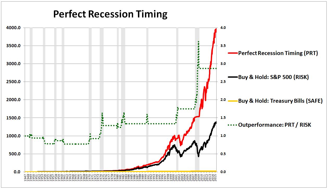
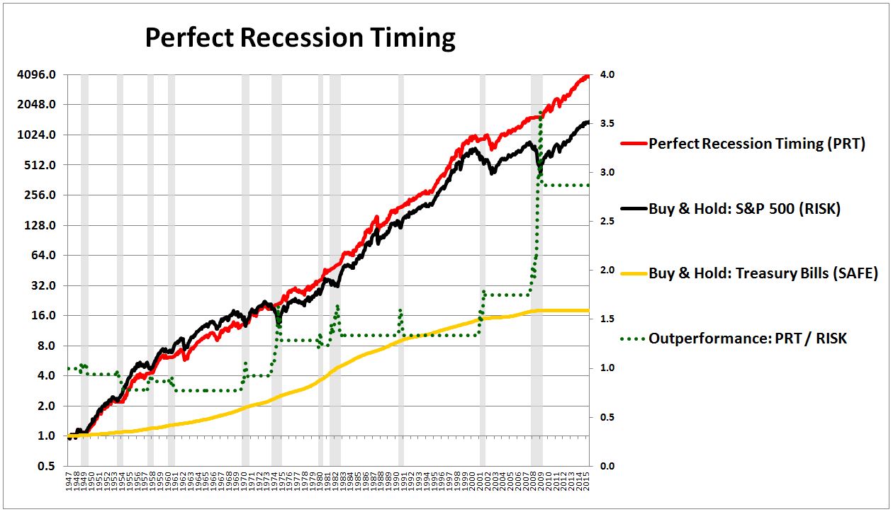
As you can see, Perfect Recession Timing strongly outperforms the market. It generates a total return of 12.9% per year, 170 bps higher than the market’s 11.2%. It experiences annualized volatility of 12.8%, 170 bps less than the market’s 14.5%. It suffers a maximum drawdown of -27.2%, roughly half of the market’s -51.0%.
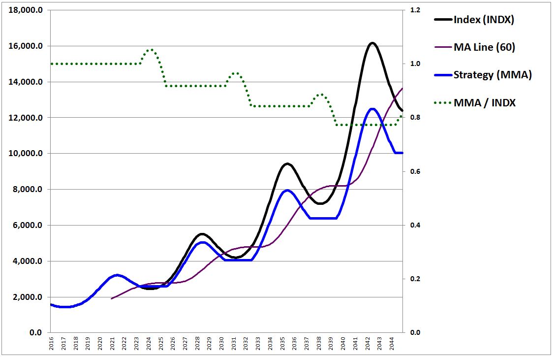
In this piece, I’m going to introduce a market timing strategy that will seek to match the performance of Perfect Recession Timing, without relying on knowledge of future recession dates. That strategy, which I’m going to call “Growth-Trend Timing”, works by adding a growth filter to the well-known trend-following strategies tested in the prior piece. The chart below shows the performance of Growth-Trend Timing in U.S. equities (blue line) alongside the performance of Perfect Recession Timing (red line):
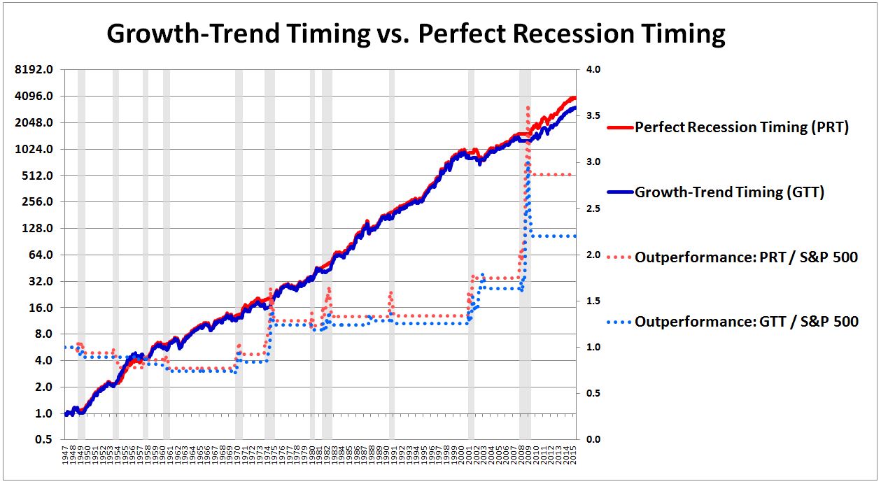
The dotted blue line is Growth-Trend Timing’s outperformance relative to a strategy that buys and holds the market. In the places where the line ratchets higher, the strategy is exiting the market and re-entering at lower prices, locking in outperformance. Notice that the line ratchets higher in almost perfect synchrony with the dotted red line, the outperformance of Perfect Recession Timing. That’s exactly the intent–for Growth-Trend Timing to successfully do what Perfect Recession Timing does, using information that is fully entirely available to investors in the present moment, as opposed to information that will only be available to them in the future, in hindsight.
The piece will consist of three parts:
- In the first part, I’m going to construct a series of random models of security prices. I’m going to use the models to rigorously articulate the geometric concepts that determine the performance of trend-following market timing strategies. In understanding the concepts in this section, we will understand what trend-following strategies have to do in order to be successful. We will then be able to devise specific strategies to optimize their performance.
- In the second part, I’m going to use insights from the first part to explain why trend-following market timing strategies perform well on aggregate indices (e.g., S&P 500, FTSE, Nikkei, etc.), but not on individual stocks (e.g., Disney, BP, Toyota, etc.). Recall that we encountered this puzzling result in the prior piece, and left it unresolved.
- In the third part, I’m going to use insights gained from both the first and second parts to build the new strategy: Growth-Trend Timing. I’m then going to do some simple out-of-sample tests on the new strategy, to illustrate the potential. More rigorous testing will follow in a subsequent piece.
Before I begin, I’m going to make an important clarification on the topic of “momentum.”
Momentum: Two Versions
The market timing strategies that we analyzed in the prior piece (please read it if you haven’t already) are often described as strategies that profit off of the phenomenon of “momentum.” To avoid confusion, we need to distinguish between two different empirical observations related to that phenomenon:
- The first is the observation that the trailing annual returns of a security predict its likely returns in the next month. High trailing annual returns suggest high returns in the next month, low trailing annual returns suggest low returns in the next month. This phenomenon underlies the power of the Fama-French-Asness momentum factor, which sorts the market each month on the basis of prior annual returns.
- The second is the observation that when a security exhibits a negative price trend, the security is more likely to suffer a substantial drawdown over the coming periods than when it exhibits a positive trend. Here, a negative trend is defined as a negative trailing return on some horizon (i.e., negative momentum), or a price that’s below a trailing moving average of some specified period. In less refined terms, the observation holds that large losses–“crashes”–are more likely to occur after an aggregate index’s price trend has already turned downward.
 These two observations are related to each other, but they are not identical, and we should not refer to them interchangeably. Unlike the first observation, the second observation does not claim that the degree of negativity in the trend predicts anything about the future return. It doesn’t say, for example, that high degrees of negativity in the trend imply high degrees of negativity in the subsequent return, or that high degrees of negativity in the trend increase the probability of subsequent negativity. It simply notes that negativity in the trend–of any degree–is a red flag that substantially increases the likelihood of a large subsequent downward move.
Though the second observation is analytically sloppier than the first, it’s more useful to a market timer. The ultimate goal of market timing is to produce equity-like returns with bond-like volatility. In practice, the only way to do that is to sidestep the large drawdowns that equities periodically produce. We cannot reliably sidestep drawdowns unless we know when they are likely to occur. When are they likely to occur? The second observation gives the answer: after a negative trend has emerged. So if you see a negative trend, get out.
The backtests conducted in the prior piece demonstrated that strategies that exit risk assets upon signs of a negative trend tend to outperform buy and hold strategies. Their successful avoidance of large drawdowns more than makes up for the relative losses that they incur by switching into lower-return assets. What we saw in the backtest, however, is that this result only holds for aggregate indices. When the strategies are used to time individual securities, the opposite result is observed–the strategies strongly underperform buy and hold, to an extent that far exceeds the level of underperformance that random timing with the same exposures would be expected to produce.
How can an approach work on aggregate indices, and then not work on the individual securities that make up those indices? That was the puzzle that we left unsolved in the prior piece, a puzzle that we’re going to try to solve in the current piece. The analysis will be tedious in certain places, but well worth the effort in terms of the quality of market understanding that we’re going to gain as a result.
Simple Market Timing: Stop Loss Strategy
In this section, I’m going to use the example of a stop loss strategy to illustrate the concept of “gap losses”, which are typically the main sources of loss for a market timing strategy.
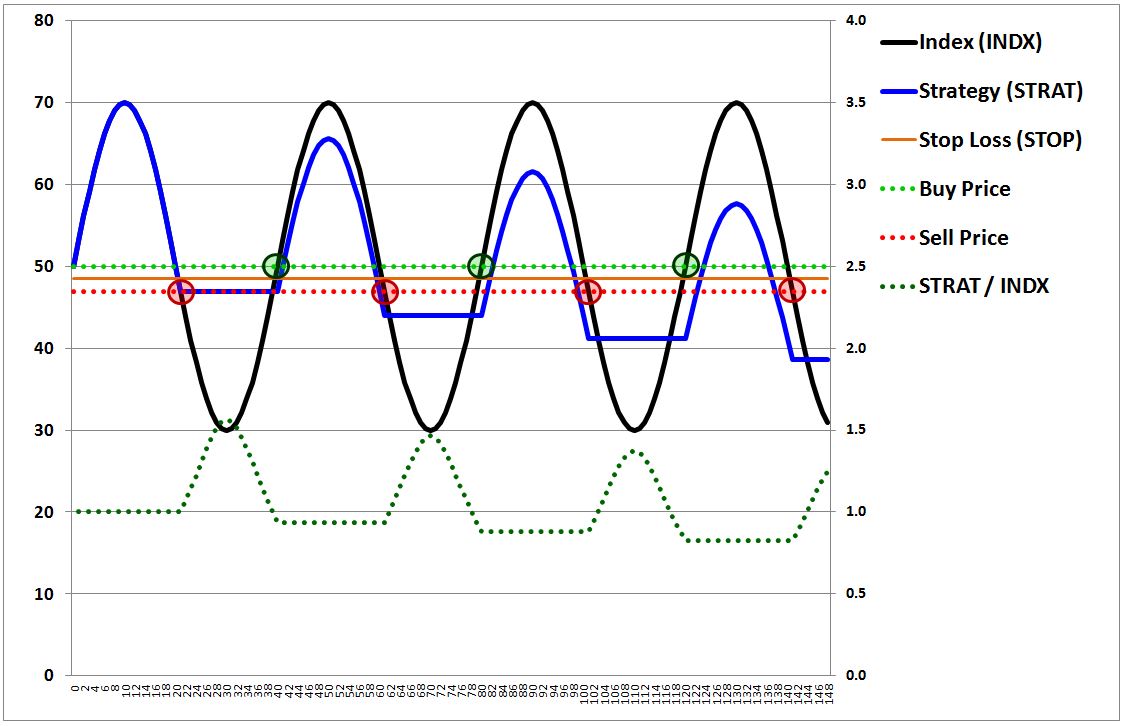
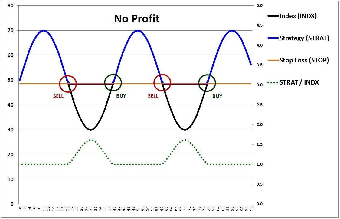
To begin, consider the following chart, which shows the price index of a hypothetical security that oscillates as a sine wave.
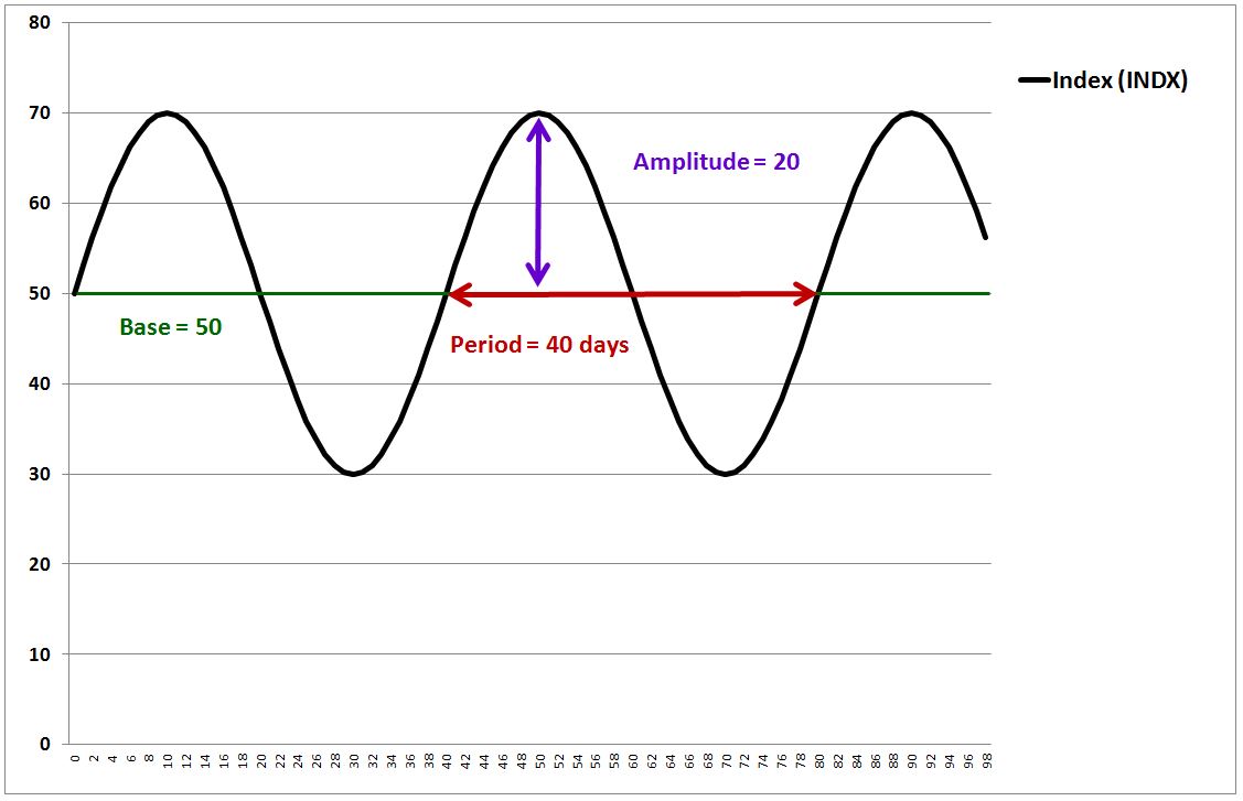
(Note: The prices in the above index, and all prices in this piece, are quoted and charted on a total return basis, with the accrual of dividends and interest payments already incorporated into the prices.)
The precise equation for the price index, quoted as a function of time t, is:
(1) Index(t) = Base + Amplitude * ( Sin (2 * π / Period * t ) )
The base, which specifies the midpoint of the index’s vertical oscillations, is set to 50. The amplitude, which specifies how far in each vertical direction the index oscillates, is set to 20. The period, which specifies how long it takes for the index to complete a full oscillation, is set to 40 days. Note that the period, 40 days, is also the distance between the peaks.
Now, I want to participate in the security’s upside, without exposing myself to its downside. So I’m going to arbitrarily pick a “stop” price, and trade the security using the following “stop loss” rule:
(1) If the price of the security is greater than or equal to the stop, then buy or stay long.
(2) If the price of the security is less than the stop, then sell or stay out.
Notice that the rule is bidirectional–it forces me out of the security when the security is falling, but it also forces me back into the security when the security is rising. In doing so, it not only protect me from the security’s downside below the stop, it also ensures that I participate in any upside above the stop that the security achieves. That’s perfect–exactly what I want as a trader.
To simplify the analysis, we assume that we’re operating in a market that satisfies the following two conditions:
Zero Bid-Ask Spread: The difference between the highest bid and the lowest ask is always infinitesimally small, and therefore negligible. Trading fees are also negligible.
Continuous Prices: Every time a security’s price changes from value A to value B, it passes through all values in between A and B. If traders already have orders in, or if they’re quick enough to place orders, they can execute trades at any of the in-between values.
The following chart shows the performance of the strategy on the above assumptions. For simplicity, we trade only one share.
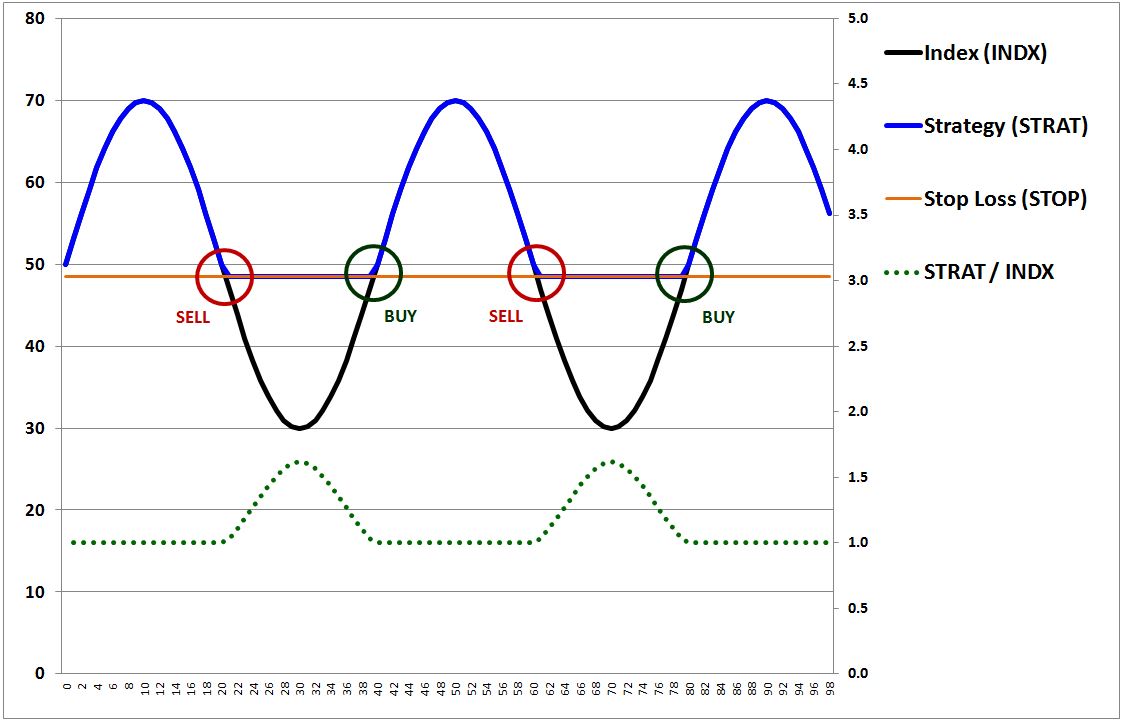
The blue line is the value of the strategy. The orange line is the stop, which I’ve arbitrarily set at a price of 48.5. The dotted green line is the strategy’s outperformance relative to a strategy that simply buys and holds the security. The outperformance is measured against the right y-axis.
As you can see, when the price rises above the stop, the strategy buys in at the stop, 48.5. For as long as the price remains above that level, the strategy stays invested in the security, with a value equal to the security’s price. When the price falls below the stop, the strategy sells out at the stop, 48.5. For as long as the price remains below that level, the strategy stays out of it, with a value steady at 48.5, the sale price.
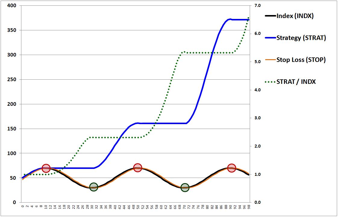
Now, you’re probably asking yourself, “what’s the point of this stupid strategy?” Well, let’s suppose that the security eventually breaks out of its range and makes a sustained move higher. Let’s suppose that it does something like this:
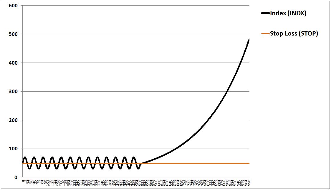
How will the strategy perform? The answer: as the price rises above the stop, the strategy will go long the security and stay long, capturing all of the security’s subsequent upside. We show that result below:

Now, let’s suppose that the opposite happens. Instead of breaking out and growing exponentially, the security breaks down and decays to zero, like this:
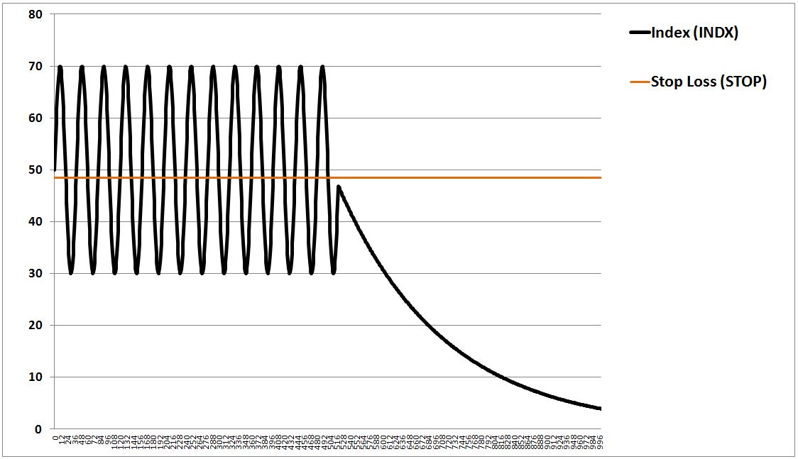
How will the strategy perform? The answer: as the price falls below the stop, the strategy will sell out of the security and stay out of it, avoiding all of the security’s downside below the stop.
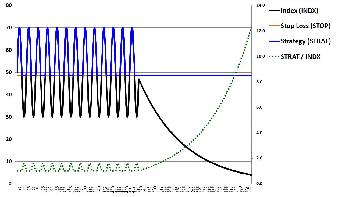
We can express the strategy’s performance in a simple equation:
(2) Strategy(t) = Max(Security Price(t), Stop)
Equation (2) tells us that the strategy’s value at any time equals the greater of either the security’s price at that time, or the stop. Since we can place the stop wherever we want, we can use the stop loss strategy to determine, for ourselves, what our downside will be when we invest in the security. Below the stop, we will lose nothing; above it, we will gain whatever the security gains.
Stepping back, we appear to have discovered something truly remarkable, a timing strategy that can allow us to participate in all of a security’s upside, without having to participate in any of its downside. Can that be right? Of course not. Markets do not offer risk-free rewards, and therefore there must be a tradeoff somewhere that we’re missing, some way that the stop loss strategy exposes us to losses. It turns out that there’s a significant tradeoff in the strategy, a mechanism through which the strategy can cause us to suffer large losses over time. We can’t see that mechanism because it’s being obscured by our assumption of “continuous” prices.
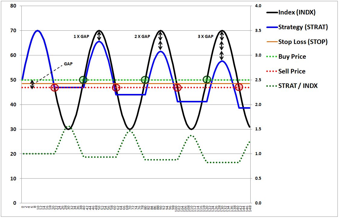
Ultimately, there’s no such thing as a “continuous” market, a market where every price change necessarily entails a movement through all in-between prices. Price changes frequently involve gaps–discontinuous jumps or drops from one price to another. Those gaps impose losses on the strategy–called “gap losses.”
To give an example, if new information is introduced to suggest that a stock priced at 50 will soon go bankrupt, the bid on the stock is not going to pass through 49.99… 49.98… 49.97 and so on, giving each trader an opportunity to sell at those prices if she wants to. Instead, the bid is going to instantaneously drop to whatever level the stock finds its first interested buyer at, which may be 49.99, or 20.37, or 50 cents, or even zero (total illiquidity). Importantly, if the price instantaneously drops to a level below the stop, the strategy isn’t going to be able to sell exactly at the stop. The best it will be able to do is sell at the first price that the security gaps down to. In the process, it will incur a “gap loss”–a loss equal to the “gap” between that price and the stop.
The worst-case gap losses inflicted on a market timing strategy are influenced, in part, by the period of time between the checks that it makes. The strategy has to periodically check on the price, to see if the price is above or below the stop. If the period of time between each check is long, then valid trades will end up taking place later in time, after prices have moved farther away from the stop. The result will be larger gap losses.
Given the importance of the period between the checks, we might think that a solution to the problem of gap losses would be to have the strategy check prices continuously, at all times. But even on continuous checking, gap losses would still occur. There are two reasons why. First, there’s a built-in discontinuity between the market’s daily close and subsequent re-opening. No strategy can escape from that discontinuity, and therefore no strategy can avoid the gap losses that it imposes. Second, discontinuous moves can occur in intraday trading–for example, when new information is instantaneously introduced into the market, or when large buyers and sellers commence execution of pre-planned trading schemes, spontaneously removing or inserting large bids and asks.
In the example above, the strategy checks the price of the security at the completion of each full day (measured at the close). The problem, however, is that the stop–48.5–is not a value that the index ever lands on at the completion of a full day. Recall the specific equation for the index:
(3) Index(t) = 50 + 20 * Sin ( 2 * π / 40 * t)
Per the equation, the closest value above 48.5 that the index lands on at the completion of a full day is 50.0, which it reaches on days 0, 20, 40, 60, 80, 100, 120, and so on. The closest value below 48.5 that it lands on is 46.9, which it reach on days 21, 39, 61, 79, 101, 119, and so on.
It follows that whenever the index price rises above the stop of 48.5, the strategy sees the event when the price is already at 50.0. So it buys into the security at the available price: 50.0. Whenever the index falls below the stop of 48.5, the strategy sees the event when the price is already at 46.9. So it sells out of the security at the available price: 46.9. Every time the price interacts with the stop, then, a buy-high-sell-low routine ensues. The strategy buys at 50.0, sells at 46.9, buys again at 50.0, sells again at 46.9, and so on, losing the difference, roughly 3 points, on each “round-trip”–each combination of a sell followed by a buy. That difference, the gap loss, represents the primary source of downside for the strategy.
Returning to the charts, the following chart illustrates the performance of the stop loss strategy when the false assumption of price continuity is abandoned and when gap losses are appropriately reflected:
The dotted bright green line is the buy price. The green shaded circles are the actual buys. The dotted red line is the sell price. The red shaded circles are the actual sells. As you can see, with each round-trip transaction, the strategy incurs a loss relative to a buy and hold strategy equal to the gap: roughly 3 points, or 6%.
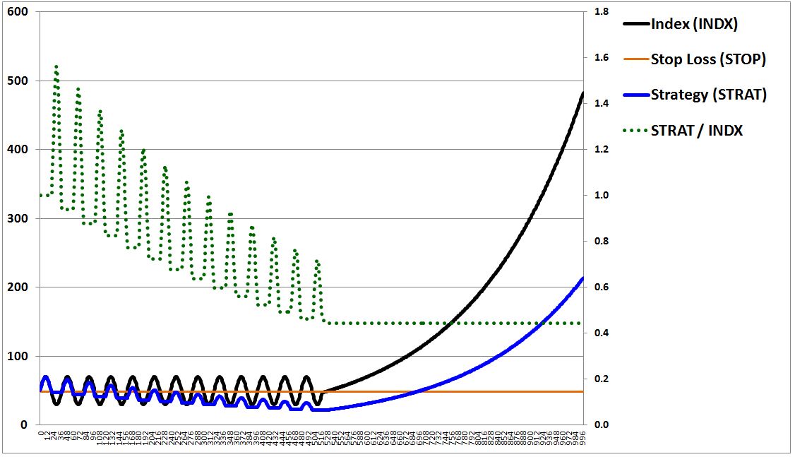
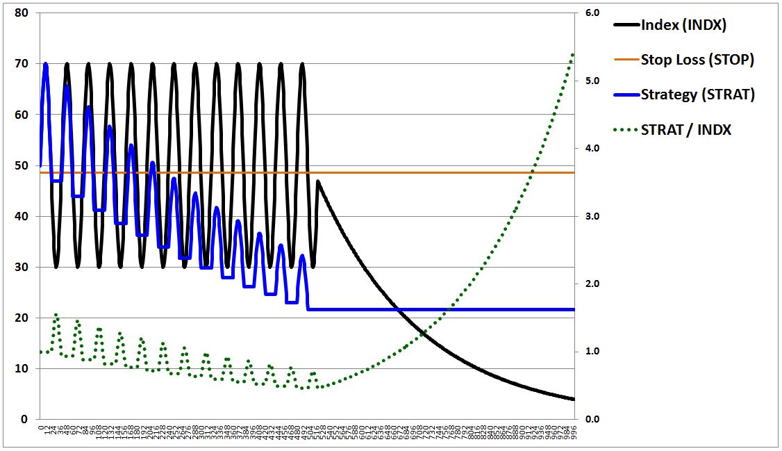
The following chart makes the phenomenon more clear. We notice the accumulation of gap losses over time by looking at the strategy’s peaks. In each cycle, the strategy’s peaks are reduced by an amount equal to the gap:
It’s important to clarify that the gap loss is not an absolute loss, but rather a loss relative to what the strategy would have produced in the “continuous” case, under the assumption of continuous prices and continuous checking. Since the stop loss strategy would have produced a zero return in the “continuous” case–selling at 48.5, buying back at 48.5, selling at 48.5, buying back at 48.5, and so on–the actual return, with gap losses included, ends up being negative.
As the price interacts more frequently with the stop, more transactions occur, and therefore the strategy’s cumulative gap losses increase. We might therefore think that it would be good for the strategy if the price were to interact with the stop as infrequently as possible. While there’s a sense in which that’s true, the moments where the price interacts with the stop are the very moments where the strategy fulfills its purpose–to protect us from the security’s downside. If we didn’t expect the price to ever interact with the stop, or if we expected interactions to occur only very rarely, we wouldn’t have a reason to bother implementing the strategy.
We arrive, then, at the strategy’s fundamental tradeoff. In exchange for attempts to protect investors from a security’s downside, the strategy takes on a different kind of downside–the downside of gap losses. When those losses fail to offset the gains that the strategy generates elsewhere, the strategy produces a negative return. In the extreme, the strategy can whittle away an investor’s capital down to almost nothing, just as buying and holding a security might do in a worst case loss scenario.
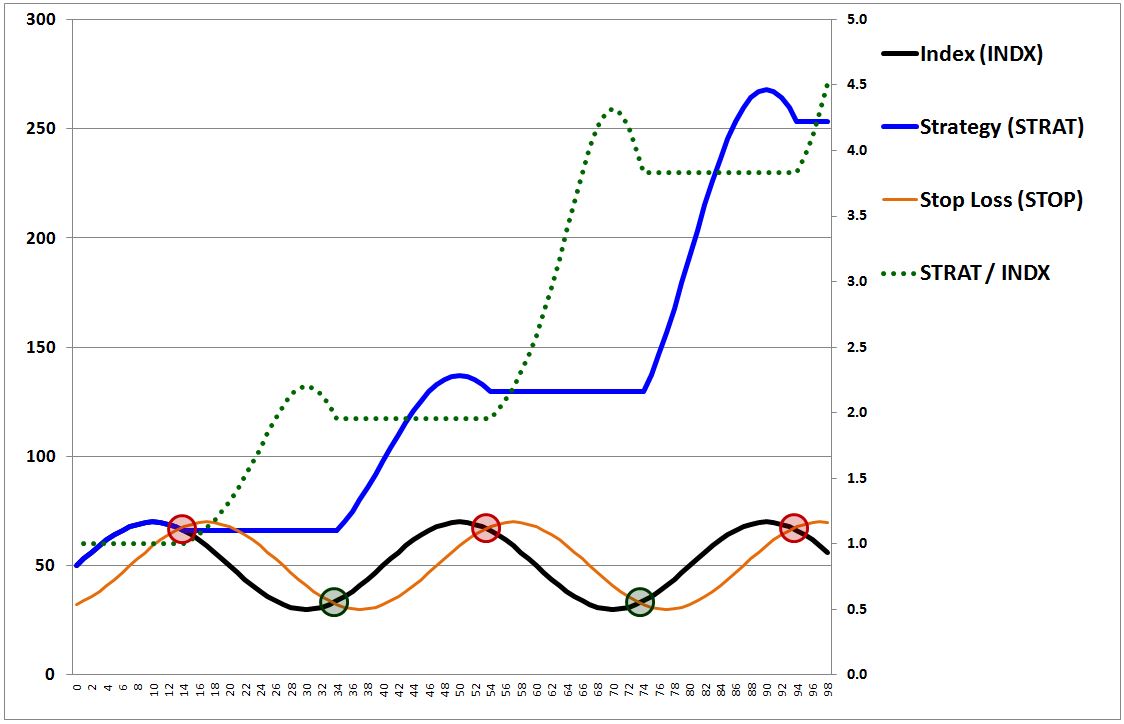
In situations where the protection from downside proves to be unnecessary–for example, because the downside is small and self-reversing–the strategy will perform poorly relative to buy and hold. We see that in the following chart:
In exchange for protection from downside below 48.5–downside that proved to be minor and self-reversing–the strategy incurred 12 gap losses. Those losses reduced the strategy’s total return by more than half and saddled it with a maximum drawdown that ended up exceeding the maximum drawdown of buy and hold.
Sometimes, however, protection from downside can prove to be valuable–specifically, when the downside is large and not self-reversing. In such situations, the strategy will perform well relative to buy and hold. We see that in the following chart:
As before, in exchange for protection from downside in the security, the strategy engaged in a substantial number of unnecessary exits and subsequent reentries. But one of those exits, the final one, proved to have been well worth the cumulative cost of the gap losses, because it protected us from a large downward move that did not subsequently reverse itself, and that instead took the stock to zero.
To correctly account for the impact of gap losses, we can re-write equation (2) as follows:
(4) Strategy(t) = Max(Security Price(t), Stop) – Cumulative Gap Losses(t)
What equation (4) is saying is that the strategy’s value at any time equals the greater of either the security’s price or the stop, minus the cumulative gap losses incurred up to that time. Those losses can be re-written as the total number of round-trip transactions up to that time multiplied by the average gap loss per round-trip transaction. The equation then becomes:
(5) Strategy(t) = Max(Security Price(t), Stop) – # of Round-Trip Transactions(t) * Average Gap Loss Per Round-Trip Transaction.
The equation is not exactly correct, but it expresses the concept correctly. The strategy is exposed to the stock’s upside, it’s protected from the majority of the stock’s downside below the stop, and it pays for that protection by incurring gap losses on each transaction, losses which subtract from the overall return.
Now, the other assumption we made–that the difference between the bid and the ask was infinitesimally small–is also technically incorrect. There’s a non-zero spread between the bid and the ask, and each time the strategy completes a round-trip market transaction, it incurs that spread as a loss. Adding the associated cost to the equation, we get a more complete equation for a bidirectional stop loss strategy:
(6) Strategy(t) = Max(Security Price(t), Stop) – # of Round-Trip Transactions(t) * (Average Gap Loss Per Round-Trip Transaction + Average Bid-Ask Spread).
Again, not exactly correct, but very close.
The cumulative cost of traversing the bid-ask spread can be quite significant, particularly when the strategy checks the price frequently (i.e., daily) and engages in a large number of resultant transactions. But, in general, the cumulative cost is not as impactful as the cumulative cost of gap losses. And so even if bid-ask spreads could be tightened to a point of irrelevancy, as appears to have happened in the modern era of sophisticated market making, a stop loss strategy that engaged in frequent, unnecessary trades would still perform poorly
To summarize:
- A bidirectional stop loss strategy allows an investor to participate in a security’s upside without having to participate in the security’s downside below a certain arbitrarily defined level–the stop.
- Because market prices are discontinuous, the transactions in a stop loss strategy inflict gap losses, which are losses relative to the return that the strategy would have produced under the assumption of perfectly continuous prices. Gap losses represent the primary source of downside for a stop loss strategy.
- Losses associated with traversing the bid-ask spread are also incurred on each round-trip transaction. In most cases, their impacts on performance are not as pronounced as the impacts of gap losses.
A Trailing Stop Loss Strategy: Otherwise Known As…
In this section, I’m going to introduce the concept of a trailing stop loss strategy. I’m going to show how the different trend-following market timing strategies that we examined in the prior piece are just different ways of implementing that concept.
The stop loss strategy that we introduced in the previous section is able to protect us from downside, but it isn’t able to generate sustained profit. The best that it can hope to do is sell at the same price that it buys in at, circumventing losses, but never actually achieving any durable gains.
The circumvention of losses improves the risk-reward proposition of investing in the security, and is therefore a valid contribution. But we want more. We want total return outperformance over the index.
For a stop loss strategy to give us that, the stop cannot stay still, stuck at the same price at all times. Rather, it needs to be able to move with the price. If the price is above the stop and rises, the stop needs to be able to rise as well, so that any subsequent sale occurs at higher prices. If the price is below the stop and falls, the stop needs to be able to fall as well, so that any subsequent purchase occurs at lower prices. If the stop is able to move in this way, trailing behind the price, the strategy will lock in any profits associated with favorable price movements. It will sell high and buy back low, converting the security’s oscillations into relative gains on the index.
The easiest way to implement a trailing stop loss strategy is to set the stop each day to a value equal to yesterday’s closing price. So, if yesterday’s closing price was 50, we set the stop for today–in both directions–to be 50. If the index is greater than or equal to 50 at the close today, we buy in or stay long. If the index is less than 50, we sell or stay out. We do the same tomorrow and every day thereafter, setting the stop equal to whatever the closing price was for the prior day. The following chart shows what our performance becomes:
Bingo! The performance ends up being fantastic. In each cycle, the price falls below the trailing stop near the index peak, around 70, triggering a sell. The price rises above the trailing stop near the index trough, around 30, triggering a buy. As the sine wave moves through its oscillations, the strategy sells at 70, buys at 30, sells at 70, buys at 30, over and over again, ratcheting up a 133% gain on each completed cycle. After 100 days, the value of the strategy ends up growing to almost 7 times the value of the index, which goes nowhere.
In the following chart, we increase the the trailing period to 7 days, setting the stop each day to the security’s price seven days ago:
The performance ends up being good, but not as good. The stop lags the index by a greater amount, and therefore the index ends up falling by a greater amount on its down leg before moving down through the stop and triggering a sell. Similarly, the index ends up rising by a greater amount on its up leg before moving up through the stop and triggering a buy. The strategy isn’t able to sell as high or buy back as low as in the 1 day case, but it still does well.
The following is a general rule for a trailing stop loss strategy:
- If the trailing period between the stop and the index is increased, the stop will end up lagging the index by a greater amount, capturing a smaller portion of the up leg and down leg of the index’s oscillation, and generating less outperformance over the index.
- If the trailing period between the stop and the index is reduced, the stop will end up hugging the index more closely, capturing a greater portion of the up leg and down leg of the index’s oscillation, and generating more outperformance over the index.
Given this rule, we might think that the way to optimize the strategy is to always use the shortest trailing period possible–one day, one minute, one second, however short we can get it, so that the stop hugs the index to the maximum extent possible, capturing as much of the index’s upward and downward “turns” as it can. This, of course, is true for an idealized price index that moves as a perfect, squeaky clean sine wave. But as we will later see, using a short trailing period to time a real price index–one that contains the messiness of random short-term volatility–will increase the number of unnecessary interactions between the index and the stop, and therefore introduce new gap losses that will tend to offset the timing benefits.
Now, let’s change the trailing period to 20 days. The following chart shows the performance:
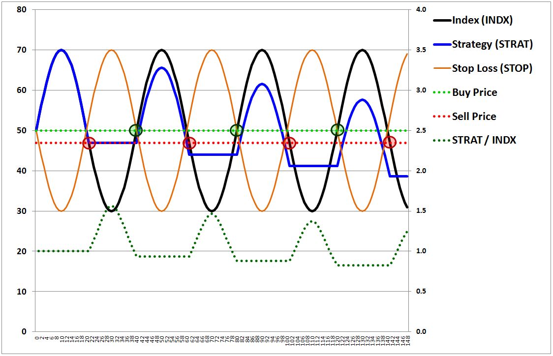
The index and the stop end up being a perfect 180 degrees out of phase with each other, with the index crossing the stop every 20 days at a price of 50. We might therefore think that the strategy will generate a zero return–buying at 50, selling at 50, buying at 50, selling at 50, buying at 50, selling at 50, and so on ad infinitum. But what are we forgetting? Gap losses. As in the original stop loss case, they will pull the strategy into a negative return.
The trading rule that defines the strategy has the strategy buy in or stay long when the price is greater than or equal to the trailing stop, and sell out or stay in cash when the price is less than the trailing stop. On the up leg, the price and the stop cross at 50, triggering a buy at 50. On the down leg, however, the first level where the strategy realizes that the price is less than the stop, 50, is not 50. Nor is it 49.99, or some number close by. It’s 46.9. The strategy therefore sells at 46.9. On each oscillation, it repeats: buying at 50, selling at 46.9, buying at 50, selling at 46.9, accumulating a loss equal to the gap on each completed round-trip. That’s why you see the strategy’s value (blue line) fall over time, even though the index (black line) and the stop (orange line) cross each other at the exact same point (50) in every cycle.
Now, to be clear, the same magnitude of gap losses were present earlier, when we set the stop’s trail at 1 day and 7 days. The difference is that we couldn’t see them, because they were offset by the large gains that the strategy was generating through its trading. On a 20 day trail, there is zero gain from the strategy’s trading–the index and the stop cross at the same value every time, 50–and so the gap losses show up clearly as net losses for the strategy. Always remember: gap losses are not absolute losses, but losses relative to what a strategy would have produced on the assumption of continuous prices and continuous checking.
Now, ask yourself: what’s another name for the trailing stop loss strategy that we’ve introduced here? The answer: a momentum strategy. The precise timing rule is:
(1) If the price is greater than or equal to the price N days ago, then buy or stay long.
(2) If the price is less than the price N days ago, then sell or stay out.
This rule is functionally identical to the timing rule of a moving average strategy, which uses averaging to smooth out single-point noise in the stop:
(1) If the price is greater than or equal to the average of the last N day’s prices, then buy or stay long.
(2) If the price is less than the average of the last N day’s prices, then sell or stay out.
The takeaway, then, is that the momentum and moving average strategies that we examined in the prior piece are nothing more than specific ways of implementing the concept of a trailing stop loss. Everything that we’ve just learned about that concept extends directly to their operations.
Now, to simplify, we’re going to ignore the momentum strategy from here forward, and focus strictly on the moving average strategy. We will analyze the difference between the two strategies–which is insignificant–at a later point in the piece.
To summarize:
- We can use a stop loss strategy to extract investment outperformance from an index’s oscillations by setting the stop to trail the index.
- When the stop of a trailing stop loss strategy is set to trail very closely behind the index, the strategy will capture a greater portion of the upward and downward moves of the index’s oscillations. All else equal, the result will be larger trading gains. But all else is not always equal. The larger trading gains will come at a significant cost, which we have not yet described in detail, but will discuss shortly.
- The momentum and moving average strategies that we examined in the prior piece are nothing more than specific ways of implementing the concept of a trailing stop loss. Everything that we’ve learned about that concept extends directly over to their operations.
Determinants of Performance: Captured Downturns and Whipsaws
In this section, I’m going to explain how the moving average interacts with the price to produce two types of trades for the strategy: a profitable type, called a “captured downturn”, and an unprofitable type, called a “whipsaw.” I’m going to introduce a precise rule that we can use to determine whether a given oscillation will lead to a captured downturn or a whipsaw.
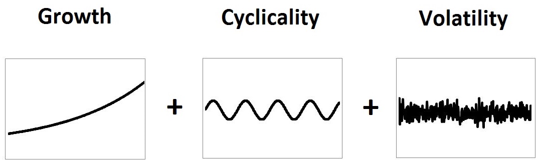
Up to now, we’ve been modeling the price of a security as a single sine wave with no vertical trend. That’s obviously a limited simplification. To take the analysis further, we need a more accurate model.
To build such a model, we start with a security’s primary fundamental: its potential payout stream, which, for an equity security, is its earnings stream. Because we’re working on a total return basis, we assume that the entirety of the stream is retained internally. The result is a stream that grows exponentially over time. We set the stream to start at 100, and to grow at 6% per year:
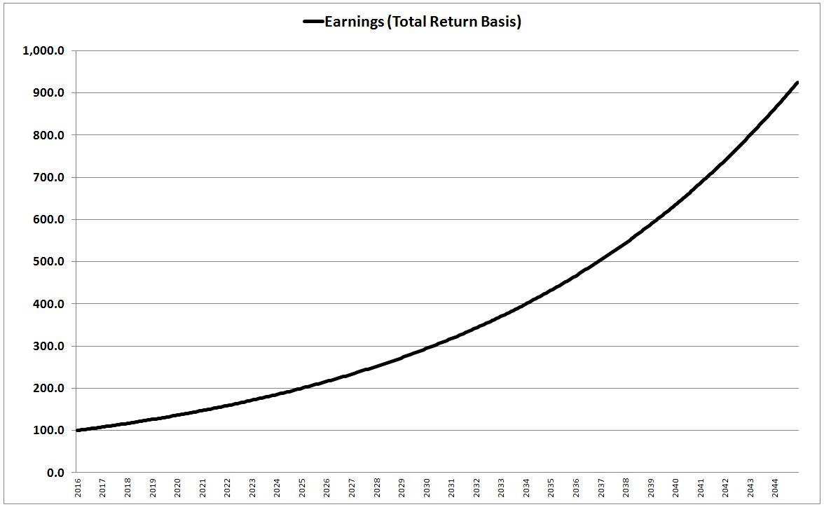
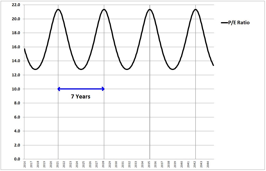
To translate the earnings into a price, we apply a valuation measure: a price-to-earnings (P/E) ratio, which we derive from an earnings yield, the inverse of a P/E ratio. To model cyclicality in the price, we set the earnings yield to oscillate in sinusoidal form with a base or mean of 6.25% (inverse: P/E of 16), and a maximum cyclical deviation of 25% in each direction. We set the period of the oscillation to be 7 years, mimicking a typical distance between business cycle peaks. Prices are quoted on a monthly basis, as of the close:
The product of the security’s earnings and price-to-earnings ratio is just the security’s price index. That index is charted below:
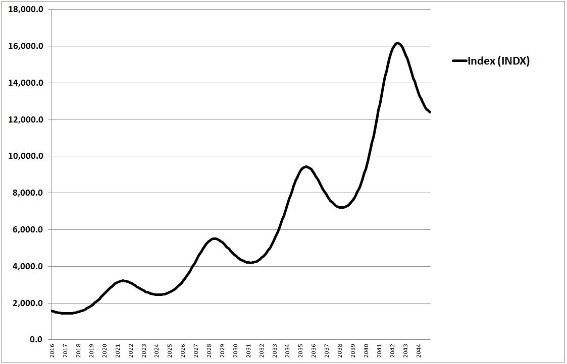
Admittedly, the model is not a fully accurate approximation of real security prices, but it’s adequate to illustrate the concepts that I’m now going to try to illustrate. The presentation may at times seem overdone, in terms of emphasizing the obvious, but the targeted insights are absolutely crucial to understanding the functionality of the strategy, so the emphasis is justified.
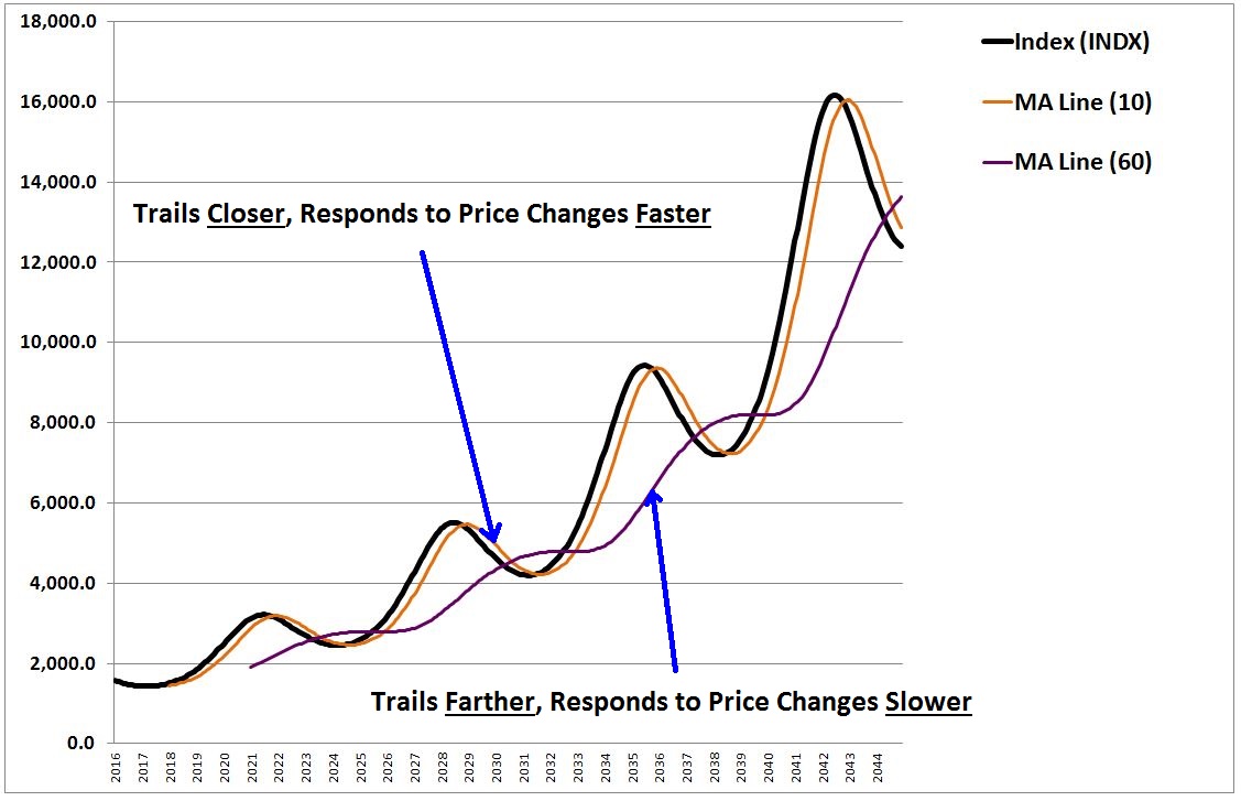
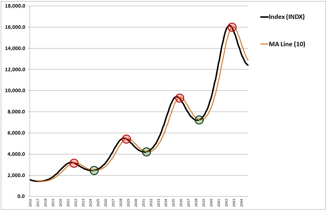
In the chart below, we show the above price index with a 10 month moving average line trailing behind it in orange, and a 60 month moving average line trailing behind it in purple:
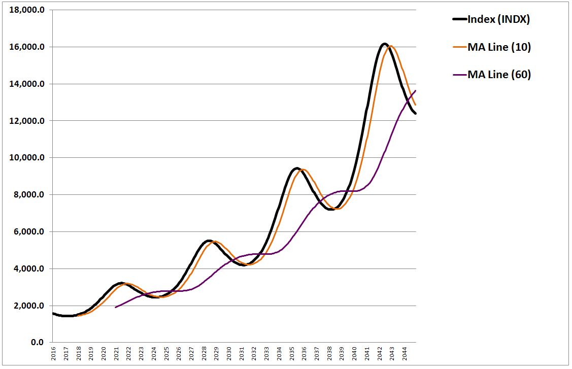
We notice two things. First, the 10 month moving average line trails closer to the price than the 60 month moving average line. Second, the 10 month moving average line responds to price changes more quickly than the 60 month moving average line.
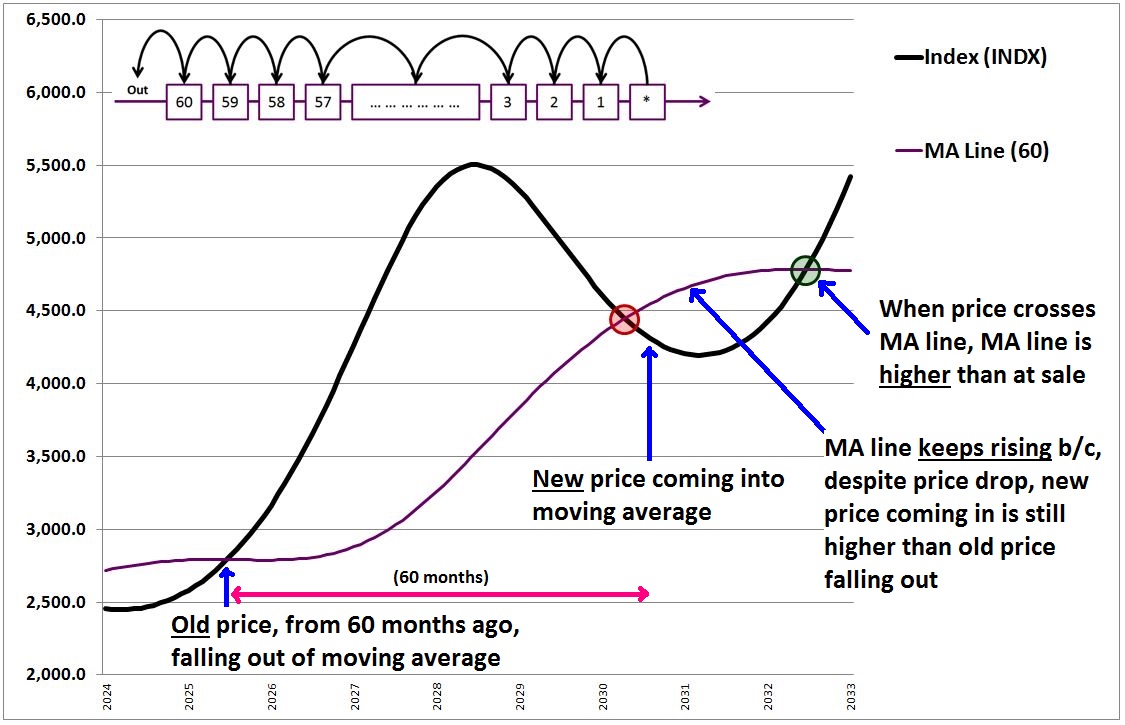
To understand why the 10 month moving average trails closer and responds to changes more quickly than the 60 month moving average, all we need to do is consider what happens in a moving average over time. As each month passes, the last monthly price in the average falls out, and a new monthly price, equal to the price in the most recent month (denoted with a * below), is introduced in.
The following chart shows this process for the 10 month moving average: 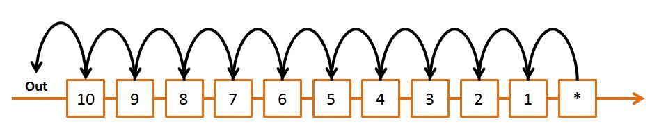
As each month passes, the price in box 10 (from 10 months ago) is thrown out. All of the prices shift one box to the left, and the price in the * box goes into box 1.
The following chart shows the same process for the 60 month moving average. Note that the illustration is abbreviated–we don’t show all 60 numbers, but abbreviate with the “…” insertion:
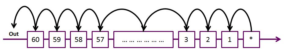
A key point to remember here is that the prices in the index trend higher over time. More recent prices therefore tend to be higher in value than more distant prices. The price from 10 months ago, for example, tends to be higher than the price from 11 months, 12 months, 13 months ago, …, and especially the price from 57 months, 58 months ago, 59 months ago, and so on. Because the 60 month moving average has more of those older prices inside its “average” than the 10 month moving average, its value tends to trail (i.e., be less than) the current price by a greater amount.
The 60 month moving average also has a larger quantity of numbers inside its “average” than the 10 month moving average–60 versus 10. For that reason, the net impact on the average of tossing a single old number out, and bringing a single new number in–an effect that occurs once each month–tends to be less for the 60 month moving average than for the 10 month moving average. That’s why the 60 month moving average responds more slowly to changes in the price. The changes are less impactful to its average, given the larger number of terms contained in that average.
These two observations represent two fundamental insights about the the relationship between the period (length) of a moving average and its behavior. That relationship is summarized in the bullets and table below:
- As the period (length) of a moving average is reduced, the moving average tends to trail closer to the price, and to respond faster to changes in the price.
- As the period (length) of a moving average is increased, the moving average tends to trail farther away from the price, and to respond more slowly to changes in the price.
The following chart illustrates the insights for the 10 and 60 month cases:
With these two insights in hand, we’re now ready to analyze the strategy’s performance. The following chart shows the performance of the 10 month moving average strategy on our new price index. The value of the strategy is shown in blue, and the outperformance over buy and hold is shown dotted in green (right y-axis):
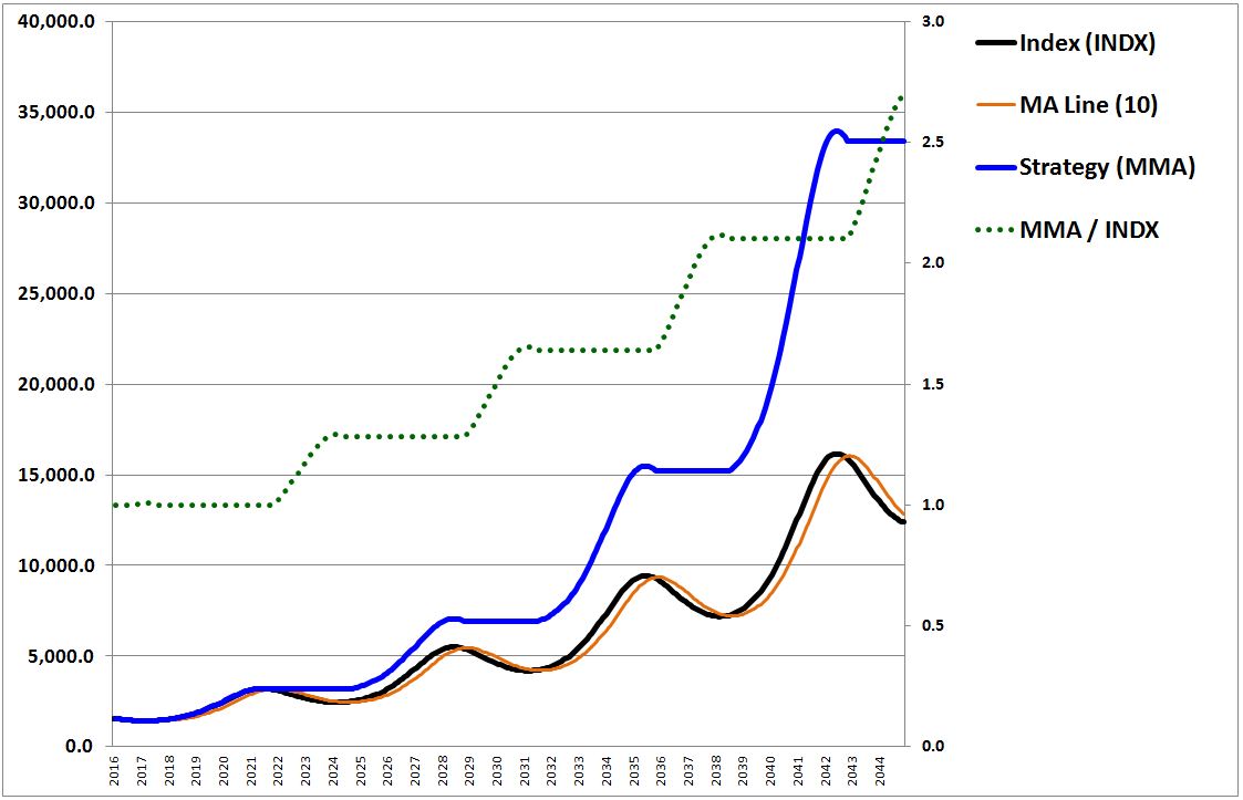
The question we want to ask is: how does the strategy generate gains on the index? Importantly, it can only generate gains on the index when it’s out of the index–when it’s invested in the index, its return necessarily equals the index’s return. Obviously, the only way to generate gains on the index while out of the index is to sell the index and buy back at lower prices. That’s what the strategy tries to do.
The following chart shows the sales and buys, circled in red and green respectively:
As you can see, the strategy succeeds in its mission: it sells high and buys back low. For a strategy to be able to do that, something very specific has to happen after the sales. The price needs to move down below the sale price, and then, crucially, before it turns back up, it needs to spend enough time below that price to bring the moving average line down with it. Then, when it turns back up and crosses the moving average line, it will cross at a lower point, causing the strategy to buy back in at a lower price than it sold at. The following chart illustrates with annotations:
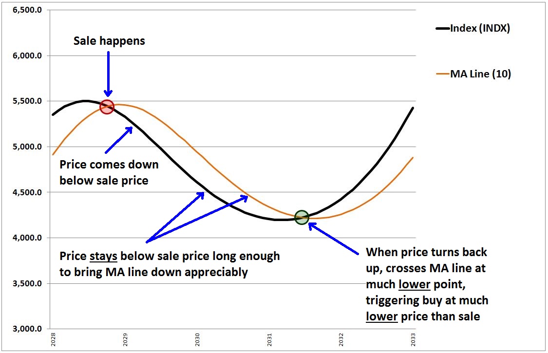
Now, in the above drawing, we’ve put the sells and buys exactly at the points where the price crosses over the moving average, which is to say that we’ve shown the trading outcome that would ensue if prices were perfectly continuous, and if our strategy were continuously checking them. But prices are not perfectly continuous, and our strategy is only checking them on a monthly basis. It follows that the sells and buys are not going to happen exactly at the crossover points–there will be gaps, which will create losses relative to the continuous case. For a profit to occur on a round-trip trade, then, not only will the moving average need to get pulled down below the sale price, it will need to get pulled down by an amount that is large enough to offset the gap losses that will be incurred.
As we saw earlier, in the current case, the 10 month moving average responds relatively quickly to the changes in the price, so when the price falls below the sale price, the moving average comes down with it. When the price subsequently turns up, the moving average is at a much lower point. The subsequent crossover therefore occurs at a much lower point, a point low enough to offset inevitable gap losses and render the trade profitable.
Now, it’s not guaranteed that things will always happen in this way. In particular, as we saw earlier, if we increase the moving average period, the moving average will respond more slowly to changes in the price. To come down below the sale price, it will need the price to spend more time at lower values after the sale. The price may well turn up before that happens. If it does, then the strategy will not succeed in buying at a lower price.
To see the struggle play out in an example, let’s look more closely at the case where the 60 month moving average is used. The following chart shows the performance:
As you can see, the strategy ends up underperforming. There are two aspects to the underperformance.
- First, because the moving average trails the price by such a large amount, the price ends up crossing the moving average on the down leg long after the peak is in, at prices that are actually very close to the upcoming trough. Only a small portion of the downturn is therefore captured for potential profit.
- Second, because of the long moving average period, which implies a slow response, the moving average does not come down sufficiently after the sales occur. Therefore, when the price turns back up, the subsequent crossover does not occur at a price that is low enough to offset the gap losses incurred in the eventual trade that takes place.
On this second point, if you look closely, you will see that the moving average actually continues to rise after the sales. The subsequent crossovers and buys, then, are triggered at higher prices, even before gap losses are taken into consideration. The following chart illustrates with annotations:
The reason the moving average continues to rise is that it’s throwing out very low prices from five years ago (60 months), and replacing them with newer, higher prices from today. Even though the newer prices have fallen substantially from their recent peak, they are still much higher than the older prices that they are replacing. So the moving average continues to drift upward. When the price turns back up, it ends up crossing the moving average at a higher price than where the sale happened at, completing an unprofitable trade (sell high, buy back higher), even before the gap losses are added in.
In light of these observations, we can categorize the strategy’s trades into two types: captured downturns and whipsaws.
- In a captured downturn, the price falls below the moving average, triggering a sale. The price then spends enough time at values below the sale price to pull the moving average down below the sale price. When the price turns back up, it crosses the moving average at a price below the sale price, triggering a buy at that price. Crucially, the implied profit in the trade exceeds the gap losses and any other costs incurred, to include the cost of traversing the bid-ask spread. The result ends up being a net gain for the strategy relative to the index. This gain comes in addition to the risk-reduction benefit of avoiding the drawdown itself.
- In a whipsaw, the price falls below the moving average, triggering a sale. It then turns back up above the moving average too quickly, without having spent enough time at lower prices to pull the moving average down sufficiently below the sale price. A subsequent buy is then triggered at a price that is not low enough to offset gap losses (and other costs) incurred in the transaction. The result ends up being a net loss for the strategy relative to the index. It’s important to once again recognize, here, that the dominant component of the loss in a typical whipsaw is the gap. In a perfectly continuous market, where gap losses did not exist, whipsaws would typically cause the strategy to get out and get back in at close to the same prices.
Using these two trade categories, we can write the following equation for the performance of the strategy:
(7) Strategy(t) = Index(t) + Cumulative Gains from Captured Downturns(t) – Cumulative Losses from Whipsaws(t)
What equation (7) is saying is that the returns of the strategy at any given time equal the value of the index (buy and hold) at that time, plus the sum total of all gains from captured downturns up to that time, minus the sum total of all losses from whipsaws up to that time. Note that we’ve neglected potential interest earned while out of the security, which will slightly boost the strategy’s return.
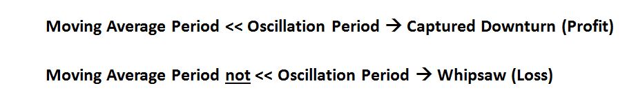
Now, there’s a simple thumbrule that we can use to determine whether the strategy will produce a captured downturn or a whipsaw in response to a given oscillation. We simply compare the period of the moving average to the period of the oscillation. If the moving average period is substantially smaller than the oscillation period, the strategy will produce a captured downturn and a profit relative to the index, with the profit getting larger as the moving average period gets smaller. If the moving average period is in the same general range as the oscillation period–or worse, greater than the oscillation period–then the strategy will produce a whipsaw and a loss relative to the index.
Here’s the rule in big letters (note: “<<” means significantly less than):
To test the rule in action, the following chart shows the strategy’s outperformance on the above price index using moving average periods of 70, 60, 50, 40, 30, 20, 10, 5, and 1 month(s):
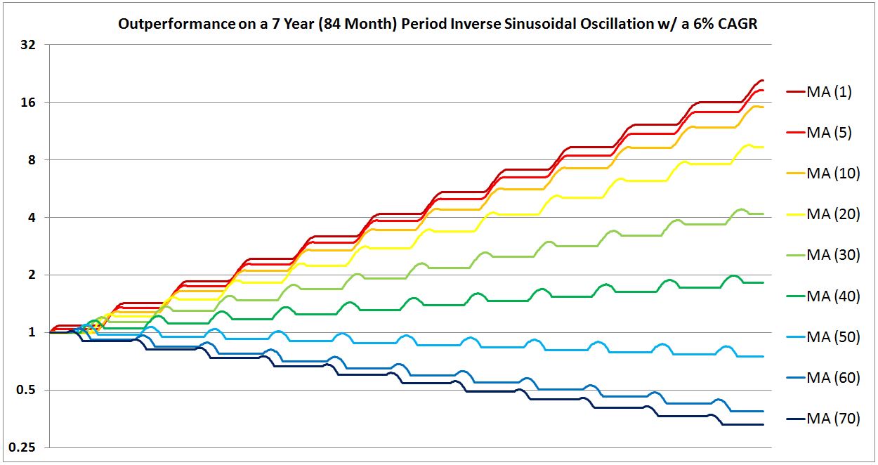
As you can see, a moving average period of 1 month produces the greatest outperformance. As the moving average period is increased from 1, the outperformance is reduced. As the moving average period is increased into the same general range as the period of the price oscillation, 84 months (7 years), the strategy begins to underperform.
The following chart shows what happens if we set the oscillation period of the index to equal the strategy’s moving average period (with both set to a value of 10 months):

The performance devolves into a cycle of repeating whipsaws, with ~20% losses on each iteration. Shockingly, the strategy ends up finishing the period at a value less than 1% of the value of the index. This result highlights the significant risk of using a trend-following strategy–large amounts of money can be lost in the whipsaws, especially as they compound on each other over time.
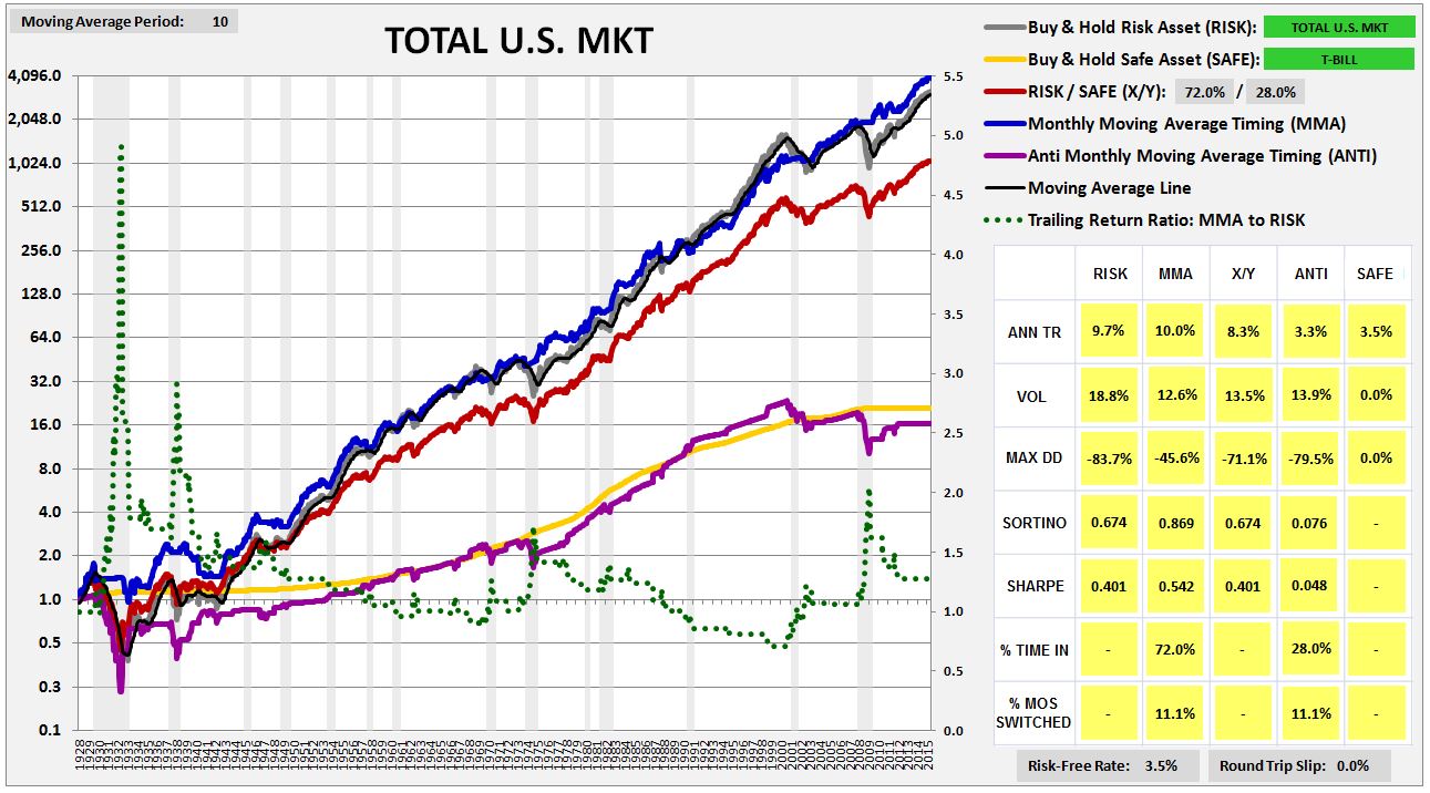
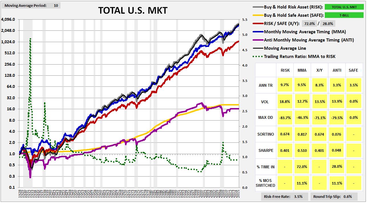
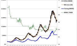
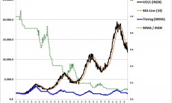
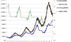
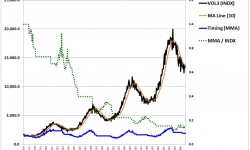
Recall that for each of the markets backtested in the prior piece, I presented tables showing the strategy’s entry dates (buy) and exit dates (sell). The example for U.S. equities is shown below (February 1928 – November 2015):
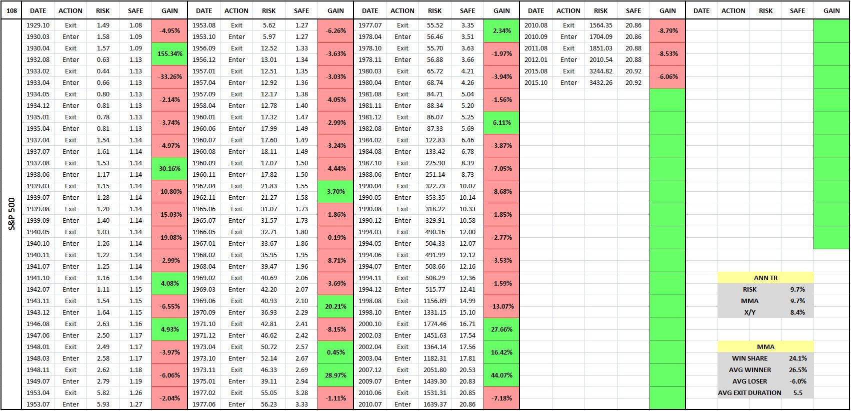
We can use the tables to categorize each round-trip trade as a captured downturn or a whipsaw. The simple rule is:
- Green Box = Captured Downturn
- Red Box = Whipsaw
An examination of the tables reveals that in equities, whipsaws tend to be more frequent than captured downturns, typically by a factor of 3 or 4. But, on a per unit basis, the gains of captured downturns tend to be larger than the losses of whipsaws, by an amount sufficient to overcome the increased frequency of whipsaws, at least when the strategy is acting well.
Recall that in the daily momentum backtest, we imposed a relative large 0.6% slip (loss) on each round-trip transaction. As we explained in a related piece on daily momentum, we used that slip in order to correctly model the average cost of traversing the bid-ask spread during the tested period, 1928 – 2015. To use any other slip would be to allow the strategy to transact at prices that did not actually exist at the time, and we obviously can’t do that in good faith.
Now, if you look at the table, you will see that the average whipsaw loss across the period was roughly 6.0%. Of that loss, 0.6% is obviously due to the cost of traversing bid-ask spread. We can reasonably attribute the other 5.4% to gap losses. So, using a conservative estimate of the cost of traversing the bid-ask spread, the cost of each gap loss ends up being roughly 9 times as large as the cost of traversing the bid-ask spread. You can see, then, why we’ve been emphasizing the point that gap losses are the more important type of loss to focus on.
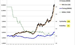
To finish off the section, let’s take a close-up look at an actual captured downturn and whipsaw from a famous period in U.S. market history–the Great Depression. The following chart shows the 10 month moving average strategy’s performance in U.S. equities from February 1928 to December 1934, with the entry-exit table shown on the right:

The strategy sells out in April 1930, as the uglier phase of the downturn begins. It buys back in August 1932, as the market screams higher off of the ultimate Great Depression low. Notice how large the gap loss ends up being on the August 1932 purchase. The index crosses the moving average at around 0.52 in the early part of the month (1.0 equals the price in February 1928), but the purchase on the close happens at 0.63, roughly 20% higher. The gap loss was large because the market had effectively gone vertical at the time. Any amount of delay between the crossover and the subsequent purchase would have been costly, imposing a large gap loss.
The strategy exits again in February 1933 as the price tumbles below the moving average. That exit proves to be a huge mistake, as the market rockets back up above the moving average over the next two months. Recall that March 1933 was the month in which FDR took office and began instituting aggressive measures to save the banking system (a bank holiday, gold confiscation, etc.). After an initial scare, the market responded very positively. As before, notice the large size of the gap loss on both the February sale and the March purchase. If the strategy had somehow been able to sell and then buy back exactly at the points where the price theoretically crossed the moving average, there would hardly have been any loss at all for the strategy. But the strategy can’t buy at those prices–the market is not continuous.
To summarize:
- On shorter moving average periods, the moving average line trails the price index by a smaller distance, and responds more quickly to its movements.
- On longer moving average periods, the moving average line trails the price index by a larger distance, and responds more slowly to its movements.
- For the moving average strategy to generate a relative gain on the index, the price must fall below the moving average, triggering a sale. The price must then spend enough time below the sale price to bring the moving average down with it, so that when the price subsequently turns back up, it crosses the moving average at a lower price than the sale price. When that happens by an amount sufficient to offset gap losses (and other costs associated with the transaction), we say that a captured downturn has occurred. Captured downturns are the strategy’s source of profit relative to the index.
- When the price turns back up above the moving average too quickly after a sale, triggering a buy without having pulled the moving average line down by a sufficient amount to offset the gap losses (and other costs incurred), we call that a whipsaw. Whipsaws are the strategy’s source of loss relative to the index.
- Captured downturns occur when the strategy’s moving average period is substantially less than the period of the oscillation that the strategy is attempting to time. Whipsaws occur whenever that’s not the case.
- The strategy’s net performance relative to the index is determined by the balance between the effects of captured downturns and the effects of whipsaws.
Tradeoffs: Changing the Moving Average Period and the Checking Period
In this section, I’m going to add an additional component to our “growing sine wave” model of prices, a component that will make the model into a genuinely accurate approximation of real security prices. I’m then going to use the improved model to explain the tradeoffs associated with changing (1) the moving average period and (2) the checking period.
In the previous section, we modeled security prices as a combination of growth and cyclicality: specifically, an earnings stream growing at 6% per year multiplied by a P/E ratio oscillating as an inverse sine wave with a period of 7 years. The resultant structure, though useful to illustrate concepts, is an unrealistic proxy for real prices–too clean, too smooth, too easy for the strategy to profitable trade.
To make the model more realistic, we need to add short-term price movements to the security that are unrelated to its growth or long-term cyclicality. There are a number of ways to do that, but right now, we’re going to do it by adding random short-term statistical deviations to both the growth rate and the inverse sine wave. Given the associated intuition, we will refer to those deviations as “volatility”, even though the term “volatility” has a precise mathematical meaning that may not always accurately apply.
The resultant price index, shown below, ends up looking much more like the price index of an actual security. Note that the index was randomly generated:

Now would probably a good time to briefly illustrate the reason why we prefer the moving average strategy to the momentum strategy, even though the performances of the two strategies are statistically indistinguishable. In the following chart, we show the index trailed by a 15 month momentum line (hot purple) and a 30 month moving average line (orange). The periods have been chosen to create an overlap:

As you can see, the momentum (MOM) line is just the price index shifted to the right by 15 months. It differs from the moving average (MA) line in that it retains all of the index’s volatility. The moving average line, in contrast, smooths that volatility away by averaging.
Now, on an ex ante basis, there’s no reason to expect the index’s volatility, when carried over into the momentum line, to add value to the timing process. Certainly, there will be individual cases where the specific movements in the line, by chance, help the strategy make better trades. But, statistically, there will be just as many cases where those movements, by chance, will cause the strategy to make worse trades. This expectation is confirmed in actual testing. Across a large universe of markets and individual stocks, we find no statistically significant difference between the performance results of the two strategies.
For convenience, we’ve chosen to focus on the strategy that has the simpler, cleaner look–the moving average strategy. But we could just as easily have chosen the momentum strategy. Had we done so, the same insights and conclusions would have followed. Those insights and conclusions apply to both strategies without distinction.

Now, there are two “knobs” that we can turn to influnence the strategy’s performance. The first “knob” is the moving average period, which we’ve already examined to some extent, but only on a highly simplified model of prices. The second “knob” is the period between the checks, i.e., the checking period, whose effect we have yet to examine in detail. In what follows, we’re going to examine both, starting with the moving average period. Our goal will be to optimize the performance of the strategy–“tweak” it to generate the highest possible relative gain on the index.
We start by setting the moving average period to a value of 30 months. The following chart shows the strategy’s performance:

As you can see, the strategy slightly outperforms. It doesn’t make sense for us to use 30 months, however, because we know, per our earlier rule, that shorter moving average periods will capture more of the downturns and generate greater outperformance:
So we shorten the moving average period to 20 months, expecting a better return. The following chart shows the performance:

As we expected, the outperformance increases. Using a 30 month moving average period in the prior case, the outperformance came in at 1.13 (dotted green line, right y-axis). In reducing the period to 20 months, we’ve increased the outperformance to 1.20.
Of course, there’s no reason to stop at 20 months. We might as well shorten the moving average period to 10 months, to improve the performance even more. The following chart shows the strategy’s performance using a 10 month moving average period:

Uh-oh! To our surprise, the performance gets worse, not better, contrary to the rule.
What’s going on?
Before we investigate the reasons for the deterioration in the performance, let’s shorten the moving average period further. The following two charts show the performances for moving average periods of 5 months and 1 month respectively:


As you can see, the performance continues to deteriorate. Again, this result is not what we expected. In the prior section, when we shortened the moving average period, the performance got better. The strategy captured a greater portion of the cyclical downturns, converting them into larger gains on the index. Now, when we shorten the moving average period, the performance gets worse. What’s happening?
Here’s the answer. As we saw earlier, when we shorten the moving average period, we cause the moving average to trail (hug) more closely to the price. In the previous section, the price was a long, clean, cyclical sine wave, with no short-term volatility that might otherwise create whipsaws, so the shortening improved the strategy’s performance. But now, we’ve added substantial short-term volatility to the price–random deviations that are impossible for the strategy to successfully time. At longer moving average periods–30 months, 20 months, etc.–the moving average trails the price by a large amount, and therefore never comes into contact with that volatility. At shorter moving average periods, however, the moving average is pulled in closer to the price, where it comes into contact with the volatility. It then suffers whipsaws that it would not otherwise suffer, incurring gap losses that it would not otherwise incur.
Of course, it’s still true that shortening the moving average period increases the portion of the cyclical downturns that the strategy captures, so there’s still that benefit. But the cumulative harm of the additional whipsaws introduced by the shortening substantially outweighs that benefit, leaving the strategy substantially worse off on net.
The following two charts visually explain the effect of shortening the moving average period from 30 months to 5 months:


If the “oscillations” associated with random short-term price deviations could be described as having a period (in the way that a sine wave would have a period), the period would be very short, because the oscillations tend to “cycle” back and forth very quickly. Given our “MA Period << Oscillation Period” rule, then, it’s extremely difficult for a timing strategy to profitably time the oscillations. In practice, the oscillations almost always end up producing whipsaws.
Ultimately, the only way for the strategy to avoid the implied harm of random short-term price deviations is to avoid touching them. Strategies that use longer moving average periods are more able to do that than strategies that use shorter ones, which is why strategies that use longer moving average periods often outperform, even though they aren’t as effective at converting downturns into gains.
The following table describes the fundamental tradeoff associated with changing the moving average period. Green is good for performance, red is bad:

As the table illustrates, when we shorten the moving average period, we increase both the good stuff (captured downturns) and the bad stuff (whipsaws). When we lengthen the moving average period, we reduce both the good stuff (captured downturns) and the bad stuff (whipsaws).
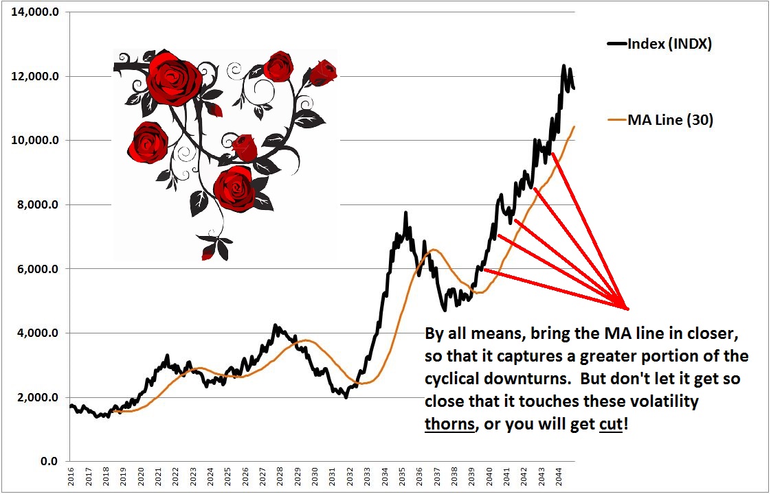
Ultimately, optimizing the strategy is about finding the moving average period that brings the moving average as close as possible to the price, so that it maximally captures tradeable cyclical downturns, but without causing it to get so close to the price that it comes into contact with untradeable short-term price volatility. We can imagine the task as being akin to the task of trying to pull a rose out of a rose bush. We have to reach into the bush to pull out the rose, but we don’t want to reach so deep that we end up getting punctured by thorns.
Now, the index that we built is quoted on a monthly basis, at the close. If we wanted to, we could change the period between the quotes from one month to one day–or one hour, or one minute, or one second, or less. Doing that would allow us to reduce the moving average period further, so that we capture cyclical downturns more fully than we may have otherwise been capturing them. But it would also bring us into contact with short-term volatility that we were previously unaware of and unexposed to, volatility that will increase our whipsaw losses, potentially dramatically.
We’re now ready to examine the strategy’s second “knob”, the period of time that passes between the checks, called the “checking period.” In the current case, we set the checking period at one month. But we could just as easily have set it at one year, five days, 12 hours, 30 minutes, 1 second, and so on–the choice is ours, provided that we have access to price quotes on those time scales.
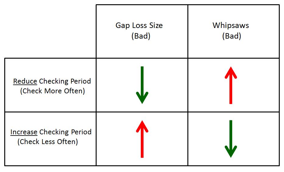
The effects of changing the checking period are straightforward. Increasing the checking period, so that the strategy checks less frequently, has the effect of reducing the quantity of price information that the strategy has access to. The impact of that reduction boils down to the impact of having the strategy see or not see the information:
- If the information is useful information, the type that the strategy stands to benefit from transacting on, then not seeing the information will hinder the strategy’s performance. Specifically, it will increase the gap losses associated with each transaction. Prices will end up drifting farther away from the moving average before the prescribed trades take place.
- If the information is useless information, the type that the strategy does not stand to benefit from transacting on, then not seeing the information will improve the strategy’s performance. The strategy will end up ignoring short-term price oscillations that would otherwise entangle it in whipsaws.
The converse is true for reducing the checking period, i.e., conducting checks more frequently. Reducing the checking period has the effect of increasing the quantity of price information that the strategy has access to. If the information is useful, then the strategy will trade on it more quickly, reducing the extent to which the price “gets away”, and therefore reducing gap losses. If the information is useless, then it will push the strategy into additional whipsaws that will detract from performance.
The following table illustrates the tradeoffs associated with changing the checking period. As before, green is good for performance, red is bad:
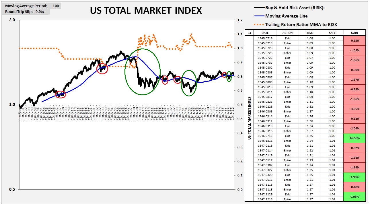
The following two charts show the performances of the strategy in the total U.S. equity market index from January of 1945 to January of 1948. The first chart runs the strategy on the daily price index (checking period of 1 day) using a 100 day moving average (~5 months). Important captured downturns are circled in green, and important whipsaws are circled in red:
The second chart runs the strategy on the monthly price index (checking period of 1 month) using a 5 month moving average.

Notice the string of repeated whipsaws that occur in the left part of the daily chart, around the middle of 1945 and in the early months of 1946. The monthly strategy completely ignores those whipsaws. As a result, across the entire period, it ends up suffering only 2 whipsaws. The daily strategy, in contrast, suffers 14 whipsaws. Crucially, however, those whipsaws come with average gap losses that are much smaller than the average gap losses incurred on the whipsaws in the monthly strategy. In the end, the two approaches produce a result that is very similar, with the monthly strategy performing slightly better.
Importantly, on a daily checking period, the cumulative impact of losses associated with traversing the bid-ask spread become significant, almost as significant as the impact of gap losses, which, of course, are smaller on a daily checking period. That’s one reason why the monthly strategy may be preferable to the daily strategy. Unlike in the daily strategy, in the monthly strategy we can accurately model large historical bid-ask spreads without destroying performance.
We see this in the following two charts, which show the performance of the daily strategy from February 1928 to July 2015 using (1) zero bid-ask spread losses and (2) bid-ask spread losses equal to the historical average of roughly 0.6%:
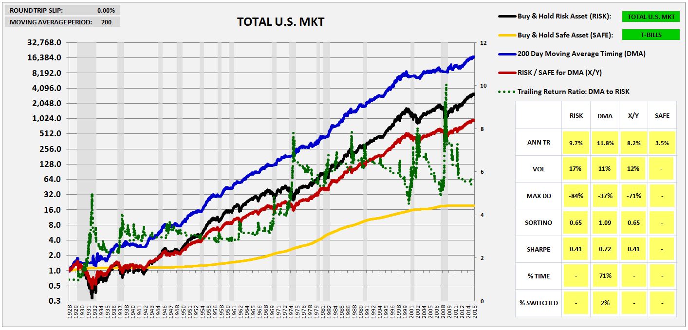

The impact on the strategy ends up being worth 1.8%. That contrasts with an impact of 0.5% for the monthly strategy using the equivalent 10 month moving average preference of the strategy’s inventor, Mebane Faber. We show the results of the monthly strategy for 0% bid-ask spread losses and 0.6% bid-ask spread losses in the two charts below, respectively:
From looking at the charts, the daily version of the strategy appears to be superior. But it’s hard to be confident in the results of the daily version, because in the last several decades, its performance has significantly deteriorated relative to the performance seen in prior eras of history. The daily version generated frequent whipsaws and no net gains in the recent downturns of 2000 and 2008, in contrast with the substantial gains that it generated in the more distant downturns of 1929, 1937, 1970 and 1974. The deterioration may be related to the deterioration of the one day momentum strategy (see a discussion here), whose success partially feeds into the success of all trend-following strategies that conduct checks of daily prices.
To summarize:
- For the moving average period:
- For the checking period:
Aggregate Indices vs. Individual Securities: Explaining the Divergent Results
In this section, I’m going to use insights gained in previous sections to explain why the trend-following strategies that we tested in the prior piece work well on aggregate indices, but not on the individual securities that make up those indices. Recall that this was a key result that we left unresolved in the prior piece.
To understand why the momentum and moving average strategies that we tested in the prior piece work on aggregate indices, but not on the individual securities that make up those indices, we return to our earlier decomposition of stock prices. An understanding of how the phenomenon of indexing differentially affects the two latter variables in the decomposition–cyclicality and volatility–will give the answer.
We first ask, what effect does increasing each component of the decomposition, while leaving all other components unchanged, have on the strategy’s performance? We first look at growth.
Growth: Increasing the growth, which is the same thing as postulating higher future returns for the index, tends to impair the strategy’s performance. The higher growth makes the it harder for the strategy to capture downturns–the downturns themselves don’t go as far down, because the growth is pushing up on them to a greater extent over time. The subsequent buys therefore don’t happen at prices as low as they might otherwise happen, reducing the gain on the index.
Importantly, when we’re talking about the difference between annual growth numbers of 6%, 7%, 8%, and so on, the effect of the difference on the strategy’s performance usually doesn’t become significant. It’s only at very high expected future growth rates–e.g., 15% and higher–that the growth becomes an impeding factor that makes successful timing difficult. When the expected future return is that high–as it was at many past bear market lows–1932, 1941, 1974, 2009, etc.–it’s advisable to abandon market timing altogether, and just focus on being in for the eventual recovery. Market timing is something you want to do when the market is expensive and when likely future returns are weak, as they unquestionable are right now.
Cyclicality: Admittedly, I’ve used the term “cyclicality” somewhat sloppily in the piece. My intent is to use the term to refer to the long, stretched-out oscillations that risk assets exhibit over time, usually in conjunction with the peaks and troughs of the business cycle, which is a multi-year process. When the amplitude of these oscillations is increased, the strategy ends up capturing greater relative gains on the downturns. The downturns end up going farther down, and therefore after the strategy exits the index on their occurrence, it ends up buying back at prices that have dropped by a larger amount, earning a greater relative gain on the index.
In the following slideshow, we illustrate the point for the 10 month moving average strategy (click on any image for a carousel to open). We set the volatility at a constant value of 2% (ignore the unit for now), and increase the amplitude of the 7 year sinusoidal oscillation in the earnings yield from 10% to 50% of the sine wave’s base or height:
As you can see, the strategy gains additional outperformance on each incremental increase in the sine wave’s amplitude, which represents the index’s “cyclicality.” At a cyclicality of 10%, which is almost no cyclicality at all, the strategy underperforms the index by almost 80%, ending at a laughable trailing return ratio of 0.2. At a cyclicality of 50%, in contrast, the strategy outperforms the index by a factor of 9 times.
Volatility: I’ve also used the term “volatility” somewhat sloppily. Though the term has a defined mathematical meaning, its associated with intuition of “choppiness” in the price. In using the term, my intention is to call up that specific intuition, which is highly relevant to the strategy’s performance.
Short-term volatility produces no net directional trend in price over time, and therefore it cannot be successfully timed by a trend-following strategy. When a trend-following strategy comes into contact with it, the results are useless gap losses and bid-ask traversals, both of which detracts substantially from performance. The following slideshow illustrates the point. We hold the cyclicality at 25%, and dial up the volatility from 2% to 5% (again, ignore the meaning of those specific percentages, just focus on the fact that they are increasing):

As the intensity of the volatility–the “choppiness” of the “chop”–is dialed up, the moving average comes into contact with a greater portion of the volatility, for more whipsaws. Additionally, each whipsaw comes with larger gap losses, as the price overshoots the moving average by a larger amount on each cross. In combination, these two hits substantially reduce the strategy’s performance.
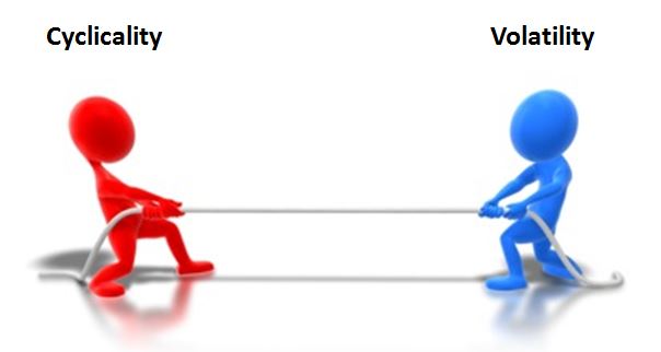
We can understand the strategy’s performance as a tug of war between cyclicality and volatility. Cyclicality creates large sustained downturns that the strategy can profitably capture. Volatility, in contrast, creates whipsaws that the strategy suffers from being involved with. When cyclicality proves to be the greater presence, the strategy outperforms. When volatility proves to be the greater presence, the strategy underperforms.
Now, to the reason why indexing improves the performance of the strategy. The reason is this. Indexing filters out the volatility contained in individual securities, while preserving their cyclicality.
When an index is built out of a constituent set of securities, the price movements that are unique to the individual consistituents tend to get averaged down. One security may be fluctuating one way, but if the others are fluctuating another way, or are not fluctuating at all, the fluctuations in the original security will get diluted away in the averaging. The price movements that are common to all of the constituents, in contrast, will not get diluted away, but will instead get pulled through into the overall index average, where they will show up in full intensity.
In risk assets, the cyclicality associated with the business cycle tends to show up in all stocks and risky securities. All stocks and risky securities fall during recessions and rise during recoveries. That cyclicality, then, tends to show up in the index. Crucially, however, the short-term volatility that occurs in the individual securities that make up the index–the short-term movements associated with names like Disney, Caterpillar, Wells Fargo, Exxon Mobil, and so on, where each movement is driven by a different, unrelated story–does not tend to show up in the index.
The 100 individual S&P 500 securities that we tested in the prior piece exhibit substantial volatility–collectively averaging around 30% for the 1963 to 2015 period. Their cyclicality–their tendency to rise and fall every several years in accordance with the ups and downs of the business cycle–is not enough to overcome this volatility, and therefore the strategy tends to trade unprofitably. But when the movements of all of the securities are averaged together into an index–the S&P 500–the divergent movements of the individual securities dilute away, reducing the volatility of the index by half, to a value of 15%. The cyclicality contained in each individual constituent, however, is fully retained in the index. The preserved cyclicality comes to dominate the diminished volatility, allowing the strategy to trade profitably.
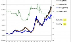
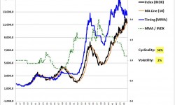
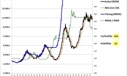
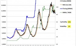
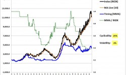
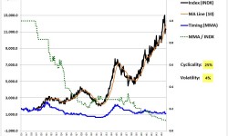
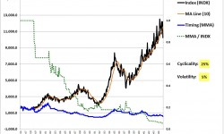
We illustrate this process below. The six different securities in the following six charts (click for a slideshow) combine a common cyclicality (long-term oscillations on a 7 year cycle) with large amounts of random, independent volatility. In each security, the volatility is set to a very high value, where it consistently dominates over the cyclicality, causing the strategy to underperform:
When we take the different securities and build a combined index out of them, the volatility unique to each individual security drop outs, but the cyclicality that the securities have in common–their tendency to rise and fall every 7 years in accordance with our simplified sinusoidal model of the business cycle–remains. The strategy is therefore able to outperform in the combined index.
The following chart shows that outperformance. The black line is an equal-weighted index built out of the six different high-volatility securities shown above:
As you can see, the volatility in the resultant index ends up being minimal. The 7 year sinusoidal cyclicality, however, is preserved in fullness. The strategy therefore performs fantastically in the index, even as it performs terribly in the individual constituents out of which the index has been built. QED.
To summarize:
- The moving average strategy’s performance is driven by the balance between cyclicality and volatility. When cyclicality is the greater presence, the strategy captures large, profitable downturns and outperforms. When volatility is the greater presence, the strategy gets caught in recurrent whipsaws and underperforms.
- The strategy underperforms in individual securities because the volatility in those securities is too high relative to the cyclicality. The securities “chop” around too much, creating too many whipsaws. When they do experience the kinds of sustained downturns that the strategy might profit from, the downturns end up not being deep enough to offset the plentitude of whipsaws.
- When different individual securities are combined into an index, the movements that the securities have in common carry through to the index. The movements that they do not have in common get averaged down and diluted away in the index.
- There’s a cyclicality common to all risky securities–the cyclicality of the business cycle, which tends to inflate and depress valuations of the entire market in unison. When an aggregate index is built out of individual securities, that cyclicality carries through into the final index result. But, crucially, the random price deviations that constitute short-term volatility, deviations that the securities do not have in common with each other, do not carry through. Rather, they get averaged down and diluted away in the index.
- As a result, the balance between cyclicality and volatility in the index, in contrast to the individual securities, proves to be favorable to the strategy, allowing it to outperform.
An Improved Trend-Following Strategy: Growth-Trend Timing
In what follows, I’m going to introduce the modification to the strategy that most readers are probably here to see: Growth-Trend Timing (GTT). As a warning, GTT is hardly an investment panacea. Like any other strategy, it carries a set of risks and vulnerabilities. That said, it’s total risk-reward proposition, in my view, is signficantly more attractive than the the risk-reward propositions of the other systematic long-horizon strategies that have been proposed.
What I find particularly compelling about the strategy is that it makes sense. It tries to systematically do what any good human trend-following trader has to do to time the market well–distinguish between those downward price breaks that are real, that are going to be met with sustained follow-throughs to lower prices, and those downward price breaks that are fake-outs, that are only going to produce whipsaw losses. Granted, there may be more efficient ways for us to make that distinction than to use GTT–maybe the best way is for us to use our market intuitions directly, in real-time, abandoning systematic approaches altogether. But GTT, in my opinion, represents a great place for an investor to start.
Recall the equation for the moving average strategy’s total return performance, an equation that also describes the total return performance of the momentum strategy. Looking at that equation, it’s clear that for the strategy to outperform on total return, the cumulative gains from captured downturns have to exceed the cumulative losses from whipsaws:
(8) Strategy(t) = Index(t) + Cumulative Gains from Captured Downturns(t) – Cumulative Losses from Whipsaws(t)
We said in the previous piece that we wanted market timing strategies to have a sound analytic basis. So, let’s ask: What is the sound analytic basis for believing that if we time the market each month using the 10 month moving average, as Mebane Faber recommends, or using a monthly 12 month momentum signal, as others have recommended, that our gains from captured downturns will exceed, or at least minimally keep up with, our losses from whipsaws? Is there any a priori basis at all for that bellief?
Simply pointing to the empirical result itself is not enough, for without an explanation for the result, an ability to understand why it is achieved, we have no way to estimate the probability that it will persist into future data. We have to just cross our fingers and hope the patterns of the past persist into the future. But that might not happen, especially if the pattern has been extracted from a very small sample size (which, in this case, it has been).
The most common explanation given for why the strategy outperforms involves an appeal to behavior. Here’s my preferred way of framing that explanation. For maximal clarity, consider a simplified flow-based model of security pricing:
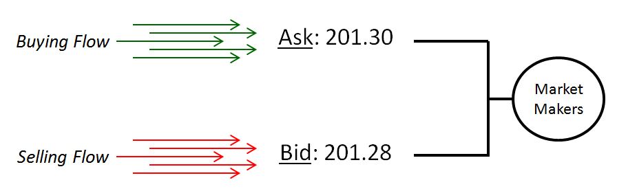
The model delineates two categories of market participants: market takers and market makers. The market takers want to change the asset compositions of their portfolios, so they place market orders to buy and sell securities. The market makers do not want to change the asset composition of their portfolios, but instead simply want to collect the spread between the prices that the market takers buy and sell at, remaining positionally neutral themselves. So the market makers lay out simultaneous bids and asks at price midpoints that they think will lead to matching buying and selling order flows. They continually change these price midpoints in order to ensure that the incoming order flows match. They are financially incented to execute this task correctly, for if they execute it incorrectly–if they put their price midpoints in the wrong places–then they will buy more than they sell, or sell more than they buy, building up inventory or debt that they themselves will have to liquidate at a loss.
Ultimately, that’s where “price” in the modern market comes from. Market makers, usually computers, try to find the general price midpoints that will lead to matching market taker order flow. They lay out bids and asks at those midpoints, and collect the spread between them as that flow comes in. Price changes, then, are the result of order flow imbalances. If order flow proves to be imbalanced at some price, market makers will have to change the price–the midpoints of the bids and asks that they are laying out–to get the flows to balance again. If they don’t do that, they will build up inventory or debt that they will have to liquidate into the market later, losing money themselves.
Now, suppose that there’s a negative fundamental trend taking place somewhere in the market. Maybe a “recession” is beginning–an economic downturn that will generate falling revenues and earnings, tightening credit conditions, rising strains in the financial system, deteriorating social mood and investor sentiment, and ultimately, lower prices and valuations. Surely, if investors become aware of that development, they will sell in advance of it.
But, crucially, they are not going to all become aware of it at the same time. At first, only a small number of investors will see it. So they will stop buying and start selling. Their actions will redirect a portion of the previously existing buying flow–say, 0.1% of it–into selling flow. A flow imbalance–consisting of too much selling flow, not enough buying flow–will then result. In response to the imbalance, the market makers will lower the price. In response, other people who aren’t yet aware of what’s coming, and who are psychologically anchored to higher prices, will see “value” in the lower prices, and will increase their buying and reduce their selling, restoring the balance. This stabilizing feedback response will attenuate the drop and keep prices from falling too quickly or too far. Instead of plunging, prices will simply “act heavy.”
 As the deteriorating fundamental picture increasingly reveals itself, caution will increase, and more order flow will shift from buying to selling. In response to the shift, market makers will reduce the price further. But there will still be those that don’t see or appreciate what’s happening. They will step in and buy the perceived bargains that are on their hands.
Of course, that can only go on for so long. As the price continues to behave poorly, more and more previously constructive investors will become conditioned–in the Skinnerian sense–into a worried, risk-averse mindset. More and more buyers will feel compelled to tap out and sell. To keep the order flow balanced, market makers will have to continue to reduce their price midpoints. Eventually, a positive feedback loop of fear will take hold, and the market’s fragile equilibrium will snap. The market will take a strong plunge lower, to a level that offers genuine bargains that fit with the deteriorating fundamental outlook.
Crucially, before the eventual plunge takes place, three factors will prevent the system from unraveling: (1) uncertainty, kept in place by the limited in-trickle of information, (2) the reward conditioning of the market gains that investors will have experienced in the cycle up to that point, which will encourage an initially constructive mentality towards the downward price trend (“it’s a buying opportunity!”), and (3) the stabilizing feedback response of anchoring, which causes people to see “opportunity” rather than “danger” in lower prices, and to therefore provide buying support to markets that would otherwise fall more quickly.
Before the plunge occurs, then, a slower, more gentle, more benign negative price trend will take hold. The market’s momentum, captured in its trailing annual return, will go negative. Prices will fall below key long-term moving averages. Internals will deteriorate. Crucially, market timing strategies that pivot off of these signals will then successfully get out, avoiding the bulk of the coming downturn.
On the eventual recovery, the process will happen in reverse. Crucially, the full upturn will not take place instantaneously. Rather, it will show early clues and signs. The market’s momentum will go positive. Prices will rise above key long-term moving averages. Internals will improve. Market timing strategies that pivot off of these signals will then get back in, usually at meaningfully lower prices than they got out at. The result will be outperformance over the index.
As we saw earlier, the only condition that needs to be met for the strategies to successfully get out and get back in at lower prices is that their periods–i.e., the lengths of their momentum horizons and moving averages–be substantially shorter than the period of the oscillation being timed. If the oscillation being timed is the business cycle, then the period simply has to be less than a few years, which is how long it takes for expansions to morph into recessions and back into expansions. A 12 month momentum period, and a 10 month moving average period, obviously qualify–they are significantly less than the typical average 7 year (84 month) business cycle length.
It would seem, then, that we’ve identified the reason why the momentum and moving average strategies outperform. The recommended periods–12 months for the momentum strategy, and 10 months from the moving average strategy–have been set to values that are short enough to allow the strategies to successfully capture the downturns associated with the business cycle, given the amount of time that it takes for those downturns to occur and reverse into recoveries, an amount of time on the order of years rather than months.
But wait. We haven’t said anything about whipsaws. Per the equation, it’s not enough for the strategy to simply extract gains from downturns. The gains have to exceed the losses that will inevitably incurred in whipsaws. What reason do we have to believe that the profits that the strategy will capture from downturns using a 12 month momentum period, or a 10 month moving average period, will consistently exceed the cumulative effect of the many whipsaws that will be suffered on those short periods? That is where the explanation is lacking.
Every market participant knows what the business cycle is, and is aware of the types of large downward price movements that it can produce. Every active market participant is eager to “time” it, where possible. That may not have been the case in the year 1918, but it’s definitely the case in the year 2016. Market participants in the year 2016 are extremely sensitive to the market’s history and well-defined cyclical tendencies. That sensitivity, if it leads to volatile short-term trading around the feared prospect of turns in the cycle, has the potential to create substantial whipsaw losses for the strategy.
Frequently, market participants will sense impending downturns and sell, pushing price into a negative trend, when there’s no fundamental process to carry the downturn through. The negative price trend will then reverse itself, inflicting gap losses on the strategy. That’s exactly what has happened in the four documented whipsaws that the moving average strategy has suffered in U.S. equities since the 2009 low:
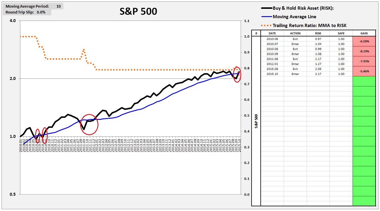
In the late summer of 2010, as investors collectively became scared of a “double-dip” scenario, the price trend went negative. But the move petered out and reversed itself, because it wasn’t supported by the fundamental picture, which turned out to be much more optimistic. The same thing happened again in the fall of 2011, when additional fears related to the potential impact and calamity of a dissolution and financial meltdown in the Eurozone took hold. Those fears turned out to be unfounded, and the market quickly recovered its losses, inflicting whipsaws on whoever tried to exit. The final whipsaw, of course, occurred just a few months ago, in the August market scare. In total, the four whipsaws have imposed a cumulative 25% loss on the strategy relative to buy and hold–a very big hit. Will profitable trades in the coming downturn–whenever it comes–make up for that loss? We don’t know.
As I write this piece, the market’s price trend is well below key momentum and moving average boundaries. But it wasn’t below those boundaries at the end of last month, so the strategy hasn’t yet exited. If things stay where they are, the strategy will sell at the end of the current month at very low prices relative to where the moving average crossover actually happened, taking on a large gap loss. The likelihood of another whipsaw for the strategy is therefore high, particularly if current fears about the energy sector and China move to the backburner.
What remains lacking, then, is a clear analytic explanation for why, on a going-forward basis, we should expect captured downturns to exceed whipsaws in the strategy. In the last several years, the strategy was lucky to get a big downturn that it was able to exploit–the 2008 Great Recession. Before that, it was gifted with big drops associated with the recessions of 1974, 1970, 1937, and 1929. Beyond those drops–which collectively amount to a sample size of only 5–every other transaction has either been a negligible gain, or a whipsaw loss, of which there have been a huge number (see the red boxes below):
My own gut sense is that the kind of deep, profitable downturns that we saw in 2008, 1974, 1937 and 1929 will not happen again for a long time–on the order of decades. The consequence of secular stagnation–the reality of which has become an almost indisputable economic fact–is that you get weaker expansions, and also weaker downturns–weaker cyclicality in general, which is exactly what we’ve seen in the current cycle. To a trend-following strategy, that’s the equivalent of poison. It attenuates the sources of gains–large downturns that get captured for profit–without attenuating the sources of losses: choppy volatility that produces whipsaws.
We therefore need to find a way to improve the strategy. The best place to start is to examine the above table and take note of the clear fact that the strategy outperforms by successfully timing the business cycle–recessions. That’s it’s primary strategy–recession-timing. When the strategy switches inside of recessions, it tends to be profitable. When it switches outside of recessions, it tends to be unprofitable.
The following two charts make the point more clear. The first chart shows the strategy’s cumulative performance relative to buy and hold inside recession, the second, outside recession:
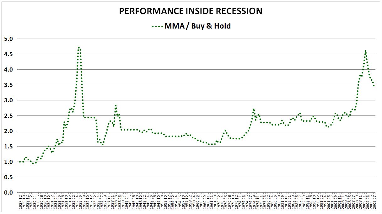
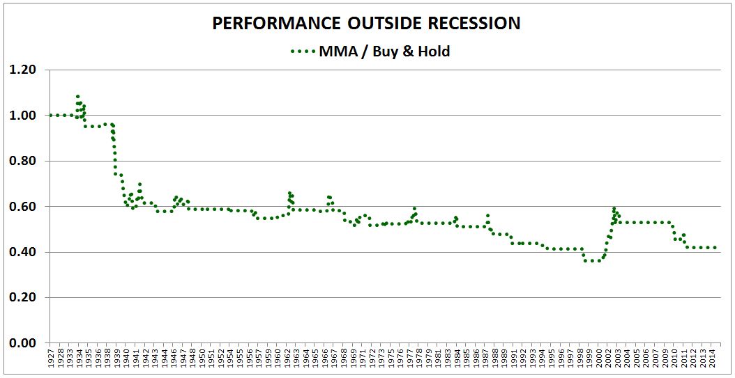
Inside recession, the strategy produces a cumulative return equal to 3.5 times the return of buy and hold. Outside recession, the strategy produces a cumulative return equal to 0.4 times the return of buy and hold. That’s a cumulative performance difference of almost 10X.
A natural way to improve the strategy, then, is to try to teach it to differentiate between situations where the fundamental backdrop makes recession likely, and situations where the fundamental backdrop makes recession unlikely. If recession is likely, then the negative price trend is likely to be met with sustained follow through, resulting in profitable captured downturns. But if recession is unlikely, as it was in the summer of 2010, the fall of 2011, the fall of 2015, and possibly now, then the negative price trend is likely to peter out and reverse itself, inflicting whipsaw losses on the strategy. If the strategy can distinguish between the two, then it can turn itself off in the latter case, where recession is unlikely, so that it avoids the whipsaw losses.
That’s exactly what Growth-Trend Timing does. It takes various combinations of high quality monthly coincident recession signals, and directs the moving average strategy to turn itself off during periods when those signals are unanimously disconfirming recession, i.e., periods where they are all confirming a positive fundamental economic backdrop.
The available monthly signals are:
- Real Retail Sales Growth (yoy)
- Industrial Production Growth (yoy)
- Real S&P 500 EPS Growth (yoy), modeled on a total return basis.
- Employment Growth (yoy)
- Real Personal Income Growth (yoy)
- Housing Start Growth (yoy)
The precise timing criterion for GTT is as follows. Take a reliable monthly growth signal, or better, a collection of reliable monthly growth signals that overlap well to describe the total state of the economy:
- If, at the close of the month, the growth signals for the prior month are unanimously positive, then go long or stay long for the next month, and ignore the next step.
- If, at the close of the month, the growth signals for the prior month are not unanimously positive, then if price is above the 10 month moving average, then go long or stay long for the next month. If price is below the 10 month moving average, sell or stay out for the next month.
Importantly, in backtesting, the growth signals need to coincide with the actual time in which the data used to produce them becomes available. When monthly economic numbers are published, they’re usually published for the prior month. So, in any backtest, the strategy needs to trade off of the previous month’s economic numbers, not the current month’s numbers, which are unavailable.
Empirically, for the U.S. economy, the strongest historical recession indicator is Real Retail Sales Growth. Since the Census Bureau began to collect and publish it as a series in the late 1940s, it has expeditiously nailed every recession that has occurred, giving only a few false positives. Notice how the blue line consistently crosses below zero at the left sides of the gray columns, the beginnings of the recessions. (Link: FRED)
Real Retail Sales Growth is a truly fantastic indictor, a direct line into the health of the U.S. consumer, the engine of the U.S. economy. We’re therefore going to use it as a fundamental, preferred signal for GTT.
The following chart shows GTT’s performance on the monthly S&P 500 using real retail sales growth as a single growth signal from January 1947 to November 2015:
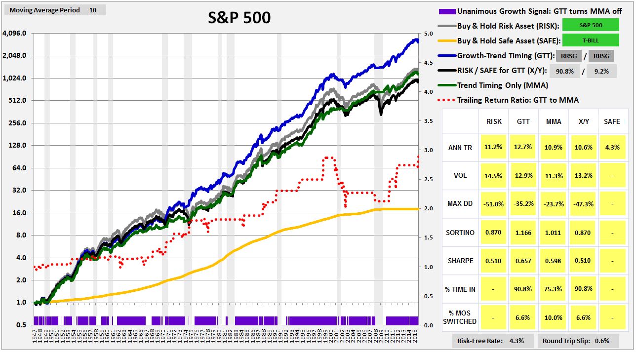
The purple bars at the bottom show periods where real retail sales growth is declaring “no recession.” In those periods, the strategy turns itself off. It stops timing altogether, and simply stays long, to avoid unnecessary whipsaws. In the places where there are no purple bars, real retail sales growth is negative, suggesting that recession is likely. The strategy therefore puts its timing protection back on, switching into and out of the market based on the usual moving average criterion. Notice that the purple bars overlap quite well with the grey columns, the recessions. The close overlap confirms the power of real retail sales growth as a coincident recession indicator.
As you can see in the chart, GTT (blue line) outperforms everything: buy and hold (gray line), the X/Y portfolio (black line), and the 10 month moving average strategy (abbreviated “MMA”, and shown in the green line). The dotted red line shows the cumulative outperformance of GTT over MMA. As expected, GTT continually ratchets higher over the period. The driver of its consistent uptrend is its avoidance of the useless whipsaws that MMA repeatedly entangles itself in.
Another accurate recession indicator is Industrial Production Growth. It’s available to a period much farther back in time–specifically, the year 1919. With the exception of a single costly omission in the 1974 recession, it’s done a very good job of accurately calling out recessions as they’ve happened. (Link: FRED)
The following chart shows GTT’s performance on the monthly S&P 500 using industrial production growth as a single growth signal from February 1928 to November 2015:
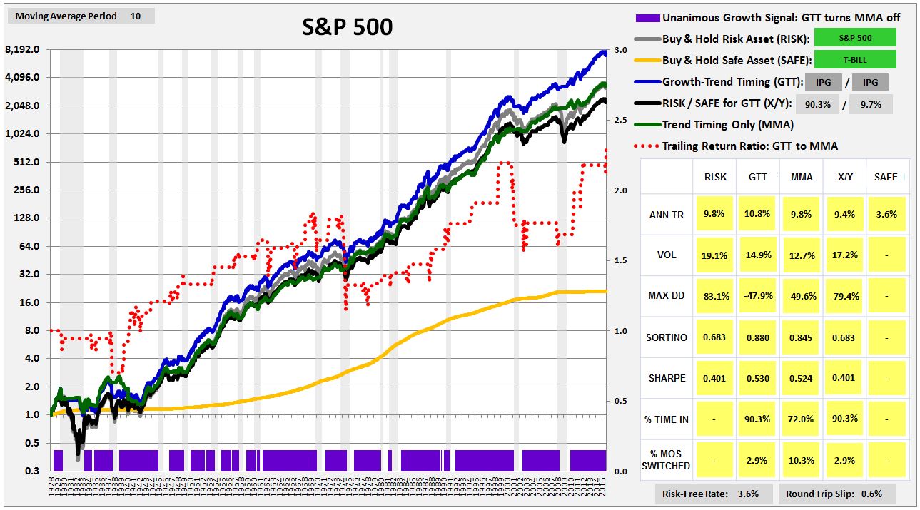
Again, GTT strongly outperforms both buy and hold and MMA. However, the outperformance isn’t as strong as it was when real retail sales growth was used, primarily because the industrial production signal misses the 1974 recession, and also because the strategy is late to exit in the 1937 recession.
Real retail sales growth and industrial production growth represent two diverse, independently reliable indicators of the health of the two fundamental segments of the overall economy: consumption and production. The best result comes when they are put together, in combination. The problem, of course, is that retail sales data isn’t available prior to 1947, so we can’t test the two signals together back to the beginning of each of their time series. Fortunately, there’s a fix to that problem. To get data on real retail sales before 1947, we can use real department store sales and real shoe sales as a proxy. Both were published by the government on a monthly basis back to the late 1910s. (Link: FRED)
Using that proxy, and combining the two signals together, we observe the following performance for GTT back to the inception of the data. Note that a recessionary indication from either metric turns the strategy’s timing function on. Otherwise, the timing function is off, and the strategy stays long:

The above construction of GTT–using the dual signals of real retail sales growth and industrial production growth–is the preferred “recession-timing” construction shown in the beginning of the piece. As you can see, the strategy on that construction consistently outperforms everything, by a very large margin. It’s only weakness is its failure to expeditiously exit prior to the 1937 recession, a recession that was almost impossible to predict using data.
The following table shows GTT’s entries and exits:

Relative to MMA, the win rate improves from roughly 24% to roughly 39%. That improvement drives the bulk of the improvement in the strategy’s overall performance. As intended, the strategy successfully captures all of the downturns that MMA captures, but without all of the whipsaws.
The following chart shows the timing power of the retail sales and industrial production growth signals taken individually, outside of a larger trend-following framework. Real retail sales growth timing is shown in red, and industrial production growth timing is shown in yellow. When growth is positive, the strategies go long, when negative, they go to cash:

Evidently, the individual timing performance of the growth signals is quite weak. The main reason for the weakness is that the signals are overly sensitive to recession risk, particularly on the back end. They stay negative after the recession is over, and are therefore late to re-enter the market on upturns, at a significant cost to performance. Their lateness doesn’t hurt the result for GTT, however, because they are being used as mere overlays for a more price-cognizant trend-following approach. GTT respects price and re-enters the market whenever the trend goes positive, no matter what the growth signals happen to be saying.
An additional reason for the weak timing performance of the growth signals taken in isolation is that they have noise in them–they sometimes go falsely negative outside of recession. When the signals are used to time the market in isolation, outside of a trend-following approach, the noise leads to whipsaws. In GTT, however, the noise is modulated by the trend-following criterion–a growth signal might go negative, but nothing will happen unless the market also happens to be in a downtrend. What are the odds that a negative growth signal and a price downtrend will both occur by coincidence, when everything else in the economy is just fine? Very low, which is the reason that GTT is able to so efficient in its timing.
A third coincident recession indicator is corporate earnings growth. The best way to model that indicator is to use real S&P 500 Total Return EPS, which corrects for both inflation and for changes in dividend payout ratios. The following chart shows GTT’s performance on the single indicator of Total Return EPS growth from February 1928 to November 2015:

The strategy again outperforms everything, but not by as large of a margin. It underperforms other iterations of the strategy in that it misses both the 1937 recession and the 1974 recession.
Another recession indicator worth examining is employment growth. Economists normally categorize employment growth as a lagging indicator, but lagging indicators can work reasonably well for GTT. To improve the recessionary accuracy of the indicator, we adjust it for the size of the labor force. (Link: FRED)

The following chart shows GTT’s performance using employment growth as a single growth indicator from February of 1949 to November of 2015:

Once again, the strategy outperforms everything. The red line, which shows GTTs cumulative outperformance over MMA, consistently marches upward over the period.
The final two coincident recession indicators worth looking at are housing start growth and real personal income growth. Housing start growth is a leading indicator, and is somewhat erratic, so we combine it with the more mellow metric of real personal income growth. We also adjust it for the size of the labor force. The recessionary breakpoints are 3% for real personal income growth, and -10% for housing start growth. (Link: FRED)

The following chart shows GTT’s performance using the two metrics in a combined growth signal from January 1960 to November 2015. If either is negative, the strategy turns its timing function on. Otherwise, it stays invested:

Once again, the strategy outperforms everything.
Now, the reason that many investors prefer to use a monthly checking period when executing trend-following strategies is that daily checking periods produce too many unnecessary trades and therefore too many gap and bid-ask spread losses. But Growth-Trend Timing dramatically reduces the number of unnecessary trades, filtering them out with the growth signal. It can therefore afford to check prices and transact on a daily basis.
The following charts shows GTT’s performance from February 1st, 1928 to July 31st, 2015 using a 200 day moving average timing criterion alongside our preferred GTT signal combination of real retail sales growth and industrial production growth:


Once again, the strategy does very well, consistently outperforming everything. The strategy’s outperformance over the simple 200 day moving average strategy is 120 bps per year–not as large as in the monthly version, but only because the moving average strategy performs more poorly in the monthly version. My suspicion, which I cannot prove, is that the simple 200 day moving average strategy is somehow benefiting from residuals associated with the daily momentum phenomenon evaluated in a prior piece. That phenomenon began to disappear from the market in the 1970s, which, not coincidentally, is when the 200 day moving average strategy began to consistently underperform.
What’s especially important, in all of these charts, is the way in which the strategy has shown recent strength. MMA and other momentum-focused strategies have tended to deteriorate in efficacy over time, especially on a daily horizon. GTT, in contrast, has not weakened it all–it’s only gotten stronger. That’s crucial, since a strategy that works in recent data is more likely to be pivoting off of causalities in the system that are still there to be exploited.
In looking at these charts, the reader may get the impression that it’s easy to improve a trend-following strategy by adding appendages after the fact. But it’s not so easy. To illustrate, here’s an appendage that we might expect to work, but that clearly doesn’t work: Shiller CAPE valuation. The following chart shows the performance of Value-Trend Timing (VTT) using the Shiller CAPE from January of 1947 to July of 2015. Growth-Trend Timing using retail sales and industrial production is shown for comparison:

VTT functions in the exact same manner as GTT, except that instead of using a growth signal, it uses a valuation signal. If, at a given point in time, the market’s valuation as measured by the Shiller CAPE is “cheap“, i.e., cheaper than the historical average valuation up to that point, VTT locks in the bargain and goes long. If the market’s valuation is expensive, i.e., more expensive than the historical average valuation up to that point, then VTT times the market using the 10 month moving average strategy.
As you can see, VTT adds literally nothing to the performance of MMA. That’s because the market’s valuation relative to its historical average does not represent a reliable timing signal. The economy’s likelihood of being in recession, in contrast, does represent such a signal. If you want to successfully time the market, what you need to be is a strong macroeconomist, not a valuation expert.
Readers probably want to know what GTT is saying about the market right now. The answer is predictably mixed. Real retail sales growth, employment growth, real personal income growth, and housing start growth are all healthily positive, reflecting strength in the domestic U.S. household sector. If you choose to build GTT on those signals, then you will be long right now, even though the market’s current price trend is negative. Of course, weakness in the energy sector, China, and the global economy more generally win out in the current tug of war with domestic U.S. strength, then the strategy, in failing to sell here, or in failing to have sold at higher levels, is going to take deeper losses.
At the same time, real Total Return EPS growth, industrial production growth, and production proxies that might be used in place of industrial production growth (e.g., ISM readings), are flashing warning signals, consistent with known stresses in the energy sector and in the global economy more generally (especially emerging markets), which those signals are more closely tied to. If you choose to build GTT using those signals individually or in combination with others, as I chose to do at the beginning of the piece, then given the market’s current negative trend, you will be in treasury bills right now–especially if you are using the daily version of the strategy, which is advisable, since the daily version shrinks the strategy’s gap losses at essentially no cost. Bear in mind that if strength in the domestic economy wins out in the current tug of war, then the strategy on this construction is likely to get whipsawed.
As with any market timing strategy, GTT carries risks. There’s a sense in which it’s been data-mined–shaped to conform to the observed historical patterns that have made recession timing profitable. Of course, the construction of any timing strategy will involve an element of data-mining, if the strategy is going to get the calls right. The designer will have to look back at the past and see how the system worked, modeling the strategy to exploit the recurrent patterns that it produced. But still, those patterns may have been coincidental, and therefore the success of the approach may not persist reliably into the future.
Equally importantly, in the past, investors were not as attuned to the predictive power of the economic readings that the strategy uses. The market’s increased general awareness of the predictive power of those readings may hinder the performance of the strategy going forward. To give an example of how the hindrance might happen, volatility could increase around the public release of the readings, as everyone focuses on them. The volatility would then inflict whipsaw losses on the strategy as it tries to trade on the readings.
What GTT has in its favor, in contrast to other popular trend-following approaches, is that it is highly efficient in its trading and extremely long-biased in its market disposition (spending roughly 87% of the time invested). Even if, by chance, the future turns out to be substantially different from the past, such that the strategy gets certain timing calls wrong, investors in the strategy are unlikely to spend large amounts of time camped outside of the market. That’s the biggest risk associated with market timing–that the investor will never find a way to get back in, and will therefore miss out on a lifetime’s worth of market earnings. By timing the market on a set of signals that flash negative warnings only very rarely, GTT mitigates that risk.
Most importantly, GTT makes sense analytically. It systematically does what any human trend-following market timer would have to do in order to be successful–distinguish between negative price trends that will give way to large downturns that support profitable exits and reentries, and negative price trends that will prove to be nothing more than short-term noise, head-fakes that quickly reverse, inflicting whipsaw losses on whoever tries to trade them. My reason for introducing the strategy is not so much to tout its efficacy, but to articulate that task as the primary task of trend-following, a task that every trend-follower should be laser-focused on, in the context of the current negative trend, and all future ones.