
Bill Griffeth interviews Paul Tudor Jones, Black Monday, October 19th, 1987.
“My metric for everything I look at is the 200-day moving average of closing prices. I’ve seen too many things go to zero, stocks and commodities. The whole trick in investing is: ‘How do I keep from losing everything?’ If you use the 200-day moving average rule, then you get out. You play defense, and you get out.” — Paul Tudor Jones, as interviewed by Tony Robbins in Money: Master the Game.
Everyone agrees that it’s appropriate to divide the space of a portfolio between different asset classes–to put, for example, 60% of a portfolio’s space into equities, and 40% of its space into fixed income. “Market Timing” does the same thing, except with time. It divides the time of a portfolio between different asset classes, in an effort to take advantage of the times in which those asset classes tend to produce the highest returns.
What’s so controversial about the idea of splitting the time of a portfolio between different asset classes, as we might do with a portfolio’s space? Why do the respected experts on investing almost unanimously discourage it?
- The reason can’t be transaction costs. Those costs have been whittled down to almost nothing over the years.
- The reason can’t be poor timing. For if markets are efficient, as opponents of market timing argue, then it shouldn’t possible for an individual to time the market “poorly.” As a rule, any choice of when to exit the market should be just as good as any other. If a person were able to consistently defy that rule, then reliably beating the market would be as simple as building a strategy to do the exact opposite of what that person does.
In my view, the reason that market timing is so heavily discouraged is two-fold:
(1) Market timing requires big choices, and big choices create big stress, especially when so much is at stake. Large amounts of stress usually lead to poor outcomes, not only in investing, but in everything.
(2) The most vocal practitioners of market timing tend to perform poorly as investors.
Looking at (2) specifically, why do the most vocal practitioners of market timing tend to perform poorly as investors? The answer is not that they are poor market timers per se. Rather, the answer is that they tend to always be underinvested. By nature, they’re usually more risk-averse to begin with, which is what sends them down the path of identifying problems in the market and stepping aside. Once they do step aside, they find it difficult to get back in, especially when the market has gone substantially against them. It’s painful to sell something and then buy it back at a higher price, locking in a loss. It’s even more difficult to admit that the loss was the result of one’s being wrong. And so instead of doing that, the practitioners entrench. They come up with reasons to stay on the course they’re on–a course that ends up producing a highly unattractive investment outcome.
To return to our space-time analogy, if an investor were to allocate 5% of the space of her portfolio to equities, and 95% to cash, her long-term performance would end up being awful. The reason would be clear–she isn’t taking risk, and if you don’t take risk, you don’t make money. But notice that we wouldn’t use her underperformance to discredit the concept of “diversification” itself, the idea that dividing the space of a portfolio between different asset classes might improve the quality of returns. We wouldn’t say that people that allocate 60/40 or 80/20 are doing things wrong. They’re fine. The problem is not in the concept of what they’re doing, but in her specific implementation of it.
Well, the same point extends to market timing. If a vocal practitioner of market timing ends up spending 5% of his time in equities, and 95% in cash, because he got out of the market and never managed to get back in, we shouldn’t use his predictably awful performance to discredit the concept of “market timing” itself, the idea that dividing a portfolio’s time between different asset classes might improve returns. We shouldn’t conclude that investors that run market timing strategies that stay invested most of the time are doing things wrong. The problem is not in the concept of what they’re doing, but in his specific implementation of it.
In my view, the practice of market timing, when done correctly, can add meaningful value to an investment process, especially in an expensive market environment like our own, where the projected future returns to a diversified buy and hold strategy are so low. The question is, what’s the correct way to do market timing? That’s the question that I’m going to try to tackle in the next few pieces.
In the current piece, I’m going to conduct a comprehensive backtest of three popular trend-following market timing strategies: the moving average strategy, the moving average crossover strategy, and the momentum strategy. These are simple, binary market timing strategies that go long or that go to cash at the close of each month based on the market’s position relative to trend. They produce very similar results, so after reviewing their performances in U.S. data, I’m going to settle on the moving average strategy as a representative strategy to backtest out-of-sample.
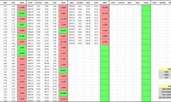
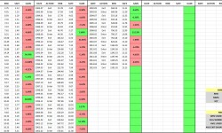
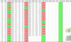
The backtest will cover roughly 235 different equity, fixed income, currency, and commodity indices, and roughly 120 different individual large company stocks (e.g., Apple, Berkshire Hathaway, Exxon Mobil, Procter and Gamble, and so on). For each backtest, I’m going to present the results in a chart and an entry-exit table, of the type shown below (10 Month Moving Average Strategy, Aggregate Stock Market Index of Sweden, January 1920 – July 2015):

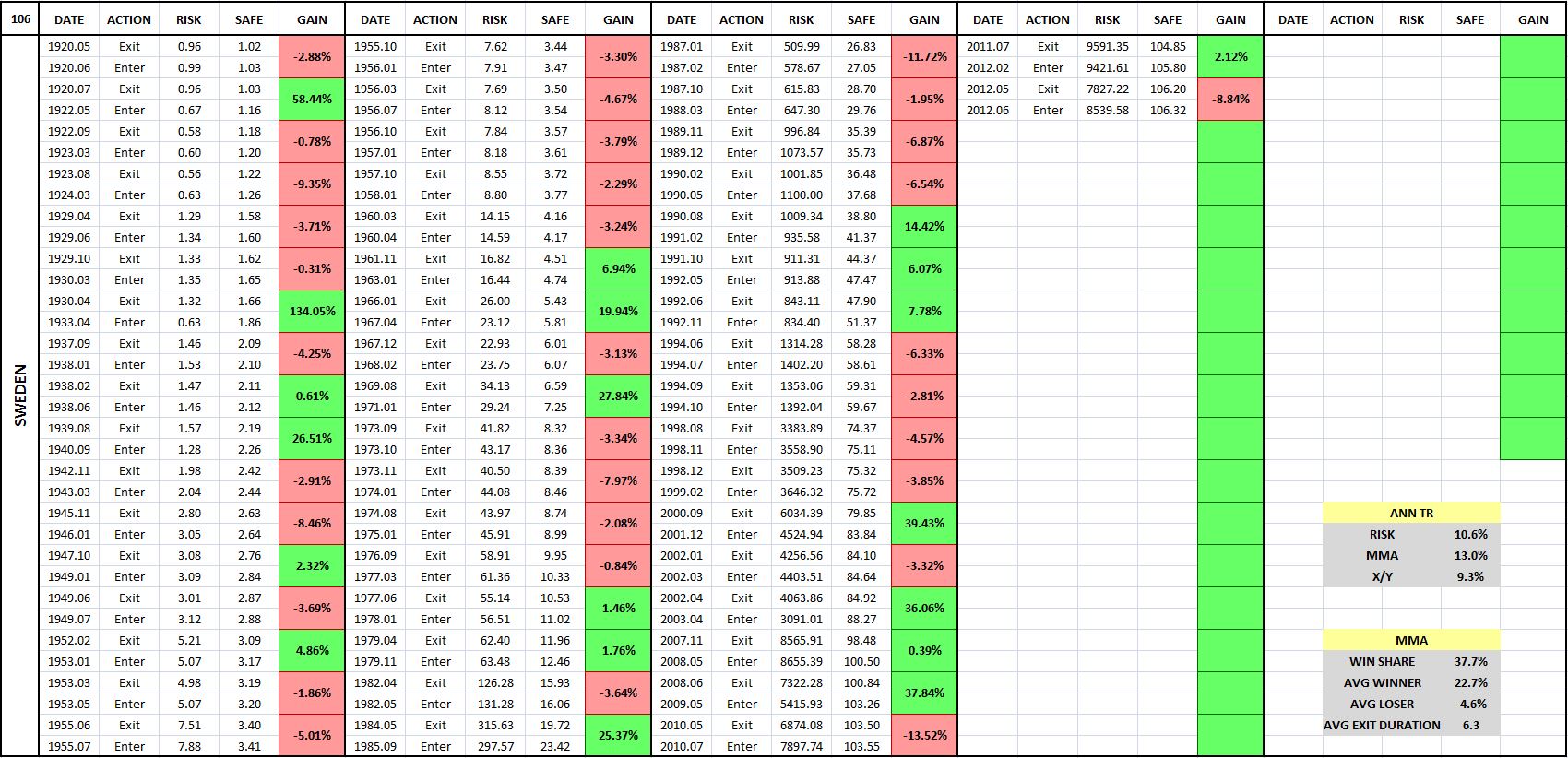
(For a precise definition of each term in the chart and table, click here.)
The purpose of the entry-exit tables is to put a “magnifying glass” on the strategy, to give a close-up view of what’s happening underneath the surface, at the level of each individual trade. In examining investment strategies at that level, we gain a deeper, more complete understanding of how they work. In addition to being gratifying in itself, such an understanding can help us more effectively implement the concepts behind the strategies.
I’ve written code that allows me to generate the charts and tables very quickly, so if readers would like to see how the strategy performs in a specific country or security that wasn’t included in the test, I encourage them to send in the data. All that’s needed is a total return index or a price index with dividend amounts and payment dates.
The backtest will reveal an unexpected result: that the strategy works very well on aggregate indices–e.g., the S&P 500, the FTSE, the Nikkei, etc.–but works very poorly on individual securities. For perspective on the divergence, consider the following chart and table of the strategy’s performance (blue line) in the S&P 500 from February of 1963 to July of 2015:
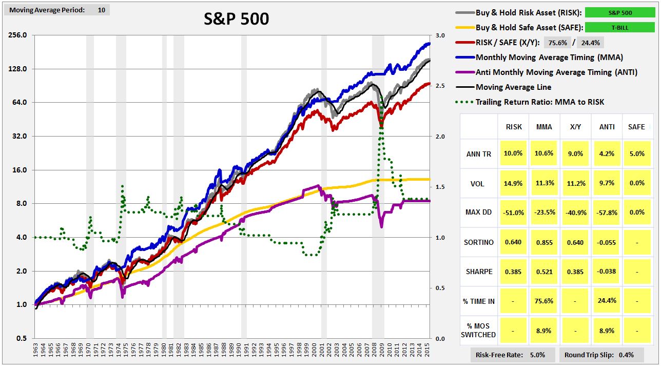
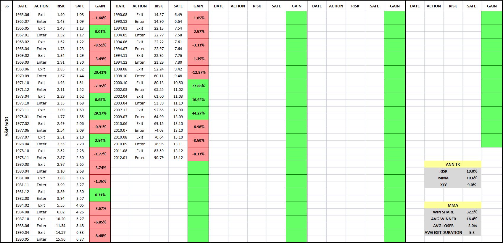
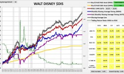
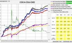
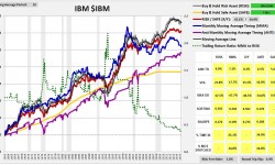
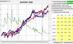
As you can see, the strategy performs very well, exceeding the return of buy and hold by over 60 bps per year, with lower volatility and roughly half the maximum drawdown. Compare that performance with the strategy’s performance in the six largest S&P 500 stocks that have trading histories back to 1963. Ordered by market cap, they are: General Electric $GE, Walt Disney $DIS, Coca-Cola $KO, International Business Machines $IBM, Dupont $DD and Caterpillar $CAT.
(Note: click on any image, and a high-resolution slideshow of all the images will appear)


(For a precise definition of each term in the charts and tables, click here.)
As you can see in the charts, the strategy substantially underperforms buy and hold in every stock except $GE. The pattern is not limited to these 6 cases–it extends out to the vast majority of stocks in the S&P 500. The strategy performs poorly in almost all of them, despite performing very well in the index.
The fact that the strategy performs poorly in individual securities is a significant problem, as it represents a failed out-of-sample test that should not occur if popular explanations for the strategy’s efficacy are correct. The most common explanations found in the academic literature involve appeals to the behavioral phenomena of underreaction and overreaction. Investors allegedly underreact to new information as it’s introduced, and then overreact to it after it’s been in the system for an extended period of time, creating price patterns that trend-following strategies can exploit. But if the phenomena of underreaction and overreaction explain the strategy’s success, then why isn’t the strategy successful in individual securities? Individual securities see plenty of underreaction and overreaction as new information about them is released and as their earnings cycles progress.
There’s a reason why the strategy fails in individual securities, and it’s quite fascinating. In the next piece, I’m going to try to explain it. I’m also going to try to use it to build a substantially improved version of the strategy. For now, my focus will simply be on presenting the results of the backtest, so that readers can come to their own conclusions.
Market Timing: Definitions and Restrictions
We begin with the following definitions:
Risk Asset: An asset that exhibits meaningful price volatility. Examples include: equities, real estate, collectibles, foreign currencies expressed in one’s own currency, and long-term government bonds. Note that I insert this last example intentionally. Long-term government bonds exhibit substantial price volatility, and are therefore risk assets, at least on the current definition.
Safe Asset: An asset that does not exhibit meaningful price volatility. There is only one truly safe asset: “cash” in base currency. For a U.S. investor, that would include: paper dollars and Fed balances (base money), demand and time deposits at FDIC insured banks, and short-term treasury bills.
Market Timing Strategy: An investment strategy that seeks to add to the performance of a Risk Asset by switching between exposure to that asset and exposure to a Safe Asset.
The market timing strategies that we’re going to examine in the current study will be strictly binary. At any given time, they will either be entirely invested in a single risk asset, or entirely invested in a single safe asset, with both specified beforehand. There will be no degrees of exposure–only 100% or 0%.
From a testing perspective, the advantage of a binary strategy is that the ultimate sources of the strategy’s performance–the individual switching events–can be analyzed directly. When a strategy alters its exposure in degrees, such an analysis becomes substantially more difficult–every month in the series becomes a tiny “switch.”
The disadvantage of a binary strategy is that the strategy’s performance will sometimes end up hinging on the outcome of a small number of very impactful switches. In such cases, it will be easier for the strategy to succeed on luck alone–the luck of happening to switch at just the right time, just as the big “crash” event is starting to begin, when the switch itself was not an expression of any kind of reliable skill at avoiding the event.
To be clear, this risk also exists in “degreed” market timing strategies, albeit to a reduced degree. Their outperformance will sometimes result from rapid moves that they make in the early stages of market downturns, when the portfolio moves can just as easily be explained by luck as by genuine skill at avoiding downturns.
In our case, we’re going to manage the risk in two ways: (1) by conducting out of sample testing on a very large, diverse quantity of independent data sets, reducing the odds that consistent outperformance could have been the result of luck, and (2) by conducting tweak tests on the strategy–manipulations of obviously irrelevant details in the strategy, to ensure that the details are not driving the results.
In additiong to being binary, the market timing strategies that we’re going to test will only switch into cash as the safe asset. They will not switch into other proxies for safety, such as long-term government bonds or gold. When a strategy switches from one volatile asset (such as equities) into another volatile asset that is standing in as the safe asset (e.g., long-term government bonds or gold), the dominant source of the strategy’s performance ends up being obscured by the possibility that a favorable or unfavorable timing of either or both assets, or alternatively, a strong independent performance from the stand-in safe asset, could be the source. Both assets, after all, are fluctuating in price.
An example will help illustrate the point. Suppose that we’re examining a market timing strategy that is either all stocks or all cash. If the strategy outperforms, we will know that it is outperforming by favorably timing the price movements of stocks and stocks alone. There’s nothing else for it to favorably time. It cannot favorably time the price movements of cash, for example, because cash is a safe asset whose “price” exhibits no movement. Suppose, alternatively, that we’re examining a strategy that switches from stocks into bonds. If the strategy outperforms, we will not know whether it outperformed by favorably timing stocks, by favorably timing bonds, or by favorably timing both. Similarly, we won’t know how much of its strength was a lucky byproduct of strength in bonds as an asset class. We therefore won’t know how much was a direct consequence of skill in the timing of stocks, which is what we’re trying to measure.
Now, to be clear, adding enhancements to a market timing strategy–degreed exposure, a higher-returning uncorrelated safe asset to switch into (e.g., long-term government bonds), leverage, and so on–can certainly improve performance. But the time to add them is after we’ve successfully tested the core performance a strategy, after we’ve confirmed that the strategy exhibits timing skill. If we add them before we’ve successfully tested the core performance of the strategy, before we’ve verified that the strategy exhibits timing skill, the risk is that we’re going to introduce noise into the test that will undermine the sensitivity and specificity of the result.
Optimizing the Risk-Reward Proposition of Market Timing
 The right way to think about market timing is in terms of risk and reward. Any given market timing strategy will carry a certain risk of bad outcomes, and a certain potential for good outcomes. We can increase the probability of seeing good outcomes, and reduce the probability of seeing bad outcomes, by seeking out strategies that manifest the following five qualities: analytic, generic, efficient, long-biased, and recently-successful.
I will explain each in turn:
Analytic: We want market timing strategies that have a sound analytic basis, whose efficacy can be shown to follow from an analysis of known facts or reasonable assumptions about a system, an analysis that we ourselves understand. These properties are beneficial for the following reasons:
(1) When a strategy with a sound analytic basis succeeds in testing, the success is more likely to have resulted from the capturing of real, recurrent processes in the data, as opposed to the exploitation coincidences that the designer has stumbled upon through trial-and-error. Strategies that succeed by exploiting coincidences will inevitably fail in real world applications, when the coincidences get shuffled around.
(2) When we understand the analytic basis for a strategy’s success, we are better able to assess the risk that the success will fail to carry over into real-world applications. That risk is simply the risk that the facts or assumptions that ground the strategy will turn out to be incorrect or incomplete. Similarly, we are better able to assess the risk that the success will decay or deteriorate over time. That risk is simply the risk that conditions relevant to the facts or assumptions will change in relevant ways over time.
To illustrate, suppose that I’ve discovered a short-term trading strategy that appears to work well in historical data. Suppose further that I’ve studied the issue and am able to show why the strategy works, given certain known specific facts about the behaviors of other investors, with the help of a set of reasonable simplifying assumptions. To determine the risk that the strategy’s success will fail to carry over into real-world applications, I need only look at the facts and assumptions and ask, what is the likelihood that they are in some way wrong, or that my analysis of their implications is somehow mistaken? Similarly, to determine the risk that the success will decay or deteriorate over time, I need only ask, what is the likelihood that conditions relevant to the facts and assumptions might change in relevant ways? How easy would it be for that to happen?
If I don’t understand the analytic basis for a strategy’s efficacy, I can’t do any of that. The best I can do is cross my fingers and hope that the observed past success will show up when I put real money to work in the strategy, and that it will keep showing up going forward. If that hope doesn’t come true, if the strategy disappoints or experiences a cold spell, there won’t be any place that I can look, anywhere that I can check, to see where I might have gone wrong, or what might have changed. My ability to stick with the strategy, and to modify it as needed in response to changes, will be significantly curtailed.
(3) An understanding of the analytic basis for a strategy’s efficacy sets boundaries on a number of other important requirements that we need to impose. We say, for example, that a strategy should succeed in out-of-sample testing. But some out-of-sample tests do not apply, because they do not embody the conditions that the strategy needs in order to work. If we don’t know how the strategy works in the first place, then we have no way to know which tests those are.
To offer an example, the moving average, moving average crossover, and momentum strategies all fail miserably in out-of-sample testing in individual stocks. Should the strategies have performed well in that testing, given our understanding of how they work, how they generate outperformance? If we don’t have an understanding of how they work, how they generate outperformance, then we obviously can’t answer the question.
Now, many would claim that it’s unreasonable to demand a complete analytic understanding of the factors behind a strategy’s efficacy. Fair enough. I’m simply describing what we want, not what we absolutely have to have in order to profitably implement a strategy. If we can’t get what we want, in terms of a solid understanding of why a strategy works, then we have to settle for the next best thing, which is to take the strategy live, ideally with small amounts of money, and let the consequences dictate the rest of the story. If the strategy works, and continues to work, and continues to work, and continues to work, and so on, then we stick with it. When it stops working for a period of time that exceeds our threshold of patience, we abandon it. I acknowledge that this is is a perfectly legitimate empirical approach that many traders and investors have been able to use to good effect. It’s just a difficult and sometimes costly approach to use, particularly in situations where the time horizon is extended and where it takes a long time for the “results” to come in.
The point I’m trying to make, then, is not that the successful implementation of a strategy necessarily requires a strong analytic understanding of the strategy’s mechanism, but that such an understanding is highly valuable, worth the cost of digging to find it. We should not just cross our fingers and hope that past patterning will repeat itself. We should dig to understand.

In the early 1890s, when the brilliant physicist Oliver Heaviside discovered his operator method for solving differential equations, the mathematics establishment dismissed it, since he couldn’t give an analytic proof for its correctness. All he could do was put it to use in practice, and show that it worked, which was not enough. To his critics, he famously retorted:
“I do not refuse my dinner simply because I do not understand the process of digestion.”
His point is relevant here. The fact that we don’t have a complete analytic understanding of a strategy’s efficacy doesn’t mean that the strategy can’t be put to profitable use. But there’s an important difference between Heaviside’s case and the case of someone who discovers a strategy that succeeds in backtesting for unknown reasons. If you make up a brand new differential equation that meets the necessary structure, an equation that Heaviside has never used his method on, that won’t be an obstacle for him–he will be able to use the method to solve it, right in front of your eyes. Make up another one, he’ll solve that one. And so on. Obviously, the same sort of on-demand demonstration is not possible in the context of a market timing strategy that someone has discovered to work in past data. All that the person can do is point to backtesting in that same stale data, or some other set of data that is likely to have high correlations to it. That doesn’t count for very much, and shouldn’t.
Generic: We want market timing strategies that are generic. Generic strategies are less likely to achieve false success by “overfitting” the data–i.e., “shaping” themselves to exploit coincidences in the data that are not going to reliably recur.
An example of a generic strategy would be the instruction contained in a simple time series momentum strategy: to switch into and out of the market based on the market’s trailing one year returns. If the market’s trailing one year returns are positive, go long, if they’re negative, go to cash or go short. Notice that one year is a generic whole number. Positive versus negative is a generic delineation between good and bad. The choice of these generic breakpoints does not suggest after-the-fact overfitting.
An example of the opposite of a generic strategy would be the instruction to be invested in the market if some highly refined condition is met: for example, if trailing one year real GDP growth is above 2.137934%, or if the CAPE is less than 17.39, or if bullish investor sentiment is below 21%. Why were these specific breakpoints chosen, when so many others were possible? Is the answer that the chosen breakpoints, with their high levels of specificity, just-so-happen to substantially strengthen the strategy’s performance in the historical data that the designer is building it in? A yes answer increases the likelihood that the performance will unravel when the strategy is taken into the real-world.
A useful test to determine whether a well-performing strategy is sufficiently generic is the “tweak” test. If we tweak the rules of the strategy in ways that should not appreciably affect its performance, does its performance appreciably suffer? If the answer is yes, then the strength of the performance is more likely to be specious.
Efficient: Switching into and out of the market inflicts gap losses, slip losses, and transaction costs, each of which represent a guaranteed negative hit to performance. However, the positive benefits of switching–the generation of outperformance through the avoidance of drawdowns–are not guaranteed. When a strategy breaks, the positive benefits go away, and the guaranteed negative hits become our downside. They can add up very quickly, which is why we want market timing strategies that switch efficiently, only when the probabilities of success in switching are high.
Long-Biased: Over long investment horizons, risk assets–in particular, equities–have a strong track record of outperforming safe assets. They’ve tended to dramatically overcompensate investors for the risks they’ve imposed, generating total returns that have been significantly higher than would have been necessary to make those risks worth taking. As investors seeking to time the market, we need to respect that track record. We need to seek out strategies that are “long-biased”, i.e., strategies that maximize their exposure to risk assets, with equities at the top of the list, and minimize their exposure to safe assets, with cash at the bottom of the list.
Psychologists tell us that, in life, “rational optimists” tend to be the most successful. We can probably extend the point to market timing strategies. The best strategies are those that are rationally optimistic, that default to constructive, long positions, and that are willing to shift to other positions, but only when the evidence clearly justifies it.
Recently Successful: When all else is equal, we should prefer market timing strategies that test well in recent data and that would have performed well in recent periods of history. Those are the periods whose conditions are the most likely to share commonalities with current conditions, which are the conditions that our timing strategies will have to perform in.
Some would perjoratively characterize our preference for success in recent data as a “This Time is Different” approach–allegedly the four most dangerous words in finance. The best way to come back at this overused cliché is with the words of Josh Brown: “Not only is this time different, every time is different.” With respect to testing, the goal is to minimize the differences. In practice, the way to do that is to favor recent data in the testing. Patterns that are found in recent data are more likely to have arisen out of causes that are still in the system. Such patterns are therefore more likely to arise again.
The Moving Average Strategy
In 2006, Mebane Faber of Cambria Investments published an important white paper in which he introduced a new strategy for implementing the time-honored practice of trend-following. His proposed strategy is captured in the following steps:
(1) For a given risk asset, at the end of each month, check the closing price of the asset.
(2) If the closing price is above the average of the 10 prior monthly closes, then go long the asset and stay long through the next month.
(3) If the price is below the average of the 10 prior monthly closes, then go to cash, or to some preferred proxy for a safe asset, and stay there through the next month.
Notably, this simple strategy, if implemented when Faber proposed it, would have gone on to protect investors from a 50% crash that began a year later. After protecting investors from that crash, the strategy would have placed investors back into long positions in the summer of 2009, just in time to capture the majority of the rebound. It’s hard to think of many human market timers that managed to perform better, playing both sides of the fence in the way that the strategy was able to do. It deserves respect.
To make the strategy cleaner, I would offer the following modification: that the strategy switch based on total return rather than price. When the strategy switches based on total return, it puts all security types on an equal footing: those whose prices naturally move up over time due to the retention of income (e.g., growth equities), and those that do not retain income and whose prices therefore cannot sustainably move upwards (e.g., high-yield bonds).
Replacing price with total return, we arrive at the following strategy:
(1) For a given risk asset, at the end of each month, check the closing level of the asset’s total return index. (Note: you can quickly derive a total return index from a price index by subtracting, from each price in the index, the cumulative dividends that were paid after the date of that price.)
(2) If the closing level of the total return index is above the average of the 10 prior monthly closing levels, then go long the asset and stay long through the next month.
(3) If the closing level of the total return index is below the average of the 10 prior monthly closing levels, then go to cash, or to some preferred proxy for a safe asset, and stay there through the next month.
We will call this strategy MMA, which stands for Monthly Moving Average strategy. The following chart shows the performance of MMA in the S&P 500 from February of 1928 to November of 2015. Note that we impose a 0.6% slip loss on each round-trip transaction, which was the average bid-ask spread for large company stocks in the 1928 – 2015 period:

(For a precise definition of each term in the chart, click here.)
The blue line in the chart is the total return of MMA. The gray line is the total return of a strategy that buys and holds the risk asset, abbreviated RISK. In this case, RISK is the S&P 500. The black line on top of the gray line, which is difficult to see in the current chart, but which will be easier to see in future charts, is the moving average line. The yellow line is the total return of a strategy that buys and holds the safe asset, abbreviated SAFE. In this case, SAFE is the three month treasury bill, rolled over on a monthly basis. The purple line is the opposite of MMA–a strategy that is out when MMA is in, and in when MMA is out. It’s abbreviated ANTI. The gray columns are U.S. recession dates.
The dotted green line shows the timing strategy’s cumulative outperformance over the risk asset, defined as the ratio of the trailing total return of the timing strategy to the trailing total return of a strategy that buys and holds the risk asset. It takes its measurement off of the right y-axis, with 1.0 representing equal performance. When the line is ratcheting up to higher numbers over time, the strategy is performing well. When the line is decaying down to lower numbers over time, the strategy is performing poorly.
We can infer the strategy’s outperformance over any two points in time by examing what happens to the green line. If the green line ends up at a higher place, then the strategy outperformed. If it ends up at a lower place, then the strategy underperformed. As you can see, the strategy dramatically outperformed from the late 1920s to the trough of the Great Depression (the huge spike at the beginning of the chart). It then underperformed from the 1930s all the way through to the late 1960s. From that point to now, it’s roughly equal performed, enjoying large periods of outperformance during market crashes, offset by periods of underperformance during the subsequent rebounds, and a long swath of underperformance during the 1990s.
Now, it’s not entirely fair to be evaluating the timing strategy’s performance against the performance of the risk asset. The timing strategy spends a significant portion of its time invested in the safe asset, which has a lower return, and a lower risk, than the risk asset. We should therefore expect the timing strategy to produce a lower return, with a lower risk, even when the timing strategy is improving the overall performance.
The appropriate way to measure the performance of the timing strategy is through the use of what I call the “X/Y portfolio”, represented by the red line in the chart. The X/Y portfolio is a mixed portfolio with an allocation to the risk asset and the safe asset that matches the timing strategy’s cumulative ex-post exposure to each asset. In the present case, the timing strategy spends roughly 72% of its time in the risk asset, and roughly 28% of its time in the safe asset. The corresponding X/Y portfolio is then a 72/28 risk/safe portfolio, a portfolio continually rebalanced to hold 72% of its assets in the S&P 500, and 28% of its assets in treasury bills.
If a timing strategy were to add exactly zero value through its timing, then its performance–its return and risk–would be expected to match the performance of the corresponding X/Y portfolio. The performances of the two strategies would be expected to match because their cumulative asset exposures would be identical–the only difference would be in the specific timing of the exposures. If a timing strategy can consistently produce a better return than the corresponding X/Y portfolio, with less risk, then it’s necessarily adding value through its timing. It’s taking the same asset exposures and transforming them into “something more.”
When looking at the charts, then, the way to assess the strategy’s skill in timing is to compare the blue line and the red line. If the blue line is substantially above the red line, then the strategy is adding positive value and is demonstrating positive skill. If the blue line equals the red line to within a reasonable statistical error, then the strategy is adding zero value and is demonstrating no skill–the performance equivalent of randomness. If the blue line is substantially below the red line, then the strategy is adding negative value and is demonstrating negative skill.
The following table shows the entry-exit dates associated with the previous chart:

(For a precise definition of each term in the table, click here.)
Each entry-exit pair (a sale followed by a purchase) produces a relative gain or loss on the index. That relative gain or loss is shown in the boxes in the “Gain” column, which are shaded in green for gains and in red for losses. You can quickly look at the table and evaluate the frequency of gains and losses by gauging the frequency of green and the red.
What the table is telling is that the strategy makes the majority of its money by avoiding large, sustained market downturns. To be able to avoid those downturns, it has to accept a large number of small losses associated with switches that prove to be unnecessary. Numerically, more than 75% of all of MMA’s trades turn out to be losing trades. But there’s a significant payout asymmetry to each trade: the average winning trade produces a relative gain of 26.5% on the index, whereas the average losing trade only inflicts a relative loss of -6.0%.
Comparing the Results: Two Additional Strategies
In addition to Faber’s strategy, two additional trend-following strategies worth considering are the moving average crossover strategy and the momentum strategy. The moving average crossover strategy works in the same way as the moving average strategy, except that instead of comparing the current value of the price or total return to a moving average, it compares a short horizon moving average to a long horizon moving average. When the short horizon moving average crosses above the long horizon moving average, a “golden cross” occurs, and the strategy goes long. When the short horizon moving average crosses below the long horizon moving average, a “death cross” occurs, and the strategy exits. The momentum strategy also works in the same way as the moving average strategy, except that instead of comparing the current value of the price or total return to a moving average, it compares the current value to a single prior value–usually the value from 12 months ago.
The following table shows the U.S. equity performance of Faber’s version of the moving average strategy (MMA-P), our proposed total return modification (MMA-TR), the moving crossover strategy (CROSS), and the momentum strategy (MOMO) across a range of possible moving average and momentum periods:
If you closely examine the table, you will see that MMA-TR, MMA-P, and MOMO are essentially identical in their performances. The performance of CROSS diverges negatively in certain places, but the comparison is somewhat artificial, given that there’s no way to put CROSS’s two moving average periods onto the same basis as the single periods of the other strategies.
Despite similar performances in U.S. equities, we favor MMA-TR over MMA-P because MMA-TR is intuitively cleaner, particular in the fixed income space. In that space, MMA-P diverges from the rest of the strategies, for the obvious reason that fixed income securities do not retain earnings and therefore do not show an upward trend in their prices over time. MMA-TR is also easier to backtest than MMA-P–only one index, a total return index, is needed. For MMA-P, we need two indices–a price index that decides the switching, and a total return index that calculates the returns.
We favor MMA-TR over MOMO for a similar reason. It’s intuitively cleaner than MOMO, since it compares the current total return level to an average of prior levels, rather than a single prior level. A strategy that makes comparisons to a single prior level is vulnerable to single-point anomalies in the data, whereas a strategy that makes comparison to an average of prior levels will smooth those anomalies out.
We’re therefore going to select MMA-TR to be the representative trend-following strategy that we backtest out-of-sample. Any conclusions that we reach will extend to all of the strategies–particularly MMA-P and MOMO, since their structures and performances are nearly identical to that of MMA-TR. We’re going to use 10 months as the moving average period, but not because 10 months is special. We’re going to use it because it’s the period that Faber used in his original paper, and because it’s the period that just-so-happens to produce the best results in U.S. equities.
Changing Moving Average Periods: A Tweak Test
Settling on a 10 month moving average period gives us our first opportunity to apply the “tweak” test. With respect to the chosen moving average period, what makes 10 months special? Why not use a different number: say, 6, 7, 8, 9, 11, 15, 20, 200 and so on? The number 10 is ultimately arbitrary, and therefore the success of the strategy should not depend on it.
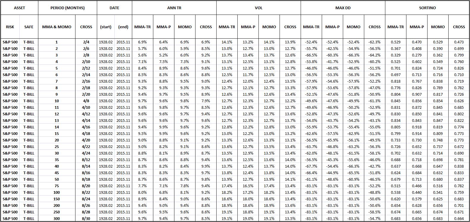
Fortunately, when we apply a reasonable range of numbers other than 10 to the strategy, we obtain similarly positive results, in satisfaction of the “tweak” test. The following table shows the performance of the strategy under moving average periods ranging from 1 month to 300 months, with the performance of 10 months highlighted in yellow:

Evidently, the strategy works well for all moving average periods ranging from around 5 months to around 50 months. When periods below around 5 months are used, the strategy ends up engaging in excessive unnecessary switching. When periods greater than around 50 months are used, the moving average ends up lagging the index by such a large amount that it’s no longer able to switch when it needs to, in response to valid signs of impending downtrends.
The following two charts illustrate the point. In the first chart, a 1 month period is used. The strategy ends up switching in roughly 46% of all months–an egregiously high percentage that indicates significant inefficiency. In the second chart, a 300 month period is used. The strategy ends up completely impotent–it never switches, not even a single time.


(For a precise definition of each term in the chart, click here.)
Evaluating the Strategy: Five Desired Qualities
Earlier, we identified five qualities that we wanted to see in market timing strategies. They were: analytic, generic, efficient, long-biased, and recently-successful. How does MMA far on those qualities? Let’s examine each individually.
Here, again, are the chart and table for the strategy’s performance in U.S. equities:
(For a precise definition of each term in the chart and table, click here.)
Here are the qualities, laid out with grades:
Analytic? Undecided. Advocates of the strategy have offered behavioral explanations for its efficacy, but those explanations leave out the details, and will be cast into doubt by the results of the testing that we’re about to do. Note that in the next piece, we’re going to give an extremely rigorous account of the strategy’s functionality, an account that will hopefully make all aspect of its observed performance–its successes and its failures–clear.
Generic? Check. We can vary the moving average period anywhere from 5 to 50 months, and the strategy retains its outperformance over buy and hold. Coincidences associated with the number 10 are not being used as a lucky crutch.
Efficient? Undecided. The strategy switches in 10% of all months. On some interpretations, that might be too much. The strategy has a switching win rate of around 25%, indicating that the majority of the switches–75%–are unnecessary and harmful to returns. But, as the table confirms, the winners tend to be much bigger than the losers, by enough to offset them in the final analysis. We can’t really say, then, that the strategy is inefficient. We leave the verdict at undecided.
Long-Biased? Check. The strategy spends 72% of its time in equities, and 28% of its time in cash, a healthy ratio. The strategy is able to maintain a long-bias because the market has a persistent upward total return trend over time, a trend that causes the total return index to spend far more time above the trailing moving average than below.
On a related note, the strategy has a beneficial propensity to self-correct. When it makes an incorrect call, the incorrectness of the call causes it to be on the wrong side of the total return trend. It’s then forced to get back on the right side of the total return trend, reversing the mistake. This propensity comes at a cost, but it’s beneficial in that prevents the strategy from languishing in error for extended periods of time. Other market timing approaches, such as approaches that try to time on valuation, do not exhibit the same built-in tendency. When they get calls wrong–for example, when they wrongly estimate the market’s correct valuation–nothing forces them to undo those calls. They get no feedback from the reality of their own performances. As a consequence, they have the potential to spend inordinately long periods of time–sometimes decades or longer–stuck out of the market, earning paltry returns.
Recently Successful? Check. The strategy has outperformed, on net, since the 1960s.
Cowles Commission Data: Highlighting a Key Testing Risk
Using data compiled by the Cowles Commission, we can conduct our first out-of-sample test on the strategy. The following chart shows the strategy’s performance in U.S. equities back to the early 1870s. We find that the strategy performs extremely well, beating the X/Y portfolio by 210 bps, with a substantially lower drawdown.
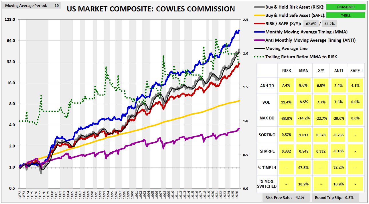
The strong performance, however, is the consequence of a hidden mistake. The Cowles Commission prices that are available for U.S. equities before 1927 are not closing prices, but averages of high and low prices for the month. In allowing ourselves to transact at those prices, we’re effectively cheating.

The point is complicated, so let me explain. When the index falls below the moving average, and we sell at the end of the month at the quoted Cowles monthly price, we’re essentially letting ourselves sell at the average price for that month, a price that’s no longer available, and that’s likely to be higher than the currently available price, given the downward price trend that we’re acting on. The same holds true in reverse. When the index moves above the average, and we buy in at the end of the month, we’re essentially letting ourselves buy in at the average price for the month, a price that’s no longer available, and that’s likely to be lower than the closing price, given the upward price trend that we’re acting on. So, in effect, whenever we sell and buy in this way, we’re letting ourselves sell higher, and buy lower, than would have been possible in real life.
To use the Cowles Commission data and not cheat, we need to insert a 1 month lag into the timing. If, at the end of a month, the strategy tells us to sell, we can’t let ourselves go back and sell at the average price for that month. Instead, we have take the entirety of the next month to sell, selling a little bit on each day. That’s the only way, in practice, to sell at an “average” monthly price. Taking this approach, we get a more truthful result. The strategy still outperforms, but by an amount that is more reasonable:
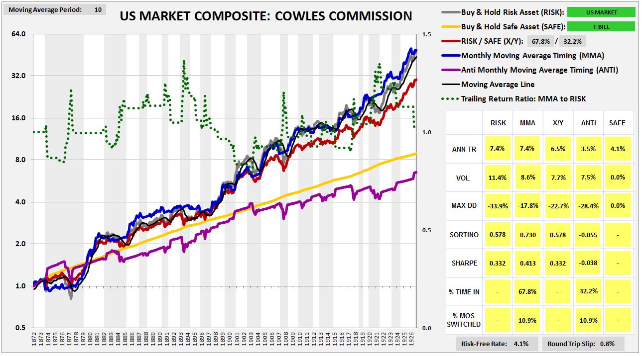
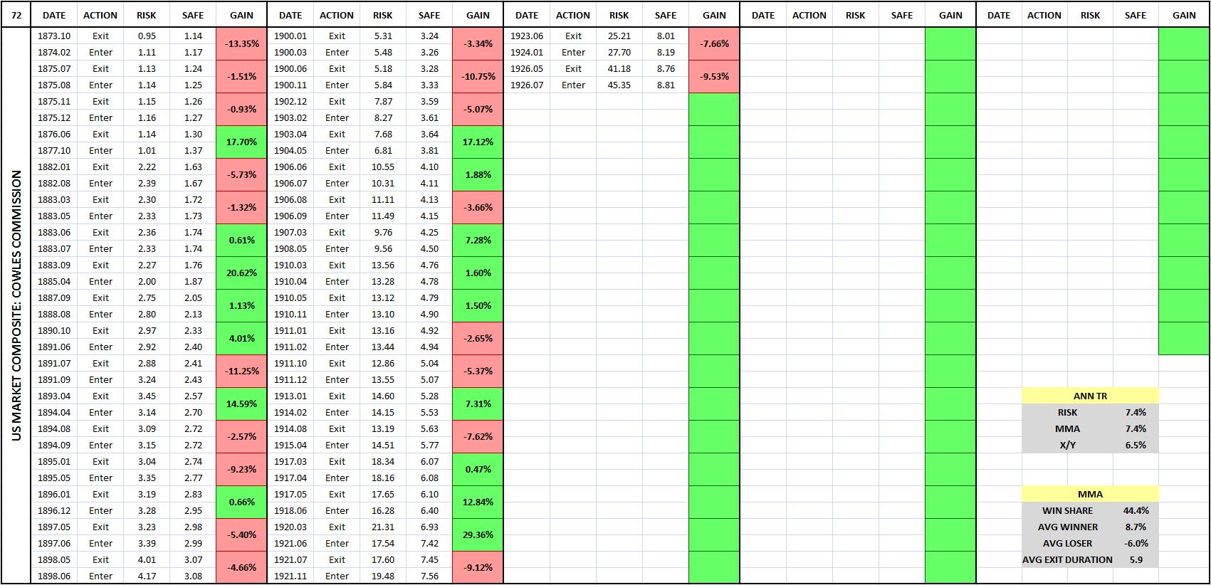
(For a precise definition of each term in the chart and table, click here.)
To avoid this kind of inadvertent cheating in our backtests, we have to make extra sure that the prices in any index that we test our strategies on are closing monthly prices. If an index is in any way put together through the use of averaging of different prices in the month–and some indices are put together that way, particularly older indices–then a test of the moving average strategy, and of all trend-following strategies more generally, will produce inaccurate, overly-optimistic results.
The Results: MMA Tested in 235 Indices and 120 Individual Securities
We’re now ready for the results. I’ve divided them in into eleven categories: U.S. Equities, U.S. Factors, U.S. Industries, U.S. Sectors, Foreign Equities in U.S. Dollar Terms, Foreign Equities in Local Currency Terms, Global Currencies, Fixed Income, Commodities, S&P 500 Names, and Bubble Roadkill Names.
In each test, our focus will be on three performance measures: Annual Total Return (reward measure), Maximum Drawdown (risk measure), and the Sortino Ratio (reward-to-risk measure). We’re going to evaluate the strategy against the X/Y portfolio on each of these measures. If the strategy is adding genuine value through its timing, our expectation is that it will outperform on all of them.
For the three performance measures, we’re going to judge the strategy on its win percentage and its excess contribution. The term “win percentage” refers to the percentage of individual backtests in a category that the strategy outperforms on. We expect strong strategies to post win percentages above 50%. The terms “excess annual return”, “excess drawdown”, and “excess Sortino” refer to the raw numerical amounts that the strategy increases those measures by, relative to the X/Y portfolio and fully invested buy and hold. So, for example, if the strategy improves total return from 8% to 9%, improves drawdown from -50% to -25%, and increases the Sortino Ratio from 0.755 to 1.000, the excess annual return will be 1%, the excess drawdown will be +25%, and the excess Sortino will be 0.245. We will calculate the excess contribution of the strategy for a group of indices by averaging the excess contributions of each index in the group.
The Sortino Ratio, which will turn out to be the same number for both the X/Y portfolio and a fully invested buy and hold portfolio, will serve as the final arbiter of performance. If a strategy conclusively outperforms on the Sortino Ratio–meaning that it delivers both a positive excess Sortino Ratio, and a win percentage on the Sortino Ratio that is greater than 50%–then we will deliver a verdict of “Outperform.” Otherwise, we will deliver a verdict of “Underperform.”
Now, to the results:
(Note: if you have questions on how to read the charts and tables, or on how terms are defined conceptually or mathematically, click here for a guide.)
U.S. Equities, 1871 – 2015: The strategy was tested in U.S. equities across different date ranges and under different choices of safe assets (treasury bills, 10 year treasury notes, investment-grade corporate bonds, and gold). Verdict: Outperform. Click here and scroll down to see a slideshow of the charts and tables.
U.S. Size, Momentum, and Value Factor Indices, 1928 – 2015: The strategy was tested in 30 different U.S. factor indices–size, momentum, and value, each separated into 10 decile indices. Verdict: Outperform. Click here and scroll down to see a slideshow of the charts and tables.
30 U.S. Industries, 1928 – 2015: The strategy was tested in 30 different U.S. industry indices. Verdict: Outperform. Click here and scroll down to see a slideshow of the charts and tables.
10 U.S. Sectors, 1928 – 2015: The strategy was tested in 10 different U.S. sector indices. Verdict: Outperform. Click here and scroll down to see a slideshow of the charts and tables.
Foreign Equities in U.S. Dollar Terms, 1971 – 2015: The strategy was tested in 77 foreign country equity indices, quoted in U.S. dollar terms. A side test on popular Ishares country ETFs was included. Interestingly, the performance in the Ishares ETFs was worse than the performance in the country indices. Verdict: Outperform. Click here and scroll down to see a slideshow of the charts and tables.
Foreign Equities in Local Currency Terms, 1971 – 2015: The strategy was tested in 32 different foreign country equity indices, quoted in local currency terms. Verdict: Outperform. Click here and scroll down to see a slideshow of the charts and tables.
Foreign Equities in Local Currency Terms, 1901 – 1971: The strategy was tested in 8 different foreign country equity indices, quoted in local currency terms, going back to a much earlier period of history. Verdict: Outperform.
Global Currencies, 1973 – 2015: The strategy was tested in 22 global currency pairs. Verdict: Outperform. The strategy’s performance in currency was its strongest performance of all. Click here and scroll down to see a slideshow of the charts and tables.
Fixed Income, 1928 – 2015: The strategy was tested in 11 different fixed income indices. Verdict: Outperform. Click here and scroll down to see a slideshow of the charts and tables.
Commodities, 1947 – 2015: The strategy was tested in 2 different commodity indices–spot gold and spot oil. Testing in rolled futures contract indices was also conducted, but is not worth including, given the awful performance of a buy and hold strategy in these indices, particularly over the last 10 years, where the futures chains have spent most of their time in contango, inflicting negative roll yields. Verdict: Outperform. Click here and scroll down to see a slideshow of the charts and tables.
100 Largest S&P 500 Stocks, 1963 – 2015: The strategy was tested in the largest 100 S&P 500 stocks that have been continuously publicly traded for at least 20 years. In contrast to the other tests, the strategy’s performance in this test was terrible. Not only did the strategy fail to add any value, it actually subtracted value, producing significantly inferior return and risk numbers relative to the X/Y portfolio, despite taking on the same cumulative exposures. Verdict: Underperform. Click here and scroll down to see a slideshow of the charts and tables.
Bubble Roadkill Sample, 1981 – 2015: The strategy performed so poorly in the test on individual large company stocks that we decided to try and see if we could come up with a sample of individual company stocks in which the strategy did work. So we ran the strategy in the context of individual companies that have experienced large boom-bust cycles, and that are now nearly worthless, at least relative to their prior market capitalizations. Examples include notorious tech names that boomed in the 90s and busted at the turn of the century, notorious housing and finance names that boomed in the early-to-mid aughts and busted in the Global Financial Crisis, and notorious commodity names that boomed in the aughts and that are busting as we speak. The expectation was that the strategy’s performance in these names would improve significantly, given the opportunity to ride a boom and exit prior to a terminal bust. The results showed that the performance did, in fact, improve–but the improvement wasn’t as large as hoped for. The strategy strongly underperformed in a number of busted names–e.g., Freeport McMoran, Aeropostale, MBIA, and Q-Logic. Verdict: Outperform. Click here and scroll down to see a slideshow of the charts and tables.
The following table summarizes the strategy’s performance across all tests on the criteria of Annual Total Return. The excess total returns and total return win percentages are shown relative to the X/Y portfolio and a portfolio that’s fully invested in the risk asset, abbreviated RISK.
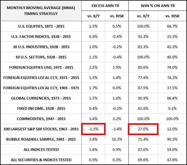
The performance is excellent in all categories except the individual S&P 500 stock category, where the performance is terrible. In the individual S&P 500 stock category, the strategy produces consistently negative excess returns and a below 50% win percentage relative to X/Y. In roughly 3 out of 4 of the sampled individual stocks, the strategy earns a total return that is less than the total return of a portfolio that takes on the same risk exposure without doing any timing. What this means is that with respect to total return, the strategy’s timing performance in the category is worse than what random timing would be expected to produce.
The following table summarizes the strategy’s performance on the criteria of Maximum Drawdown. The excess drawdowns and drawdown win percentages are shown relative to the X/Y portfolio and a portfolio that’s fully invested in the risk asset, abbreviated RISK.
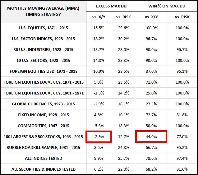
Note that there’s some slight underperformance relative to the X/Y portfolio in foreign equities and global currencies. But, as we will see when we look at the final arbiter of performance, the Sortino Ratio, the added return more than makes up for the increased risk. Once again, the strategy significantly underperforms in the individual S&P 500 stock category, posting a below 50% win percentage and exceeding the X/Y portfolio’s drawdown. As before, with respect to drawdown risk, the strategy’s timing decisions in the category end up being worse than what random timing would be expected to produce.
The following table summarizes the strategy’s performance on the criteria of the Sortino Ratio, which we treat as the final arbiter of performance. The excess Sortinos and Sortino win percentages for the strategy are shown relative to the X/Y portfolio and a portfolio that’s fully invested in the risk asset, abbreviated RISK.
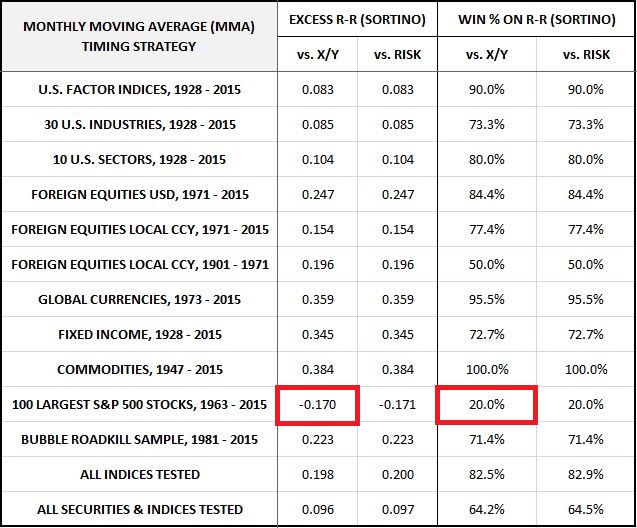
The performance is excellent in all categories except the individual S&P 500 stock category. Importantly, the excess Sortinos for foreign equities and global currencies are firmly positive, confirming that the added return is making up for the larger-than-expected excess drawdown and lower-than-expected drawdown win percentages noted in the previous table.
The strategy’s performance in individual S&P 500 securities, however, is terrible. In 4 out of 5 individual S&P 500 stocks, the strategy produces a Sortino ratio inferior to that of buy and hold. This result again tells us that on the criterion of risk-reward, the strategy’s timing performance in the category is worse than what random timing would be expected to produce.
To summarize, MMA strongly outperforms the X/Y portfolio on all metrics and in all test categories except for the individual S&P 500 stock category, where it strongly underperforms. If we could somehow eliminate that category, then the strategy would pass the backtest with flying colors.
Unfortunately, we can’t ignore the strategy’s dismal performance in the individual S&P 500 stock category. The performance represents a failed out-of-sample test in what was an extremely large sample of independent securities–100 in total, almost a third of the entire backtest. It is not a result that we predicted, nor is it a result that fits with the most common explanations for why the strategy works. To make matters worse, most of the equity and credit indices that we tested are correlated with each other. And so the claim that the success in the 250 indices should count more in the final analysis than the failure in the 100 securities is questionable.
A number of pro-MMA and anti-MMA explanations can be given for the strategy’s failure in individual securities. On the pro-MMA side, one can argue that there’s survivorship bias in the decision to use continuously traded S&P 500 stocks in the test, a bias that reduces the strategy’s performance. That category of stocks is likely to have performed well over the years, and unlikely to have included the kinds of stocks that generated deep drawdowns. Given that the strategy works by protecting against downside, we should expect the strategy to underperform in the category. This claim is bolstered by the fact that the strategy performed well in the different category of bubble roadkill stocks.
On the anti-MMA side, one can argue that the “stale price” effect discussed in an earlier piece creates artificial success for the strategy in the context of indices. That success then predictably falls away when individual stocks are tested, given that individual stocks are not exposed to the “stale price” effect. This claim is bolstered by the fact that the strategy doesn’t perform as well in Ishares MSCI ETFs (which are actual tradeable individual securities) as it does in the MSCI indices that those ETFs track (which are idealized indices that cannot be traded, and that are subject to the “stale price” effect, particularly in illiquid foreign markets).
The following table shows the two performances side by side for 14 different countries, starting at the Ishares ETF inception date in 1996:
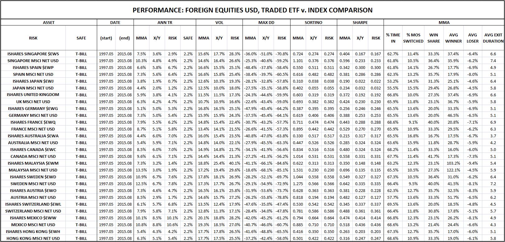
As the table confirms, the strategy’s outperformance over the X/Y portfolio is significantly larger when the strategy is tested in the indices than when it’s tested in the ETF securities that track the indices. Averaging all 14 countries together, the total return difference between the strategy and the X/Y portfolio in the indices ends up being 154 bps higher than in the ETF securities. Notice that 154 bps is roughly the average amount that the strategy underperforms the X/Y portfolio in the individual S&P 500 stock category–probably a coincidence, but still interesting.
In truth, none of these explanations capture the true reason for the strategy’s underperformance in individual stocks. That reason goes much deeper, and ultimately derives from certain fundamental geometric facts about how the strategy operates. In the next piece, I’m going to expound on those facts in careful detail, and propose a modification to the strategy based on them, a modification that will substantially improve the strategy’s performance. Until then, thanks for reading.
Links to backtests: [U.S. Equities, U.S. Factors, U.S. Industries, U.S. Sectors, Foreign Equities in USD, Foreign Equities in Local Currency, Global Currencies, Fixed Income, Commodities, Largest 100 Individual S&P 500 Stocks, Bubble Roadkill]
(Disclaimer: The information in this piece is personal opinion and should not be interpreted as professional investment or tax advice. The author makes no representations as to the accuracy, completeness, suitability, or validity of any of the information presented.)