 In late December of 2010, with the S&P 500 pushing through the mid 1200s on the heels of QE2 exuberance, my favorite financial economist–the great Robert Shiller–made what will likely turn out to be a very inaccurate prediction. To be fair to Shiller, it wasn’t really a “prediction”, but more of an “estimate.” He estimated that the S&P 500 would trade at 1430 in the year 2020.
Wait, did he mean 2430? No. He meant 1430–the level the market was at in late 2012, just before it went on its epic run. He estimated that the market would be there eight years later, in 2020.
His estimate could still end up being right. But, at this point, it will take a lot of luck. The trough of a 30% market downturn–from current levels, not higher levels–will have to occur exactly in 2020. Either that, or the market will have to suffer an even larger downturn, and then recover to the target by 2020. Neither of these chance occurrences seems to have been intended as the basis for the original estimate.
Rather than chuckle at the wrongness of the estimate, we may want to consider its implications for the current market. Here we have an excellent financial economist, one of the few to have accurately identified both the tech bubble and the housing bubble in real-time, estimating that in five years the market will be 30% below where it is today.
What is that telling us? Maybe it’s telling us that nobody–not even the “experts”–knows what’s going to happen in the market, and that all of this “analysis” mumbo-jumbo is just a front that people offer up in defense of stances that they’re already entrenched in for other reasons (emotional, dispositional, moral, ego-related, career-related, business-strategy-related, because they’ve already gone on record, cemented an identity, staked a reputation, and need to be “right”, etc.)
But maybe it’s telling us something else. Maybe it’s telling us that this market has been stretched very thin, well beyond the limits of defensible valuation, such that well-reasoned prior estimates for where prices would now be are missing the mark by miles. If true, that’s great news for those that were buying equities in 2010. It’s not great news for those that are buying equities now.
Historical EPS: The Trend is Not Your Friend
In the CNBC interview, Shiller explained the basis for his estimate:
“The problem with the traditional price earnings ratio is that earnings are just too volatile from year to year… We’re talking ten years out. So I’m going to go back to 100 years. The growth of real inflation directed earnings is surprisingly low. From 1890 to 1990 it was only 1.5 percent a year… I take earnings and I extrapolate them out at 1.5 percent from where they–S&P 500 earnings–are now and then I apply a price earnings ratio of 15, which is the historical average for 1890 to 1990.” — Robert Shiller, CNBC, December 31st, 2010
The best way to understand Shiller’s logic here would be to refer to a chart of S&P 500 earnings per share (EPS) relative to its historical “trend.” The CEO of Business Insider, Henry Blodget, recently highlighted a nice version of such a chart, put together by GMO’s James Montier.
 Chris Brightman of Research Affiliates presented a similar chart in a 2014 piece entitled “The Profits Bubble.” I’ve written over the chart in maroon:
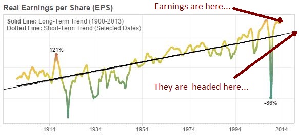
The logic works like this. We assume that EPS oscillates around, and eventually reverts to, a long-term trend (the gold line in the first chart, the black line in the second). To estimate EPS for a date in the future, we determine where the trend will be on that date (that is, we assume an eventual reversion to it). We then apply a “normal” P/E multiple to the EPS estimate to get an estimated price.
As of 2Q 2010, reported S&P 500 EPS was $67.10, almost perfectly on the historical trend. So Shiller extrapolated the trend growth rate–1.5% real, plus 2% inflation–out 10 years. He then applied a 15 P/E ratio. At 1.5% + 2% = 3.5% growth per year over 10 years, $67.10 becomes $95. 15 times $95 is roughly 1430–Shiller’s 2020 price target.
Before I share my chief concern with this logic, let me say that I agree with Shiller’s (and Blodget’s, and Montier’s, and Brightman’s) thesis that long-term returns from current prices will likely be disappointing, meaningfully less than the historical average of 6% real. I would much rather be with them in that debate than with those that are arriving at optimistic conclusions by naively extrapolating their own recent experiences, pretending that markets are always as kind and rewarding as they have been to U.S. investors over the last 6 years. As a strategy, extrapolation can work, but it doesn’t generally work at the tail end of a tripling of prices that has left the market historically expensive on pretty much every measure available.
That said, Shiller’s trend-based argument is flawed. The historical trend growth rate of real S&P 500 EPS that he uses–1.5%–does not apply to the current market. The reason is straightforward, and centers on the impact that secular changes in the dividend payout ratio have had on growth. EPS in the current market grows at a much faster pace than it did in the past, because a much larger share of current profit is devoted to growth-generating reinvestment, with a much smaller share devoted to the payment of dividends.
Now, here’s the problem. We don’t have a clear, reliable, uncontroversial way to account for the impact that changes in the dividend payout ratio have had on earnings growth over time. We are each then left to estimate the impact for ourselves. Not surprisingly, those of us that want the market to go down estimate it to be a small impact, and therefore ignore the risk that it might undermine trend-based arguments. Those of us that want the market to go up estimate it to be a large impact, and dismiss trend-based arguments altogether. Both approaches are wrong.
In this piece, I’m going to attempt to solve the problem. I’m going to introduce a new type of EPS index, called the “Total Return EPS” index. The Total Return EPS index represents what EPS would have been if corporations had never paid any dividends at all, but had instead used all of their dividend cashflows to buy back their own shares (or acquire or merge with other existing companies–there’s no difference in this context). When regular EPS is converted to Total Return EPS, growth trends can be analyzed without concern for the distortive impact that changes in the dividend payout ratio have had over time, because the dividend payout ratio for all eras gets reduced to the same common denominator, 0%.
In previous pieces (on foreign share, financial share, technology share, sectoral balance of payments, and wealth redistribution), I’ve argued that corporate profits, though overextended, are not as overextended as they might initially appear to be. A study of Total Return EPS confirms this argument. Regular S&P 500 EPS–shown in the Blodget/Montier/Brightman charts above–is a whopping 75% above its historical trend. But Total Return EPS is only 28% above its historical trend.
After introducing the Total Return EPS index, I’m going to teach the reader how to quickly and easily build it using Shiller’s publically-downloadable spreadsheet. I’m then going to use it to redo his 2020 S&P 500 estimate, based on the data that was available in 2010. In contrast to the bearish 1430 number that he arrived at, my estimate will come out to around 2150–still bearish, but not absurdly so, and significantly more likely to hit the mark, at least in hindsight.
It turns out that we can use Total Return EPS to do all sorts of interesting things: accurately predict future growth based on position relative to trend, decompose and visualize historical returns in terms of their contributing components, estimate profit margins during periods in the late 19th and early 20th century when the data necessary to calculate them was not available, construct new-and-improved Shiller CAPEs that allow for valid comparisons across history and across countries, and many more. But those would be too much to discuss in one piece, so I’m going to save them for later.
Here, I’m simply going to introduce the concept, and use it to generate a new 2020 S&P 500 estimate. Before I do that, I’m going to briefly outline the factors that have driven the secular decline in the dividend payout ratio.
Secular Decline in The Dividend Payout Ratio
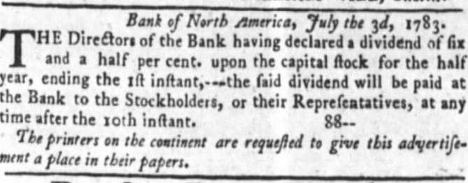
An early dividend announcement from the Bank of North America. Chartered in 1781 at the urging of Alexander Hamilton, the Bank of North America was the first Central Bank of the United States. It merged to form Wachovia Bank, and now exists as a part of the present day Wells Fargo ($WFC).
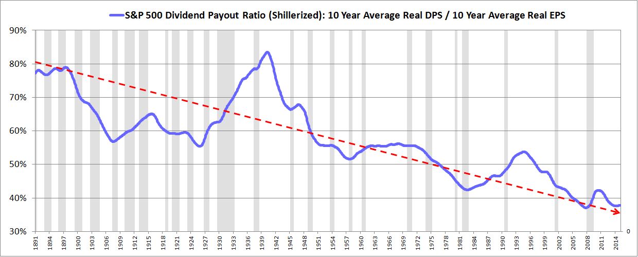
The market’s dividend payout ratio, which is the percentage of earnings that goes to dividends rather than to growth-generating reinvestment, has declined significantly over the last century. In the chart below, I use the “Shillerized” version of the dividend payout ratio to illustrate the point.
Why has the dividend payout ratio fallen so much? We can point to at least three interconnected reasons:
First, the investment world is not as endeared to the idea of receiving dividends as it used to be, and therefore corporations are not under as much pressure to pay them.
“Do you know the only thing that gives me pleasure? It’s to see my dividends coming in!” — John D. Rockefeller, quoted by John Lewis in Cosmopolitan, 1908.
Shareholders are perfectly comfortable, and often prefer, to see their idle excess funds deployed into other accretive activities–business expansion, share buybacks, acquisitions, mergers, and so on. The increased liquidity and efficiency that the modern market affords ensures that any wealth created in these activities will immediately accrue to the benefit of shareholders in the form of higher stock prices. In earlier periods, that was not necessarily the case.
Second, SEC rule 10b-18, originally issued in 1982, gave corporations that engage in share repurchases “safe harbor” from claims of market manipulation, removing a key legal risk that had otherwise discouraged the practice. With that risk removed, share buybacks became a virtual no-brainer, an efficient and perfectly legal way of distributing capital to shareholders without causing them to incur unwanted tax liabilities. When share buybacks displace dividend income, the money that continuing shareholders would otherwise have had to pay in dividend taxes stays inside the asset, where it is able to compound over time.
But what about situations where the market is expensive? Shouldn’t they encourage a shift away from buybacks, and towards dividends? No. Given the way that most people invest–with the “dividend reinvestment” option checked off–any dividends that are paid in lieu of buybacks will lead to the same outcome. They will be used to purchase shares at the same expensive market prices–it’s just that in the dividend case, the purchases will take place outside the company, rather than inside. The only relevant difference will be in the tax, which will be paid now rather than later.
Third, increased reliance on stock options as a form of performance-based employee compensation has created obvious reasons for corporate managers to prefer internal reinvestment to dividends. When corporate managers pay dividends, the wealth contained in those dividends leaves the company, and no associated EPS growth is generated from it. Their claim on the wealth, which they hold through their stock options, is therefore lost, and any compensation they would have received for the EPS growth that the wealth would have produced, they do not receive. But when they reinvest the wealth internally, it stays inside the firm, preserving their stock-option-based claims on it, and creating a direct boost to EPS that brings them that much closer to their performance targets.
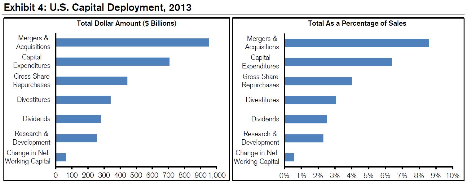
It should come as no surprise then, that buybacks, acquisitions, and mergers now dwarf dividends as a destination for excess funds. The following chart, borrowed from Michael Mauboussin’s fantastic piece on capital allocation trends in the U.S. corporate sector, illustrates the phenomenon. The amount of capital recycled into mergers, acquisitions, and share repurchases is now roughly six times as large as the amount of capital returned to shareholders in the form of dividends. 100 years ago, that amount would have been an imperceptible fraction of the dividend amount.
Constructing the Total Return EPS Index
According to S&P corporation, trailing twelve month (ttm) reported EPS for the S&P 500 is $102.77. What would it be today, if, starting in 1871, all of the dividends that were paid out to shareholders had instead been used to repurchase shares (or acquire or merge with other companies)? That’s the question that the Total Return EPS index is trying to answer–not only for today’s date, but for all dates in market history.
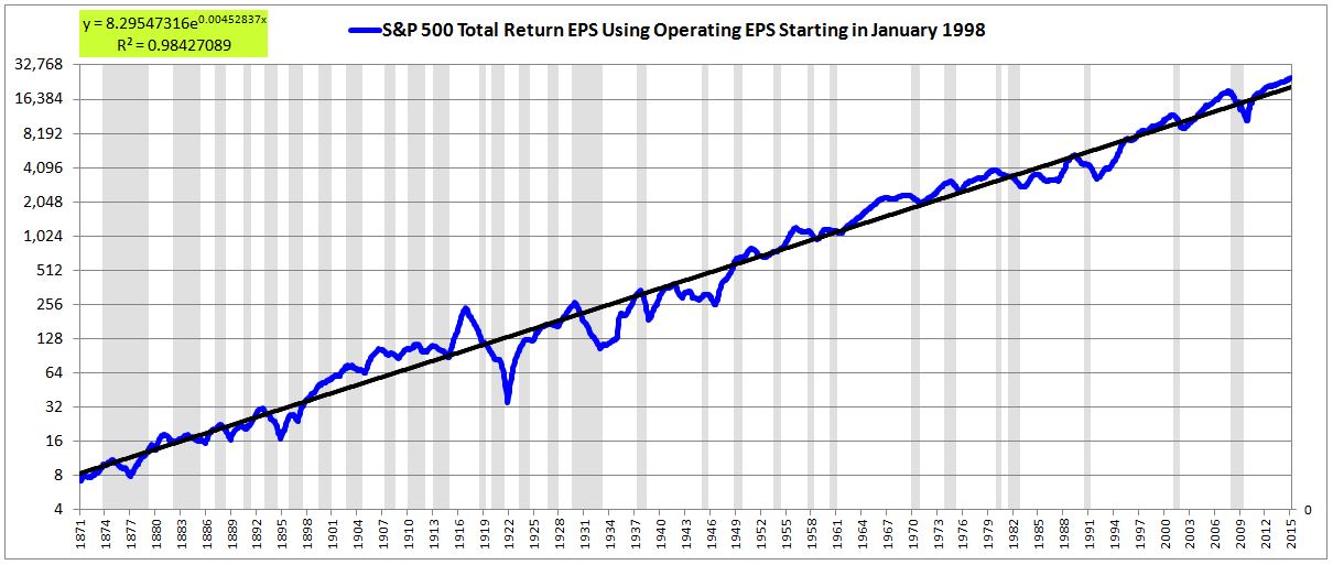
To get an answer, we start with Shiller’s familiar spreadsheet, which contains average monthly prices and reported earnings for the S&P 500 and its pre-1957 ancestry, with data obtained from S&P corporation and the Cowles Commission. We can use this data to create a log chart of EPS over time. The EPS is shown below in red, with the exponential trendline shown in black and recessionary periods shaded in gray. Recall that exponentials look linear on a log scale.
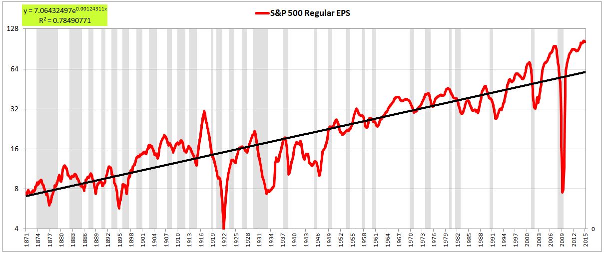
This chart is essentially the Blodget/Montier/Brightman chart shown earlier. As we see in the chart, current EPS is way above trend–by almost 75%. If, right now, it were to fall back to trend, it would have to fall all the way down to $60. At current prices, the index would then be valued at roughly 35 times earnings.
Now, let me make two brief points about the chart:
First, the chart shows inflation-adjusted EPS. Every earnings data point charted in this piece is inflation-adjusted to today’s dollars. When studying equity markets over the long-term, we absolutely have to inflation-adjust. To not inflation-adjust would be to retain a source of noise and volatility in the data that we cannot accurately model or predict. Any patterns that we subsequently identify would automatically be called into question as potential cases of coincidence-exploitation and data-mining.
Second, the massive drops seen in 2003 and 2009 were the result of the application of accounting standards that were not applied to prior eras and that do not reflect true earnings performance. In a perfect world, we would correct the chart accordingly, replacing the drops with more accurate estimates of earnings for the affected periods. In some contexts, we will make such a correction, substituting operating EPS for reported EPS. But in other contexts, we won’t, because it’s not necessarily needed, and will create false grounds for bears to dismiss what we’re trying to show.
In terms of analyzing the current equity market, it’s not crucial that we correct for the drops, because we’re not looking at Shiller-type averages of past EPS. We’re only looking at trailing twelve month (ttm) EPS. From the perspective of the ttm period ending in February 2015, the accounting-driven implosions of 2003 and 2009 have long since dropped out of the metric. That said, when you look at the chart and attempt to glean patterns and trends from it, remember that the large drops in those periods are visual distortions, and are not supposed to be there.
The following chart shows regular EPS with the 2003 and 2009 periods corrected. A mix of Bloomberg’s and S&P’s operating EPS series is inserted in the place of reported EPS starting in January 1998.
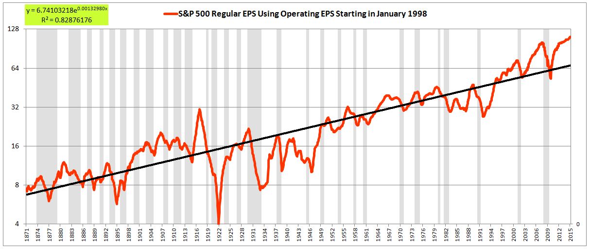
If you look closely, you will notice that the EPS values in this chart and the uncorrected chart fail to adhere to a consistent long-term growth trend. From the 1870s all the way through to the 1930s, there was essentially zero EPS growth. From the 1930s through to the 1990s, there was more EPS growth, but still not all that much. Then, starting in the mid 1990s, EPS growth exploded, achieving in a 20 year period what had earlier taken 60 years to achieve. How can we fit all of these periods onto the same trendline? We can’t, which is why the chart is ugly and uninspiring–a straight line forced onto a highly malformed time series.
To turn the time series into something more visually compelling, we need to build an index that puts all periods of history on an equal footing with respect to the tradeoff between dividend income and earnings growth. If we do that, everything will fall into place.
Enter the Total Return EPS Index. The Total Return EPS Index models what EPS would have been if the dividend payout ratio had been 0% at all times in history, with all dividend cash flows instead used to repurchase shares (or acquire or merge with existing companies). The Total Return EPS index reduces all periods to that common denominator, so that different periods can be accurately compared with each other, and a true underlying growth trend legitimately extracted.
Now, there’s one crucial, counter-intuitive caveat that we need to insert. The index should not assume that shares are bought back at market prices. For if it makes that assumption, then periods of history where stocks were cheap will show abnormally high growth, driven by the high rate of return that the share buybacks, conducted at cheap prices, will have produced. Conversely, periods of history in which stocks were expensive will show abnormally low growth, driven by the low rates of return that the share buybacks, conducted at expensive prices, will have produced. We’re trying to determine the historical trend in EPS growth. Valuation–the cheapness and expensiveness of stock prices in any given period–has nothing to do with that trend. We therefore need to remove its effects from the index.
Instead of assuming, as most “total return” indices do, that shares are bought back at market prices, our new index will therefore assume that they are bought back at prices that reflect the same underlying value across history. Such an assumption is needed to ensure that all periods of history are placed on an equal footing, to allow for accurate comparisons between them.
But how shall we measure value across history? The best available tool–far from perfect, but adequate to the task–is the Shiller CAPE. We’re going to assume, then, that shares are bought back at prices that correspond to a constant Shiller CAPE across history–in this case, a Shiller CAPE equal to the historical (geometric) average of 16.59, which we will arbitrarily refer to as “fair value.”
Unfortunately, for the 1871-1881 period, there aren’t 10 years worth of trailing data on which to calculate a Shiller CAPE. So, for that period, we’re going to have to use the simple ttm P/E ratio. We will assume that shares are bought back at a ttm P/E ratio equal to the historical (geometric) average of 15.54.
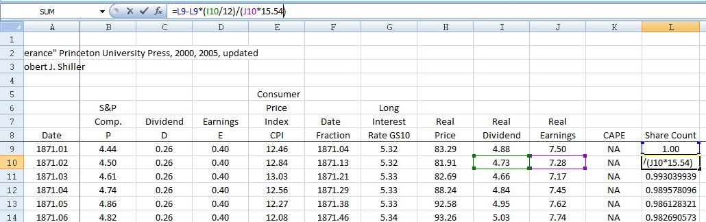
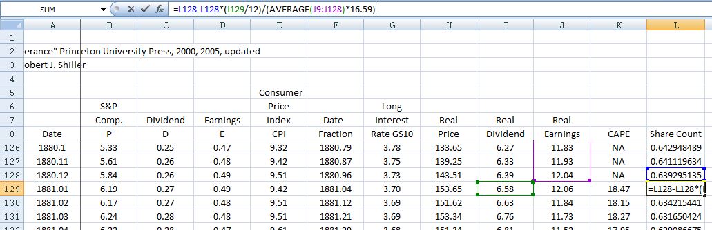
Now, to the spreadsheet itself. Here’s the concept. We start by creating a column that contains an arbitrary starting share count. We make the initial share count, in the first month of the series, equal to 1.0 (or whatever number you want). We then shrink the share count each month by the amount of shares that the monthly dividend would have been able to purchase at fair value prices (again, “fair value” as measured by the Shiller CAPE for periods after January 1881, and the ttm P/E ratio for periods before January 1881.)
The images below show the technique in practice from 1871 to 1881. In each month, we shrink the share count by the amount of shares that the dividend for that month would have been able to buy, assuming a fair value ttm P/E multiple of 15.54.
In January of 1881, the first month where a Shiller CAPE reading is available, we shift to that measure of fair value. In each month, we shrink the share count by the amount of shares that the dividend for the month would have been able to buy, assuming a Shiller CAPE of 16.59.
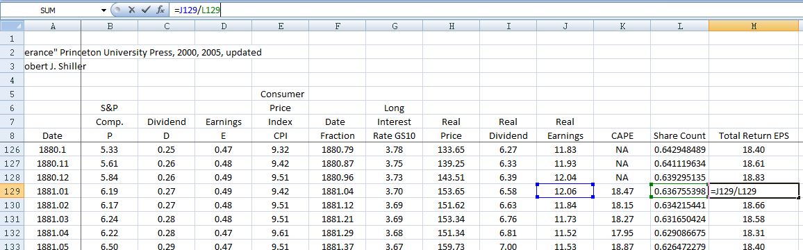
What we end up with is a gradually contracting share count that tracks what would have happened to the actual share count if all dividend payouts had instead been used to repurchase shares. Dividing the actual reported EPS by that share count, we get the Total Return EPS, which is what the EPS would have been under a 0% dividend payout ratio.
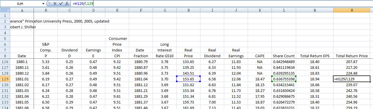
But if all dividends had instead been used to repurchase shares, then the market’s price on the subsequently higher earnings would have been higher. We therefore need to calculate a new price index, a price index that reflects what the price would have been, on the assumption that the market had valued the now-higher earnings in the same way, with the same P/E multiple. To do this, we divide the actual price by the contracting share count, just as we divided the actual EPS by that share count. We end up with the Total Return Price Index, which goes together with the Total Return EPS index (we will use this price index in a future piece to calculate a new-and-improved Shiller CAPE).
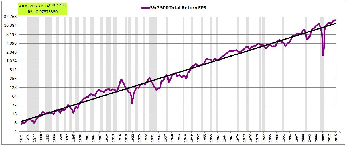
The following chart plots the uncorrected Total Return EPS on a log scale. At present, it’s roughly 28% above its historical trend, versus 75% for the uncorrected regular EPS.
The following chart plots the corrected Total Return EPS on a log scale. At present, it’s roughly 21% above its historical trend, versus 58% for the corrected regular EPS.
Notice, in particular, the dramatic improvement in the consistency of the trend. The growth from the 1870s to the 1930s, for example, is on par with the growth from the 1930s to the 1990s, which is on par with the growth from the 1990s to now. In the charts of regular EPS shown earlier, that was not the case. The first period, when the dividend payout ratio was high, had virtually no growth; the second period, when the dividend payout ratio was lower, had moderate growth; the third period, when the dividend payout ratio was lowest of all, had substantial growth.
Annualized, the historical trend in Total Return EPS growth comes out to around 5.5% per year for the uncorrected case, and 5.7% per year for the corrected case–both close to the generic 6% number that represents the U.S. corporate sector’s historical return on equity. This is not a coincidence.
A New 2020 Estimate
I’m now going to redo Shiller’s 2020 price estimate using the corrected version of Total Return EPS. As of June 2010, nominal EPS was $69.43. Total Return EPS was 7.5% below its historical trend. Boosting nominal EPS by an amount sufficient to bring Total Return EPS back to trend, we get $75. So, if EPS in 2010 had been $75, Total Return EPS would have been perfectly on its trend.
The Total Return EPS, as constructed, grows at an average rate of 5.7% per year. Inflation adds roughly 2%, and the dividend, using the yield at the time, subtracts roughly 2%. So we get 5.7% + 2% – 2% = 5.7% as the expected nominal EPS growth rate. Applying that expected growth rate out over a 10 year period to the starting $75 number, we end up with $131. That’s the EPS estimate that this trend-based method produces for the year 2020. Multiply by 15 and we get 1965, versus Shiller’s overly bearish 1430.
Now, the 15 number that Shiller used as the “average” ttm P/E ratio represents the average ttm P/E ratio from 1890 to 1990. An average from a later, more relevant slice of history would probably be more appropriate. The (geometric) average ttm P/E ratio from the S&P 500’s inaugural year of 1957 to present is 16.46. Using that number, we arrive at a year 2020 S&P 500 price estimate of 2156 (which, interestingly, is roughly the same as the year 2020 estimate–2154–that I arrived at using a more direct method in a piece from 2013.)
These estimates assume a reversion of both earnings and P/E back to their properly-measured historical trends. Such a reversion may not occur. But if it were to occur, it would not be anything historically extreme–just a drag on EPS growth that brings final EPS to a value ~15% to ~20% below where it would be if it grew at the trend rate from today forward, coupled to a downshift in the P/E ratio from the current 18+ back to the average of around 16.5.
It may be hard to believe that such a reversion could ever take place in this teflon, never-lose, never-give-a-bear-a-damn-thing U.S. equity market, but go ahead and #timestamp that estimate, we’ll come back to it. A number of impeding forces are likely to push back on U.S. equity performance between now and 2020, that have only recently started to rear their heads.