In the debate on profit margins, two different types of charts frequently appear. The first chart is a chart of the aggregate profit margin of the S&P 500.
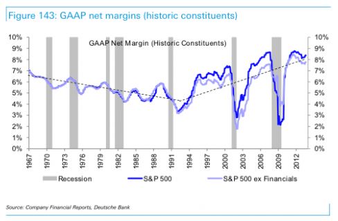
Valuation bulls tend to prefer this chart because it undermines the view that profit margins revert to a constant mean over time. The line in the chart goes through a multi-decade bear market, falling from 7% in 1967 to 3.5% in 1992. At each point along the way, it makes lower lows and lower highs, exhibiting very little mean-reversion. Then, around 1994, it rises substantially, and remains historically elevated for most of the subsequent twenty-year period.
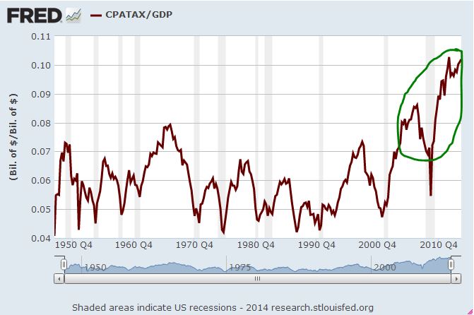
The second chart is the chart of corporate profit (FRED: CPATAX) as a percentage of GDP.
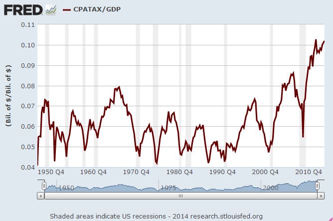
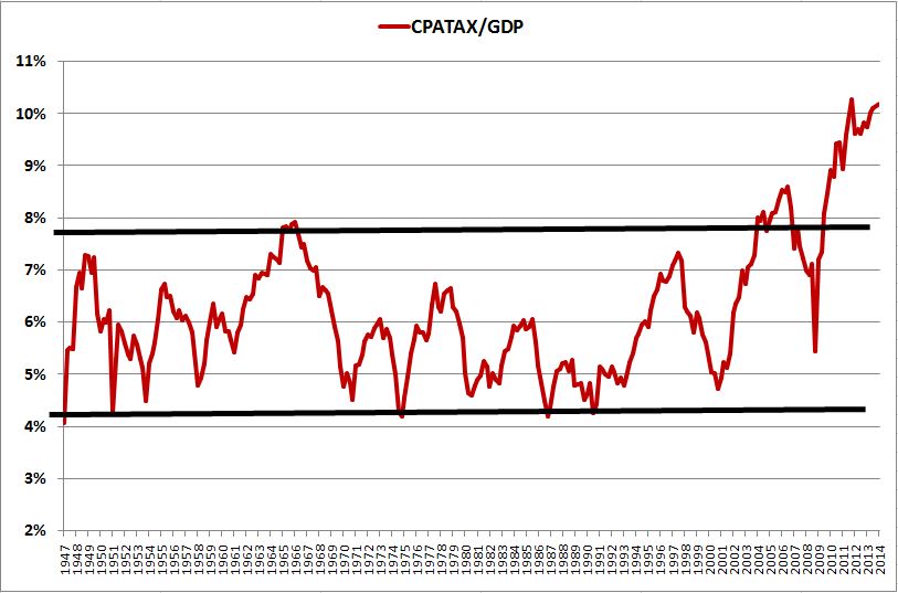
Valuation bears tend to prefer this chart because, unlike the chart of the S&P 500 profit margin, it exhibits a visually compelling pattern of mean-reversion. From 1947 to 2002, it oscillates like a sine-wave around a well-defined average, with well-defined highs and a tightly well-defined low, bounded by the black lines in the recreation below.
This latter chart, CPATAX/GDP, and that of its twin brother, CPATAX/GNP, is an illusory result of flawed macroeconomic accounting. In the paragraphs that follow, I’m going to try to clearly and intuitively explain why. Hopefully, the chart will disappear once and for all.
Please note at the outset that the flaw in the chart has nothing to do with the fact that foreign sales are earned at a higher profit margin than domestic sales. That’s a separate issue. This issue is much more basic. The chart effectively treats foreign sales as if they were earned at an infinite profit margin, because it doesn’t account for their costs. The sharp upside breakout seen from 2003 onward is due in large part to this mistake.
At the end of the piece, I’m going to explain how to accurately calculate the true corporate profit margin using macroeconomic data. The excellent economists at the BEA have provided us with a very useful data series, NIPA Table 1.14, available in FRED, that allows us to divide corporate profits directly by corporate final sales, so that we get a direct and accurate picture of the profit margin, without having to use GDP as an approximation.
Importantly, when we chart the true profit margin–profits divided by sales–the compelling visual pattern of mean-reversion exhibited in the CPATAX/GDP chart weakens considerably. It becomes clear that the “true mean” to which profit margins naturally revert has changed in relevant ways over time, and therefore can change. Right now, we are likely in a situation where the natural mean for profit margins is higher than it was in the 1970s, 1980s, and early 1990s.
Respecting the Reality of Change
The following chart shows CPATAX divided by GDP from 1947 to present. The black line represents the average from 1947 to 2002, and the green line represents the average from 2003 to 2013.

As you can see in the chart, CPATAX/GDP is wildly elevated at present. It currently sits 63.3% above its average from 1947 to 2013, and a whopping 75.0% above its average from 1947 to 2002.
As readers of this blog have probably inferred by now, I’m not very patient when it comes to waiting for “mean-reversion” to occur. In my view, when a variable deviates for long periods of time from a reversion pattern that it has exhibited in the past, the right response is to expect something important to have changed–possibly for the long haul, such that a predictable reversion to prior averages will no longer be readily in the cards. The task would then be to find out what that something is, and try to understand it.
If CPATAX/GDP, as depicted in the chart, were an accurate approximation of the corporate profit margin, my response would be to say that we need to rethink the claim that profit margins revert to a constant mean over time. Whatever the “true mean” for profit margins might have been in the past, that mean must have increased. The chart doesn’t realistically lend itself to any other conclusion.
Consider that from 1947 to 2003, the highest measured value of CPATAX/GDP was 7.9%, realized in the first quarter of 1966. From 2003 until today, the average value has been 8.4%. So the average value of the last decade is roughly 50 bps above the record high of the entire preceding half-century. If that outcome isn’t sufficient to establish that the “true mean” of the system–or the “natural mean”, as I like to call it–has increased, what outcome would be?
As with the Shiller CAPE, we can’t allow the permanently elevated state of an allegedly mean-reverting variable to become a permanent reason not to invest. But that’s unfortunately what both the Shiller CAPE and “profit margins” have turned into. If at any time in the last 20 years you’ve wanted to be bearish, then with a brief exception in late 2008 and early 2009, at least one of these themes has always been there for you as a readily-available reason. In my estimation, they will continue to be there for you–at least the Shiller CAPE, which, in my view, is not going to mean-revert any time soon. We thus have to ask ourselves, is “never investing” a viable long-term plan? If not, then the metrics and the analysis need to be re-examined.
Refusing to respond to changes in reality leads to destruction. Reality will not tolerate it. If a variable that allegedly mean-reverts refuses to revert over long periods of time, then we need to acknowledge the possibility that the variable is not naturally mean-reverting, or that the mean that it naturally reverts to has changed. Economics is not physics. There are no “divinely-ordained” constants that govern the system. The averages that economic variables exhibit, and the settling points towards which they gravitate, can and do change as secular conditions in economies change. This fact is true of almost anything “economic” that we might measure–growth rates, interest rates, inflation rates, asset valuations, and profit margins.
Two Distinctions: “Product” vs. “Income” and “National” vs. “Domestic”
Fortunately, if we search for the reason that CPATAX/GDP has “broken out”, we will quickly find it. Before we can go there, however, we need to make two important distinctions: (1) “product” v. “income” and (2) “national” vs. “domestic.”
Product refers to whatever is produced, at its monetary market value. Income refers to whatever is earned, in monetary amounts. Roughly speaking, product and income equal each other. A good or service that is produced and sold for some amount is income to whoever produced and sold it. The sale proceeds are distributed to each of the individuals that played a part in its production.
If a car company makes and sells a car, the product is the car, at market value, and the income is the sum of (1) the wage received by the company worker for the value that he has added through his labor, (2) the interest received by the company bondholder for the value that he has added in lending his money, and (3) the profit received by the company shareholder for the value that he has added through the direction and use of his property. After taxes and fines are removed, the sale proceeds are necessarily going to go to one of those three locations: wages, interest, or profit. The profit margin represents the portion of the sale proceeds that go to profit. Because GDP roughly tracks with total sales in the economy, corporate profit divided by GDP gives a rough “macroeconomic” approximation of the aggregate profit margin of the corporate sector.
The term national refers to whatever belongs to U.S. resident individuals and corporations. So, for example, gross national product (GNP) refers to the total output, at market value, supplied by the labor and property of U.S. residents, whether that output is generated domestically or in a foreign country. Gross national income (GNI) refers to the total income earned by all U.S. residents, whether they earn the income from activities that occur inside the United States or abroad.
The term domestic refers to whatever occurs inside U.S. borders. So, for example, gross domestic product (GDP) refers to the total output, at market value, generated from operations inside the United States, whether the individuals that produce the output are U.S. residents or residents of a foreign country. Gross domestic income refers to the total income earned by all people and businesses operating inside the United States, whether those people and businesses are Americans or foreigners.
Put simply, product is concerned with production, and income is concerned with compensation–two sides of the same coin. National is concerned with who product and income are produced and earned by, and domestic is concerned with where they are produced and earned.
CPATAX/GDP: Identifying the Mistake
The expression CPATAX/GDP contains an obvious distortion. CPATAX is a “national” term–it refers to the after-tax profit of all U.S. resident corporations, whether that profit is earned domestically, or from operations in a foreign country. GDP, in contrast, is a “domestic” term–it refers to the total gross output (and therefore the total gross income) produced (and earned) inside the United States, whether that income is earned by U.S. residents or by foreign entities.
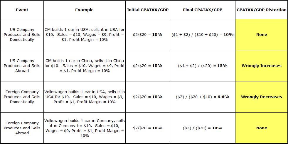
Notice that if a U.S. corporation earns a profit from affiliate operations abroad, the profit will be added to the numerator of CPATAX/GDP, but the costs will not be added to the denominator, as they should be in a “profit margin” analysis. Those costs, the compensation that the U.S. corporation pays to the entire foreign value-added chain–the workers, supervisors, suppliers, contractors, advertisers, and so on–are not part of U.S. GDP. They are a part of the GDP of other countries. Additionally, the profit that accrues to the U.S. corporation will not be added to the denominator, as it should be–again, it was not earned from operations inside the United States. In effect, nothing will be added to the denominator, even though profit was added to the numerator.
General Motors (GM) operates numerous plants in China. Suppose that one of these plants produces and sells one extra car. The profit will be added to CPATAX–a U.S. resident corporation, through its foreign affiliate, has earned money. But the wages and salaries paid to the workers and supervisors at the plant, and the compensation paid to the domestic suppliers, advertisers, contractors, and so on, will not be added to GDP, because the activities did not take place inside the United States. They took place in China, and therefore they belong to Chinese GDP. So, in effect, CPATAX/GDP will increase as if the sale entailed a 100% profit margin–actually, an infinite profit margin. Positive profit on a revenue of zero.
Similarly, if a foreign corporation earns a profit from operations inside the United States, both the costs and the profit will be added to the denominator of CPATAX/GDP, but the profit will not be added to the numerator. That profit–which accrues to the foreign corporation operating domestically, and is part of U.S. GDP–is not part of CPATAX.
Volkswagen runs a very successful plant in Chattanooga, TN. Suppose that this plant produces and sells one additional car. The profit will not be added to CPATAX, because it was earned by an affiliate of a foreign resident corporation, rather than a U.S. resident corporation. But the wages paid to the workers that operate the plant will be added to GDP, because the production took take place inside U.S. borders. So, in effect, CPATAX/GDP will fall as if the sale had occurred at a 0% profit margin. No profit on positive revenue.
The following table illustrates the distortions with concrete numbers. We assume that CPATAX/GDP for the aggregate economy is initially equal to 10%, and then some event occurs that should not change the profit margin–say, GM produces and sells a car in China at a 10% profit margin, or Volkswagen produces and sells a car in the US at a 10% profit margin. The table walks through the distortion dollar by dollar:
Now, if the two types of profits–U.S. company profit earned from operations abroad, and foreign company profit earned from operations in the US–were to roughly match each other in monetary size, then the two distortions, which act in opposite directions, might, by luck, offset each other’s effects. Unfortunately, they do not match each other in monetary size–not even close.
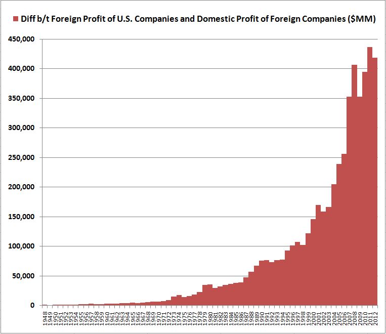
Over the last 50 years, U.S. company profit earned abroad has increased by a much larger total amount than foreign company profit earned in the U.S. The difference has become especially significant in the last 10 years, as foreign sales have boomed. At present, U.S. company profit earned abroad is around $665B, whereas foreign company profit earned in the U.S. is only around $250B–a difference of around $400B.
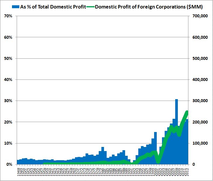
The following chart shows total U.S. national corporate profit earned abroad in absolute terms, and as a share of total U.S. national profit. You can see that profit earned abroad is now more than 40% of the total profit earned by U.S. resident corporations. Almost half, so this is a huge effect.

The following chart shows the total profit of foreign companies earned from operations in the United States in absolute terms, and as a share of total U.S. domestic profit. The scale is the same as in the previous chart to allow for a visually accurate comparison.
The following chart shows the difference between the foreign profit of U.S. corporations and the domestic profit of foreign corporations (FRED).
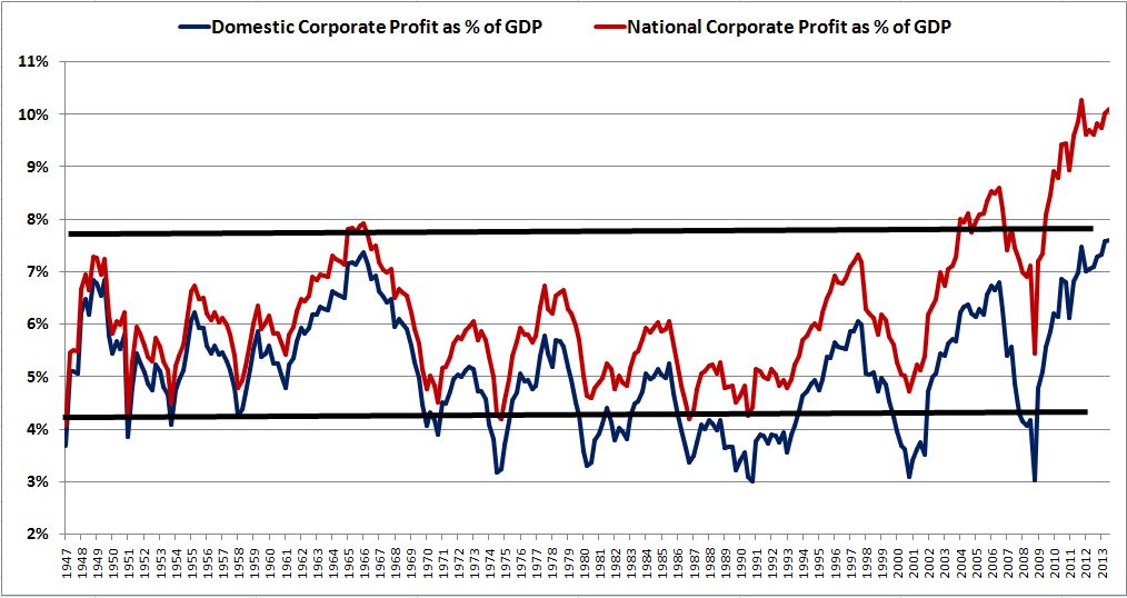
Now, the BEA gathers data on domestic corporate profits–that is, corporate profit generated from domestic operations. To get an idea of how much of an effect the foreign sales distortion has had on CPATAX/GDP, we can compare CPATAX/GDP (maroon line below) with domestic corporate profit divided by GDP (blue line below) (FRED).

Notice that the maroon line, U.S. national profit (CPATAX) divided by GDP, and the blue line, U.S. domestic profit divided by GDP, consistently deviate from each other over time. Any time you see such a consistent, gradual pattern of divergence in macroeconomic data, you can be confident that something is missing from the story. In this case, the missing “something” is the difference between the amount of national profit earned abroad and the amount of domestic profit earned by foreigners. That difference is directly proportionally to the difference between national and domestic profit (in absolute terms and as a % of GDP). The difference has consistently increased over time, which is why the lines consistently deviate.
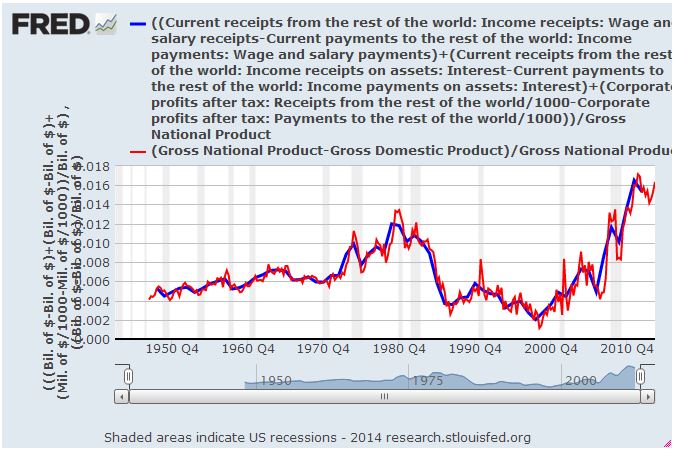
The following chart (FRED) shows (1) the difference between U.S. national profit (CPATAX) divided by GDP and U.S. domestic profit divided by GDP and (2) the difference between U.S. profits earned abroad as a percentage of GDP and domestic profits earned by foreign corporations as a percentage of GDP.

The fit between the blue line and the orange line is 100% perfect–as expected, since the relationship is analytic. But notice the jump that occurs from 2003 onward (circled in red above). That jump–which corresponds to the jump in foreign sales generated abroad–is a substantial driver of the jump seen in the CPATAX/GDP that occurs around the same time period (circled in green).
The distortion of foreign sales grows across the entire 60 year period of the chart, and then accelerates in the 2000s, as foreign sales boom. The true profit margin, underneath this distortion, actually declines up until the 1990s–consistent with the previously discussed decades-long bear market that profit margins seem to undergo in the S&P 500 profit margin chart. But the decline is masked in CPATAX/GDP by the gradual increase in the foreign sales of U.S. corporations, which are being added to the expression at an infinite margin. The following chart paints the picture.
The nice, neat mean-reversion channel that the red line seems to adhere to, and the “breakout” that occurs from 2003 onward, show themselves to be illusory. Both of these apparent phenomena are consequences of improper macroeconomic accounting. CPATAX/GDP is a conceptually incoherent expression, and should be discarded.
Substituting GNP for GDP
John Hussman has frequently cited the chart of CPATAX/GDP in his writings. In a piece this last December, he shared a chart that correlates CPATAX/GDP to future 4 year profit growth. The implied outlook for future profit growth is ugly, to say the least.
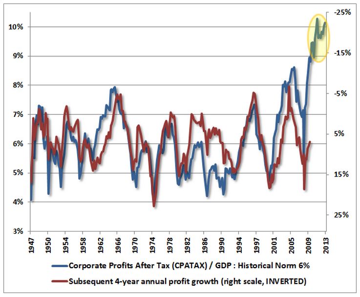
To be completely fair to John, he made it clear in the piece that he doesn’t expect a profit contraction as severe as the chart suggests:
“At present, the extreme profit/GDP ratio we observe here is consistent with expectations of a 22% annual contraction in profits over the coming 4-year period – which would imply a roughly 63% cumulative contraction in profits from present levels. My impression is that’s probably too aggressive an expectation except as a temporary trough. A more reasonable expectation, in my view, would put corporate profits down about 10% annually over the next few years… Part of the reason we would expect a more muted contraction in profit margins is the recognition that government budget deficits are likely to remain relatively high in the coming years.”
As I’ve explained elsewhere, I tend to be skeptical of these “X divided by Y” versus “future growth of X” charts, for three reasons:
First, they try to fit the present value of a variable to its future growth, which is just the difference between its present value and its future value. So “present value” shows up in both expressions. Any time “present value” changes, the change flows into both expressions inversely, creating the perception of a non-trivial inverse correlation, where one may not actually exist.
Second, the visual attractiveness of these types of charts often depends on the choice of the time frame–4 years might look great, but how does 7 years look? 10 years? Why is 4 years special? Is it special because it plays a role in some theory, or because it just happens to be the easiest number to build a fit around, given purely coincidental patterning in the data set? If the latter, then it’s unlikely that the chart will be able to accurately predict future numbers. It’s easy to build models that can predict past data, when we already know the answers and can mold the questions to match them. It’s obviously much harder to build models that can predict future data, where the answers are unknown.
Third, the charts look at nominal growth, rather than real growth. Profit margins don’t know what inflation is going to be going forward. But inflation has a significant effect on nominal profit growth. Since 1947, 3.7% of the 8.1% in nominal annual profit growth has been due to inflation–almost half the total. In an environment with highly variable inflation, such as the period from 1947 to 2013, profit margins shouldn’t be able to predict future nominal profit growth with such a high degree of confidence. If a chart is produced that shows that they can, coincidences in the data set are likely to be contributing to the result.
Now, to be fair, each of these criticisms applies to my own prior piece on asset supply, where I fit aggregate investor equity allocation to 10 year nominal S&P 500 total returns. It was an interesting exercise, and there’s certainly a relationship there (as there is between profit margins and profit growth, everything else equal) but the fit, however tight, is not something that anyone should be making defined future bets on. It’s the analysis that’s important.
In my view, curve fits should be met with skepticism unless there is a compelling analytic story behind them, the expressions being fit are independent of each other, the fits really nail it, or the fits are successfully tested out of sample, in different data sets–for example, data sets taken from the economies of other large countries. Testing a fit in the same data set that was used to put it together is not real testing–you won’t have any way to know whether the observed correlation is real or driven by coincidence. It’s also important that the fit track well in the recent data, because the recent data are the data most likely to share structural similarities with the data that we actually care about: the future data that we’re trying to predict.
With respect to this chart, however, we don’t even need to get into the debate about whether the predictions of in-sample “variable vs. its own future growth” fits should be trusted. The metric itself is fundamentally flawed, for the reasons explained earlier. CPATAX/GDP models foreign sales as if they were earned at an infinite profit margin. The costs of those sales show up nowhere in the expression. Obviously, we’ve had strong growth in foreign sales in the last decade, and that’s the reason for the weird “breakout” seen in the CPATAX/GDP chart.
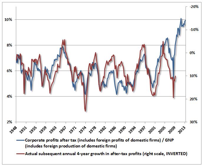
Now, an alternative to CPATAX/GDP is CPATAX/GNP. In CPATAX/GNP, U.S. national profit shows up in both the numerator and the denominator. If we wanted to normalize CPATAX to something that grows with the size of the economy, as we might want to do in the context of a balance of payments analysis such as the analysis that the Kalecki-Levy equation entails, GNP would be the more consistent choice.
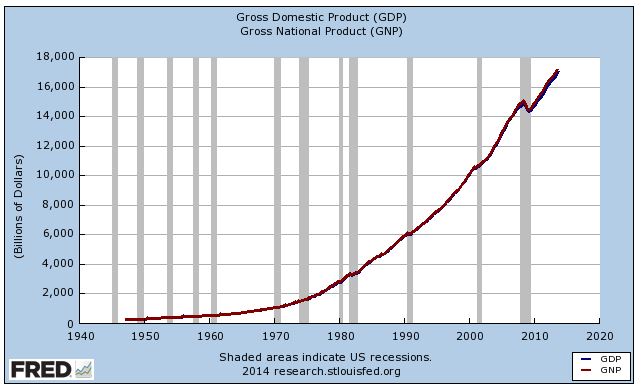
In a comment from a few weeks ago, John (correctly) pointed out that the difference between CPATAX/GDP and CPATAX/GNP is almost imperceptible.
“To normalize corporate profits relative to the overall economy, I’ve typically divided them by U.S. GDP. This is somehow taken as a striking error by some, who argue that the relevant profit share should be obtained by dividing the BEA corporate profit figures by a measure that similarly includes production abroad by U.S. corporations and excludes production in the United States by foreigners. This technically appropriate figure is Gross National Product (by contrast, Gross Domestic Product captures output generated domestically in the United States, regardless of whether it was generated by a foreign or domestic company or individual)… Want to know how large the difference is between the level of Gross National Product and Gross Domestic Product? About one-half of one percent. The distinction is virtually meaningless.”
He then showed a chart of GDP and GNP together–the two are almost identical:
He then replaced GDP with GNP in the fit. Evidently, the fit still works, and the prediction is still extremely bearish.
But substituting GNP for GDP doesn’t solve the problem. Though GNP is a more consistent term to use, it doesn’t include the corporate expenses that are incurred in foreign operations: primarily, the compensation paid to foreign intermediaries and foreign employees of U.S. foreign affiliates. Consider the Chinese managers, contractors, suppliers, cooks, cashiers, janitors, and so on that run McDonald’s China. Their expense represents the bulk of the costs of McDonald’s Chinese profits. It needs to be included in the denominator of a profit margin analysis. But it isn’t being included.
As an expression, CPATAX/GNP is slightly better than CPATAX/GDP because it at least adds the profit portion of foreign sales to both sides of the expression, numerator and denominator. But that’s a small change–all it means is that foreign sales are being added at a 100% profit margin, rather than at an infinite profit margin, as CPATAX/GDP was adding them. The expression needs to add them at whatever profit margin they are actually being earned at–say, 10% to 15% on a final sales basis. The other 85% to 90% that goes to everyone else in the value-added chain needs to show up in the denominator. But it doesn’t show up.
So that there’s no confusion, I’m now going to go through the issue in analytic detail. Let’s assume that “product” is essentially equal to “income”, which we will define as being equal to wages plus interest plus profit plus other. Then,
GDP = Wages[US resident, domestic] + Wages[foreigner, domestic] + Interest[US resident, domestic] + Interest[foreigner, domestic] + Profit[US resident, domestic] + Profit[foreigner, domestic] + Other.
GNP = Wages[US resident, domestic] + Wages[US resident, abroad] + Interest[US resident, domestic] + Interest[US resident, abroad] + Profit[US resident, domestic] + Profit[US resident, abroad] + Other.
In each expression, the first term in brackets refers to who generates the income (a U.S. resident or a foreigner), the second term refers to where it is generated (in the domestic U.S. or abroad).
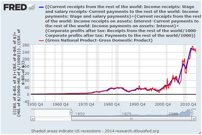
When we subtract GDP from GNP, the common terms cancel, and we get an expression for the difference.
GNP – GDP = Wages[US resident, abroad] – Wages[foreigner, domestic] + Interest[US resident, abroad] – Interest[foreigner, domestic] + Profit[US resident, abroad] – Profit[foreigner, domestic].
Notice that you don’t see the critical costs of foreign operations, specifically, Wages[foreigners, abroad], anywhere in the expression. Those costs are not being accounted for in either GDP or GNP.
To prove that the above equation for GNP – GDP is analytically accurate, the following chart plots both sides of the equation from 1948 to 2013 (FRED). The fit is 100% perfect:
Here, we show the fit with both sides of the equation normalized to GNP (FRED). One data set is annual, the other is quarterly, which is the reason for the squiggles.
There should be no confusion, then. In the present environment, CPATAX/GDP is not a conceptually valid approximation of any profit margin, and neither is CPATAX/GNP. If we should ever want to normalize CPATAX to something that grows with the size of the economy, as we might want to do in the context of an analysis of the Kalecki-Levy equation, we can normalize it to GNP for consistency’s sake. But the ensuing expression is not a profit margin, nor does it accurately represent profit margins when foreign sales are a meaningful presence.
NIPA Table 1.14: Gross Value Added of Domestic Corporations
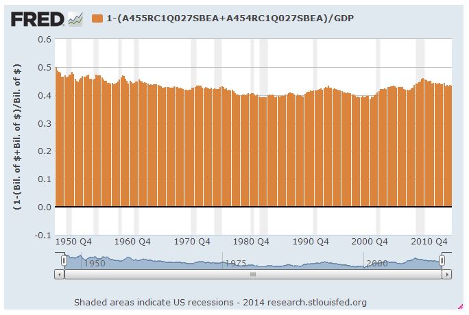
The conceptually valid analogue to profit margins is domestic corporate profit divided by GDP. But even this analogue contains distortions. GDP includes substantial non-corporate income: rental income, small business income, interest income on non-corporate bonds, etc. This income is unrelated to corporate sales, and therefore it should not be counted in the denominator of a profit margin expression. The extra dilution that it adds to the expression via the larger denominator is unneccessary and unhelpful. It distorts the profit margin higher or lower depending on whether the non-corporate income share is lower or higher.
The following chart shows the share of non-corporate income in GDP from 1947 to present (FRED). In the 1940s and 1950s, the share is above average, and this causes profit/GDP to be lower than it would be if it were tracking profit margins consistently. In the 1970s and 1980s, the share falls below average, and this makes profit/GDP look higher than it would be if it were tracking profit margins consistently.
Fortunately, we can eliminate the GDP distortion altogether. A direct, numerically accurate expression of the profit margin can be obtained from NIPA Table 1.14. Line 1 gives the aggregate “gross value added” of all corporate businesses operating in the United States, which is effectively equivalent to domestic corporate final sales (to end users). Divide after-tax domestic corporate profits (line 13) by domestic corporate final sales (Line 1) and you have the true profit margin for the aggregate domestic corporate economy (FRED).
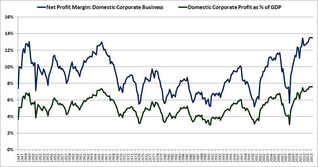
The green line is lower than the blue line because the denominator of the green line wrongly includes non-corporate sales. The difference in the patterns is small because the contribution of non-corporate income to GDP doesn’t change by all that much over the period–it oscillates between roughly 40% and 50% of the total. But there’s still a distortion. The green line is lower than it should be in the early part of the chart and higher than it should be in the middle, because the contribution of non-corporate income to GDP is higher and lower, respectively, in those periods.
Now, you might ask, to calculate the profit margin, why do we only include final sales to end users, instead of all corporate sales? The answer is to avoid double-counting the same output and revenue. Consider the following illustration:
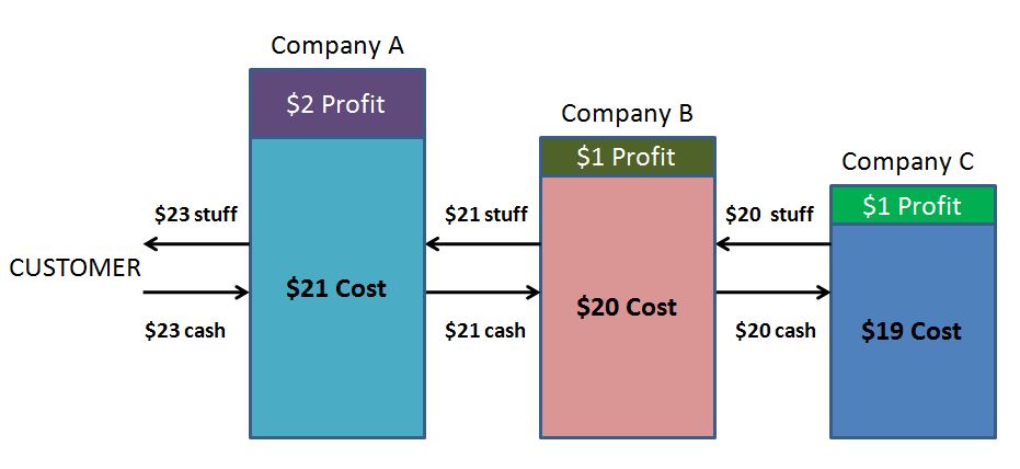
If you were to sum up the profits of each of Companies A, B, and C and divide them by the sum of their respective revenues, you would conclude that the aggregate profit margin equals ($2 + $1 + $1) = $4 divided by ($23 + $21 + $20) = $64 which is 6.3%. But in this aggregation, the same effective output and revenue is being counted multiple times, once at each stage of the value-addition process. The true profit margin–i.e., the true profit share of the total output–is ($2 + $1 + $1) = $4 divided by the final sale value to the end customer, $23, for a profit margin of 17.4%–a very different number.
Intermediation is the reason that the profit margins in the chart derived from NIPA Table 1.14 are substantially higher than the profit margins in the S&P 500 charts shown earlier. The profit margins calculated in the S&P 500 chart count the same output and revenues more than once, because some corporations in the S&P 500 are intermediary producers for and customers of other corporations in the S&P 500. Also, not all of the profit earned in the value-added chain of S&P 500 companies is counted, because not all intermediate and final producers in that chain are members of the S&P 500 (or even publically-traded).
The Chart to Use
Utilizing the data in NIPA Table 1.14 (FRED), we end up with the following chart, which is the only accurate NIPA chart of net profit margins for the macroeconomy, and the only NIPA chart that anyone should be citing in this debate (note the changed scale from above):
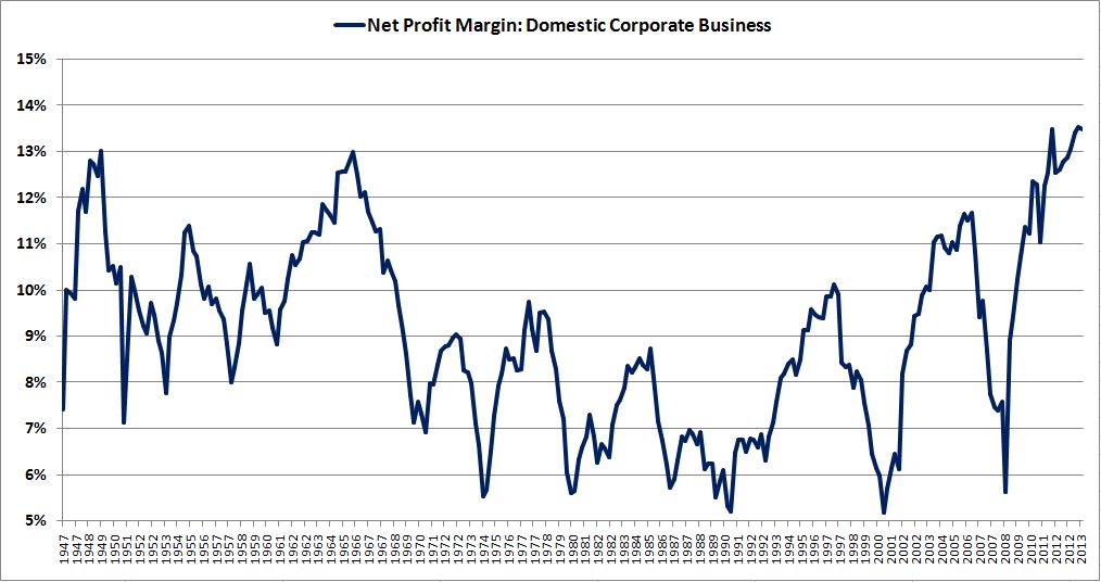
To be clear, the current profit margin is still elevated, but it’s not as wildly elevated as the CPATAX/GDP and CPATAX/GNP charts suggest. It currently sits 48.7% above its average from 1947 to 2013, and 54.7% above its average from 1947 to 2002. Importantly, it’s roughly in line with the highs of the 1940s and 1960s, rather than 25% above them, as in the earlier charts.
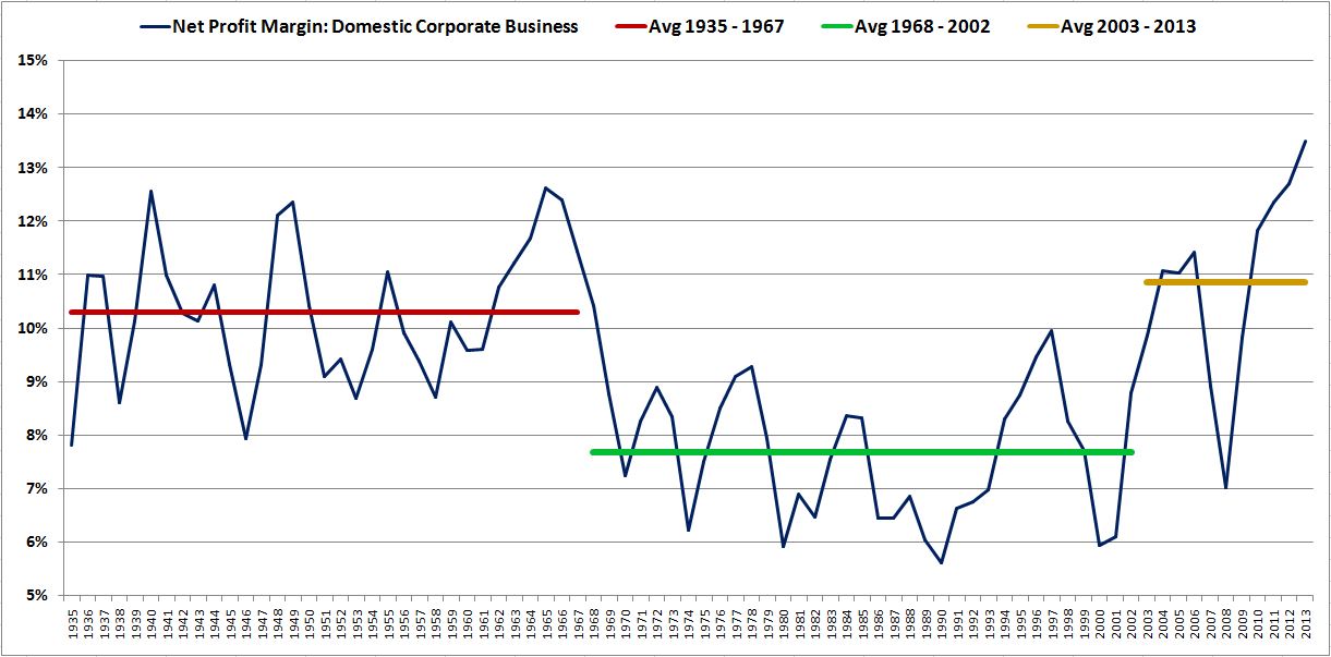
Unlike the earlier charts, this chart doesn’t lend itself as generously to the view that profit margins revert to a constant mean over time. There are long periods in the chart where the average profit margin is high–for example, the period from 1947 to 1967 (this period extends back to the mid 1930s in annual data, shown below), and the period from 2003 to 2013. There is also a long period where the average profit margin is low–the period from 1968 to 2002.
What does the chart suggest for future equity earnings growth and equity total returns? High profit margins are obviously a headwind, but the specific answer depends on your expectations with respect to mean-reversion. If, for example, you think profit margins will have to contract to the average of the entire data set, or even worse, to the average seen from 1968 to 2002, then future equity earnings growth is going to be negative, at least in real terms, and equity total returns will likely be poor. But those aren’t the only possibilities–nor are they necessarily the most likely possibilities. In the next piece, we will explore the possibilities in more detail.