My prior piece on asset supply has received significant interest, and so I feel an obligation to clarify. The title, “The Single Greatest Predictor of Future Stock Market Returns”, was something of an intentional exaggeration, chosen not only to draw attention to an out-of-the-box (and, in my opinion, useful) way of thinking about equity returns, but also to take a subtle jab at commonly-cited valuation metrics. The title was not meant to be taken literally.
In this piece, I’m going to do three things. First, I’m going to explain why “valuation vs. future return” charts can be deceptive, and why the correlations they purport to exhibit need to be scrutinized at a higher standard. Second, I’m going to explain the conceptual basis for valuation metrics in general. Third, I’m going to discuss the problem with valuation metrics–why it’s so hard to use them to accurately estimate future returns.
Adventures In Curve Fitting
Recall that I presented the following chart and table:

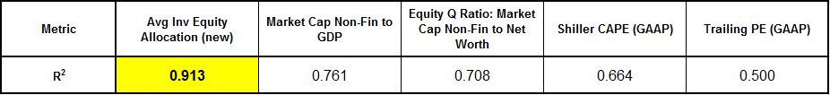
This chart compares with charts that valuation bears such as the (deservedly) well-respected Dr. John Hussman and Andrew Smithers present in their various market critiques.
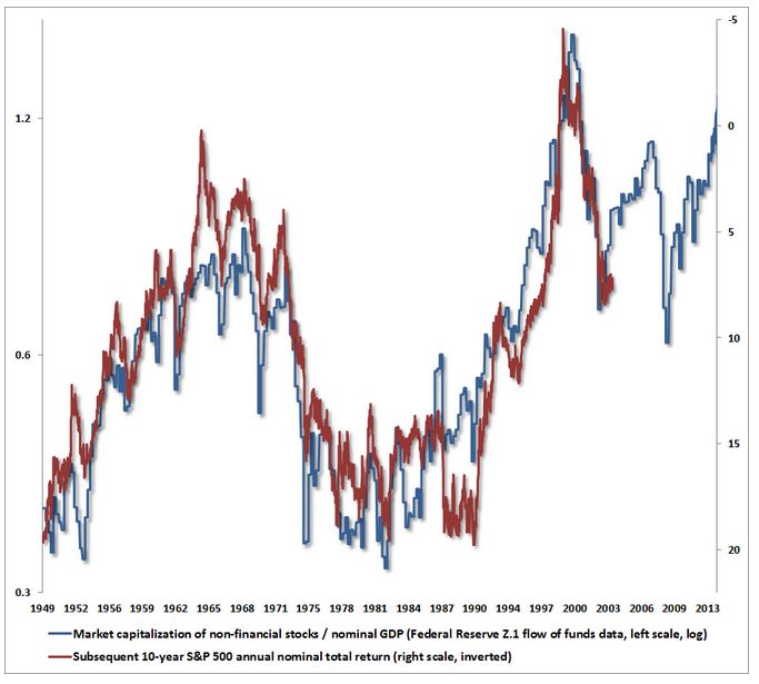
Charts like these (including my own) that attempt to correlate valuation metrics with future returns start off at a significant unfair advantage relative to other types of correlation efforts. Note that a valuation metric is just the current price divided by some variable (earnings, book value, sales, etc.). Neglecting dividends, the long-term future return is just the difference between the current price and some price far out in the future. Notice that “current price” shows up in both of these terms. Is it such a surprise, then, that valuation metrics and future returns seem to correlate well?
Roughly:
(1) Valuation Metric = Current Price / Variable
(2) Future Return = Future Price – Current Price
If future prices are inclined to rise at some rate over the long-term, then any time current price falls (and the same fall isn’t exactly mimicked way out in the future), (1) will go down, and (2) will go up. The valuation metric will fall, and the return–the distance between the future price and the current price–will rise. Hence the (inverse) correlation.
Now, if you choose a denominator for the valuation metric that is highly noisy, its noise may get in the way. But if you choose a denominator that is smooth over time, the pattern will hold. Notably, the plot of the valuation metric versus future return will end up producing a series of coinciding squiggles and jumps that create the visual illusion of non-trivial correlative strength, when there is none.
Let me illustrate with an example. Suppose that we invent the following arbitrary valuation metric–S&P 500 price divided by a straight line that goes from 74 in September of 1984 to 606 in December of 2013. The following chart shows the correlation between this arbitrary valuation metric and future S&P 500 price returns (inverted):
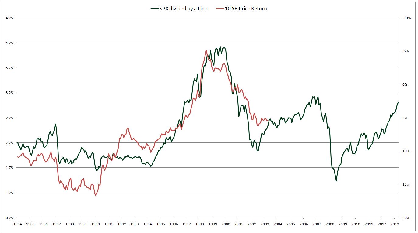
Not bad–at least for something this ridiculous. Notice the coinciding squiggles and jumps that occur throughout the plot. The two lines appear to be on the same wavelength, as if they were talking to each other. And they are–but in a way that is completely trivial and meaningless.
The line that I chose for the denominator of the metric goes from roughly 1/3 the S&P 500 level in 1982 to roughly 1/3 the S&P 500 level in 2013. The line rises gradually and is noise-free, therefore any change in price shows up as a deviation in the metric’s value, just as it shows up as an inverse change in the future return. The line roughly keeps up with the S&P 500 over the long-term, which is why it stays in a range on the chart.
In addition to being fooled by the coinciding squiggles and jumps, our eyes tend to hold the metric to a lower standard than they should. If it’s a little bit off, we say it’s OK, it’s expected, nature isn’t perfect. But wait, a “little bit” off on a chart like this could mean 5% per year over the next 10 years. That’s not a little bit.
If the purpose of the chart is to state what is already obvious, that lower present prices lead to higher future returns, all else equal, and that higher present prices lead to lower future returns, ell else equal–then fine, trivial claim accepted. But, of course, the chart is trying to do much more than make a trivial claim: it’s trying to make a specific claim about what the return is going to be going forward. The correlation in the chart should not be taken as evidence of the accuracy of that claim, because the correlation is artificially boosted by the endemic self-relation that exists between the terms being compared.
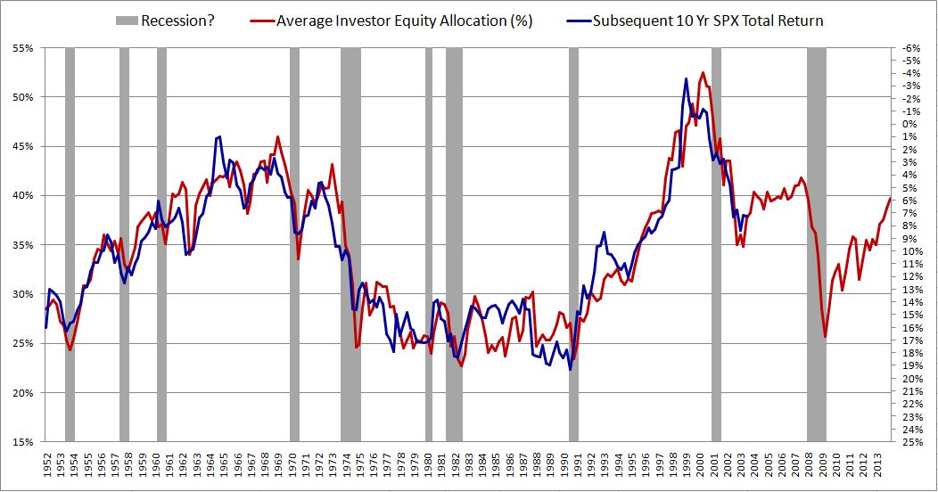
For these reasons, valuation v. future return charts need to be held to a higher standard of scrutiny. Ideally, they need to be tested out of sample. The reason I’m not prepared to say, with high confidence, that equity allocation relative to the norm is the “Single Greatest Predictor of Future Stock Market Returns”, is that I haven’t yet been able to test the approach in European and Japanese historical data (which are very difficult to obtain). Success in that data would give reliable, out-of-sample confirmation. There’s obviously going to be a correlation–the question is whether it will be as strong as it has been in the U.S. over the last 60 years. Personally, I have very strong doubts. It’s probably just a coincidence.
Let me illustrate the importance of out-of-sample testing with another example, potentially more relevant and useful. The following chart shows the inflation-adjusted total return of the S&P 500 from 1871 to 2013 (x-axis is the number of months since January 1871):
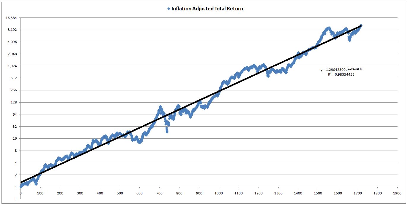
Let’s define a new valuation metric, we’ll call it TRvT (Total Return vs Trend). TRvT is calculated by taking the actual real total return of the S&P 500 (measured from 1871 forward) and dividing it by the real total return that would have been realized if the S&P had been on its exponential trendline from 1871 to 2013. The conceptual assumption behind the metric is that real total returns naturally follow a long-term trendline, which we approximate exponentially. In periods where total returns rise above that trendline, subsequent total returns end up being lower than normal, so as to bring the overall total return back to trend. And vice-versa.
Assume that it’s 1910, and we’re putting this metric to work. Here is what the chart of the metric looks like, alongside future 10 year real returns (inverted):

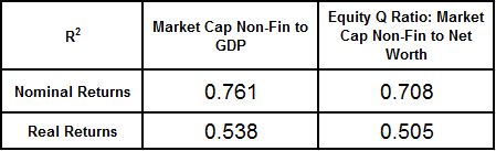
A decent fit. The r-squared versus future returns for the period is 0.76–higher than a number of the metrics that valuation bears are presently citing. Per the chart, the estimated real total return over the next 10 years will be around 6%–very attractive.
Now, watch what happens as we go forward in an out-of-sample test over the next century, where we no longer have the luxury of curve-fitting backwards:
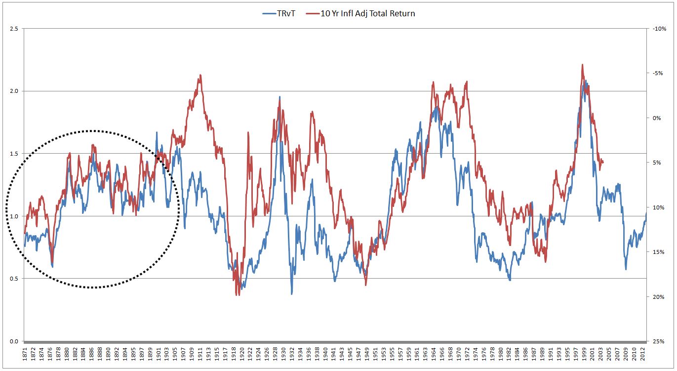
The dashed circle is where we were. As you can see, the metric blows up. It maintains a rough correlation with future returns over the next 100 years, as expected, but the returns don’t come close to what our curve-fit of the metric estimated them to be numerically. And that’s what counts in the end–the numerical estimation. It’s of no help to say that “low” on this chart is better than “high”, all else equal–that much is obvious and always true for any valuation metric. What we want from these metrics is a good estimate of long-term future returns. Unfortunately, such an estimate is very difficult to produce when looking forward out of sample (though much easier to produce when looking backwards with models in excel).
Of note, TRvT actually has a better correlation with future real returns than Shiller CAPE. From 1881 to 2003, it’s r-squared was 0.52, versus Shiller CAPE’s abysmal 0.32. The following chart shows 10 year inflation adjusted total returns (inverted) alongside TRvT and Shiller CAPE (both normalized to their historical averages):
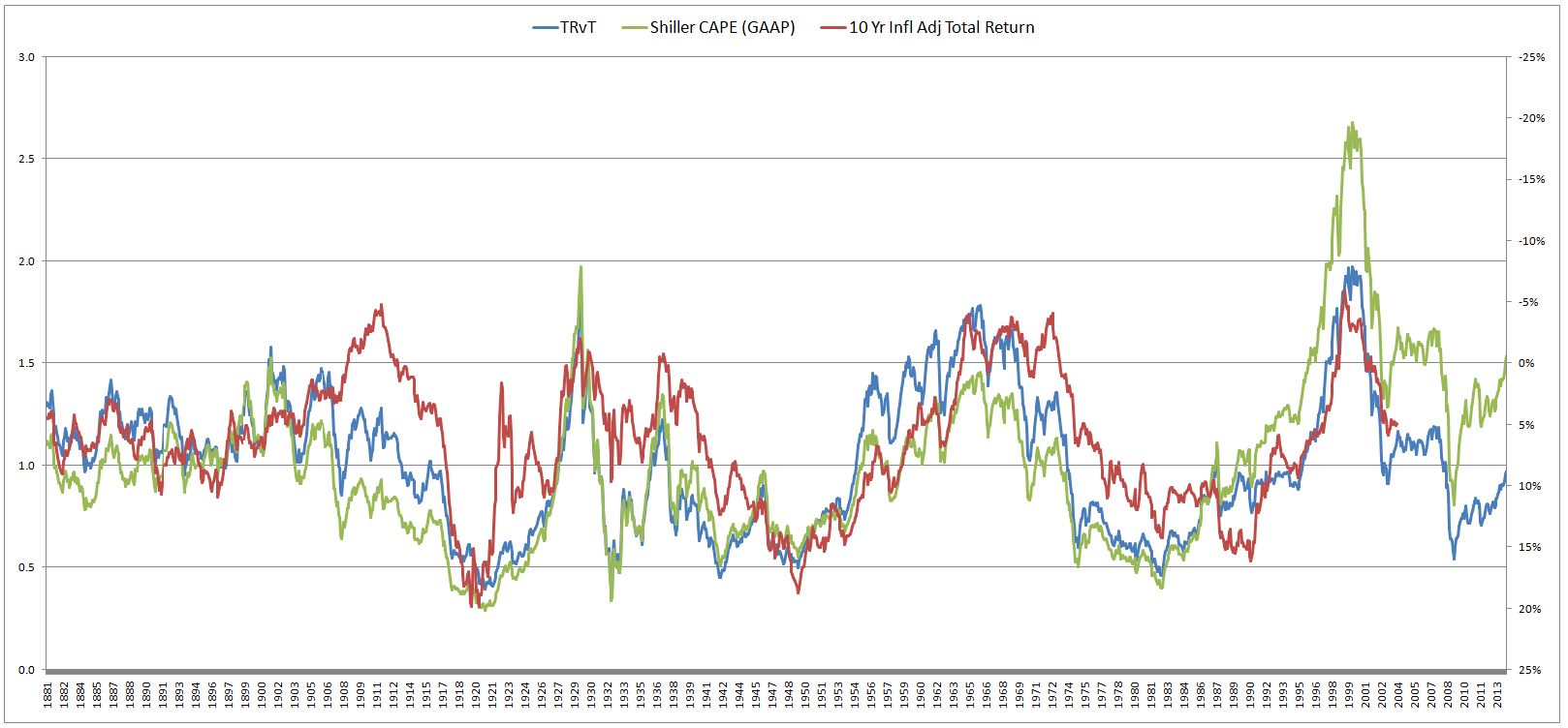
Neither metric performs particularly well, but in those cases where there are large deviations with the actual outcome (the red line), TRvT usually ends up closer. If you’re bullish, you’ll probably like it–it’s currently estimating 11% real returns over the next 10 years!
The Basis for Valuation Metrics
Valuation metrics operate on the assumption that stock prices can be modeled as rising in accordance with some trendline over the very long-term. If you determine where stock prices would be, right now, if they were on their trendline, you can make an estimate of the returns they will produce from now to some time far out in the future, when they will have inevitably returned to it. If stock prices are significantly above their trendline, then long-term future returns will end up being lower than normal, as prices revert back down to the trendline over the long-term. And vice-versa.
Let me illustrate with a simple example. Suppose that God tells you, in year zero, that he programmed stock prices to rise 8% per year over the next 10 years–not uniformly, but on average. So you buy in. Immediately thereafter, stock prices rise by 300%. As a smart, long-term investor, would you hold, or sell?
Obviously, you would sell. He just told you that over the next 10 years stocks were going to average 8% per year. This means that ten years from now they are going to be about 115% higher than they were when you bought them. But right now they are 300% higher than when you bought them. Thus you are effectively guaranteed to earn a negative return over the next 10 years.
You estimated their prospective return by assessing where they are relative to the trendline that God revealed to you: 8% per year. Valuation metrics are trying to conduct a similar calculation. Notice that TRvT conducted the calculation on price directly by assuming that real total returns follow an exponential curve–it fit an exponential curve to actual real total returns from 1871 to 2013, and then estimated future returns at each point in time by calculating where actual total returns were relative to that curve.
The other metrics try to find an external variable that grows commensurately with the trendline of stock prices over time. A comparison of current price to that variable will reveal where stock prices are relative to their trendline, and will therefore provide an estimation of what long-term future returns will be (as they return to that trendline, if they are not on it).
The critical difference between the classical “valuation” approach, which focuses on earnings, book values, sales, and the “allocation” approach that I proposed in the previous piece, is this. The classical “valuation” approach holds that the fundamental force behind the rising trend in stock prices is the rising trend in earnings. On this approach, the market has a certain “valuation intelligence” that it applies to price so as to keep the P/E ratio within some reasonable range, on average, over the long term. For this reason, the trendline of price ends up being the trendline of earnings, multiplied by some constant (the mean-reverting P/E multiple). The “valuation” approach tries to measure future returns by assessing where stock prices are relative to the trendline of earnings.
The “allocation” approach, in contrast, holds that the fundamental force behind the rising trend in price is not the rising trend in earnings, but the rising trend in the supply of cash and bonds that investors must hold in their portfolios. On this approach, the market has a certain equity allocation preference, a preference that fluctuates around some range across the business cycle. That preference can only be met if the supply of equity rises commensurately with the supply of cash and bonds. Because the corporate sector doesn’t create sufficient equity on net, the only way the supply of equity can rise is if prices increase. For this reason, the trendline of price ends up equaling the trendline of the supply of cash and bonds. The “allocation” approach tries to estimate future returns by assessing where stock prices are relative to that trendline.
Now, to return to the classical “valuation” approach, if the trendline of price equals the trendline of earnings, then to build a viable metric, we need to find an external variable that accurately represents the trendline of earnings. We might choose to use trailing twelve month (ttm) EPS, and make the valuation metric ttm P/E proper. The problem, however, is that ttm EPS tends to fall significantly during and after recessions. These recessionary drops are eventually undone in the subsequent recoveries, therefore they do not reflect the trendline of earnings. If we use ttm EPS in the metric, we will get a false signal in every recession that prices have jumped above their trendline, when in fact they haven’t.
Each of the familiar non-cyclical valuation metrics attempts to address the problem of cyclicality of earnings in its own way. “Market Cap to GDP” (or price to sales) uses Nominal GDP or sales to estimate the trendline in earnings–if profit margins are mean reverting, then the trendline of earnings is just the trendline in sales. “Equity Q-Ratio” (or price to book) uses net worth or book value to estimate the trendline in earnings–the assumption is that, like profit margins, return on equity is mean-reverting, therefore the trendline in earnings is just the trendline in book value.
Unlike “Market Cap to Nominal GDP” and “Equity Q Ratio”, Shiller CAPE doesn’t make a direct assumption about the mean reversion of profit margins or return on equity. Rather, it just calculates an average of earnings over the last ten years. That average smoothes out recessionary fluctuations. It rises in accordance with the earnings trendline, but filters out the unwanted earnings noise that comes from recessionary cyclicality.
The Problem with Valuation Metrics
The problem with attempts to use valuation metrics to predict future returns is that there is no reason why the trendline in stock prices needs to follow some neat, consistent, predictable function over time–not even over the long-term.
The basis for the claim that stock prices follow neat, consistent, predictable trendlines is the assumption that certain critical variables are mean-reverting–for example, P/E ratios, profit margins, growth rates, and so on. Unfortunately, these variables aren’t actually mean-reverting, not in any sense ordained by nature, and certainly not with the level of consistency that would be required for the valuation metrics to be able to make high confidence return predictions out of sample.
The claim of mean reversion is just the perception of someone who looks back and takes an average of relevantly-different individual cases. There is no reason why such an average has to be closely obeyed as we go forward into the future, where we encounter new cases with inevitably new sets of details and contingencies. When we test a hypothesis out of sample, we frequently find that the average of prior samples isn’t closely obeyed. All of these bearish valuation metrics provide a real-world example of the point. Sure, they work great to predict returns in the historical data that they’ve been fitted to. The problem is, they don’t work in the future data, the data we actually care about.
Assume, for a moment, that P/E multiples mean revert to within a reasonable range over the long-term, and that stock prices therefore adhere to the long-term trendline of earnings. Conceptually, why can’t the trendline of earnings rise at significantly different rates during different long-term historical periods? The answer is that it can. The actual data clearly bear this out.
The following chart shows nominal ttm EPS (GAAP) alongside nominal 10 year average ttm EPS (GAAP) from 1881 to 2013:
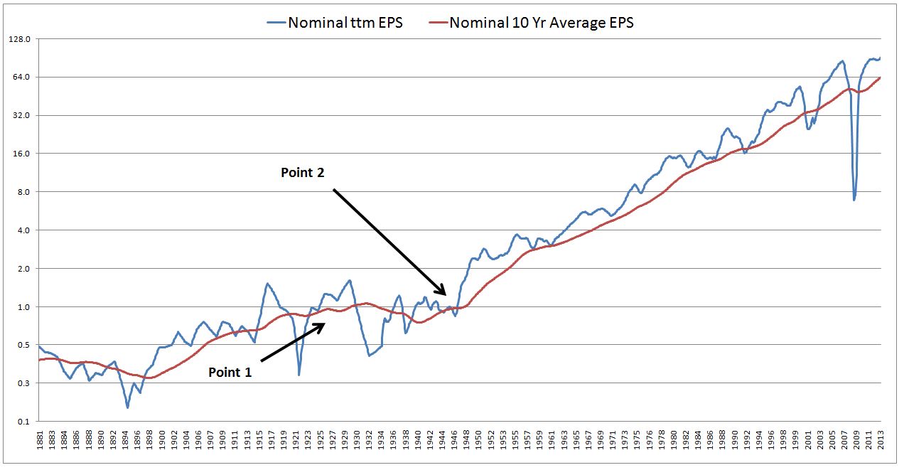
The red line, of course, is the 10 year approximation of the blue line, to smooth out the cyclicality. But notice that even the red line also has a type of cyclicality. It’s not a consistent function. Over long swaths of history, it sometimes rises faster, sometimes rises slower, and sometimes falls.
Compare Point 1 (circa 1926) and Point 2 (circa 1945) in the chart. Suppose that at Point 1, stock prices are below where they would be if a constant multiple were applied to the red line. Suppose that at Point 2 stock prices are above where they would be if a constant multiple were applied to the red line.
The implication would be that stocks are going to produce a higher return at Point 1 than at Point 2. At Point 1, they are below where the trendline says they should be, at Point 2 they are above it. However, the trendline is not a uniform, consistent function. It grows faster over the 10 years following Point 2 than over the 10 years following Point 1. For this reason, if the multiple stays constant, 10 year returns from Point 1 are actually going to be lower than Point 2, contrary to the metric’s suggestion. Any “fit” between the metric and future returns is going to fail in that period.
Part of the reason that the metric would fail is that it assumes no change in the contribution of inflation to earnings between the different periods. But can this assumption possibly be true? In particular, is it valid to assume that averages of inflation across 10 year periods are going to be roughly the same, regardless of which 10 year period you choose? Of course not. Compare the 1930s and 2000s with the 1940s, 1950s, and 1970s and 1980s for proof.
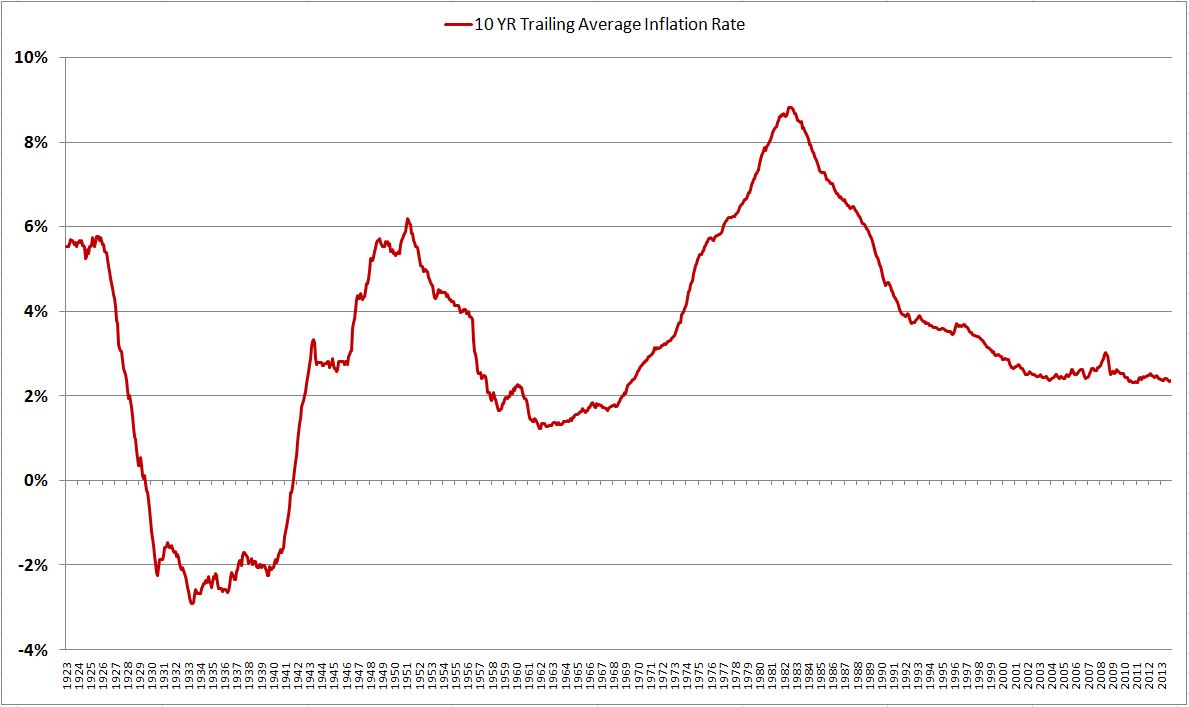
The Shiller CAPE adjusts trailing earnings for past inflation, to avoid unfairly biasing the most recent data in the average (the data that would have received the biggest boost from inflation). But when making predictions looking forward, it knows nothing about future inflation. Therefore, if it correlates to anything, it should correlate to the real returns of stocks, not the nominal returns. The same is true for all of these valuation metrics. They have no idea what inflation is going to be at any given time, looking forward out into the future. If they are being touted as predictors of nominal returns, which include the significant contribution of inflation to earnings, then something is obviously wrong.
Consider the following chart that John Hussman recently posted on twitter:
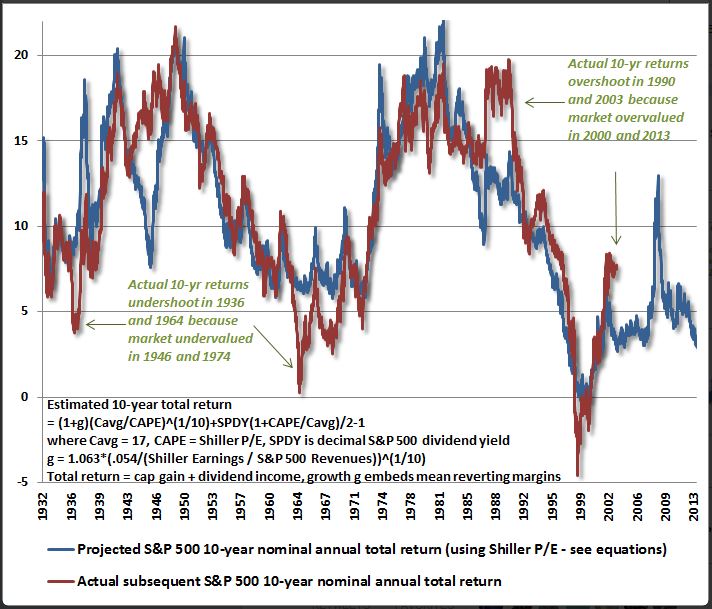
Well done. But you can immediately know that something is wrong, because John attempts to correlate the Shiller CAPE (and a second variable–revenues) to the nominal total returns of stocks. How does his metric know, in the year 1932, that over the next 10 years inflation is going to be low, roughly 0% per year, pushing the trendline of nominal earnings and therefore nominal stock prices down? How does the metric know, in 1975, that over the next 10 years, inflation is going to be very high, roughly 7% per year, pushing the trendline of nominal earnings and therefore nominal stock prices up? The difference is worth 7% in predicted nominal annual total returns, a huge chunk of the chart.
Now, reasons can be postulated for why the two lines still end up tracking each other, despite the ignored impact of inflation variability over time, but these reasons will end up being contrived. There is no way to know, looking forward, whether what is cited as the “reason” is actually just a coincidence unique to a specific period of market history that bails out the metric where inflation-related discrepancies would otherwise show up.
To take a stab, maybe the explanation is that if there is high inflation over a ten year period, there will be low P/E multiples, which will offset the higher earnings growth. We don’t have much data to test this claim (basically, one, maybe two decades of market history in one country), but even if it is true, there is no reason why the multiples have to be low at the end of a high inflation 10 year period, where they would impact returns: see 1977 to 1987 as a classic example. Moreover, the explanation wouldn’t explain periods such as 1932 to 1942 where inflation was extremely low or negative–did those periods end with higher multiples?
Notably, the fit doesn’t appear to be that strong, particularly in comparison to the metric we proposed (shown below). There appear to be a number deviating periods, some unrelated to the alleged valuation excesses. The metric is estimating between 2% to 3% returns over the next 10 years. But, let’s be realistic, it can’t assert those numbers with any more confidence than it might assert 5% or 6%–a few ticks higher on the chart. The difference makes a big difference: in this case, the difference between stocks being fairly valued (relative to the likely long-term returns of cash and bonds) and overvalued.
To be fair, the metric that I proposed is subject to similar criticisms:
How does the metric know, for example, that the forward growth rate of the total supply of cash and bonds in investor portfolios (shown below), and therefore the forward growth rate of stock prices (assuming allocation preferences are mean-reverting), is going to be higher in the 1970s and 1980s than in the 1990s?
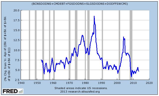
If the supply of cash and bonds rises faster than normal, then stock prices should rise faster than normal, assuming the equity allocation preference doesn’t change over the period. Therefore, the future return should be higher. How does the metric model this fact? It doesn’t. For whatever reason, it gets lucky, and any effect of higher cash and bond supply growth gets offset by other coincidences, or just dismissed as visual noise.
Now, this doesn’t mean that allocation dynamics don’t affect stock prices, or that they aren’t an important driver of returns–they are, without question. We should pay attention to them, factor them into our market analyses. But, admittedly, the metric doesn’t deserve the reputation for predictive precision that the chart, by chance, affords it.
Consider John’s chart of Market Cap to GDP:
Market Cap to GDP and Q-Ratio (market cap to net worth) make the same assumption about GDP and book values that the allocation metric makes about the supply of cash and bonds in investor portfolios–namely, that stock prices grow, over the long-term, on par with them. But how do these metrics know how high nominal GDP growth and nominal book value growth are going to be at any given time, looking forward? How can they accurately predict those values across a data set with highly variable inflation?
If the metrics were being correlated with real returns, they would have a hope of getting by without knowing the inflation component–but in this case, Dr. Hussman is once again attempting a correlation to nominal returns, which implies that the metric somehow knows what the different contributions of inflation to returns are going to be in each of the different 10 year periods.
Notably, if you attempt to correlate the metrics to real returns, the performance gets worse. So what you have is a valuation metric that cannot predict real returns, but only nominal returns–even though it knows absolutely nothing about inflation:
One is tempted to ask, would such a metric work in an out of sample test in 1993 Brazil, or 2008 Zimbabwe?
For all of these reasons, looking backwards and fitting valuation metrics to precise returns so as to come up with a precise estimate is not a productive exercise. Unless the ensuing “value v. return” charts are rigorously and extensively tested out of sample (without the chart-maker already knowing the answer, and being able to spend time “tweaking” out a visually-pleasing hindsight fit that takes advantage of happenstance coincidences in market history), their predictions should be ignored, or at least taken very lightly, as an extremely general comment about the future. Maybe the comment here is: future returns will be lower than history. Fine, but don’t try to go any farther, and distinguish between low as 5% and low as 2%.
The original chart of equity allocation is operational proof of this point. A variable that seemingly has nothing to do with valuation predicts returns substantially better over the data set than all of the profit-margin-mean-reversion valuation metrics, and also the Shiller CAPE metric. It turns out that there are interesting reasons, unrelated to valuation, why that might be the case–but those points are secondary here.
Now, the valuation bears will surely be able to point to alleged coincidences in the 1952 to 2003 predictive period that cause the equity allocation metric to beat their metrics–for example, the fact that the metric labels markets from the late 1980s onwards as cheaper than they actually were (because debt to GDP ratios happened to be higher), and that this discrepancy is then bailed out by the fact that markets subsequently went into a bubble and have stayed in a significantly overvalued state ever since (at least on their view–they cite this ongoing state of overvaluation as the reason why their metrics are not currently working).
But even if true, this is exactly the kind of coincidence that is at the heart of the success of their own metrics, across other periods of history. All of these metrics begin with an unfair head start, all of them have the squiggles and jumps that create illusions of additional correlation, all of them stay roughly on scale. Coincidences are frequently what cause them to correlate well over the various periods where they do correlate well. And therefore none of them have the ability to predict future returns with the level of confidence and precision that would be useful to an investor.
The right way to model returns–and to debate the valuation issue–is not to put together curve-fits (as I admittedly did in the prior piece, and as so many valuation bears do), but to use sound macroeconomic and market analysis to estimate the likely trajectory of the variables that govern returns. If we assume that the P/E multiple is not going to change going forward, then future returns, neglecting dividends, are going to be a function of the drivers of earnings growth: inflation rates, real GDP (sales) growth, and profit margin changes. Profit margins are significantly elevated right now–they are what the current valuation debate hinges on. I plan to discuss them in future pieces.