Of all the arguments for a significantly bearish outlook, I find John Hussman’s chart of estimated future equity returns, shown below, to be among the most compelling. I’ve spent a lot of time trying to figure out what is going on with this chart, trying to understand how it is able to accurately predict returns on a point-to-point basis. I’m pretty confident that I’ve found the answer, and it’s quite interesting. In what follows, I’m going to share it.
The Prediction Model
In a weekly comment from February of last year, John explained the return forecasting model that he uses to generate the chart. The basic concept is to separate Total Return into two sources: Dividend Return and Price Return.
(1) Total Return = Dividend Return + Price Return
The model approximates the future Dividend Return as the present dividend yield.
(2) Dividend Return = Dividend Yield
The model uses the following complicated equation to approximate the future price return,
(3) Price Return = (1 + g) * (Mean_V/Present_V) ^ (1/t) – 1
The terms in (3) are defined as follows:
- g is the historical nominal average annual growth rate of per-share fundamentals–revenues, book values, earnings, and so on–which is what the nominal annual Price Return would be if valuations were to stay constant over the period.
- Present_V is the market’s present valuation as measured by some preferred valuation metric: the Shiller CAPE, Market Cap to GDP, the Q-Ratio, etc.
- Mean_V is the average historical value of the preferred valuation metric.
- t is the time horizon over which returns are being forecasted.
Assuming that valuations are not going to stay constant, but are instead going to revert to the mean over the period, the Price Return will equal g adjusted to reflect the boost or drag of the mean-reversion. The term (Mean_V/Present_V) ^ (1/t) in the equation accomplishes the adjustment.
Adding the Dividend Return to the Price Return, we get the model’s basic equation:
(4) Total Return = Dividend Yield + (1 + g) * (Mean_V/Present_V) ^ (1/t) – 1
John typically uses the equation to make estimates over a time horizon t of 10 years. He also uses 6.3% for g. The equation becomes:
Total Return = Dividend Yield + 1.063 * (Mean_V/Present_V) ^ (1/10) – 1
To illustrate how the model works, let’s apply the Shiller CAPE to it. With the S&P 500 around 1950, the present value of the Shiller CAPE is 26.5. The historical mean, dating back to 1947 is 17. The market’s present dividend yield is 1.86%. So the predicted nominal 10 year total return is: .0186 + 1.063 * (17/26.5)^(1/10) – 1 = 3.5% per year.
Interestingly, when the Shiller CAPE is used in John’s model, the current market gets doubly penalized. The present dividend payout ratio of 35% is significantly below the historical average of 50%. If the historical average payout ratio were presently in place, the dividend yield would be 2.7%, not 1.86%. Of course, the lost dividend return is currently being traded for growth, which is higher than it would be under a higher dividend payout ratio. But the higher growth is not reflected anywhere in the model–the constant g, 6.3%, remains unchanged. At the same time, the higher growth causes the Shiller CAPE to get distorted upward relative to the past, for reasons discussed in an earlier piece on the problems with the Shiller CAPE. But the model makes no adjustment to account for the upward distortion. The combined effect of both errors is easily worth at least a percent in annual total return.
In place of the Shiller CAPE, we can also apply the Market Cap to GDP metric to the model. The present value of Market Cap to GDP is roughly 1.30. The historical mean, dating back to 1951, is 0.64. So the predicted nominal 10 year total return is: .0186 + 1.063 * (0.64/1.30) ^ (1/10) – 1 = 0.9% per year. Note that Market Cap to GDP is currently being distorted by the same increase in foreign profit share that’s distorting CPATAX/GDP. As I explained in a previous piece, GDP is not an accurate proxy for the sales of U.S. national corporations.
Finally, we can apply the Q-Ratio–the market value of all non-financial corporations divided by their aggregate net worth–to the model. The present value of the Q-Ratio is 1.16. The historical mean value is .61. So the predicted nominal return over the next 10 years is: 0.185 + 1.063 * (0.65/1.16) ^ (1/10) – 1 = 2.1% per year. Note that the Q-Ratio, as constructed, doesn’t include the financial sector, which is by far the cheapest sector in the market right now. If you include the financial sector in the calculation of the Q-Ratio, the estimated return rises to 2.8% per year.
Charting the Predicted and Actual Returns
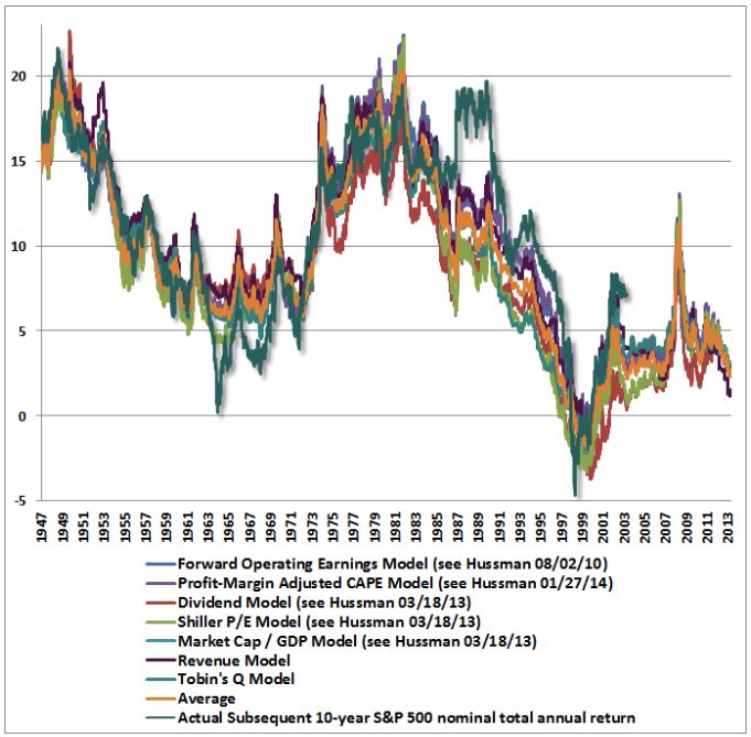
In a piece from March of last year, John applied a number of different valuation metrics to the model, producing the following chart of predicted and actual returns:

In March of this year he posted an updated version of the chart that shows the model’s predictions for 7 different valuation metrics:
As you can see, over history, the correlations between the predicted returns and the actual returns have been very strong. The different valuation metrics seem to be speaking together in unison, forecasting extremely low returns for the market over the next 10 years. A number of analysts and commentators have cited the chart as evidence of the market’s extreme overvaluation, to include the CEO of Business Insider, Henry Blodget.
In a piece written in December, I argued that the chart was a “curve-fit”–an exploitation of coincidental patterning in the historical data set that was unlikely to repeat going forward. My skepticism was grounded in the fact that the chart purported to correlate valuation with nominal returns, unadjusted for inflation. Most of the respected thinkers that write on valuation–for example, Andrew Smithers, Jeremy Grantham, and James Montier–assert a relationship between valuation and real returns, not nominal returns. One would expect valuation to drive real returns, rather than nominal returns, because stocks are a real asset, a claim on the output of real capital. Changes in the prices of goods and services will translate into similar changes in nominal fundamentals: revenues, book values and profits. Given that those changes are impossible to predict based on valuation, taking them out of a valuation model that is trying to predict returns should improve the model’s accuracy. But John doesn’t take them out–he keeps them in–and is somehow able to produce a tight fit in spite of it.
Interestingly, the valuation metrics in question actually correlate better with nominal 10 year returns than they do with real 10 year returns. That doesn’t make sense. The ability of a valuation metric to predict future returns should not be improved by the addition of noise.

Using insights discussed in the prior piece, I’m now in a position to offer a more specific and compelling challenge to John’s chart. I believe that I’ve discovered the exact phenomenon in the chart that is driving the illusion of accurate prediction. I’m now going to flesh that phenomenon out in detail.
Three Sources of Error: Dividends, Growth, Valuation
There are three expected sources of error in John’s model. First, over 10 year periods in history, the dividend’s contribution to total return has not always equaled the starting dividend yield. Second, the nominal growth rate of per-share fundamentals has not always equaled 6.3%. Third, over different 10 year periods across history, valuations have not always reverted to the mean–in fact, in some periods, they’ve gone from starting close to the mean, to moving away from it.
We will now explore each of these errors in detail. Note that the mathematical convention we will use to define “error” will be “actual result minus model-predicted result.” A positive error means reality overshot the model; a negative error means the model overshot reality. Generally, whatever is shown in blue on a graph will be model-related, whatever is shown in red will be reality-related.
(1) Dividend Error
The following chart shows the starting dividend yield and the actual annual total return contribution from the reinvested dividend over the subsequent 10 year period. The chart begins in 1935 and ends in 2004, the last year for which subsequent 10 year return data is available:

(Details: We approximate the total return contribution from the reinvested dividend by subtracting the annual 10 year returns of the S&P 500 price index from the annual 10 year returns of the S&P 500 total return index. The difference between the returns of the two indices just is the reinvested dividend’s contribution.)
There are two main drivers of the dividend error. First, the determinants of future dividends–earnings growth rates and dividend payout ratios–have been highly variable across history, even when averaged over 10 year periods. The starting dividend yield does not capture their variability. Second, dividends are reinvested at prevailing market valuations, which have varied dramatically across different bull and bear market cycles. As I illustrated in a previous piece, the valuation at which dividends are reinvested determines the rate at which they compound, and therefore significantly impacts the total return.
(2) Growth Error
Even when long time horizons are used, the nominal growth rate of per-share fundamentals–revenues, book values, and smoothed earnings–frequently ends up not being equal the model’s 6.3% assumption. As an illustration, the following chart shows the actual nominal growth rate of smoothed earnings (Robert Shiller’s 10 year EPS average, which is the “fundamental” in the Shiller CAPE) from 1935 to 2004:

As you can see in the chart, there is huge variability in the average growth across different 10 year periods. From 1972 to 1982, for example, the growth exceeded 10% per year. From 1982 to 1992, the growth was less than 3% per year. Part of the reason that the variability is so high is that the analysis is a nominal analysis, unadjusted for inflation. Inflation is a significant driver of earnings growth, and has varied substantially across different periods of market history.
(3) Valuation Error
Needless to say, for any chosen valuation metric, one can point to many 10 year periods in history where the metric will have ended the period far away from its historical mean. Indeed, the only way for a valuation metric to finish every identifiable 10 year period on its mean would be for the valuation metric to always be on its mean–i.e., to never deviate from it at all.
Any time a valuation metric used in the model does deviate from its mean, the model will produce an error for 10 year periods that end at that time, because it will have wrongly assumed that a mean-reversion will have occurred. It follows that any valuation-based model, if it’s being honest, should produce errors in certain places–specifically, those places where the terminal valuation (at the end of the 10 year period) deviated from the historical mean. If we come across a model that shows no error, then something is amiss.
Now, the following chart shows the Shiller CAPE from 1935 to 2014:

As you can see, the metric frequently lands at values far away from 17, the presumed mean. Every time this occurs at the end of a 10 year period, the predicted returns and the actual returns should deviate, because the predictions are being made on the basis of a mean-reversion that doesn’t actually happen.
Now, when we use a long time horizon–for example, 10 years–we spread out the the valuation error over time, and therefore we reduce its annual magnitude. But even with this reduction, the annual error is still quite significant. The following chart shows what the S&P 500 annual price return actually was (red) over 10 year periods, alongside what it would have been (blue) if the Shiller CAPE had mean-reverted to 17 over those periods.

The difference between the two lines is the model’s “valuation error.” As you can see, it’s a very large error–worth north of 10% per year in some periods–particularly in periods after 1960 (after which valuation took what seems to be a secular turn upward).
Of the three types of errors, the largest is the valuation error, which has fluctuated between plus and minus 10%. The second largest is the growth error, which has fluctuated between plus and minus 4%. The smallest is the dividend error, which has fluctuated between plus and minus 2%. As we saw in the previous piece, growth and dividends are fungible and inversely related. From here forward, we’re going to sum their errors together, and compare the sum to the larger valuation error.
Plotting the Errors Alongside Each Other
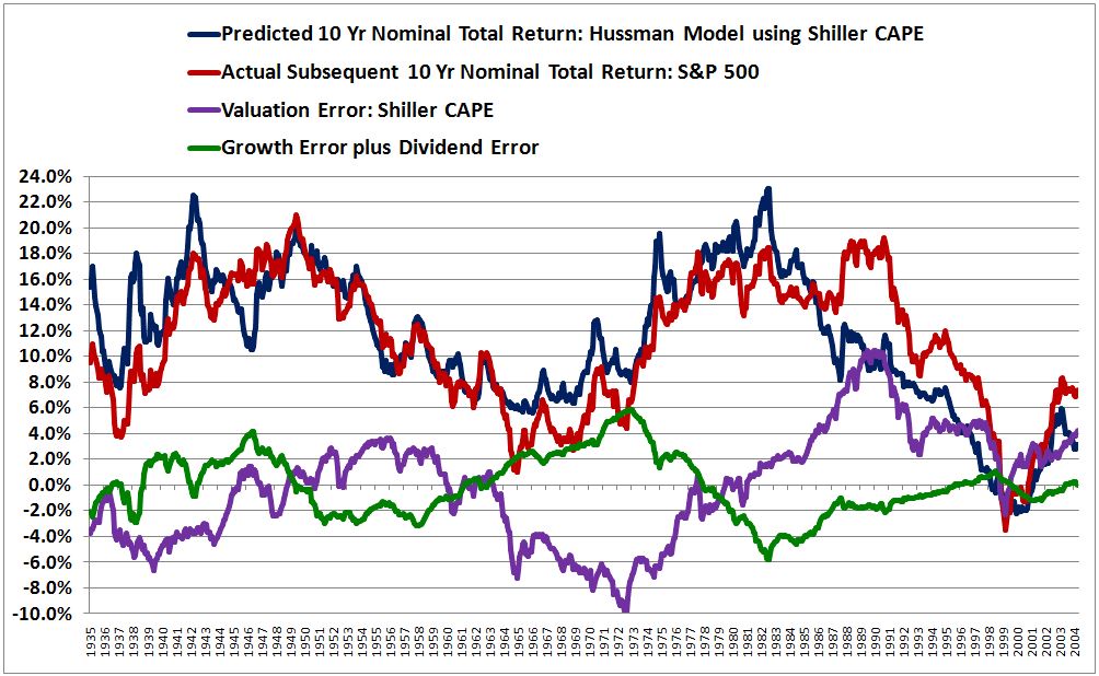
The following chart is a reproduction of the model from 1935 to 2014 using the Shiller CAPE:

The correlation between predicted returns and actual returns is 0.813. Note that John is able to push this correlation above 0.90 by applying a profit margin adjustment to the equation. Unfortunately, I don’t have access to S&P 500 sales data prior to the mid 1960s, and so am unable to replicate the adjustment.
To see what is happening to produce the attractive fit, we need to plot the errors in the model alongside each other. The following chart shows the sum of the growth and dividend errors (green) alongside the valuation error (purple) from 1935 to 2004 (the last year for which actual subsequent 10 year return data is available):

Now, look closely at the errors. Notice that they are out of phase with each other, and that they roughly cancel each other out, at least in the period up to the mid 1980s, which–not coincidentally–is the period in which the model produces a tight fit.

The following chart shows the errors alongside the predicted and actual returns:
Again, look closely. Notice that whenever the sum of the errors (the sum of the green and purple lines) is positive, the actual return (the red line) ends up being greater than the predicted return (the blue line). Conversely, whenever the sum of the errors (the sum of the green and purple lines) is negative, the actual return (the red line) ends up being less than the predicted return (the blue line). For most of the chart, the sum of the errors is small, even though the individual errors themselves are not. That’s precisely why the model’s predictions are able to line up well with the actual results, even though the model’s underlying assumptions are frequently and significantly incorrect.
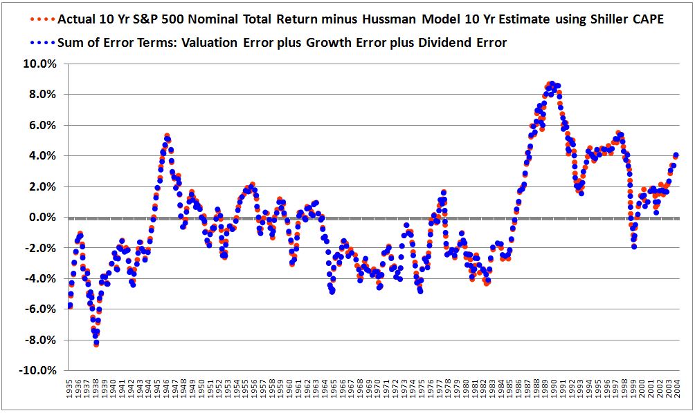
For proof that we are properly modeling the errors, the following chart shows the difference between the actual and predicted returns alongside the sum of the individual error terms. The two lines land almost perfectly on top of each other, as they should.
I won’t pain the reader with additional charts, but suffice it to say that all of the 7 metrics in the chart shown earlier, reprinted below, exhibit this same error cancellation phenomenon. Without the error cancellation, none of the predictions would track well with the actual results.
In hindsight, we should not be surprised to find that the fit in the chart is driven by error cancellation. The assumptions that annual growth will equal 6.3% and that valuations will revert to their historical means by the end of every sampling period are frequently wrong by huge amounts. Logically, the only way that a model can make seemingly accurate return predictions based on these inaccurate assumptions is if the errors cancel each other out.
Testing for a Curve-Fit: Changing the Time Horizon
Now, before we conclude that the chart and the model are “curve-fits”–exploitations of superficial coincidences in the studied historical period that cannot be relied upon to recur or repeat in the data going forward–we need to entertain the possibility that the cancellations actually do reflect real fundamental relationships. If they do, then the cancellations will likely continue to occur going forward, which will allow the model to continue to make accurate predictions, despite the inaccuracies in its underlying assumptions.
As it turns out, there is an easy way to test whether or not the chart and the model are curve-fits: just expand the time horizon. If a valuation metric can predict returns on a 10 year horizon, it should be able to predict returns on, say, a 30 year horizon. A 30 year horizon, after all, is just three 10 year horizons in series–back to back to back. Indeed, each data point on a 30 year horizon provides a broader sampling of history and therefore achieves a greater dilution of the outliers that drive errors. A 30 year horizon should therefore produce a tighter correlation than the correlation produced by a 10 year horizon.
The following chart shows the model’s predicted and actual returns using the Shiller CAPE on a 30 year prediction horizon rather than a 10 year prediction horizon.

As you can see, the chart devolves into a mess. The correlation falls from an attractive 0.813 to an abysmal 0.222–the exact opposite of what should happen, given that the outliers driving the errors are being diluted to a greater extent on the 30 year horizon. Granted, the peak deviation between predicted and actual is only around 4%–but that’s 4% per year over 30 years, a truly massive deviation, worth roughly 225% in additional total return.
The following chart plots the error terms on the 30 year horizon:

Crucially, the errors no longer offset each other. That’s why the fit breaks down.

Now, as a forecasting horizon, the choice of 30 years is just as arbitrary as the choice of 10 years. What we need to do is calculate the correlations across all reasonable horizons, and disclose them in full. To that end, the following table shows the correlations for 30 different time horizons, starting at 7 years and going out to 36 years. To confirm a similar breakdown, the table includes the performance of the model’s predictions using Market Cap to GDP and the Q-Ratio as valuation inputs.

At around 20 years, the correlations start to break down. By 30 years, no correlation is left. What we have, then, is clear evidence of curve-fitting. There is a coincidental pattern in the data from 1935 to 2004 that the model latches onto. At time horizons between roughly 10 years and 20 years in that slice of history, valuation and growth happen to overshoot their assumed means in equal and opposite directions, such that the associated errors cancel, and an attractive fit is generated. When different time horizons are used, such as 25 years or 30 years or 35 years, the overshoots are brought into a phase relationship where they no longer happen to cancel. With the quirk of cancellation lost, the correlation unravels.
For a concrete example of the coincidence in question, consider the stock market of the 1970s. As we saw earlier, from 1972 to 1982, nominal growth was very strong, overshooting its mean by almost 4% (10% versus the assumed value of 6.3%). The driver of the high nominal growth was notoriously high inflation–changes in the price index driven by lopsided demography and weak productivity growth. The high inflation eventually gave way to an era of very high policy interest rates, which pulled down valuations and caused the multiple at the end of the period to dramatically undershoot the mean (a Shiller CAPE of 7 versus a mean of 17). Conveniently, then, the overshoot in growth and the undershoot in valuation ended up coinciding and offsetting each other, producing the appearance of an accurate prediction for the period, even though the model’s specific assumptions about valuation and growth were way off the mark.
If you change the time horizon to 30 years, analyzing the period from 1972 to 2002 instead of the period from 1972 to 1982, the convenient cancellation ceases to take place. Unlike in 1982, the market in 2002 was coming out of a bubble, and the multiple significantly overshot the average, as did the growth over the entire period–producing two uncancelled errors in the prediction.
Pre-1930s Data: Out of Sample Testing
John probably stumbled upon his model by searching for it, by trying out different possible horizons, and seeing what the results were. In his search, he found one that works–roughly 10 years. But any time you sample a large set, you’re going to find a few cases that give you the result you want, something that looks good. To exclude chance as the explanation for the success, you need to explain why the success occurred in that specific case, but not in the others. What is John’s explanation? What is his basis for telling us that the model’s ability to produce decent fits on 10 year horizons, but not on other horizons–25 years, 35 years, is more than a coincidence that he has identified through his search efforts?
At the Wine Country Conference (Scribd, YouTube), John explained that his model’s predictions work best on time horizons that roughly correspond to odd multiples of half market cycles. A full market cycle (peak to peak) is allegedly 5 to 7 years, so 7 to 10 years, which is John’s preferred horizon of prediction, would be roughly 1.5 times a full market cycle, or roughly 3 times a half market cycle.
In the presentation, he showed the model’s performance on a 20 year horizon and noted the slightly “off phase” profile, attributing it to the fact that 20 years doesn’t properly correspond to an odd multiple of a half market cycle. From the presentation:

What John seems to be missing here is the cause of the “off phase” profile. The growth and valuation errors that were nicely offsetting each other on the 10 year horizon are being pulled into a different relative positioning on the 20 year horizon, undoing the illusion of accurate prediction. As the time horizon is extended from 20 years to 30 years, the fit unravels further. This loss of accuracy is not a problem with 20 years or 30 years as prediction horizons per se; rather, it’s a problem with the model. The model is making incorrect assumptions that get bailed out by superficial coincidences in the historical period being sampled. These coincidences do not survive significant changes of the time horizon, and therefore should not be trusted to recur in future data.
Now, as a strategy, John could acknowledge the obvious, that error cancellation effects are ultimately driving the correlations, and still defend the model by arguing that those effects are somehow endemic to economies and markets on horizons such as 10 years that correspond to odd multiples of half market cycles. But this would be a very peculiar claim to make. To believe it, we would obviously need a compelling supporting argument, something to explain why it’s the case that economies and markets function such that growth and valuation tend to reliably overshoot their means by equal and opposite amounts on those, but not on other horizons. Are there any explanations we can give? Certainly not any persuasive ones. The claim is entirely post-hoc.
In the previous piece, we saw that the “Real Reversion” method produced highly accurate predictions on a 40 year horizon because the growth and valuation errors in the model conveniently cancelled each other on that horizon, just as the errors in John’s model conveniently cancel each other on a 10 year horizon. The errors didn’t cancel each other on a 60 year horizon, and so the fit fell apart, just as the fit for John’s model falls apart when the time horizon is extended. To give a slippery defense of “Real Reversion”, we could argue that the error cancellation seen on a 40 year horizon is somehow endemic to the way economies and markets operate, and that it will reliably continue into the future data. But we would need to provide an explanation for why that’s the case, why the errors should be expected to cancel on a 40 year horizon, but not on a 60 year horizon. We can always make up stories for why coincidences happen the way they do, but to deny that the coincidences are, in fact, coincidences, the stories need to be compelling. What is the compelling story to tell here for why the growth and valuation errors in John’s model can be confidently trusted to cancel on horizons equal to 10 years (or different odd multiples of half market cycles) going forward, but not on other horizons? There is none.
Even if the claim that growth and valuation errors are inclined to cancel on horizons equal to odd multiples of half market cycles is true, that still doesn’t explain why the model fails on a 30 year horizon. 30 years, after all, is an odd multiple of 10 years, which is an odd multiple of a half market cycle; therefore, 30 years is an odd multiple of a half market cycle (unlike 20 years). If the claim is true, the model should work on that horizon, especially given that the longer horizon achieves a greater dilution of errors. But it doesn’t work.
To return to the example of the early 1970s, the 10 year period from 1972 to 1982 started at a business cycle peak and landed in a business cycle trough–what you would expect over a time horizon equal to an odd multiple of a half market cycle. But the same is true of the 30 year period from 1972 to 2002–it began at a business cycle peak and ended at a business cycle trough. If the model can accurately predict the 10 year outcome, and not by luck, then why can’t it accurately predict the 30 year outcome? There is no convincing answer. The success on the 10 year horizon rather than the 30 year horizon is coincidental. 10 years gets “picked” from the set of possible horizons not because there is a compelling reason for why it should work better than other horizons, but because it just so happens to be the horizon that achieves the desired fit, supporting the desired conclusion.
This brings us to another problem with the chart: sample size. To make robust claims about how economic and market cycles work, as John seems to want to do, we need more than a sample size of 2, 3, or 4–we need a sample size closer to 100 or 1,000 or 10,000. Generously, from 1935 to 2004, we only have four separate periods, each driven by different and unrelated dynamics, in which the growth and valuation errors offset each other (and one additional period in which they failed to offset each other–the period associated with the last two decades, where the model’s performance has evidently deteriorated). Thus we don’t even have a tiny fraction of what we would need in order to confidently project continued offsets out into the unknown future.
Ultimately, to assert that an observed pattern–in particular, a pattern that lacks a compelling reason or explanation–represents a fundamental feature of reality, rather than a coincidence, it is not enough to point to the data from which the pattern was gleaned, and cite that data as evidence. If I want to claim, as a robust rule, that my favorite sports team wins championships every four years, or that every time I eat a chicken-salad sandwich for lunch the market jumps 2% (h/t @mark_dow), I can’t point to the “data”–the last three or four occurrences–and say “Look at the historical evidence, it’s happened every time!” It’s “happening” is precisely what has led me to the unusual hypothesis in the first place. At a minimum, I need to test the unusual hypothesis in data that is independent of the data that led me to it.
Ideally, I would test the hypothesis in the unknown data of the future, running the experiment over and over again in real-time to see if the asserted thesis holds up. If the thesis does hold up–if chicken-salad sandwiches continue to be followed by 2% market jumps–then we’re probably on to something. What we all intuitively recognize, of course, is that the thesis won’t hold up if tested in this rigorous way. It’s only going to hold up if tested in biased ways, and so those are the ways that we naturally prefer for it to be tested (because we want it to hold up, whether or not it’s true).
Now, to be fair, in the present context, a rigorous real-time test isn’t feasible, so we have to settle for the next best thing: an out of sample test in existing data that we haven’t yet seen or played with. There is a wealth of accurate price, dividend and earnings data for the U.S. stock market, collected by the Cowles Commission and Robert Shiller, that is left out of John’s chart, and that we can use for an out of sample test of his model. This data covers the period from 1871 to the 1930s. In the previous piece, I showed that we can make return predictions in that data that are just as accurate as any return predictions that we might make in data from more recent periods. If the observed pattern of error cancellation is endemic to the way economies and markets work, and not a happenstance quirk of the chosen period, then it should show up on 10 year horizons in that data, just as it shows up on 10 year horizons in data from more recent periods.
Does it? No. The following chart shows the performance of the model, using the Shiller CAPE as input, from 1881 to 1935:

As you can see, the fit is a mess, missing by as much 15% in certain places. The correlation is a lousy .556. The following chart plots the errors, whose cancellation is nowhere near as consistent as in the 1935 to 1995 slice of history that Hussman’s model thrives in:

The following table gives the correlations between the model’s predicted returns and the actual subsequent returns using all available data from 1881 to 2014 (no convenient ex-post exclusions). The earlier starting point of 1881 rather than 1935 allows us to credibly push the time horizon out farther, up to 60 years:

When all of the available data is utilized, the correlations end up being awful. We can conclude, then, that we’re working with a curve-fit. The predictions align well with the actual results in the 1935 to 2004 period for reasons that are happenstance and coincidental. The errors just so happen to conveniently offset each other in that period, when a 10 year horizon is used.
There have been four large valuation excursions relative to the mean since 1935–1937 to 1954 (low valuation), 1955 to 1972 (high valuation), 1973 to 1990 (low valuation), 1991 to 2014 (high valuation). When growth is measured on rolling horizons between around 10 and around 19 years, roughly three of these valuation excursions end up being offset by growth excursions of proportionate magnitudes and opposite directions relative to the mean (in contrast, the most recent valuation excursion, from the early 1990s onward, is not similarly offset, which is why the model has exhibited relatively poor performance over the last 20 years). When growth is measured on longer horizons, or when other periods of stock market history are sampled (pre-1930s), the valuation excursions do not get offset with the same consistency, indicating that the offset is coincidental. There is no basis for expecting future growth and valuation excursions to nicely offset each other as neatly as they did in the prior instances in question, on any time horizon chosen ex-ante–10 years, 20 years, 30 years, whatever–and therefore there is no basis for trusting that the model’s specific future return predictions will turn out to be accurate.
In Search of “Historical Reliability”
In a piece from February of last year, John laid out criteria for gauging investment merit on the basis of valuation:
The only way to adequately gauge investment merit here is to have a valid and historically reliable approach for estimating prospective future market returns. What is most uncomfortable about the present market environment is that even some people whom we respect are tossing out comments about market valuation here that are provably wrong, or at least require one to dispense with the entirety of historical evidence if their optimistic views are to be correct… Again, the Tinker Bell approach won’t cut it. Before you accept someone’s view about market valuation, examine the data – decades of it. Ignore clever-sounding valuation arguments that don’t have a strong, consistent, and demonstrated relationship with subsequent market returns.
Unfortunately, John’s model for estimating prospective future returns is not “historically reliable.” It contains significant realized historical errors in its assumptions, specifically the assumptions that nominal growth will be 6.3%, and that valuations will mean-revert over 10 year time horizons. The model is able to produce a strong historical fit on 10 year time horizons inside the 1935 to 2004 period only because it capitalizes on superficialities that exist on that horizon and in that specific period of history, superficialities that cause the model’s growth and valuation errors to offset. There is no logical reason to expect the superficialities to be endemic to market function–repeatable, reliable–and they do not hold up in out of sample testing–testing in different periods and over different time horizons, including time horizons that correspond to odd multiples of half market cycles, such as 30 years. There is no basis, then, for expecting them to persist going forward.
Now, to be clear, John’s prediction that future 10 year returns will be extremely low, or even zero, could very well end up being true. There are a number of ways that a low or zero return scenario could play out: profit margins could enter secular decline, fall appreciably and not recover, nominal growth could end up being very weak, an aging demographic could become less tolerant of equity volatility and sell down the market’s valuation, inflation could accelerate, forcing the Fed to significantly tighten monetary policy and reign in the elevated valuation paradigm of the last two decades, the economy could just so happen to land in a recession at the end of the period, and so on. In truth, the market could have to face down more than one of these bearish factors at the same time, causing returns to be even lower than what John’s model is currently estimating.
If the issue here were whether currently high stock prices mean lower future returns–then there would be no dispute. It’s basic bond math applied to equities: higher prices, lower yields. The dispute is about the specific numbers. How low will the low returns be? 0%? 2%? 4%? The difference makes a differnece. The point I want to emphasize here is that these seemingly tightly-correlated charts that John presents as evidence for his extremely low predictions are not evidence of the “historical reliability” of those predictions. The charts are demonstrable curve-fits that exploit superficial coincidences in the historical data being analyzed. Investors are best served by setting them aside, and focusing on the arguments themselves. What does the future hold for the U.S. economy and the U.S. corporate sector? How are investor’s going to try to allocate their wealth in light of that future, as it unfolds? Those are the questions that we need to focus on as investors; the curve-fits don’t help us answer them.
If the assumptions in John’s model turn out to be true–in particular, the assumption that the Shiller CAPE and other valuation metrics will revert from their “permanently high plateaus” of the last two decades to the averages of prior historical periods–then, yes, his bearish predictions will end up coming true. But as we’ve seen from watching people repeatedly predict similar reversions going back as far as the mid 1990s, and be wrong, a reversion, though possible, is by no means guaranteed. Investors should evaluate claims of a coming reversion on their own merits, on the strength of the specific arguments for and against them, not on the false notion that the “historical record”, as evidenced by these curve-fits, has anything special to say about them. It does not.