Earlier this year, the market was bombarded with a series of stupid charts comparing 2014 to 1929. As happens with all incorrect predictions, the prediction that 2014 was going to unfold as a replay of 1929 has quietly faded, without a follow-up from its prognosticators. Here’s to hoping that we’ll eventually get an update 😉
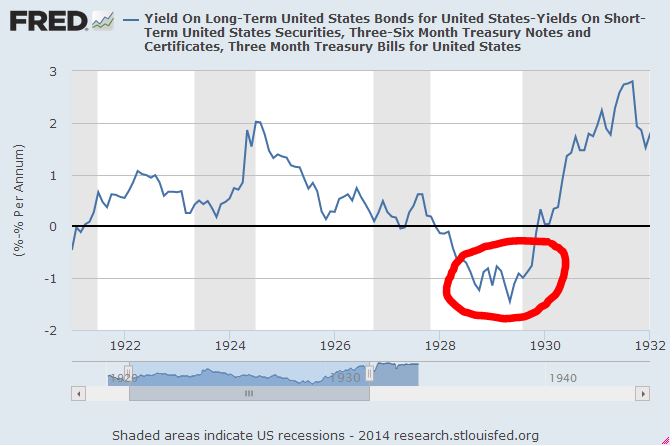
Most people think that 1929 was an inopportune time to invest–and, cyclically, it was. Recession represented a real risk as far back as 1928, when the Federal Reserve aggressively hiked the discount rate and sold three quarters of its stock of government securities in an effort to ward off a feared stock market “bubble.” By early 1929, the classic sign of an inappropriately tight monetary policy–an inverted yield curve–was well in place (FRED).
In the months after the crash, as it became clear that the economy was in recession, the Fed took action to ease monetary conditions. Unfortunately, in 1930, a misguided story began to gain traction among policymakers that the previous expansion had been driven by “malinvestment”, and that the economy would not be able to sustainably recover until the malinvestment was liquidated. This story led the Fed to shift to a notoriously tight monetary stance, particularly with respect to banks facing funding strains, to whom the Fed refused to emergency-lend. The ensuing effects on the economy, from the panic of 1930 until FDR’s banking holiday in the spring of 1933, are well-known history.
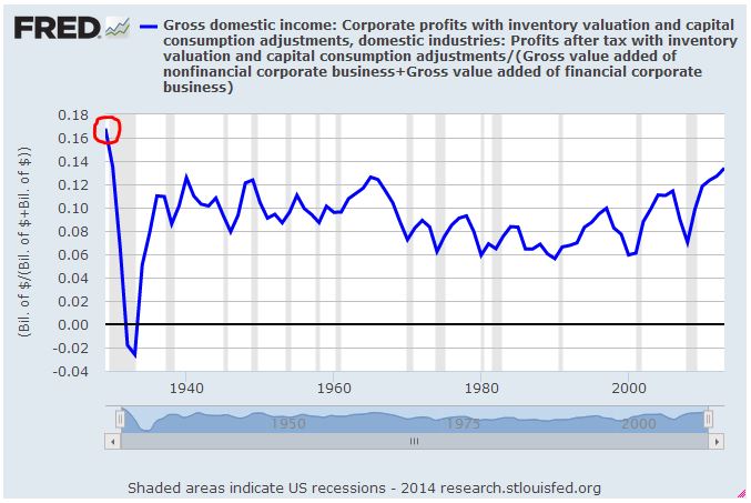
On the valuation front, 1929 also seemed like an inopportune time to invest. Profit margins (FRED) were at record highs relative to subsequent data. We don’t have reliable data for profit margins prior to 1929, but they had probably been higher in the late 1910s. Still, they were very high in 1929, much higher than they’ve ever been since:
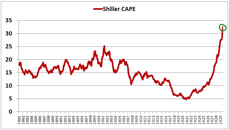
The Shiller CAPE, had gone parabolic, to never-before-seen values north of 30. The simple PE ratio, at around 20, was at a less extreme value, but still significantly elevated.
In hindsight, valuation wasn’t the real problem in 1929, just as it wasn’t the real problem in 2007. The real problem was downward economic momentum and a reflexive, self-feeding financial panic. The panic was successfully arrested in the fall of 2008 by the Fed’s efforts to stabilize the banking system, and exacerbated in the fall of 1930 by the Fed’s decision to walk away and let the banking system implode on itself.
For all of the maligning of the market’s valuation in 1929, the subsequent long-term total return that it produced was actually surprisingly strong. The habit is to evaluate market performance in terms of the subsequent 10 year return, which, for 1929, was a lousy -1% real. But the choice of 10 years as a time horizon is arbitrary and unfair. Growth in the 1930s was marred by economic mismanagement, and the terminal point for the period, 1939, coincided with Hitler’s invasion of Poland and the official outbreak of World War 2–a weak period for global equity market valuations. A better time horizon to use is 30 years, which dilutes the depressed growth performance of 1929-1939 with two other decades of data and puts the terminal point for the period at 1959, a period characterized by a more favorable valuation environment. The following chart shows subsequent 30 year real total returns for the S&P 500 from 1911 to 1984:
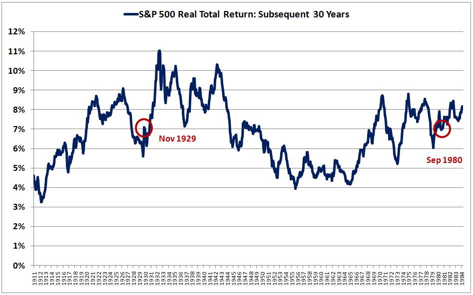
Surprisingly, a long-term investor that bought the market in November 1929, immediately after the first drop, did better than a long-term investor that bought the market in September 1980. For perspective, the market’s valuation in November 1929, as measured by the CAPE, was 21. Its valuation in September 1980 was 9. Measured in terms of the Q-Ratio (market value to net worth), the valuation difference was even more extreme: 1.21 versus 0.39.
Why did the November 1929 market produce better subsequent long-term returns than the market of September 1980, despite dramatically higher starting valuations? You might want to blame higher terminal valuations–but don’t try. The CAPE in 1959, 30 years after 1929, was actually lower than in 2010, 30 years after 1980: 18 versus 20. The Q-Ratio was also lower: 0.64 versus 0.84.
Ultimately, the outperformance was driven by three factors: (1) stronger corporate performance (real EPS growth given the reinvestment rate was above average from 1929-1959, and below average from 1980-2010), (2) dividends reinvested at more attractive valuations (which were much cheaper, on average, from 1929-1959 than from 1980-2010), and (3) shortcomings in the CAPE and Q-Ratio as valuation metrics (1929 and 2010 were not as expensive as these metrics depicted.)
It’s also interesting to look at the total return in excess of the risk-free rate, which is the only sound way to evaluate returns when making concrete investment decisions (not just “what can stocks get me”, but “what can they get me relative to what I can easily get by simply holding the currency, risk-free.”) The following chart shows the nominal 30 year total return of the S&P 500 minus the nominal 30 year total return of rolled 3 month treasury bills, from 1911 to 1984:
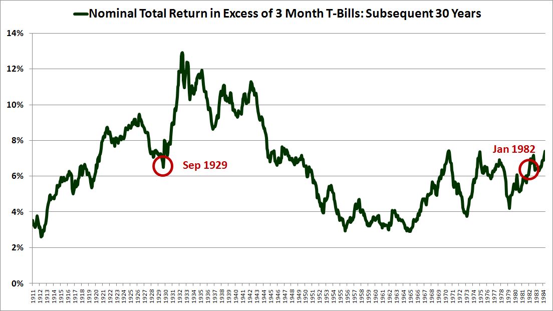
Surprisingly, the market of September 1929, which had a CAPE of 32 and a Q-Ratio of 1.59, outperformed the market of January 1982, which had a CAPE of 7 and a Q-Ratio of 0.31.
The next time you see a heightened CAPE or Q-Ratio flaunted as a reason for abandoning a disciplined buy-and-hold strategy, it may help to remember the example of 1929–how it astonishingly outperformed 1982, otherwise considered to be the greatest buying opportunity of our generation. The familiar lesson of 1929 is that you should avoid investing in recessionary environments where monetary policy is inappropriately tight, but there is another, forgotten lesson to be learned: that valuation is an imperfect tool for estimating long-term future returns. In the realm of long-term investment decision-making, it is not the only consideration that matters: the future path of risk-free interest rates matters just as much, if not more.
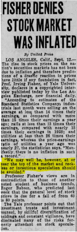
It seems that Irving Fisher may have been right after all, despite his inopportune timing. From September 12th, 1929:
In an ironic twist of fate, as we’ve moved forward from the crisis, the Irving Fishers of 2007-2008 have come to look more and more credible, despite their ill-timed bullishness, while the permabears who allegedly “called the crash” have been exposed as the beneficiaries of broken-clock luck.
The true speculative winners, of course, were those who managed to quickly process and appreciate the stabilizing efficacy of the Fed’s emergency interventions in late 2008 and early 2009, and who foresaw and embraced the subsequent drivers of the new bull market, as they became more evident: (1) unexpectedly strong earnings performance, driven by aggressive cost-cutting, made possible by significant technology-fueled productivity gains, that would go on to withstand the strains of a weak recovery and the feared possibility of profit margin deterioration, and (2) a low-inflation, low-growth goldilocks scenario in the larger economy that would allow for a highly accomodative Fed whose low interest rate policies would eventually give way to a T.I.N.A. yield chase. The “story” of the bull market has been the battle between these bullish drivers and the bearish psychological residue of 2008–the caution and hesitation to take risk, driven by lingering fears of a repeat, that has prevented investors from going “all in”, at least until recently.
As for the future, the speculative spoils from here forward will go to whoever manages to correctly anticipate–or at least quickly react to–the forces that might reverse the trend of strong earnings and historically easy monetary policy, if or when they finally arrive.