(Much thanks to the must follow @ElliotTurn for valuable help and feedback in the development of these charts and tables)
In this piece, I’m going to present a series of charts and tables that seek to efficiently convey the state of U.S. equity valuations from all available vantage points–that is, “from all angles.” Note that a convenient slideshow aggregating the tables and charts together is presented at the bottom.
S&P 500:
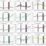
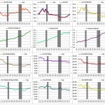
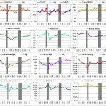
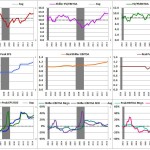
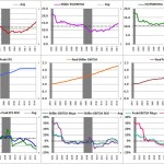
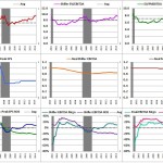
The following “ttm” chart shows trailing-twelve month (ttm) values and ratios from 1996 to 2014 (click on the chart to enlarge):
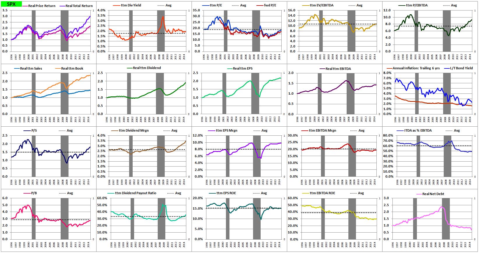
(Legend: The squares show the following metrics (1 to 20, left to right, top to bottom): (1) real price returns and real total returns (with dividends reinvested at market prices), (2) trailing-twelve month (ttm) dividend yields, (3) ttm price to earnings (P/E) ratios and fwd P/E ratios based on analyst estimates, (4) ttm enterprise value to earnings before interest, taxes, depreciation and amortization (EV/EBITDA) ratios, (5) ttm price to ebitda (P/EBITDA) ratios, (6) real ttm sales and book value growth, (7) real ttm dividend growth, (8) real ttm EPS growth, (9) real ttm EBITDA growth, (10) annualized inflation rates for the prior 6 years and long-term government bond yields, (11) ttm price to sales (P/S) ratios, (12) ttm dividend margins (ttm dividends as a % of sales), (13) ttm EPS margins (ttm EPS as a % of sales), (14) ttm EBITDA margins (ttm EBITDA as a a % of sales), (15) interest, taxes, depreciation and amortization (ITDA) as a % of EBITDA (which gives a picture of how much the earnings are being reduced by those expenses at any given time–very important), (16) price to book (P/B) ratios, (17) ttm dividend payout ratios (ttm dividends divided by ttm EPS), (18) ttm EPS return on equity (ROE) (ttm EPS divided by book value), (19) ttm EBITDA ROE (ttm EBITDA divided by book value), (20) real net debt (debt minus cash and liquid assets, i.e., the difference between enterprise value and price). The dotted black line in each chart shows the metric’s average for the period.)
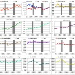
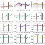
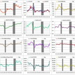
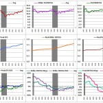
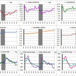
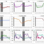
The following “Shiller” chart shows different types of Shillerized valuations from 1996 to 2014:

(Legend: The squares show the following metrics (1 to 15, left to right, top to bottom): (1) shiller P/E ratio (real price divided by the of average real ttm EPS seen over the prior 6 years (10 leads to too much information loss), (2) price to peak earnings (P/PkEPS) ratio (real price divided by the highest ttm real EPS earnings reading seen over the prior 6 years), (3) Shiller EV/EBITDA (using 6 years), (4) enterprise value to peak EBITDA (EV/PkEBITDA) ratio (using 6 years), (5) Shiller price to EBITDA ratio (using 6 years), (6) real shiller EPS (average of real ttm EPS over the prior 6 years), real peak EPS (highest ttm EPS seen over the prior 6 years), (7) real Shiller EBITDA (average of real ttm EBITDA over the prior 6 years), (8) real peak EBITDA (highest ttm EBITDA seen over the prior 6 years), (9) real ttm Sales and real ttm Book value, (10) – (14) margins and ROEs for all Shiller and peak metrics (Shiller EPS / sales, Shiller EPS / book value, Peak EPS / sales, Peak EPS/ book value, Shiller EBITDA / sales, Shiller EBITDA / book value, peak EBITDA / sales, peak EBITDA / book value, (15) asset turnover, i.e., sales / book value.)
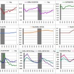
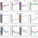
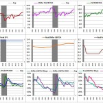
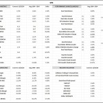
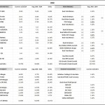
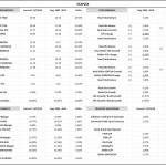
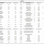
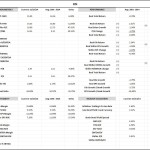
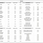
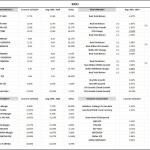
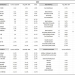
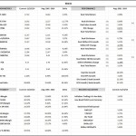
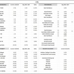
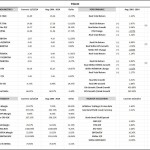
The following table presents data from the above charts in numeric form.
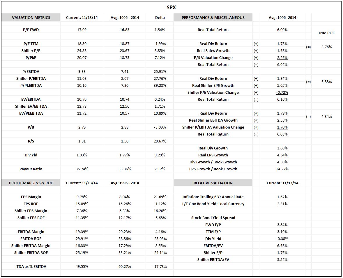
(Legend: The upper left quadrant shows valuation metrics as of the close on 11/13/14 and the average for the period (along with the delta between the present value and the average). The upper right quadrant decomposes the returns into dividends, growth in fundamentals, and changes in valuation for three different fundamental bases: price to sales, Shiller P/E, and Shiller P/EBITDA. Note that the “true ROE” of the corporate sector is the return that it would produce in a given period if valuation were held constant during that period. Thus the true ROE equals the dividend return plus the return due to growth in the given fundamental (which will necessarily equal the growth in the price if the valuation relative to that fundamental stays constant). The lower left quadrant shows margins and ROE as of the close on 11/13/14 and relative to the average for the period. The lower right quadrant shows valuation metrics relative to the long-term government bond yield.)
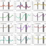
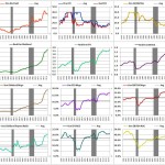
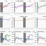
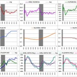
I will now present the same charts and tables for the the Russell 2000 and the 10 GICS sectors–Consumer Discretionary, Consumer Staples, Energy, Financials, Healthcare, Industrials, Materials, Technology, in that order–in slideshows.
Slideshow: TTM Charts
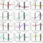
Here are all of the “ttm” charts (ttm valuation ratios, growth, margins, ROEs, inflation, government bond yields, etc.) in a slideshow (going from upper left to lowe right: SPX, R2K, Discretionary, Staples, Energy, Financials, Healthcare, Industrials, Materials, Technology). Click on any image to start the slideshow there:
Slideshow: Shiller Charts
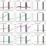
Here are all of the “Shiller” charts (Shillerized data) in a slideshow (going from upper left to lowe right: SPX, R2K, Discretionary, Staples, Energy, Financials, Healthcare, Industrials, Materials, Technology). Click any image to start the slideshow there:
Slideshow: Tables
Here are all of the tables (going from upper left to lowe right: SPX, R2K, Discretionary, Staples, Energy, Financials, Healthcare, Industrials, Materials, Technology). Click on any image to start the slideshow there:
In a subsequent piece, I will present the same charts and tables for 17 different countries. I will also present tables that rank the sectors and countries by the different valuation and growth factors.