 From January of 1933 through July of this year, beer companies produced a real, inflation-adjusted total return of 10% per year. Steel companies, in contrast, produced a return of 5%. This difference in performance, spread out over 82 years, is enormous–the difference between a $1,000 investment that turns into $26,000,000 in real terms, and a $1,000 investment that turns into $57,000.
Given the extreme difference in past performance, we might think that it would be a good idea to overweight beer stocks in our portfolios and underweight steel stocks. Whether it would actually be a good idea would depend on the underlying reason for the performance difference. Two very different reasons are possible:
(1) Differences in Return on Investment (ROI): Beer companies might be better businesses than steel companies, with higher ROIs. Wealth invested and reinvested in them might grow faster over time, and might be impaired and destroyed less frequently.
(2) Change in Valuation: Beer companies might have been cheap in 1933, and might be expensive in 2015. Steel companies, in contrast, might have been expensive in 1933, and might be cheap in 2015.
If the reason for the historical performance difference is (1) Difference in ROI, and if we expect the difference to persist into the future, then we obviously want to overweight beer companies and underweight steel companies–assuming, of course, that they trade near the same valuations. But if the reason is (2) Change in Valuation, then we want to do the opposite.
The distinction between (1) and (2) speaks to an important challenge in investing. Asset returns tend to mean-revert. We therefore want to own assets that have underperformed, all else equal. Assets that have underperformed have more “room to run”, and will tend to generate stronger subsequent returns than favored assets that have already had their day. But, in seeking out assets that have underperformed, we need to distinguish between underperformance that is likely to continue into the future, and underperformance that is likely to reverse, i.e., revert to the mean. That distinction is not always an easy distinction to make. Making it requires distinguishing, in part, between (1) underperformance that’s driven by poor ROI–structural lack of profitability in the underlying business or industry, and (2) underperformance that’s driven by negative sentiment and the associated imposition of a low valuation. The latter is likely to be followed by a reversion to the mean; the former is not.
In this piece, I’m going to share charts of the fundamental equity performances of different U.S. industries, starting in January 1933 and ending in July of 2015. I put the charts together earlier today in an effort to ascertain the extent to which differences in the historical performances of different industries have been driven by factors that are structural to the industries themselves, rather than cyclical coincidences associated with the choice of starting and ending dates–the possibility, for example, that beer stocks were in a bear market in 1933, with severely depressed valuation, and are now in a bull market, with elevated valuation, where the change in valuation, and not any underlying strength in beer-making as a business, explains the strong performance.
The charts are built using data from the publically-available CRSP library of Dr. Kenneth French. The only variables available back to that date are price and dividend–but they are all that are needed to do the analysis. Dividends are the original, true equity fundamental.
The benefit to using dividends as a fundamental is that they are concrete and unambiguous. “What was actually paid out?” is a much easier question to accurately answer than the question “What was actually earned?” or “What is the book actually worth?” There are no accounting differences across different industries and different periods of history that we have to work through to get to an answer. The disadvantage to using dividends is that dividend payout ratios have fallen over time. A greater portion of current corporate cash flow is recycled into the business than in the past, chiefly in the form of share buybacks and acquisitions that show up in increased per share growth. For this reason, when we approximate growth using dividend growth, we end up underestimating the true growth of recent periods. But that’s not a problem. The underestimation will hit all industries, preserving the potential for comparison between them. If we want a fully accurate picture of the fundamental return, we can get one by mentally bumping up the annualized numbers by around 100 basis points or so.
The first task in the project is to find a way to takes changes in valuation out of the return picture. We do that by building a total return index whose growth is limited to the two fundamental components of total return–growth in fundamentals (in this case, dividends–we use the 5 year smoothed average of monthly ttm dividends), and growth from reinvested dividend income.
We start by setting the index at 1.000 in January of 1933. The smoothed dividends might have grown by 0.5% from January of 1933 to February of 1933, and the dividend yield for the month might have been 0.1%. If that was the case, we would increase the index from January to February by 0.6%–the sum of the two. The index entry for February would then be 1 * 1.006% = 1.006. We calculate the index value for each month out to July of 2015 in this way, summing the growth contribution and the reinvested dividend income contribution together, and growing the index by the combined amount. What we end up with is an index that has only fundamental total return in it–return due to growth and dividend income. Any contribution that a change in valuation from start to finish might have made will end up removed. (Of course, contributions from interim changes in valuation, which affect the rate of return at which dividends are reinvested, will not be removed. Removing them requires making a judgement about “fair value”, so as to reinvest the dividends at that value. That’s a difficult judgment to make across different industries and time periods when you only have dividend yields to work with as a valuation metric. So we reinvest at market prices).
Unfortunately, we face a potentially confounding variable in the cyclicality of dividends, a cyclicality that smoothing cannot fully eliminate. If smoothed dividends were at a cyclical trough in 1933, and are at a cyclical peak now, our chart will show strong fundamental growth. But that growth will not be the kind of growth we’re looking for, growth indicative of a structurally superior ROI. It will instead be an artifact of the place in the profit cycle of the industry in question that 1933 and 2015 happened to coincide with.
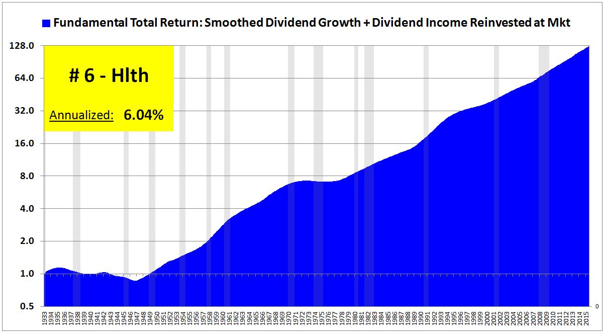
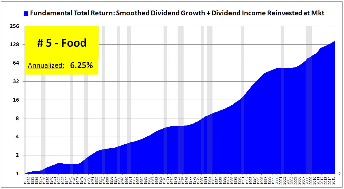
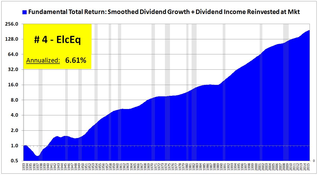
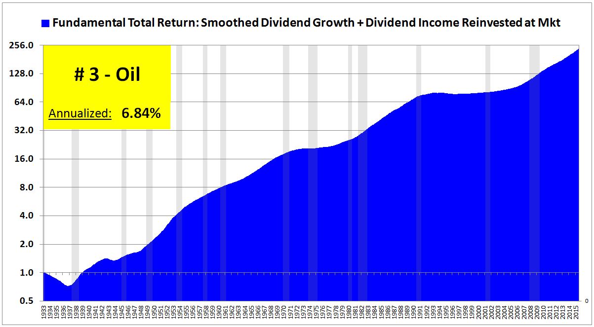
There’s no good way to remove the influence of this potential confounder. The best we can do is to make an effort to assess the performance not based on one chosen starting point, but based on many. So, even though the return for the period is quoted as a single number for a single period, 1933 to 2015, it’s a good idea to visually look at how the index grew between different points inside that range. How did it grow 1945 to 1970? From 1977 to 1990? From 2000 to 2010? If the strong performance of the industry in question is the result of a structurally elevated ROI–sustained high profitability in the underlying business–then we should see something resembling consistently strong performance across most or all dates.
Not to spoil the show, but we’re actually going to see that in industries like liquor and tobacco, which we suspect to be superior businesses with structurally higher ROIs. In junky industries like steel and mining, however, what we’re going to see is crash and boom, crash and boom. Periods of strong growth in those industries only seem to emerge from the rubble of large prior losses, leaving long-term shareholders who stick around for both with a subpar net gain.
The following legend clarifies the definition of each industry term. There are 30 in total.
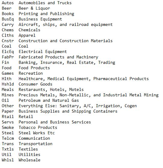
To the charts. The following slideshow ranks each industry by fundamental return, starting with #30, and ending with #1. All charts and numbers are real, inflation-adjusted to July of 2015. Note that you can hit pause, and then move from slide to slide at your own pace:
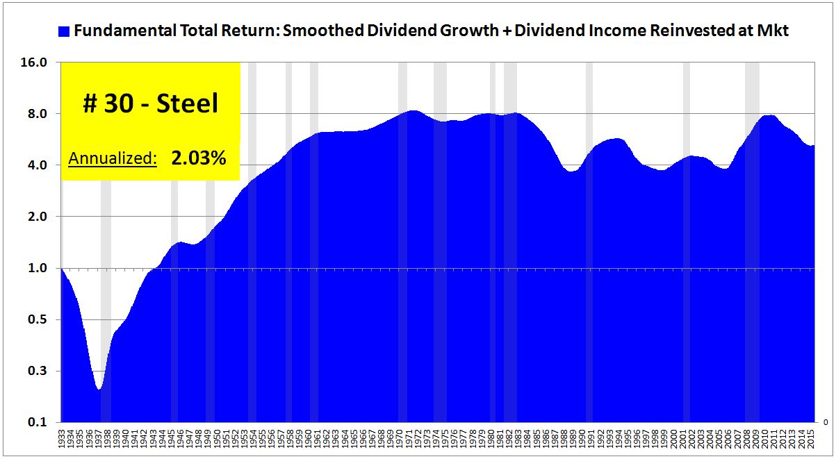
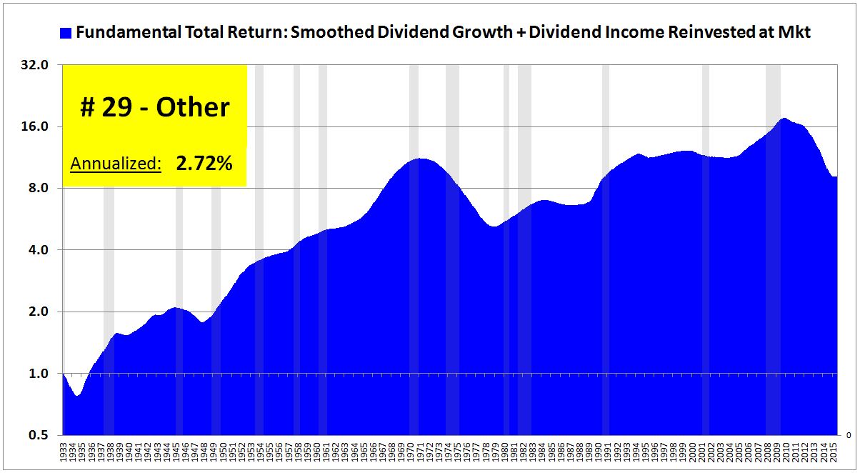
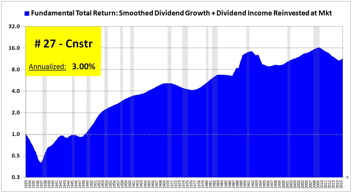
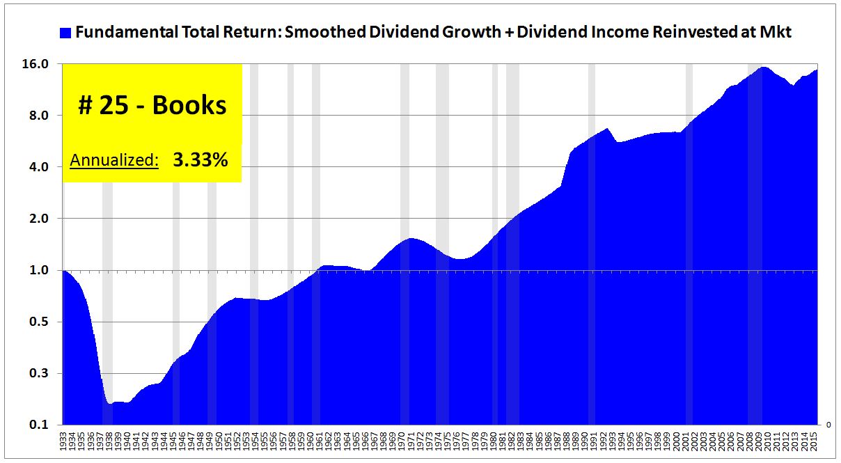
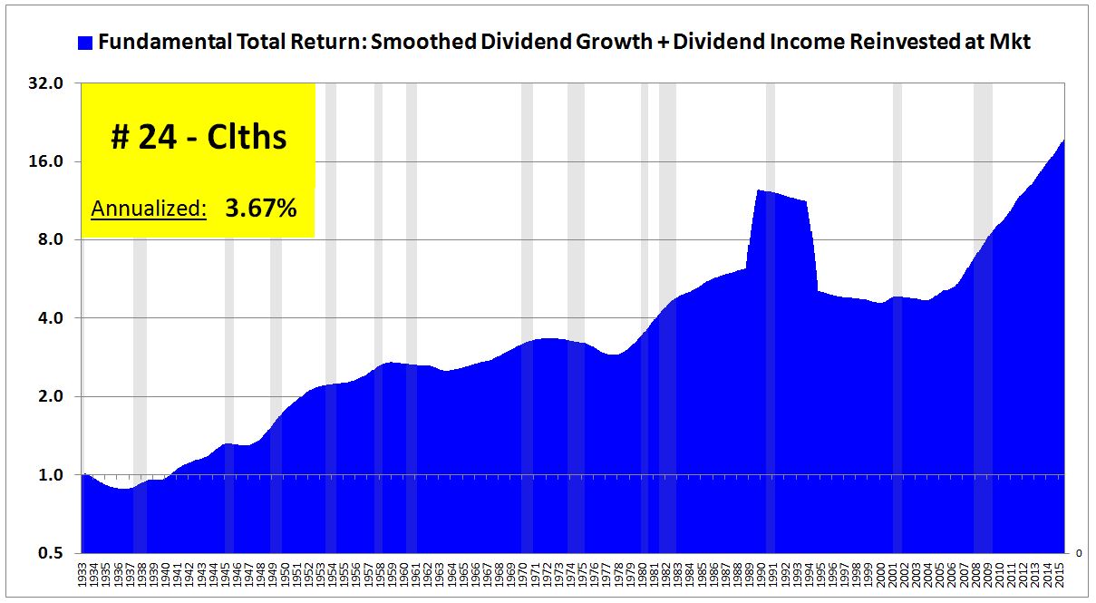
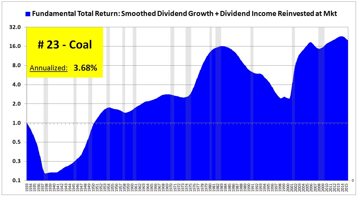
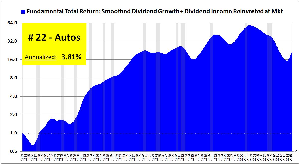
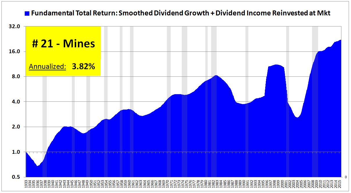
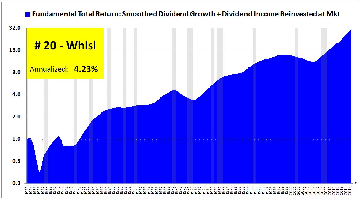
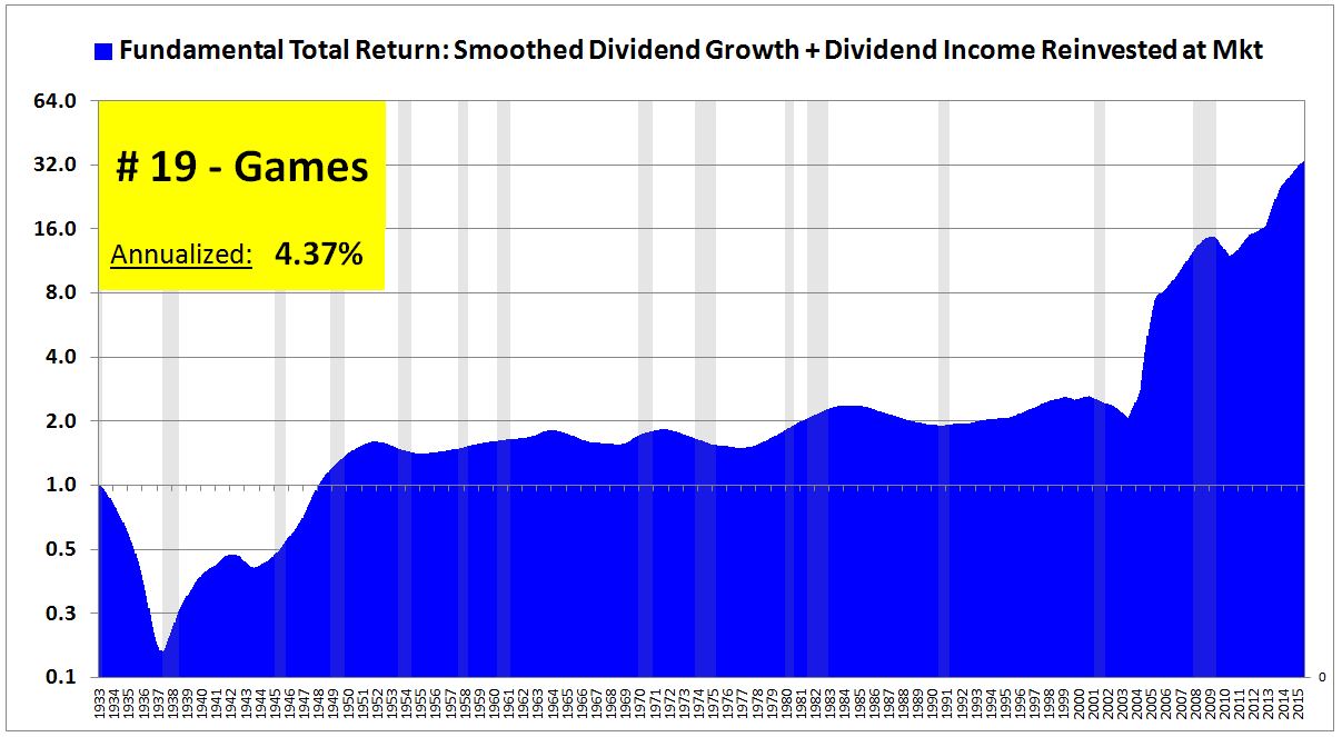
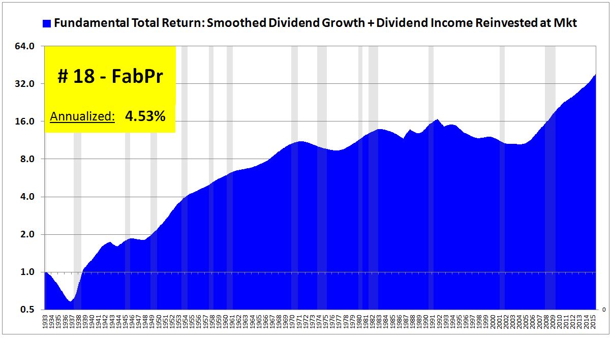
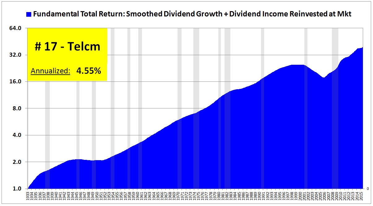
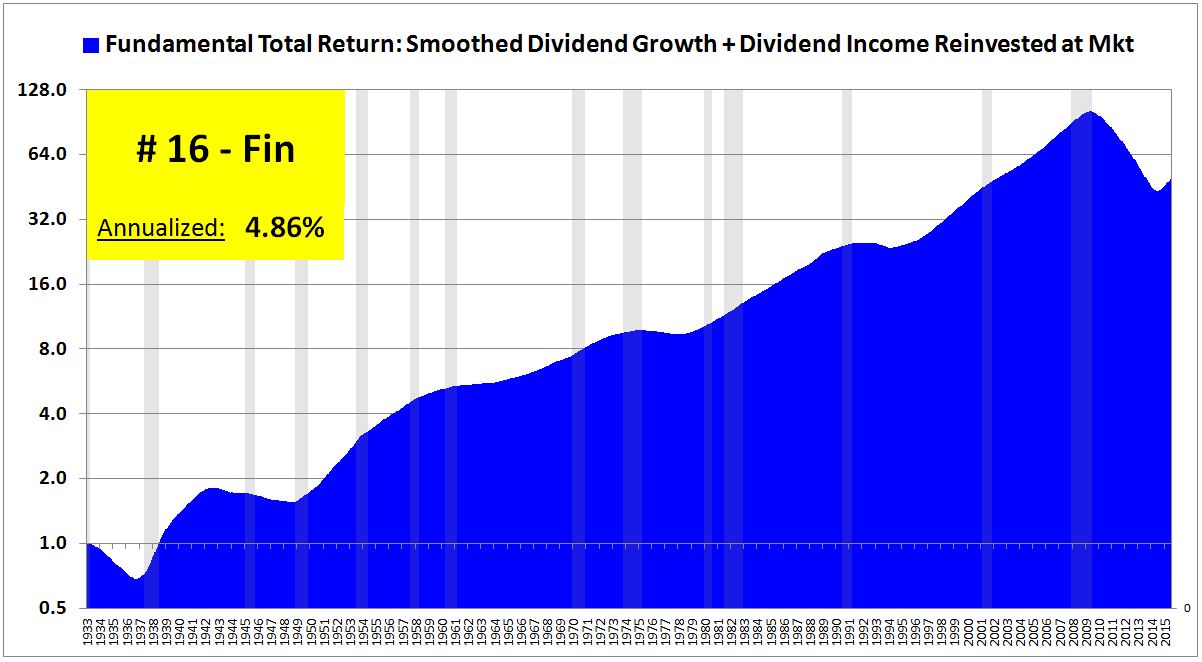
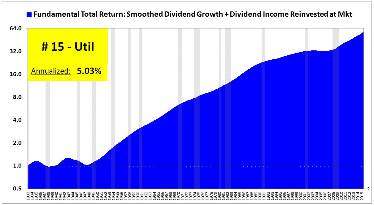
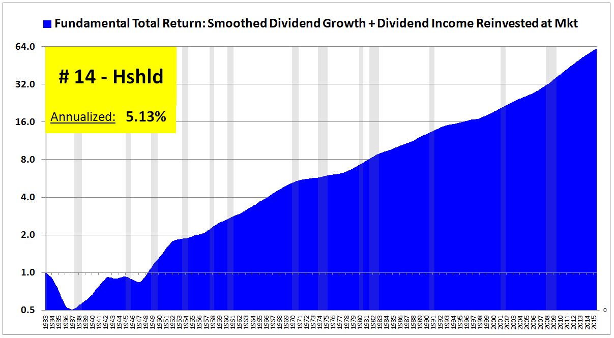
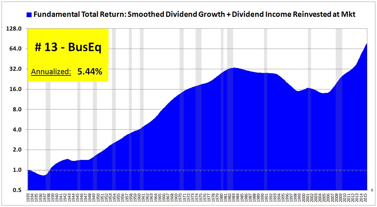
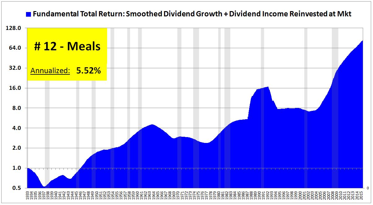
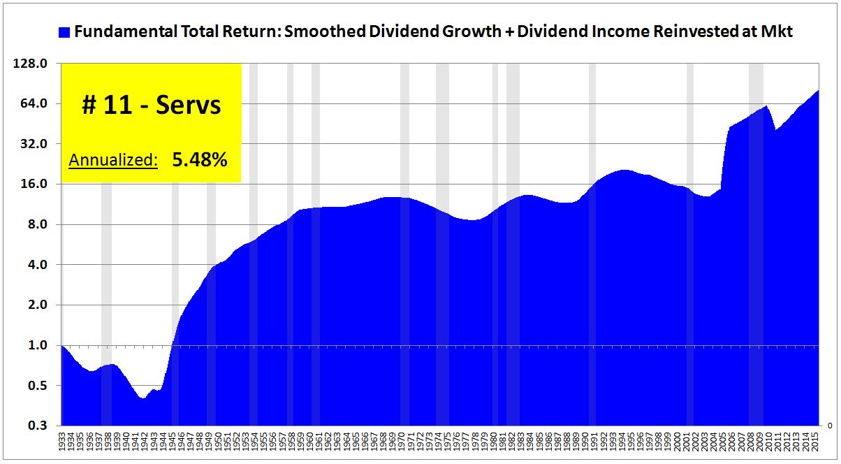
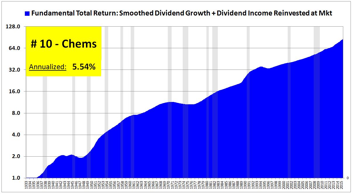
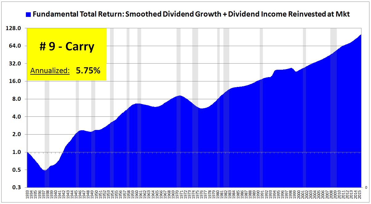
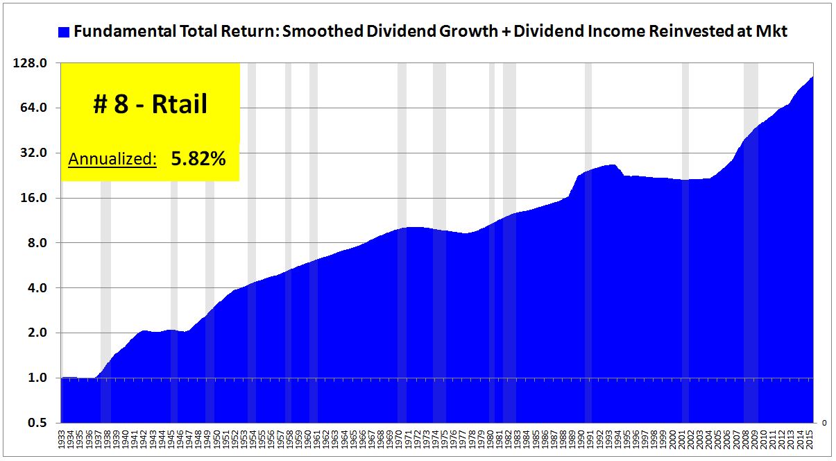
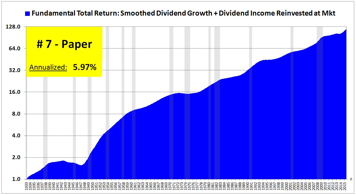
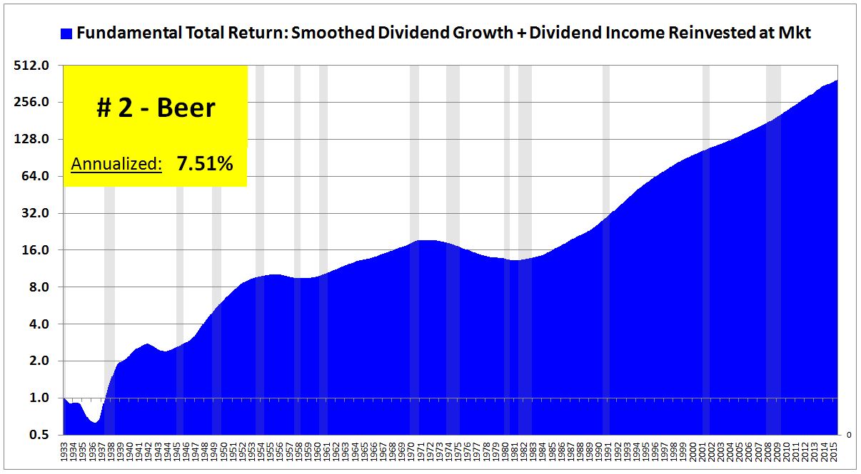
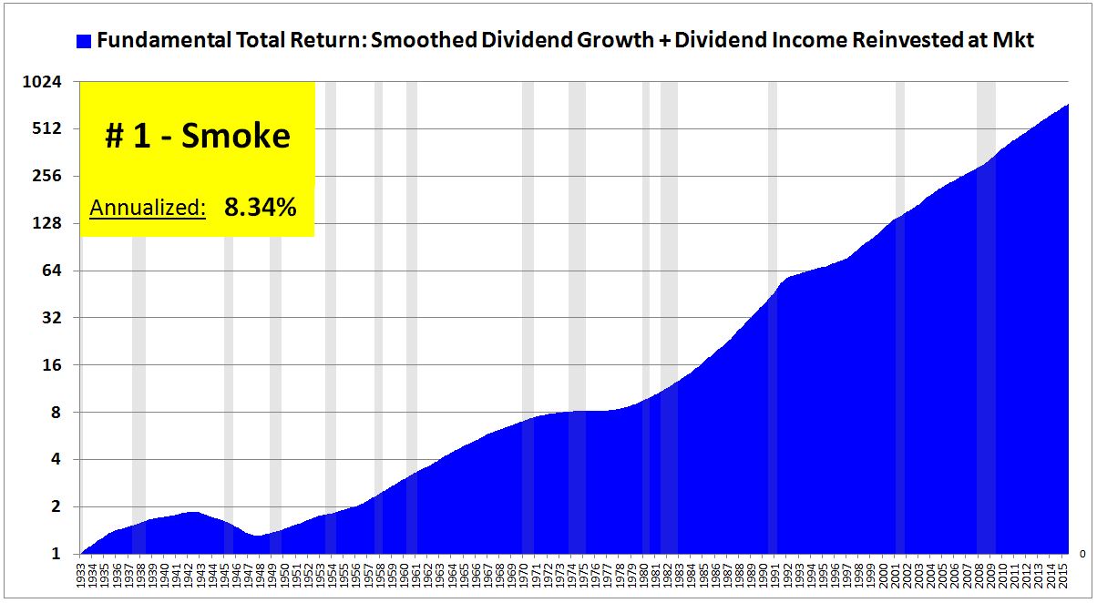
The following table shows the industries and real fundamental annual total returns from 1933 to 2015 together, ranked from low to high:
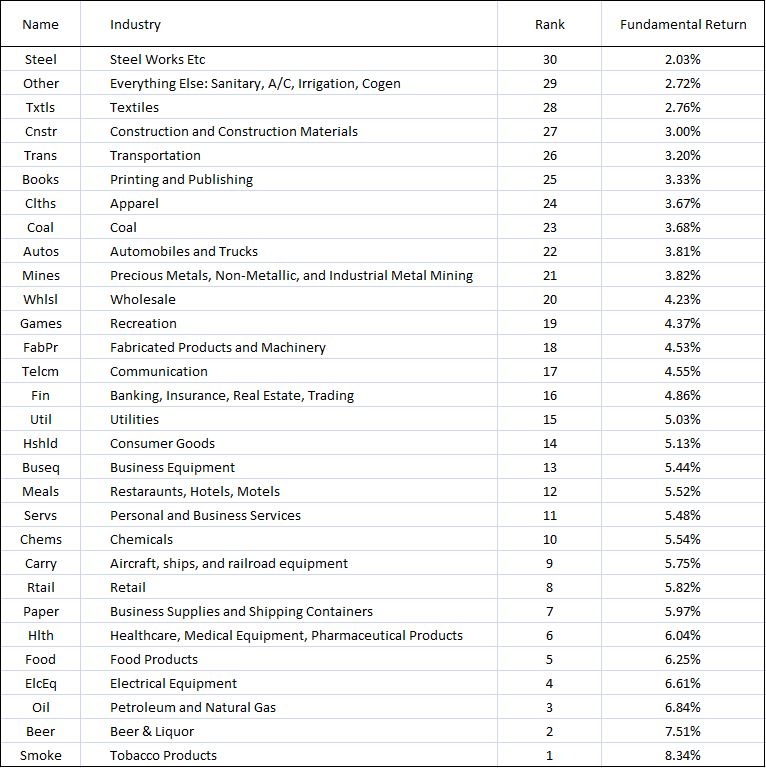
To be clear, the charts and tables tell us which industries performed well from 1933 to 2015. They don’t tell us which industries will perform well from 2015 into the future. Beer might have been a consistently great businesses over the last century, steel might have been a consistently weak business. But it doesn’t follow that the businesses are going to exhibit the same fundamental performances over the next century–conditions can change in relevant ways. And if we believe that the businesses are going to generate the same fundamental performances that they generated in the past, it doesn’t necessarily follow that we should overweight or underweight them. The relative weighting that we assign them should depend on the extent to which their valuations already reflect the expected performance divergence.