Profit Margins: Accounting for the Impact of a Changing Financial Share

In a prior piece, I argued that that the frequently-cited macroeconomic expression “CPATAX/GDP”, shown below in maroon (FRED), is a flawed way of measuring the aggregate profit margin of U.S. corporations.

cpataxgdp

When a U.S. corporation earns profit from foreign operations, “CPATAX/GDP” counts the profit in the numerator, but doesn’t count the costs of the profit–the wages and salaries of the employees of the foreign operations–in the denominator.  All else equal, the omission causes the profit margin to appear larger than it actually is.

If the share of U.S. corporate profit earned abroad were constant across history, then the profit margin overstatement inherent in “CPATAX/GDP” would occur equally in all years of the data set, and therefore a comparison of the present values of the metric to the averages of past values would still potentially be valid.  However, the share of profit earned abroad has not been constant across history.  In the last 60 years, it has increased dramatically–from less than 10% in 1948 to more than 40% in 2014.  Any comparison between the present values of “CPATAX/GDP” and the averages of past values is therefore invalid.

In place of the flawed “CPATAX/GDP”, I offered a more accurate profit margin metric–domestic profit divided by domestic final sales (GVA: gross value added), shown below in blue (FRED):

cpgva

This metric divides the domestic profit of corporations by the revenue from which that profit was generated.  All costs associated with a given unit of profit are included in the denominator, therefore the previous overstatement is eliminated.

Unfortunately, not even this metric allows for a valid comparison with the past.  The reason the metric doesn’t allow for a valid comparison is that it fails to distinguish between financial and non-financial profit.  Historically, financial profit has been earned at a much higher profit margin than non-financial profit.  If the share of financial profit in total profit were constant across time, the distinction wouldn’t matter.  But, as before, that share has not been constant across time–it has increased substantially.  A comparison between the present values of the metric and the averages of past values is therefore invalid.

NIPA Table 1.14 conveniently divides total corporate revenue (GVA) into non-financial sector revenue (Line 17) and financial sector revenue (Line 16).  The following chart shows financial sector revenue as a share of total corporate revenue from 1947 to 2013 (FRED):

finprofnonfin

As you can see, the share has tripled, from 4% in 1947 to 12% in 2014.  Now, if financial profit were earned at roughly the same profit margin as non-financial profit, the increase would not matter.  But, as it turns out, financial profit is earned at a much higher profit margin–more than twice as high.  This isn’t a recent phenomenon–it’s been the case since at least the 1920s, as far back as the NIPA data goes.

The following chart shows the profit margin of the financial sector (red) alongside the profit margin of the non-financial sector (green) from 1947 to 2013 (FRED):

finvnonfin

As you can see, the average profit margin for the financial sector is more than twice as large as the average profit margin for the non-financial sector, with the pattern consistent all the way back to the 1940s.  Given that the share of profit that goes to the higher-margin financial sector has increased, we should expect the total corporate profit margin to have similarly increased.  Any comparison of the total corporate profit margin with the averages of past periods needs to account for the increase.

The optimal way to account for the increase is to drop financial profit altogether and focus only on non-financial profit–profit generated from productive operations in the real economy.  The following chart shows the non-financial sector profit margin from 1947 to 2013 (FRED):

nonfincp

When it comes to making comparisons with the past, this chart is the most accurate chart of profit margins available.  To be clear, non-financial profit margins are elevated, but they are less elevated than aggregate profit margins, and nowhere near as elevated as the bogus “CPATAX/GDP” was suggesting.

The following table lists each type of profit margin alongside its historical mean, current elevation, and the annual drag that profit growth would suffer if the profit margin were to revert to the mean over the next 10 years:

tableproif

Interestingly, the aggregate domestic profit margin is currently more elevated relative to the past than both the financial and non-financial profit margins that make it up.  The reason this is possible is that the share of profit going to the financial sector has increased.

Returning to the chart, rather than being 25% above the highs of prior cycles, as we were with the bogus “CPATAX/GDP”, we’re actually still below those highs–both the high registered in 1966, and the high registered in 1949.  In terms of past precedence, it’s therefore entirely conceivable that profit margins could continue to trek higher in the current cycle.  That is, in fact, what seems to be happening.  With approximately 94% of S&P 500 companies reporting earnings for the first quarter, the trailing twelve month net profit margin for the index is on pace to register yet another new high: 9.67% on operating earnings (as tallied by Howard Silverblatt of S&P), and 8.95% on GAAP earnings (company-reported).

pms3

On Twitter, economist Andy Harless made a clever point that replacing “CPATAX/GDP” with these more accurate metrics may actually help the valuation bear case, because the more accurate metrics don’t exhibit a “breakout” to new highs in the same way that “CPATAX/GDP” did.  If valuation bulls embrace the more accurate metrics instead of “CPATAX/GDP”, they will no longer be able to cite such a “breakout” as evidence of a structural shift in corporate profitability.

But, as the chart below illustrates, if we remove the distorting presence of higher-margin financial profits, which have increased over time, the evidence of a structural shift remains intact. In the Great Recession–the worst downturn for the corporate sector since the Great Depression–profit margins didn’t even come close to touching the lows of prior eras.  In fact, they barely touched the historical average.  In charts that include the financial sector, profit margins appear to briefly fall to record lows, but this appearance is an artifact of the huge credit losses that the financial sector incurred in the period.  The profit margins of non-financial corporations remained historically elevated, contrary to what mean-reversion analysis would have predicted.

whynomore2

Posted in Uncategorized | Comments Off on Profit Margins: Accounting for the Impact of a Changing Financial Share

Why A 66% Crash Would Be Better than a 200% Melt-up

Suppose that you’re a middle-aged professional with a 30 year retirement time horizon. Your portfolio is 100% invested in U.S. equities–it consists of 100 shares of the S&P 500, worth $187K at current market prices.  Assuming that the fundamentals remain unchanged, which outcome would leave you wealthier at retirement: (1) for the S&P 500 to soar 200% in a glorious bubble-like melt-up, or (2) for the S&P 500 to plunge 66% in a brutal Depression-like crash?

Surprisingly, you would end up wealthier at retirement if the plunge occurred.  This is true even if we assume that the plunge lasts forever, and that you add no new money to the market as prices fall.

Let’s work through the details.  We can separate the drivers of equity total return into three components: dividends, earnings per-share growth, and changes in valuation.

We’ll start with dividends.  At 1870, the current S&P 500 dividend yield is somewhere between 1.8% and 2%.  The reason it’s historically low is that a significant portion of the cash flow that has traditionally gone to dividends is currently going to share buybacks.  But share buybacks are equivalent to dividends, reinvested internally.  To make things simple, then, let’s assume that from here forward, all buyback cash flows are going to be diverted to dividends.  From a total return perspective, the additional dividends will get reinvested by the shareholders, so everything will end up in the same place.  If the current buyback yield, net of dilution, were diverted to dividends, the dividend yield would be something close to 3%, which, not coincidentally, is also what the dividend yield would be right now if the corporate sector adhered to a more historically normal dividend payout ratio.

Earnings per share (EPS) growth is more difficult to estimate because we don’t know what’s going to happen to corporate profitability–it’s currently at an elevated level and could revert to the mean.  To be conservative, let’s assume that it does revert to the mean, and that EPS growth, excluding the float-shrink effects of buybacks, ends up being very low–say, 2% per year.

As for the market’s valuation, we’re comparing two different possibilities: first, that it rises by 200%, second, that it falls by 66% percent.  In both cases, we’re assuming that the move sticks–that the valuation stays elevated or depressed forever.

The following table outlines the trajectory of the total return in the two cases.

divg

As you can see, the plunge is demonstrably better for your retirement than the melt-up, with the obvious caveat that you have to maintain discipline and stick with the investment. If you panic and sell in response to the plunge, all bets are off.  

Now, to be clear, we haven’t priced in the intangibles associated with melt-ups and crashes–specifically, the highly satisfying experience of watching investments appreciate, and the highly distressing experience of watching them crater, particularly when other people’s money is involved.  If we’re taking those intangibles into account, then we should obviously prefer the melt-up. But on a raw return basis, the plunge wins.

The reason the plunge produces a better final outcome is that the valuation at which investors reinvest dividends–or, alternatively, the valuation at which corporations buy back shares, if they choose that route instead of the dividend route–has a powerful impact on long-term total returns, an impact that increases non-linearly as valuations fall to depressed extremes.   In the case of the plunge, the dividends are reinvested at roughly 1/9 the valuation of the bubble.  Over 30 years, the accumulated effect of the cheap reinvestment is enough to fully make up for the one-time impact of a 9 bagger increase in valuation.

Investors might want to reconsider whether or not a world without corrections and crashes would actually be a good thing for the long-term, particularly given the extent to which corporations are currently recycling their cash flows into dividends and buybacks. As far as future returns are concerned, such a world would come at a cost, even for those that are already comfortably in.

Posted in Uncategorized | Comments Off on Why A 66% Crash Would Be Better than a 200% Melt-up

Profit Margins: The Death of a Chart

In the debate on profit margins, two different types of charts frequently appear.  The first chart is a chart of the aggregate profit margin of the S&P 500.

gaapnetmargins

Valuation bulls tend to prefer this chart because it undermines the view that profit margins revert to a constant mean over time.  The line in the chart goes through a multi-decade bear market, falling from 7% in 1967 to 3.5% in 1992.  At each point along the way, it makes lower lows and lower highs, exhibiting very little mean-reversion.  Then, around 1994, it rises substantially, and remains historically elevated for most of the subsequent twenty-year period.

The second chart is the chart of corporate profit (FRED: CPATAX) as a percentage of GDP.

fredpm

Valuation bears tend to prefer this chart because, unlike the chart of the S&P 500 profit margin, it exhibits a visually compelling pattern of mean-reversion.  From 1947 to 2002, it oscillates like a sine-wave around a well-defined average, with well-defined highs and a tightly well-defined low, bounded by the black lines in the recreation below.

cpataxgdp

This latter chart, CPATAX/GDP, and that of its twin brother, CPATAX/GNP, is an illusory result of flawed macroeconomic accounting.  In the paragraphs that follow, I’m going to try to clearly and intuitively explain why.  Hopefully, the chart will disappear once and for all.

Please note at the outset that the flaw in the chart has nothing to do with the fact that foreign sales are earned at a higher profit margin than domestic sales.  That’s a separate issue.  This issue is much more basic.  The chart effectively treats foreign sales as if they were earned at an infinite profit margin, because it doesn’t account for their costs.  The sharp upside breakout seen from 2003 onward is due in large part to this mistake.

At the end of the piece, I’m going to explain how to accurately calculate the true corporate profit margin using macroeconomic data.  The excellent economists at the BEA have provided us with a very useful data series, NIPA Table 1.14, available in FRED, that allows us to divide corporate profits directly by corporate final sales, so that we get a direct and accurate picture of the profit margin, without having to use GDP as an approximation.

Importantly, when we chart the true profit margin–profits divided by sales–the compelling visual pattern of mean-reversion exhibited in the CPATAX/GDP chart weakens considerably.  It becomes clear that the “true mean” to which profit margins naturally revert has changed in relevant ways over time, and therefore can change.  Right now, we are likely in a situation where the natural mean for profit margins is higher than it was in the 1970s, 1980s, and early 1990s.

Respecting the Reality of Change

The following chart shows CPATAX divided by GDP from 1947 to present.  The black line represents the average from 1947 to 2002, and the green line represents the average from 2003 to 2013.

cptxa

As you can see in the chart, CPATAX/GDP is wildly elevated at present.  It currently sits 63.3% above its average from 1947 to 2013, and a whopping 75.0% above its average from 1947 to 2002.

As readers of this blog have probably inferred by now, I’m not very patient when it comes to waiting for “mean-reversion” to occur.  In my view, when a variable deviates for long periods of time from a reversion pattern that it has exhibited in the past, the right response is to expect something important to have changed–possibly for the long haul, such that a predictable reversion to prior averages will no longer be readily in the cards.  The task would then be to find out what that something is, and try to understand it.

If CPATAX/GDP, as depicted in the chart, were an accurate approximation of the corporate profit margin, my response would be to say that we need to rethink the claim that profit margins revert to a constant mean over time.  Whatever the “true mean” for profit margins might have been in the past, that mean must have increased.  The chart doesn’t realistically lend itself to any other conclusion.

Consider that from 1947 to 2003, the highest measured value of CPATAX/GDP was 7.9%, realized in the first quarter of 1966.  From 2003 until today, the average value has been 8.4%.  So the average value of the last decade is roughly 50 bps above the record high of the entire preceding half-century.  If that outcome isn’t sufficient to establish that the “true mean” of the system–or the “natural mean”, as I like to call it–has increased, what outcome would be?  

As with the Shiller CAPE, we can’t allow the permanently elevated state of an allegedly mean-reverting variable to become a permanent reason not to invest.  But that’s unfortunately what both the Shiller CAPE and “profit margins” have turned into.  If at any time in the last 20 years you’ve wanted to be bearish, then with a brief exception in late 2008 and early 2009, at least one of these themes has always been there for you as a readily-available reason.  In my estimation, they will continue to be there for you–at least the Shiller CAPE, which, in my view, is not going to mean-revert any time soon.  We thus have to ask ourselves, is “never investing” a viable long-term plan?  If not, then the metrics and the analysis need to be re-examined.

Refusing to respond to changes in reality leads to destruction.  Reality will not tolerate it. If a variable that allegedly mean-reverts refuses to revert over long periods of time, then we need to acknowledge the possibility that the variable is not naturally mean-reverting, or that the mean that it naturally reverts to has changed. Economics is not physics.  There are no “divinely-ordained” constants that govern the system.  The averages that economic variables exhibit, and the settling points towards which they gravitate, can and do change as secular conditions in economies change.  This fact is true of almost anything “economic” that we might measure–growth rates, interest rates, inflation rates, asset valuations, and profit margins.  

Two Distinctions: “Product” vs. “Income” and “National” vs. “Domestic”

Fortunately, if we search for the reason that CPATAX/GDP has “broken out”, we will quickly find it.  Before we can go there, however, we need to make two important distinctions: (1) “product” v. “income” and (2) “national” vs. “domestic.”

Product refers to whatever is produced, at its monetary market value.  Income refers to whatever is earned, in monetary amounts.  Roughly speaking, product and income equal each other.  A good or service that is produced and sold for some amount is income to whoever produced and sold it.  The sale proceeds are distributed to each of the individuals that played a part in its production.

If a car company makes and sells a car, the product is the car, at market value, and the income is the sum of (1) the wage received by the company worker for the value that he has added through his labor, (2) the interest received by the company bondholder for the value that he has added in lending his money, and (3) the profit received by the company shareholder for the value that he has added through the direction and use of his property. After taxes and fines are removed, the sale proceeds are necessarily going to go to one of those three locations: wages, interest, or profit.  The profit margin represents the portion of the sale proceeds that go to profit.  Because GDP roughly tracks with total sales in the economy, corporate profit divided by GDP gives a rough “macroeconomic” approximation of the aggregate profit margin of the corporate sector.

The term national refers to whatever belongs to U.S. resident individuals and corporations. So, for example, gross national product (GNP) refers to the total output, at market value, supplied by the labor and property of U.S. residents, whether that output is generated domestically or in a foreign country.  Gross national income (GNI) refers to the total income earned by all U.S. residents, whether they earn the income from activities that occur inside the United States or abroad.

The term domestic refers to whatever occurs inside U.S. borders.  So, for example, gross domestic product (GDP) refers to the total output, at market value, generated from operations inside the United States, whether the individuals that produce the output are U.S. residents or residents of a foreign country.  Gross domestic income refers to the total income earned by all people and businesses operating inside the United States, whether those people and businesses are Americans or foreigners.

Put simply, product is concerned with production, and income is concerned with compensation–two sides of the same coin.  National is concerned with who product and income are produced and earned by, and domestic is concerned with where they are produced and earned.

CPATAX/GDP:  Identifying the Mistake 

The expression CPATAX/GDP contains an obvious distortion.  CPATAX is a “national” term–it refers to the after-tax profit of all U.S. resident corporations, whether that profit is earned domestically, or from operations in a foreign country.  GDP, in contrast, is a “domestic” term–it refers to the total gross output (and therefore the total gross income) produced (and earned) inside the United States, whether that income is earned by U.S. residents or by foreign entities.

Notice that if a U.S. corporation earns a profit from affiliate operations abroad, the profit will be added to the numerator of CPATAX/GDP, but the costs will not be added to the denominator, as they should be in a “profit margin” analysis.  Those costs, the compensation that the U.S. corporation pays to the entire foreign value-added chain–the workers, supervisors, suppliers, contractors, advertisers, and so on–are not part of U.S. GDP.  They are a part of the GDP of other countries.  Additionally, the profit that accrues to the U.S. corporation will not be added to the denominator, as it should be–again, it was not earned from operations inside the United States.  In effect, nothing will be added to the denominator, even though profit was added to the numerator.

General Motors (GM) operates numerous plants in China.  Suppose that one of these plants produces and sells one extra car.  The profit will be added to CPATAX–a U.S. resident corporation, through its foreign affiliate, has earned money. But the wages and salaries paid to the workers and supervisors at the plant, and the compensation paid to the domestic suppliers, advertisers, contractors, and so on, will not be added to GDP, because the activities did not take place inside the United States.  They took place in China, and therefore they belong to Chinese GDP.  So, in effect, CPATAX/GDP will increase as if the sale entailed a 100% profit margin–actually, an infinite profit margin.  Positive profit on a revenue of zero.

Similarly, if a foreign corporation earns a profit from operations inside the United States, both the costs and the profit will be added to the denominator of CPATAX/GDP, but the profit will not be added to the numerator.  That profit–which accrues to the foreign corporation operating domestically, and is part of U.S. GDP–is not part of CPATAX.

Volkswagen runs a very successful plant in Chattanooga, TN.  Suppose that this plant produces and sells one additional car.  The profit will not be added to CPATAX, because it was earned by an affiliate of a foreign resident corporation, rather than a U.S. resident corporation.  But the wages paid to the workers that operate the plant will be added to GDP, because the production took take place inside U.S. borders.  So, in effect, CPATAX/GDP will fall as if the sale had occurred at a 0% profit margin.  No profit on positive revenue.

The following table illustrates the distortions with concrete numbers.  We assume that CPATAX/GDP for the aggregate economy is initially equal to 10%, and then some event occurs that should not change the profit margin–say, GM produces and sells a car in China at a 10% profit margin, or Volkswagen produces and sells a car in the US at a 10% profit margin.  The table walks through the distortion dollar by dollar:

foreigntable

Now, if the two types of profits–U.S. company profit earned from operations abroad, and foreign company profit earned from operations in the US–were to roughly match each other in monetary size, then the two distortions, which act in opposite directions, might, by luck, offset each other’s effects.  Unfortunately, they do not match each other in monetary size–not even close.

Over the last 50 years, U.S. company profit earned abroad has increased by a much larger total amount than foreign company profit earned in the U.S.  The difference has become especially significant in the last 10 years, as foreign sales have boomed.  At present, U.S. company profit earned abroad is around $665B, whereas foreign company profit earned in the U.S. is only around $250B–a difference of around $400B.

The following chart shows total U.S. national corporate profit earned abroad in absolute terms, and as a share of total U.S. national profit.  You can see that profit earned abroad is now more than 40% of the total profit earned by U.S. resident corporations.  Almost half, so this is a huge effect.

abroad

The following chart shows the total profit of foreign companies earned from operations in the United States in absolute terms, and as a share of total U.S. domestic profit.  The scale is the same as in the previous chart to allow for a visually accurate comparison.

doms

The following chart shows the difference between the foreign profit of U.S. corporations and the domestic profit of foreign corporations (FRED).

fpdmc

Now, the BEA gathers data on domestic corporate profits–that is, corporate profit generated from domestic operations.  To get an idea of how much of an effect the foreign sales distortion has had on CPATAX/GDP, we can compare CPATAX/GDP (maroon line below) with domestic corporate profit divided by GDP (blue line below) (FRED).

cpalka

Notice that the maroon line, U.S. national profit (CPATAX) divided by GDP, and the blue line, U.S. domestic profit divided by GDP, consistently deviate from each other over time. Any time you see such a consistent, gradual pattern of divergence in macroeconomic data, you can be confident that something is missing from the story.  In this case, the missing “something” is the difference between the amount of national profit earned abroad and the amount of domestic profit earned by foreigners.  That difference is directly proportionally to the difference between national and domestic profit (in absolute terms and as a % of GDP).  The difference has consistently increased over time, which is why the lines consistently deviate.

The following chart (FRED) shows (1) the difference between U.S. national profit (CPATAX) divided by GDP and U.S. domestic profit divided by GDP and (2) the difference between U.S. profits earned abroad as a percentage of GDP and domestic profits earned by foreign corporations as a percentage of GDP.

res

The fit between the blue line and the orange line is 100% perfect–as expected, since the relationship is analytic.  But notice the jump that occurs from 2003 onward (circled in red above). That jump–which corresponds to the jump in foreign sales generated abroad–is a substantial driver of the jump seen in the CPATAX/GDP that occurs around the same time period (circled in green).

fa3a3

The distortion of foreign sales grows across the entire 60 year period of the chart, and then accelerates in the 2000s, as foreign sales boom.  The true profit margin, underneath this distortion, actually declines up until the 1990s–consistent with the previously discussed decades-long bear market that profit margins seem to undergo in the S&P 500 profit margin chart.  But the decline is masked in CPATAX/GDP by the gradual increase in the foreign sales of U.S. corporations, which are being added to the expression at an infinite margin.  The following chart paints the picture.

domcorp

The nice, neat mean-reversion channel that the red line seems to adhere to, and the “breakout” that occurs from 2003 onward, show themselves to be illusory.  Both of these apparent phenomena are consequences of improper macroeconomic accounting. CPATAX/GDP is a conceptually incoherent expression, and should be discarded.

Substituting GNP for GDP

John Hussman has frequently cited the chart of CPATAX/GDP in his writings.  In a piece this last December, he shared a chart that correlates CPATAX/GDP to future 4 year profit growth.  The implied outlook for future profit growth is ugly, to say the least.

cpataxgdp3

To be completely fair to John, he made it clear in the piece that he doesn’t expect a profit contraction as severe as the chart suggests:

“At present, the extreme profit/GDP ratio we observe here is consistent with expectations of a 22% annual contraction in profits over the coming 4-year period – which would imply a roughly 63% cumulative contraction in profits from present levels. My impression is that’s probably too aggressive an expectation except as a temporary trough.  A more reasonable expectation, in my view, would put corporate profits down about 10% annually over the next few years…  Part of the reason we would expect a more muted contraction in profit margins is the recognition that government budget deficits are likely to remain relatively high in the coming years.”

As I’ve explained elsewhere, I tend to be skeptical of these “X divided by Y” versus “future growth of X” charts, for three reasons:

First, they try to fit the present value of a variable to its future growth, which is just the difference between its present value and its future value.  So “present value” shows up in both expressions.  Any time “present value” changes, the change flows into both expressions inversely, creating the perception of a non-trivial inverse correlation, where one may not actually exist.

Second, the visual attractiveness of these types of charts often depends on the choice of the time frame–4 years might look great, but how does 7 years look?  10 years?  Why is 4 years special?  Is it special because it plays a role in some theory, or because it just happens to be the easiest number to build a fit around, given purely coincidental patterning in the data set?  If the latter, then it’s unlikely that the chart will be able to accurately predict future numbers.  It’s easy to build models that can predict past data, when we already know the answers and can mold the questions to match them.  It’s obviously much harder to build models that can predict future data, where the answers are unknown.

Third, the charts look at nominal growth, rather than real growth.  Profit margins don’t know what inflation is going to be going forward.  But inflation has a significant effect on nominal profit growth.  Since 1947, 3.7% of the 8.1% in nominal annual profit growth has been due to inflation–almost half the total.  In an environment with highly variable inflation, such as the period from 1947 to 2013, profit margins shouldn’t be able to predict future nominal profit growth with such a high degree of confidence.  If a chart is produced that shows that they can, coincidences in the data set are likely to be contributing to the result.

Now, to be fair, each of these criticisms applies to my own prior piece on asset supply, where I fit aggregate investor equity allocation to 10 year nominal S&P 500 total returns. It was an interesting exercise, and there’s certainly a relationship there (as there is between profit margins and profit growth, everything else equal) but the fit, however tight, is not something that anyone should be making defined future bets on.  It’s the analysis that’s important.

In my view, curve fits should be met with skepticism unless there is a compelling analytic story behind them, the expressions being fit are independent of each other, the fits really nail it, or the fits are successfully tested out of sample, in different data sets–for example, data sets taken from the economies of other large countries.  Testing a fit in the same data set that was used to put it together is not real testing–you won’t have any way to know whether the observed correlation is real or driven by coincidence.  It’s also important that the fit track well in the recent data, because the recent data are the data most likely to share structural similarities with the data that we actually care about: the future data that we’re trying to predict.

With respect to this chart, however, we don’t even need to get into the debate about whether the predictions of in-sample “variable vs. its own future growth” fits should be trusted.  The metric itself is fundamentally flawed, for the reasons explained earlier.  CPATAX/GDP models foreign sales as if they were earned at an infinite profit margin.  The costs of those sales show up nowhere in the expression.  Obviously, we’ve had strong growth in foreign sales in the last decade, and that’s the reason for the weird “breakout” seen in the CPATAX/GDP chart.

Now, an alternative to CPATAX/GDP is CPATAX/GNP.  In CPATAX/GNP, U.S. national profit shows up in both the numerator and the denominator.  If we wanted to normalize CPATAX to something that grows with the size of the economy, as we might want to do in the context of a balance of payments analysis such as the analysis that the Kalecki-Levy equation entails, GNP would be the more consistent choice.

In a comment from a few weeks ago, John (correctly) pointed out that the difference between CPATAX/GDP and CPATAX/GNP is almost imperceptible.

“To normalize corporate profits relative to the overall economy, I’ve typically divided them by U.S. GDP. This is somehow taken as a striking error by some, who argue that the relevant profit share should be obtained by dividing the BEA corporate profit figures by a measure that similarly includes production abroad by U.S. corporations and excludes production in the United States by foreigners. This technically appropriate figure is Gross National Product (by contrast, Gross Domestic Product captures output generated domestically in the United States, regardless of whether it was generated by a foreign or domestic company or individual)…  Want to know how large the difference is between the level of Gross National Product and Gross Domestic Product? About one-half of one percent. The distinction is virtually meaningless.”

He then showed a chart of GDP and GNP together–the two are almost identical:

hgdpsa

He then replaced GDP with GNP in the fit.  Evidently, the fit still works, and the prediction is still extremely bearish.

gnpdpa3

But substituting GNP for GDP doesn’t solve the problem.  Though GNP is a more consistent term to use, it doesn’t include the corporate expenses that are incurred in foreign operations: primarily, the compensation paid to foreign intermediaries and foreign employees of U.S. foreign affiliates.  Consider the Chinese managers, contractors, suppliers, cooks, cashiers, janitors, and so on that run McDonald’s China.  Their expense represents the bulk of the costs of McDonald’s Chinese profits.  It needs to be included in the denominator of a profit margin analysis.  But it isn’t being included.

As an expression, CPATAX/GNP is slightly better than CPATAX/GDP because it at least adds the profit portion of foreign sales to both sides of the expression, numerator and denominator.  But that’s a small change–all it means is that foreign sales are being added at a 100% profit margin, rather than at an infinite profit margin, as CPATAX/GDP was adding them.  The expression needs to add them at whatever profit margin they are actually being earned at–say, 10% to 15% on a final sales basis.  The other 85% to 90% that goes to everyone else in the value-added chain needs to show up in the denominator. But it doesn’t show up.

So that there’s no confusion, I’m now going to go through the issue in analytic detail.  Let’s assume that “product” is essentially equal to “income”, which we will define as being equal to wages plus interest plus profit plus other.  Then,

GDP = Wages[US resident, domestic] + Wages[foreigner, domestic] + Interest[US resident, domestic] + Interest[foreigner, domestic] + Profit[US resident, domestic] + Profit[foreigner, domestic] + Other.

GNP = Wages[US resident, domestic] + Wages[US resident, abroad] + Interest[US resident, domestic] + Interest[US resident, abroad] + Profit[US resident, domestic] + Profit[US resident, abroad] + Other.

In each expression, the first term in brackets refers to who generates the income (a U.S. resident or a foreigner), the second term refers to where it is generated (in the domestic U.S. or abroad).

When we subtract GDP from GNP, the common terms cancel, and we get an expression for the difference.

GNP – GDP = Wages[US resident, abroad] – Wages[foreigner, domestic] + Interest[US resident, abroad] – Interest[foreigner, domestic] + Profit[US resident, abroad] – Profit[foreigner, domestic].

Notice that you don’t see the critical costs of foreign operations, specifically, Wages[foreigners, abroad], anywhere in the expression. Those costs are not being accounted for in either GDP or GNP.

To prove that the above equation for GNP – GDP is analytically accurate, the following chart plots both sides of the equation from 1948 to 2013 (FRED).  The fit is 100% perfect:

cpsad

Here, we show the fit with both sides of the equation normalized to GNP (FRED).  One data set is annual, the other is quarterly, which is the reason for the squiggles.

cpds

There should be no confusion, then.  In the present environment, CPATAX/GDP is not a conceptually valid approximation of any profit margin, and neither is CPATAX/GNP.  If we should ever want to normalize CPATAX to something that grows with the size of the economy, as we might want to do in the context of an analysis of the Kalecki-Levy equation, we can normalize it to GNP for consistency’s sake.  But the ensuing expression is not a profit margin, nor does it accurately represent profit margins when foreign sales are a meaningful presence.

NIPA Table 1.14: Gross Value Added of Domestic Corporations

The conceptually valid analogue to profit margins is domestic corporate profit divided by GDP.  But even this analogue contains distortions.  GDP includes substantial non-corporate income: rental income, small business income, interest income on non-corporate bonds, etc. This income is unrelated to corporate sales, and therefore it should not be counted in the denominator of a profit margin expression.  The extra dilution that it adds to the expression via the larger denominator is unneccessary and unhelpful.  It distorts the profit margin higher or lower depending on whether the non-corporate income share is lower or higher.

The following chart shows the share of non-corporate income in GDP from 1947 to present (FRED).  In the 1940s and 1950s, the share is above average, and this causes profit/GDP to be lower than it would be if it were tracking profit margins consistently.  In the 1970s and 1980s, the share falls below average, and this makes profit/GDP look higher than it would be if it were tracking profit margins consistently.

noncorpbiz

Fortunately, we can eliminate the GDP distortion altogether.  A direct, numerically accurate expression of the profit margin can be obtained from NIPA Table 1.14.  Line 1 gives the aggregate “gross value added” of all corporate businesses operating in the United States, which is effectively equivalent to domestic corporate final sales (to end users). Divide after-tax domestic corporate profits (line 13) by domestic corporate final sales (Line 1) and you have the true profit margin for the aggregate domestic corporate economy (FRED).

kljlaklaek

The green line is lower than the blue line because the denominator of the green line wrongly includes non-corporate sales.  The difference in the patterns is small because the contribution of non-corporate income to GDP doesn’t change by all that much over the period–it oscillates between roughly 40% and 50% of the total.  But there’s still a distortion.  The green line is lower than it should be in the early part of the chart and higher than it should be in the middle, because the contribution of non-corporate income to GDP is higher and lower, respectively, in those periods.

Now, you might ask, to calculate the profit margin, why do we only include final sales to end users, instead of all corporate sales?  The answer is to avoid double-counting the same output and revenue.  Consider the following illustration:

customer

If you were to sum up the profits of each of Companies A, B, and C and divide them by the sum of their respective revenues, you would conclude that the aggregate profit margin equals ($2 + $1 + $1) = $4 divided by ($23 + $21 + $20) = $64 which is 6.3%.  But in this aggregation, the same effective output and revenue is being counted multiple times, once at each stage of the value-addition process.  The true profit margin–i.e., the true profit share of the total output–is ($2 + $1 + $1) = $4 divided by the final sale value to the end customer, $23, for a profit margin of 17.4%–a very different number.

Intermediation is the reason that the profit margins in the chart derived from NIPA Table 1.14 are substantially higher than the profit margins in the S&P 500 charts shown earlier.  The profit margins calculated in the S&P 500 chart count the same output and revenues more than once, because some corporations in the S&P 500 are intermediary producers for and customers of other corporations in the S&P 500.  Also, not all of the profit earned in the value-added chain of S&P 500 companies is counted, because not all intermediate and final producers in that chain are members of the S&P 500 (or even publically-traded).

The Chart to Use

Utilizing the data in NIPA Table 1.14 (FRED), we end up with the following chart, which is the only accurate NIPA chart of net profit margins for the macroeconomy, and the only NIPA chart that anyone should be citing in this debate (note the changed scale from above):

netpm

To be clear, the current profit margin is still elevated, but it’s not as wildly elevated as the CPATAX/GDP and CPATAX/GNP charts suggest.  It currently sits 48.7% above its average from 1947 to 2013, and 54.7% above its average from 1947 to 2002. Importantly, it’s roughly in line with the highs of the 1940s and 1960s, rather than 25% above them, as in the earlier charts.

Unlike the earlier charts, this chart doesn’t lend itself as generously to the view that profit margins revert to a constant mean over time.  There are long periods in the chart where the average profit margin is high–for example, the period from 1947 to 1967 (this period extends back to the mid 1930s in annual data, shown below), and the period from 2003 to 2013.  There is also a long period where the average profit margin is low–the period from 1968 to 2002.

avgke

What does the chart suggest for future equity earnings growth and equity total returns? High profit margins are obviously a headwind, but the specific answer depends on your expectations with respect to mean-reversion.  If, for example, you think profit margins will have to contract to the average of the entire data set, or even worse, to the average seen from 1968 to 2002, then future equity earnings growth is going to be negative, at least in real terms, and equity total returns will likely be poor.  But those aren’t the only possibilities–nor are they necessarily the most likely possibilities.  In the next piece, we will explore the possibilities in more detail.

Posted in Uncategorized | Comments Off on Profit Margins: The Death of a Chart

Wal-Mart’s 1974 Annual Report: Sometimes You Get What You Pay For

wally

On Thursday, October 3, 1974, the S&P 500 closed at 62, the definitive closing low of the brutal 1973-1974 bear market.  The trailing twelve month PE ratio for the index at the time was 6.9.  The yield on the 10 year treasury bond was 7.9%, and the Fed Funds Rate was 10%.

On that day, Wal-Mart Stores (NYSE: WMT) closed at $12.  Its EPS for the prior fiscal year was $0.93.  Its trailing PE ratio on that number was 12.9.

wmtsaepswmt

Here is a link to Wal-Mart’s annual report for FY 1974.  It’s a fun read–you’ll probably learn more about Wal-Mart’s core business reading this report than you will reading the 2013 report.  I doubt that I would have spotted the gem of Wal-Mart had I been investing in 1974, but in reading the report in hindsight, it seems clear that this was an extremely well-run business.

From October 3, 1974, until present, the S&P 500 produced a nominal total return of roughly 12% per year.  With dividends reinvested, a $10,000 investment in the S&P 500 went on to become roughly $900,000.  In that same period, Wal-Mart produced a nominal total return of roughly 23% per year. With dividends reinvested, a $10,000 investment in $WMT went on to become roughly $45,000,000.  That same investment now pays more than $1,000,000 each year in annual dividends–100 times the initial price.  Here is a Morningstar chart of the performance on a log scale, starting at the end of December of 1974.

fm

The reason that Wal-Mart produced a fantastic return from 1974 to now is not that it was cheap relative to its present or near-term future earnings.  By the standards of 1974, it was actually a growth stock–priced at almost twice the market multiple.  In the current market, an equivalent valuation would be something like 30 or 40 times earnings–for a business with uncomplicated earnings that had already been in operation in Arkansas for three decades.  It produced a fantastic return because it was a fantastic business, with miles and miles of growth still in front of it.

Suppose that we put $10,000 into your pocket and teleport you back in time, onto the floor of the NYSE at 1PM on Thursday, October 3, 1974.   You know what you know now, and you can buy whatever stock you want to buy.  When the market closes, we’re going to teleport you back to the present, and your $10,000 investment will have turned into whatever it would have turned into, from then until today.

What are you going to buy?  If you’re smart, you’re obviously going to buy $WMT–as much of it as you possibly can. You haven’t looked at any other names, therefore you can’t be sure of their performance.  Exxon? Coca-Cola? You would equal perform the market. IBM? You would dramatically underperform.  The only present-day blue-chip company that I can think of that would have even come close to matching Wal-Mart’s performance is Walgreen (WAG: NYSE).  In $WAG, a $10,000 investment in 1974 would have turned into $10,000,000.

Now, what is the maximum price that you should be willing to pay for $WMT, knowing what it’s going to become?  And what sort of valuation would this price imply?  One way to answer the question would be to discount $WMT’s total return from 1974 to today at the rate of return of the overall market.  $WMT at $12 produced a 40 year annual total return of 23%.  It turns out that the price that would bring this return down to the market rate, 12%, is roughly $600.

In 1974, $600 for a $WMT share would have represented a PE ratio of more than 600.  In the current market, which is much richer, this would be the equivalent of something like 1500 times trailing earnings–again for a company with undistorted earnings that has been in operation for decades.

To account for risk and uncertainty, which doesn’t exist for you, but does exist for anyone that’s not traveling through time, suppose that we cut our $600 maximum fair price for $WMT by 90%. Then we cut it in half.  Then we cut it in half again.  Normalized to the 2014 market, the multiple would still be roughly 40 times earnings.  Many people would balk at such a “rich” price–but for $WMT, it arguably would have been, and arguably actually was, the single greatest buying opportunity of that generation.

The next time we see an excellent business trading at 40 times earnings, or 75 times earnings, or 100 times earnings, or wherever, and we shy away, it might help to remember the example of Wal-Mart.  High multiples can be entirely justified, provided that the growth potential is real.  We definitely should remember the example if we ever come under the temptation to short individual names based on valuation concerns.  Nothing is riskier or more imprudent than to short a high-quality business with an uptrending stock price, simply because we think the price is too high.  It can always go higher–often, it will go higher, for fundamentally valid reasons that we’ve failed to appreciate.

Ultimately, the market has to do what we just tried to do above–figure out how to price the obvious superstars of the future, not for next year, but for the next forty years. And so we should give it some slack when we see it catapult the $TSLA’s, $AMZN’s, and $FB’s of the world to valuations that make us uncomfortable.  Depending on how things turn out, those valuations may prove to have been cheap.

As investors, we intuitively conceptualize the P/E ratio as a measure of how much “upside” a stock has, how much juice is left in the can.  This is pure anchoring bias–we envision the expansion of the multiple as the ultimate source of our return.  If we’re long-term investors, the ultimate source of our return will be the growth that the company generates in its business–not in one year, but over it’s entire lifetime.  And so a stock priced at a high multiple can be overflowing with juice left in the can, if the potential to grow is there.   It can be a screaming bargain,  just as $WMT was.

Now, let’s shift gears for a moment and go in the other direction.  Shown below is the FY 2000 10-K for Eastman Kodak (EKDKQ:OTCBB, formerly EK:NYSE):

kodak

On April 4, 2001, $EK closed at 38.35.  Using FY 2000 diluted EPS, the PE ratio was 8.3. Single digits, yummy!  The S&P 500 at the time was trading at around 30 times trailing GAAP earnings.  The GAAP numbers were distorted by writedowns, but even on operating earnings, the PE ratio was in the low-to-mid 20s–unattractive.  Relative to the market, $EK was extremely cheap.

If you were teleported into the April 2001 market, with a mission to buy $EK and hold it until now, what is the maximum price that you would be willing to pay?  If you’re familiar with the story, you wouldn’t be willing to pay any more than $6.78, which is the sum total of dividends that $EK paid from April 2001 up to its eventual bankruptcy a decade later.  ek

Let’s take a couple of dollars off of the 6.78 number to discount it for the 4% to 5% returns that you could have earned in a treasury bond from then until now.  We end up with 4.78 as our maximum reasonable price.  What trailing multiple does this price imply?  Roughly 1 times earnings.  Given everything that was in store for this company–a bankruptcy roughly a decade later–one times earnings was the appropriate value.  Just think how many foolish bottom feeders, psychologically anchored to higher prices, would have jumped at the opportunity to buy $EK at 7, or 5, or even 3 times earnings.  They would have been walking into a death trap.

The next time we see a fundamentally broken company trading at a single digit multiple, it might help to remember the example of Eastman Kodak.  Past earnings mean little if the business is decaying, and they mean nothing if the business will soon cease to exist.

Now, my goal here isn’t to question the merits of a systematic value-based investment strategy.  Markets put a high risk-premium on businesses that have run up on hard times. This risk-premium statistically overcompensates for the inevitable failures that occur in the lot, and therefore a disciplined strategy of harvesting the risk-premium will tend to outperform over time.

But if we’re going to get into the nitty-gritty of active stock picking, if we’re going to delve into the details of the individual names themselves, we shouldn’t blindly conclude that low multiples offer buying opportunities, or that high multiples imply froth or danger.  The truth is sometimes the other way around.

Posted in Uncategorized | Comments Off on Wal-Mart’s 1974 Annual Report: Sometimes You Get What You Pay For

Profit Margins: The Epicenter of the Valuation Debate

James Montier of GMO, whose work I deeply respect and enjoy reading, recently put out a white paper defending the Shiller CAPE from some of the attacks that have been waged against it.  He offered a number of strong arguments.  In this post, I want to focus on one argument in specific: the argument that because many valuation metrics, in addition to the Shiller CAPE, are sending signals of extreme overvaluation, that the signals are more likely to be accurate.

John Hussman makes a similar argument.  In a recent weekly comment, he put all of the metrics together onto a single chart:

hussmanchart

The suggestion is that these “independent” metrics, by speaking together in unison, bolster the reliability of the extreme overvaluation call.  But if you examine the metrics closely, you will notice that each of them conducts some kind of profit margin “normalization”, whether directly or indirectly.  The metrics either directly adjust earnings to reflect average historical profit margins, or they peg the market’s valuation to variables that track with the size of the economy, so that if the profit share of the economy changes, the effect on valuation is removed.  Each metric therefore hinges on the assumption of profit margin mean-reversion: the assumption that profit margins naturally gravitate towards a constant mean–a mean that does not change as structural conditions in the economy change.

But what happens if this assumption turns out to be wrong?  Looking back, profit margins have resisted mean-reversion for quite awhile now.  If you use the profit margins that actually matter, S&P 500 profit margins, and you ignore brief recessionary periods, they’ve resisted it for almost 20 years.  The following charts show the trajectory of S&P 500 profit margins over time (the first chart shows pro-forma net margins, the second chart shows GAAP net margins, and includes the notorious writedown charges of the last two recessions):

ijajeklkbianco

As the charts illustrate, outside of recessions, profit margins have remained significantly above the long-term average for almost two decades.  Why ignore recessionary periods? Because no one disagrees that profit margins fall in recessions, that they are cyclical in nature.  The question is whether they are mean-reverting–specifically, whether they revert to a mean that stays constant over time.  If they spend all of their time elevated well above the mean, and only fall to touch it briefly during recessions, after which they rise right back up, then either they aren’t mean-reverting, or you’re not using the right mean.

Suppose that the White Queen comes down and tells us that over the next 10 years, profit margins are going to stay roughly near their current levels.  With the exception of a brief recession in which they fall and bounce back, they aren’t going to mean-revert, at least not to the average of any prior historical era.  Would these metrics, with their “independent” signals, be of any use in predicting subsequent 10 year returns? Hardly.  They would all fail together, because they would all be wrong on that one crucial issue–the issue of profit margins.  

The market sets prices based on how forward earnings actually look in the present moment, given the present trend, not based on how they would look under a set of countertrend, counterfactual assumptions.  If profit margins 10 years from now end up roughly where they are today, then assuming no changes in the P/E multiple (it’s fine), the total return will simply be the nominal sales growth plus the shareholder yield (dividends plus buybacks net of dilution).  For our low growth environment, we might conservatively estimate 4% to 5% for the nominal sales growth (this estimate would include inflation and the impact of a year or two of mild recession some time in the next 10 years), and 2% to 3% for the shareholder yield, to produce an annual total return of 6% to 8%.  This return, if produced, would be perfectly healthy, normal, respectable, indicative of a market that’s appropriately priced, not a market at a valuation extreme.  

Now, what I’m saying here isn’t just conjecture: all of the metrics did fail together, when applied in a similar manner in the last cycle.  As we can see in John Hussman’s chart, ten years ago, in early 2004, the metrics all showed an extremely overvalued market–ranging anywhere from 50% to 100% overvalued.  But the actual long-term return that was produced from early 2004 to now was quite healthy–more than 7% per year.  And that was with the ugliest recession since the Great Depression sandwiched in the middle.

Why the miss?  Valuation bears will blame it on the fact that the current market is heavily overvalued, and that the overvaluation has caused the returns from 2004 to now to be artificially high.  But this point begs the question.  The market is only heavily overvalued if the metrics are calling things correctly.  Are they?

The market is priced at roughly 17 times trailing earnings–hardly an extreme.  The reason that the metrics missed has nothing to do with any abnormality in that multiple, and everything to do with the fact that profit margins didn’t mean-revert as assumed. Using S&P’s operating earnings compilation, at the end of the 1st quarter of 2004, the S&P 500 profit margin was just under 8.0%.  Instead of falling back to 5.5%, or to wherever the historical average is, it actually rose.  With the fourth quarter of 2013 now complete, the profit margin is 9.6%–a new record high.  The profit margin increase (from 8.0% to 9.6%) roughly offset the contraction in the P/E multiple (from 19.4 to 17.2) to produce a net total return of around 7%.

spxprof3a

It’s a mistake, then, to think that these normalized metrics somehow provide “independent” confirmation of each other’s accuracy.  In essence, they are all the same metric, expressed in different formulations.  What we have in the valuation debate are two metrics–one metric, with many different permutations, that will only work if profit margins fall significantly over the next several years, and another metric, with one permutation, that will only work if they don’t.  

Now, to be fair, valuation bears may end up being right in their extreme overvaluation call. Profit margins may fall significantly from here forward, leaving behind an extremely expensive market. If that happens, they will get the last laugh–and they will deserve it. But they are mistaken if they think that this call is backed by multiple “independent” sources.  It is not.  It hinges on one single macroeconomic thesis–a thesis that, so far, has not worked out, that could easily continue to not work out, and that if it doesn’t work out, will drag the entire edifice down with it.

In valuation-themed posts that follow, I intend to drop the corollary discussions about the Shiller CAPE and focus directly on this one issue, profit margins, the epicenter of the valuation debate.  I encourage valuation bears to do the same.  Let’s get to the point.  If profit margins are going to fall significantly over the next several years, I want valuation bears to convince me of it now, so that I can prepare for the inevitable downside.  And I hope the same is true in the other direction: that if profit margins are not going to fall, or if they are only going to fall moderately (my base case expectation), or–heaven forbid–if they are actually going to keep rising from here (a possibility that some analysts are arguing for), that valuation bears would want me and others to convince them of it now, so that they can restore their equity exposures to normal, or at least get more comfortable with the idea of buying the dips and corrections that this bull market offers going forward.

Posted in Uncategorized | Comments Off on Profit Margins: The Epicenter of the Valuation Debate

The U.S. Stock Market is Expensive, and It Should Be

Is the U.S. stock market expensive?  To answer the question, we need to get precise about what we mean by “expensive.”  Expensive relative to what?  When valuation bears say that the stock market is expensive, they usually mean “expensive relative to the past.” They take charts of normalized valuation metrics–Shiller CAPE, Price to Sales, Price to Book, Market Cap to GDP, Q-Ratio, and so on–and point out that the current value is higher than the average value.   

OK, but so what?  Most of us already agree that the stock market is expensive–again, relative to the past.  If the choice were between investing in the 2014 market, and investing in the “average” market of the pre-1995 period, I doubt that very many informed investors would choose 2014.  The typical market before the tech-bubble was priced to offer very attractive returns, with a median P/E of around 13 times trailing earnings.  The current market, at around 17 times trailing earnings, is priced much more richly.  But this doesn’t mean that the current market is priced incorrectly.  It doesn’t mean that a mistake is being made, and that you should therefore hunker down in cash and wait for the situation to get “corrected.”  There’s an excellent chance that nothing is going to get corrected, that you’re going to wait in vain forever, because nothing is wrong. 

Yes, the market is expensive relative to the past, but why shouldn’t it be?  If markets are efficient, then equities cannot remain priced for historically attractive returns while all other asset classes are priced for historically unattractive returns.  In such a scenario, every rational investor will choose to hold equities.  But, as a rule, someone must always be found to hold the other stuff–including the cash.  Equity prices will therefore get pushed up and implied returns pulled down.  The market will seek out a new equilibrium in which relative valuations are more congruent with each other, and where it is easier to find a willing holder of every asset.

Right now, cash and bonds are offering historically unattractive returns.  That condition is unlikely to change any time soon.  Granted, as the economy picks up steam over the next few years, the Fed will tighten.  But it’s unlikely that the Fed will tighten by very much. Maybe by a couple hundred basis points, but nothing that would provide an independently attractive return to savers.

The U.S. economy is a mature, aging economy with very little population growth.  Relative to the past, it has a much smaller “future” to build for, and much less in the way of new, genuinely innovative things that it can build.  For this reason, the U.S. household and corporate sectors have little reason to invest and expand credit at the paces that characterized prior historical eras.

Over the next several years and decades, the Fed will likely find it difficult to ensure that adequate levels of investment and credit creation take place to match the desired level of savings in the economy.  The only variable that it can adjust to achieve the required balance is the interest rate, and therefore the interest rate is almost certainly going to remain low relative to history.  If you disagree, just look at what the market is saying: the 10 year treasury is at 2.65% for a reason.  

The Last 20 Years

Stocks have been expensive relative to the past for pretty much the entirety of the last 20 years.  The expensiveness coincides very neatly with the time when the low interest rate regime initially began.  The biggest mistake that valuation bears have made is to interpret this expensiveness in moralistic terms, as some kind of “scandal.”  It’s not a scandal.  It’s the expected outcome of a properly functioning market.

Some have suggested that the Federal Reserve is unfairly “punishing” savers by setting interest rates at a low level.  But this is empty rhetoric.  Savers do not have a right to get paid to sit on risk-free bank deposits.  When the economy is overheating, the Fed may choose to create an interest rate environment that rewards them for sitting on bank deposits rather than spending and investing and making the overheat worse.  But this reward is not a right, just like the reward of a low borrowing cost that the Fed sometimes affords to those that do choose to spend and invest, when economic conditions call for it, is not a right.  

From 2003 to 2008, valuation bears typically focused on two themes: the first was the rising level of instability in the U.S. economy, expressed most vividly in the housing bubble, the second was the market’s elevated valuation.  They got the first theme right, but the second theme wrong.  Unfortunately, they interpreted the 2008 plunge as confirmation that they were right on both themes.  The experience has given them the misplaced confidence to stubbornly fight the tape, to continually bet on a repeat of 2008, even when there’s been little reason to expect one.

Let’s be honest.  To the extent that you, the reader, are a valuation bear, you probably got the cyclical economic call right, and you deserve credit for it.  But you got the valuation call wrong. That’s why you avoided the crash, but were then unable to participate in much of the bull market that has subsequently ensued.  If you had focused simply on the cycle itself, and ignored the “overvaluation” bit, you would have been much better off.  Not just from 2009 to now, but from 1995 to now.

Anchoring and the Sunk Cost Fallacy

To return to the issue of interest rates, we can find periods in history–say, the 1910s or the 1940s–where cash and bonds yielded very little while stocks were cheap, priced for very high returns.  But we’re not living in the 1910s or the 1940s.  There’s no reason to use the cautiousness and irrationality that investors exhibited in those periods as a guide for what’s likely to happen now, in the year 2014.  We need to give markets some credit–they are capable of evolving, progressing, becoming more efficient over time. Over the last 100 years, they’ve evolved immensely.  Easy arbitrage opportunities, whether across asset classes, or inside them, have become much fewer and farther between.

Over the last 10 years, cash has returned roughly 1.5% annually.  Over the next 10 years, those on the sidelines will be lucky to see cash match that average return.  Who is the person that is going to opt to hold cash at a long-term return of 1.5% if stocks are priced to return their historical average of 10%?  Certainly not me.  Certainly not you.  Not even the valuation bears.  But then who?  In the year 2014, is there anyone historically misguided enough to think that hunkering down in cash in such an environment is the right answer? In 1917, or 1942, a sufficient number of those people may have existed, enough to create an arbitrage opportunity for the rest of the market.  But very few exist now.  And therefore investors should not expect, as a matter of course, to be offered the historical average, 10%, in exchange for taking equity risk.  It’s not a realistic expectation.

To use the market’s valuation relative to the past as a criterion for investing is to fall prey to the behavioral bias of anchoring and the fallacy of sunk cost.  Who cares if stocks offered a better return in the past than they currently offer?  All that matters is what they are offering now, and what they are likely to offer in the future.  We select from the options that are there, not from the options that used to be there, and especially not from the options that we think “should be” there in a moral sense.

I’m all for the idea of going into Europe, or Japan, or even cautiously into the mess of the Emerging Markets, to try to find better equity bargains than currently exist in the U.S. Likewise, I fully support efforts to try to identify and exploit the hidden forces that might eventually cause U.S. stocks to fall appreciably, so that they offer more attractive returns. But “valuation relative to the past” is not one of those forces.

Asset Supply: The Expensiveness is Not Only a Function of Implied Returns

An issue that often gets neglected, but that is crucial here, is the issue of asset supply. What is the total supply of cash in the market?  What is the total supply of credit?  What is the total supply of equity?  The prices required to attract the needed holders of each asset class, and thereby move the market towards equilibrium, depend not only on the relative implied returns, but also on the relative amount of each asset class in existence–how much there is that needs to be held in investor portfolios.

To briefly review, the “supply” of equity is the total dollar “amount” of it in existence–the total shares outstanding times the market price.  The relative supply of equity is the total dollar amount of it in existence relative to the total amount of cash and credit in existence. That relative amount matters because the three asset classes take up space in investor portfolios, and investors have preferences for how much space each should take up–what “percentage” of their overall portfolios each should represent.  They seek out certain exposures.  How much exposure they seek out is a function of all of the familiar variables that drive market outcomes: sentiment, confidence, mood, valuation, culture, demographics, past experience, reinforcement, social, environmental, and market feedback, and so on.  If you flood the market with new cash and credit, and nothing else changes, equity prices will experience upward pressure, unrelated to any of these variables, because investors will attempt to allocate the new “wealth” in accordance with their allocation preferences.  The amount of equity exposure they want isn’t going to fall just because new cash and credit have been shoved into their portfolios for them to hold. Therefore, equity prices will get pushed up.

Right now, there’s a very large amount of cash and credit in existence.  It’s been building up in the system for over 30 years.  At currently high market prices, the relative supply of equity, and therefore the aggregate portfolio exposure to it, is roughly in line with normal levels, despite the large amount of cash and credit in existence.  However, if you were to pull the market down substantially, so as to bring the implied return back to its historical average–say, 10%–the relative supply of equity would fall well below normal levels.  But at an implied 10% return, the portfolio demand for equity exposure would be much higher than it is now–despite the much lower relative supply.  The result would be a supply shortage that pushes equity prices right back up.  For a related discussion of some of the allocative forces underneath the market’s seemingly relentless upward pressure, I highly recommend Josh Brown’s recent viral hit, The Relentless Bid, Explained.

Citing a number of different normalized valuation measures, John Hussman recently estimated that that the U.S. equity market is more than 100% overvalued, that it needs to fall by more than 50% just to offer normal historical returns.  But even if John is right in this conclusion, it doesn’t matter–the market isn’t capable of sustaining a 50% fall in the current environment.

new supply

Sure, the market could fall by 50% in a temporary panic, unrelated to valuation, as it did in late 2008 and early 2009.  But for it to drop by 50% in a long-term valuation re-rating, a move that actually sticks, investors would need to undergo a sea change in portfolio allocation preference.  They would need to want their equity exposures reduced to the record lows of the early 1980s, a period when the competition–cash and bonds–was yielding double digits.  Right now, the competition is yielding virtually nothing.

A scenario where stocks offer normal historical returns, where cash and bonds offer nothing and a few hundred basis points respectively, and where investors choose to keep their stock exposures at generational lows, not for a couple of quarters as they work through a panic, but for the long haul–for years, decades–is too unrealistic to even be worth discussing.  Definitely not a scenario that anyone should be betting on. 

Once we agree that the stock market is expensive, and that it should be expensive, the next step is to consider whether it’s as expensive as these “normalized” valuation measures suggest it to be–whether it’s at a clear extreme that cannot be justified by reference to the secular drop in interest rates and the favorable supply dynamics.  I say that it is not–at least not yet.  In the coming weeks, I intend to write more on some of the reasons why.

Posted in Uncategorized | Comments Off on The U.S. Stock Market is Expensive, and It Should Be

A Conservative Estimate of 10 Year Total Returns for the S&P 500

In prior pieces, I’ve stated that I think the S&P 500 at around 1775 can return between 5% and 6% per year over the next 10 years, a number that is significantly more attractive than the yield offered by the 10 year bond, especially after adjusting for differences in tax rates (which we have to do to be fully accurate).  In what follows, I’m going to share the logic behind the estimate.  I’m also going to discuss a key demographic risk to the conclusion.

Estimating Total Returns for Equities

Some analysts simplistically assume that you can accurately estimate the future total returns of equities by taking the earnings yield–the earnings divided by the price–and adding inflation.  At 1775, the S&P 500 earnings yield would be around 6%.  So you take 6% and add 2% for inflation to get 8% total return going forward.

But this is sloppy analysis.  A stock is not a bond with a maturity.  Its future returns can’t be estimated in the same way that the future returns of a 10 year bond might be estimated.  In 10 years, you’re not going to get your principal back in exchange for your equities.  Instead, you’re going to get back whatever price you’re able to sell your equities for, a price that the market will ultimately choose.  Over the interim period, the only yield that you’re going to receive is a dividend yield.  An earnings yield is not a real yield, it’s just a fictitious internal ratio.  Some of it will be lost to changes in profit margins, and some of it will have to be reinvested just to keep revenues growing at the rate of inflation (and maybe even to keep revenues nominally constant).

To accurately estimate future total returns, we need to rigorously examine the individual components that drive total return.  On the classic “valuation” construction, there are three components:

(1) Change in Price-Earnings (PE) Multiple 

(2) Change in Earnings Per Share (EPS), consisting of:

(a) Change in Total Revenue

(b) Change in Profit Margin

(c) Change in Share Count (driven by dilution, buybacks, and acquisitions)

(3) Total Dividends Paid

If you know these three components, then you know the total return.  The challenge is to estimate the path of each component over the next 10 years.

Applying the Logic Backwards to December 2003

To illustrate how an estimate of each component can yield an estimate of future total returns, let’s use the logic backwards, on the S&P 500 in December 2003.  The following table shows the value each component in December 2003 and December 2013:

trill

I’ve added in the Shiller PE and the Price to Sales Ratio to push back against some of the alarmist rhetoric that we’re currently hearing about “overvaluation.”  The market right now is essentially at the exact same valuation that it was at in December 2003, in the early-to-middle innings of the last bull market, more than 40% below the eventual top. The 10 year total return that was earned from that point forward was a highly respectable 7.30%.

Note that we’re using the S&P 500 index divisor as an estimate of the share count.  Without getting into the theoretical reasons why this is roughly accurate, and can sometimes even be conservative, suffice it to say that we can confirm the accuracy of the assumption empirically.  Factset has calculated the actual change in the share count of all companies in the S&P 500 from 2004 to present.  The following table shows the change alongside the change in the S&P 500 index divisor:

divisor

The two track each other relative closely, with the deviation expanding the most during the crisis period.  If we assume that another 2008 crisis is not on the horizon, then the tracking error between the two should be negligible.

The strategy, then, is to take the drivers of total return (PE multiple, revenues, share count, profit margin), set them at their endpoints (2003 and 2013), and then “play” out the interim period.  Each year, earnings are generated, dividends are paid and reinvested, some percentage of shares is bought back net of dilution.  The revenue grows, the profit margin changes, the earnings change, the multiple changes, and so on each in an assumed linear fashion.  The investor ends up with some return.  The following table shows the evolution:

2003

The predicted return is 7.24%, roughly equal to the actual return.  Note that the numbers aren’t exact, but they shouldn’t be, as this is just an approximation.

The Change in the PE Multiple

To estimate the total return, we need to estimate the change in the PE multiple over the next 10 years.  Unlike other variables that contribute to total return, the PE multiple is not set by an actual economic process.  Instead, it is set by a process of portfolio allocation. The financial market presents investors with a menu of financial assets to hold–stocks, bonds, and cash. Each asset has to be held by someone.  For each asset, investors push and pull on each other’s portfolios to determine who that someone will be.  The PE multiple emerges as a byproduct of this process.

The question of what the PE multiple will be in 10 years is ultimately a question of how eager investors will be to own equities versus other asset classes.  Trivially, the answer will depend on the sentiment towards each asset class.  Sentiment is driven by a myriad of factors–the phase of the business cycle, extrapolated past experiences, expectations about interest rates, and so on.

Where in the business cycle will we be in exactly 10 years?  What will the recent experiences of investors have been?  Will the ride have been smooth relative to the last 10 years, or will investors have been forced to endure another ugly crash?  What will expectations about the Fed’s interest rate path be?  These questions are crucial to the trajectory of the PE multiple.  They are very difficult to confidently answer.

Given that the current PE multiple is not particularly elevated, and that the structural forces behind low interest rates are likely to persist (as they have for the last 20 years), the best estimate for the PE multiple is probably one that doesn’t assume a large change in either direction.

At 1775, the S&P 500’s PE multiple on trailing earnings is 16.59.  We’re going to assume that over the next 10 years it’s going to mean revert.  But not to the average of the last 50 or 100 or 200 years, which would be an aggressive and unreasonable assumption.  Rather, we’re going to assume mean reversion to the average of the last 10 years.  The last 10 years excludes the overvaluation of the Tech Bubble, and includes the undervaluation of the Great Recession.  It is a therefore a conservative data set to use.  Conveniently, from 4Q 2003 to 4Q 2013, the geometric average PE multiple on trailing S&P operating earnings was 16.69, roughly what it is now.

The Change in the Profit Margin

To estimate what the profit margin of the S&P 500 will be in 10 years, we’re going to once again assume that mean reversion takes place.  But again, we’re not going to assume mean reversion to the average of the last 50 or 100 or 200 years, which would be aggressive and unreasonable.  Instead, we’re going to assume mean reversion to the average of the last 10 years.

From 4Q 2003 to 4Q 2013, the geometric average net profit margin on S&P operating earnings was 7.89%. We’re going to assume that over the next 10 years, the net profit margin will contract from its current value of 9.57% to that value, creating a meaningful drag on EPS growth.

Now, is it fair to the valuation bears to exclude all of the historical data prior to 2003 in the analysis? It doesn’t matter.  The goal isn’t to be fair.  The goal is to get the estimate right.  People often assume that the best way to conduct a mean reversion analysis is to utilize a data set that goes as far back as you can take it.  But when you take a data set back farther than its applicability warrants, you introduce data points into the analysis that are not reflective of present and likely future conditions.  The polluted result ends up being less accurate, not more accurate.

The data set of the last 10 years adequately reflects how profit margins are likely to evolve in a low growth, low inflation, low interest rate, weak labor share environment–the kind of environment that has persisted in the United States for more than two decades, and that will likely continue to persist going forward.  It offers a much more prudent data set for analysis than data taken from periods when the S&P 500 was dominated by “old economy” industries, when interest rates were sky high, and when labor unions ruled the day.

Crucially, our assumption represents a reasonable “middle ground” in the debate about profit margins.  It acknowledges that some mean reversion will take place, but it doesn’t call for dramatic mean reversion.  The level that it uses as an “average” is taken from a 10 year period that included significant economic strain.

If profit margins were “destined” to revert to 4% or 5% for the long-term, this reversion would have already happened.  The economic strain of the Great Recession provided ample opportunity for it to happen.  But it didn’t happen, despite continuous warnings from valuation bears that it would.  This important feedback from reality needs to be respected and incorporated.

Total Revenue Growth, Share Count Change, and Dividends Paid

We need to estimate the likely growth in the total revenue (not per share) of all 500 companies in the S&P over the next 10 years.  To that end, we might think that we can just use the average nGDP growth of the last 50 or 100 or 200 years, and project that average out into the future.  But this approach would involve the same error that we’ve been criticizing the valuation bears for: naively assuming mean reversion to a distant past average.  An indiscriminate average of the past does not necessarily represent what is likely for the future.  This is especially true with respect to growth: the current potential growth rate of the U.S. economy is nowhere near the average of the last 50 or 100 or 200 years.  If we project that average out in our calculation, we’re going to get an overly bullish result.

It’s important to remember that revenue growth is not free.  For the corporate sector to grow at the rate of nGDP, it needs to invest in new capacity.  That investment requires a diversion of cash flow that would otherwise be used to pay dividends and buy back shares. It may even require the corporate sector to conduct net share issuances.  So when it comes to these variables–revenues, buybacks, dividends–we can’t just make arbitrary, independent estimates for each.  We have to tie them together in the analysis.  How much is the corporate sector going to devote to dividends?  How much is it going to devote to share buybacks?  The answer will end up being inversely proportional to the amount of revenue growth that it will be able to claim and capture.  

Fortunately, there’s a simple way to conservatively and accurately estimate all three components together: revenue growth, share count change, to include the effect of dilutions, and dividends paid over the next 10 years.  Just use the realized value for each variable over the last 10 years.  We know that the realized values of the last 10 years are mutually achievable in practice because they actually were achieved together, despite highly unfavorable economic conditions.

The last 10 years is conservative with respect to revenue growth because it involved a deep recession and a slow recovery.  It’s conservative with respect to share count change because the crisis forced large dilutions that negated most of the prior buyback gains.  It’s conservative with respect to dividends because dividends were cut significantly–especially for the traditionally dividend-centric banking sector.  None of these penalties needs to be incurred over the next 10 years, but to be conservative, we’ll assume they will be.

A Conservative Estimate – 5%

From 4Q 2003 to 4Q 2013, the average annual revenue growth rate for companies of the S&P 500, unadjusted for share count change, was roughly 4.25%.  Note, this is nominal revenue growth, including inflation, and should not be confused with real GDP growth, which is typically much lower.  The 4.25% nominal growth rate that the S&P 500 achieved over the last 10 years was significantly below the post-war average of 6% to 7%.

After adding dilution, the share count shrank by an amount that would have been equivalent to the corporate sector devoting 7% of its annual earnings to share buybacks each year.  In truth, the corporate sector devoted much more to buybacks than that, but a significant portion was lost to the share dilution of the crisis, and also stock option exercise (which, unfortunately, is being unavoidably double-counted here, since it is also subtracted from operating earnings as a separate expense). 

The average dividend payout ratio was around 33%.  If we assume that those values hold over the next ten years, and incorporate our assumptions about the change in PE ratio (16.59 to 16.69) and the contraction in profit margins (9.57% to 7.89%), we get the following result:

2013

The result is a 5% total return from December 2013 to December 2023.  The S&P 500 starts at 1775 and ends at 2329.  In absolute terms, the return is nothing to jump at, but it’s significantly better than the returns offered by cash and treasury bonds.  The excess return is especially attractive when we adjust for taxes–which we have to do in order to make the analysis fully accurate.  The interest payments on cash and bonds are taxed north of 40%, the capital gains and dividend payments offered by equities are taxed at 20%.  At around 2.8%, the after tax yield to maturity on a 10 year treasury bond right now is around 1.7%, whereas the S&P 500 after tax total return is around 4% (assuming the highest Federal tax bracket for each).

Now, if you take the name plate yields on lower grade securities, such as junk bonds, the implied returns look higher than 5% right now–but you have to remember that we’re estimating returns across an entire credit cycle, to include a deep recession that will push default rates significantly higher.  If you incorporate the impact of higher default rates, the eventual total return on junk bonds will be meaningfully less than 5%.  

Importantly, our estimate is conservative.  It assumes no PE multiple expansion, which could easily happen.  It assumes a meaningful contraction in the profit margin, back to the levels of 2003, which doesn’t have to happen.  And it uses a revenue growth rate and an assumption about dilution that was derived from a period that was sullied by a deep recession and a financial crisis, neither of which are likely to occur again in the next 10 years.  Importantly, the profit margin is assumed to contract, but no additional growth is added on in exchange for that contraction, making the approach doubly conservative. Even with these penalties, the return ends up being defensible.

To give some perspective, if we added 100 bps to total annual growth, we get 6% total returns.  If, in addition, we use the net buyback payout ratio of 25% that the corporate sector achieved from 2003 to 2008, before the extreme dilution of the crisis took place, we get a 7% total return.  So there is plenty of upside to the 5% estimate, even on reasonable assumptions.

Now, some would point out that a 5% return over the next 10 years doesn’t mean a straight line, and that significant losses may still occur.  This is true, and it’s borne out in the 2003 example.  There was an attractive total return, but also a large drawdown that investors had to endure along the way.  

But it’s important to remember that the point cuts both ways.  Just as there may be a big drawdown over the next 10 years, there may also be a big “melt up”–a period where the market latches onto the optimism of the current growth acceleration, and rises faster than it should over the next few years, eventually overshooting its assumed final destination (S&P 500 2329 in the year 2023).  It would then give back the overshoot during a subsequent contraction, resulting in a cumulative 5% total return.  Given where we presently are in terms of the business cycle and monetary policy, such an outcome would seem significantly more likely right now than one where stocks spontaneously suffer a large drawdown for no reason.

The fact that long-term returns do not occur in a straight line is the very reason why, within an “acceptable” range of valuation, it’s best to focus on the business cycle, monetary policy, and price trend when investing.  “Valuation” is useful more as a secondary consideration that becomes primary when it reaches clear extremes.  Inside acceptable ranges, it’s not going to tell you what to do as an investor, when you need to know what to do.

Risk to the Estimate — Demographics

The estimate assumes a profit margin contraction from 9.57% to 7.89%, the average of the last 10 years.  If we were to see a deeper contraction, the total return would fall significantly.  For example, if the profit margin were to mean revert to the average of the last 50 years, around 5%, the total return would fall to 1%.  But a profit margin contraction from 9.57% to 5% is a very aggressive assumption, discredited by the actual experience of the last 20 years.  In the present low growth, low inflation, de-unionized corporate operating environment, there is no mechanism for labor to take such a sizeable share of income away from capital.

A bigger risk to the estimate, in my opinion, is demographic.  Over the next 10 years, the population is set to age significantly.  We don’t know how the aggregate investor preference for equities might change during that process.  It’s certainly possible that the investment population, given its increasing age, could become more averse to the increased risk of equities, which would push the PE multiple down and depress the total return. For perspective, if the PE multiple were to fall to 10 over the next 10 years, from its present value of around 16, the S&P 500 total return would go from 5% to zero.

There are three reasons why I’m not especially concerned about demographic risks to the estimate.  First, much of the wealth in America is concentrated in the hands of the extremely wealthy.  As they grow older, the owners of that wealth are not planning to use it to fund actual retirement living expenses, but to grow it and bequeath it to heirs.  Their ability and willingness to tolerate the risk of equities, in exchange for the much greater long-term return, is therefore larger than assumed.  This is especially true when you consider how the money is actually managed–it’s not managed directly by the families, but by investment banks, family offices, hedge funds, and so forth.

Second, equities have earned a significant amount of goodwill among America’s older generation of wealthy individuals–the group that currently owns the majority of U.S. stocks.  The buoyant equity markets of the last 30 years have been the number one causal drivers of their rising levels of wealth.  That earned “goodwill” is likely to be maintained going forward, especially in an environment where the other options–cash and bonds–are offering unacceptable returns.  

Third, and most importantly, as long as cash interest rates remain zero, older investors that want a return on their money will have little choice but to accept mark-to-market risk in equities.  Granted, they can invest in long-term bonds, but as we saw last year, that asset class offers its own uncertainty and mark-to-market risk, particularly in environments like this one where interest rates are low and rising.  

My own informal sampling of older investors suggests that they are quite comfortable owning the $JNJ’s, $PG’s, and $XOM’s of the world, names that they trust.  Indeed, most of them wished they owned more, and would like to buy more if given a chance.  Ironically, what they seem to be most afraid of is owning long-term bonds.  They fear the effects that higher interest rates will have on their portfolios.  As with all investors, their preference is going to be a function of the prevailing environment–how each asset class is performing, and how it has performed for them.  As long as the economy and the business environment are healthy, and the blue chips of the S&P 500 are holding value as they pay out their dividends, there’s no reason why older investors should be expected to grow averse to them, or to prefer the zero returns of bank account cash in their place.

Now, if short-term interest rates rise in a meaningful way, and cash comes to offer an independently attractive return to older investors, the situation will obviously change. There’s no reason for older investors to accept the mark-to-market risk of equities and long-term bonds when they can earn commensurate returns in a savings account 100% free of all risk.  For this reason, if the Fed were to take cash interest rates to levels that provide independently attractive returns, the market would pay a high price–not only in terms of downward pressure on valuations, but also in terms of the retarding impact on growth.

Personally, I don’t think it’s likely that we’ll see cash rates above 3% in the next 10 years, or even in our lifetimes.  In the presence of elevated debt levels, aging demographics, falling population growth, rising wealth inequality, and secular stagnation, the U.S. economy simply cannot handle short-term interest rates that high.  In the last expansion, it was barely able to handle rates above 4%.  Almost as soon as the Fed hiked above that level, the yield curve inverted.  It stayed inverted until the eventual result: a recession. The Fed understands the structural issues involved, and is going to be much more careful next time around.

To summarize, I see the demographic risk to equity valuations as hinging primarily on the short-term interest rate, the low level of which is currently pushing up the valuation of all asset classes.  To be frank, I think the short-term interest rate is going to stay very low essentially forever, never again rising enough to create an independently sufficient return for investors.  Seen in that light, I think the assumption that the multiple will stay around 16–when it could in fact continue to increase from here–is quite reasonable.

Posted in Uncategorized | Comments Off on A Conservative Estimate of 10 Year Total Returns for the S&P 500

The Shiller CAPE: Addressing the Responses

In this piece, I’m going to address three responses to my earlier piece on the Shiller CAPE. First, a response from Peter Atwater of Financial Insyghts.  Second, a response from John Rekenthaler of Morningstar.  Third, a response from Bill Hester of Hussman Funds.  Let me say at the outset that I greatly appreciate the attention that these well thought out and well written responses have brought to the Philosophical Economics blog.

A number of interesting questions will be explored.  The piece is long, so feel free to fast forward to any specific highlight that interest you:

  •  (#1) How did the last two recessions compare with the prior 12 recessions on NIPA profit, CPI, real GDP, and the obvious outlier: S&P 500 reported earnings?
  • (#2) How did Sears’ 1931 annual report, issued in the depth of the Great Depression, compare with its 2008 annual report, issued in the depth of the Great Recession?
  • (#3) Is the expensing of stock options and asset writedowns an accurate form of accounting? Or is it a form of double-counting that distorts the true earnings power of a corporation?
  • (#4) Why are S&P reported profits more volatile than NIPA profits?  Does the answer involve changes to accounting regulations, or does it involve changes to stock option compensation practices?  Do executives want the profits of their companies to be more volatile, given that volatility increases the value of their stock options?
  • (#5) Why are executives of large corporations averse to making real economic investments? Why do they prefer to distribute cash via dividends and share buybacks?  Why is the U.S. economy currently depressed?  What is the solution?
  • (#6) Are profit margins mean-reverting?  What causes them to rise and fall?  If they fall, what will the likely drivers be?  When in the cycle do reported company earnings typically fall?  Using history as a guide, what is the risk of a meaningful fall in EPS right now?
  • (#7) Is it reasonable to expect the Shiller CAPE to revert to past historical averages in the current environment?  Did valuation bears get lucky in 2008?  Will they get lucky again?  

Peter Atwater’s Response

In an article on Minyanville, Peter Atwater, president of Financial Insyghts and author of Moods and Markets, argues that accounting practices follow changes in social mood.  In good times, optimistic managers apply accounting standards in ways that overstate earnings, and in bad times, the opposite.  He claims that CAPE is important as a valuation metric because it cancels out these distortions.  He also suggests that CAPE is a useful check against the temptation to throw out the “old” rules, a temptation that investors tend to embrace at the worst possible times in the cycle.

I agree with Peter’s points.  The problem, in my view, is that changes in accounting regulations have significantly worsened what the “down” part of the cycle looks like relative to the past.  If we’re going to effectively use CAPE to conduct apples-to-apples valuation analysis, we need to address this distortion.

The following table shows the changes in earnings and other economic variables that occurred in each of the fourteen recessions from 1929 to 2013.  We take a period starting six months before the beginning of the recession, and ending six months after its termination.  For each period, we calculate (1) the change in S&P reported earnings from peak to trough, (2) the change in CPI that occurred alongside the reported earnings change, (3) the change in NIPA profits from peak to trough, and (4) the change in real GDP from peak to trough.

epsrecessn2

Take a moment to peruse the table.  Notice how extreme the plunges in reported earnings were in the last two recessions (2001, 2008) relative to earlier recessions, and relative to the concurrent changes in the other variables.  The 2001 recession was small, with only a tiny drop in NIPA profits and GDP–but reported earnings fell more than in any other recession outside of the Great Depression.  The economic downturn of 2008 was not especially extreme by historical standards–but earnings fell more than in the Great Depression.

Does it make sense that earnings would have contracted more in the 2008 recession than in the Great Depression (highlighted in green), a downturn that was 6 times as severe in real terms, 10 times as severe in nominal terms?  In the Great Depression, NIPA profits actually went negative.  They fell by more than 100%.  We can only imagine the earnings calamity that would have ensued if current accounting regulations had been in existence at the time: every intangible asset in the entire economy would have had to have been written down.

The fact that NIPA profits fell significantly more than S&P reported profits during the Great Depression suggests that public corporations were understating their losses to shareholders. The suggestion should come as no surprise–financial regulation and oversight of publicly-traded firms at the time was nothing like it is now.  For fun, compare Sears’ 1931 annual report to its 2008 annual report.  Which report do you think was more rigorous?  Which report do you think faced greater regulatory imposition and supervision? One was a friendly, fluffy 8 page letter from the Company President, with a few tables, the other was 104 pages of “risk factors”, “disclaimers” and “SFAS testing.”  Notice the $10MM in goodwill carried on the 1931 balance sheet.  We don’t know exactly what it entailed, as the company didn’t discuss it.  Under current accounting standards, it would have had to have been tested for impairment.  Given the company’s rapidly declining sales amid a deflating operating environment, there’s an excellent chance that it would not have passed.  If fully written down, it would have negated almost all of the company’s earnings for the year.

If S&P earnings in the Great Depression had been reported in accordance with current accounting regulations–to include current levels of rigor and oversight–then, at a minimum, they would have fallen by the same amount as NIPA profits, and probably by a an amount orders of magnitude larger, enough to “erase” years of prior earnings from the Shiller average.  The example would have served as an excellent operational disclaimer on CAPE: do not use after ugly downturns, lest you end up with distorted pictures of valuation.  Such a disclaimer would have been particularly useful in the early stages of the current bull market, when valuation bears were already aggressively citing CAPE as a reason to stay away.   

To summarize, there’s no question that corporate accounting follows trends in social mood. In good times, managers are overly “generous” with their results, in bad times, they are forced to “fess up.”  But changes to accounting regulations have dramatically amplified what the “fessing up” part looks like relative to the past.  Corporations are taking much bigger baths in downturns than they used to (#1#2#3, #4), for reasons directly traceable to the changes.  If we want the CAPE metric to be reliable going forward, we need to modify it to account for the difference.

John Rekenthaler’s Response

John Rekenthaler, Vice President of Research for Morningstar, agrees that the Shiller CAPE is flawed, but doubts that the proposed changes are sufficient to fix it.  He points out that even after the modifications, the metric fails to account for recent historical experience.  The modified metric was dramatically elevated in the mid-to-late 1990s and meaningfully elevated in the early-to-mid 2000s, yet the market went on to post strong subsequent returns–stronger than the metric would have otherwise predicted.

John is right.  Changes in accounting and dividend payout ratios are not in themselves sufficient to make the metric work in the current era.  That’s why in the last part of the piece I argued that we’ve reached a “permanently high plateau” in valuations, and that we need to shift the benchmark for the metric upwards.  John took issue with the phrasing “permanently high plateau”, preferring a more charitable allusion: a “new normal.”  Fair enough.  To be clear, I chose the phrasing somewhat facetiously, to mock the apparent “scandal” that ensues when people state the obvious: that “this time is different.” 

Not only is this time different, every time is different.  That’s why so many investors are able to outperform the market looking backwards, using curve-fitted rules and strategies. But when you take them out of their familiar historical data sets, and into the messiness of reality, where conditions change over time, the outperformance evaporates.  

The question is, in what way is this time different, relative to the ways that other times have been different?  With respect to the Shiller CAPE, the explanation doesn’t need to rest entirely on the notion that exogenous changes (structurally low inflation and interest rates, improved policymaker understanding and support of the economy, reduction in the risk of left tail events, an increase in retail access to the stock market, a better-informed class of investors that more efficiently identifies and collapses excessive risk premia that would have been left in the system in the past, changes in dividend and capital gains tax rates–and if you’re a bear, “the Greenspan-Bernanke-Yellen Put”) have produced a “new normal” for Shiller CAPE valuations.  There are additional, more mechanical changes in the metric that can be cited.

Bill Hester’s Response

Bill Hester, senior financial analyst at Hussman Funds, notes that the Bloomberg EPS series, which goes back to 1954, entails a splice between something approximating reported earnings before 1998, and something approximating operating earnings (as calculated by S&P) after 1998.  He argues that it’s unfair to the past to calculate the Shiller CAPE with the Bloomberg series, because operating earnings are persistently higher than reported earnings, by an average of around 30%.

It’s true that from the beginning of publication (1988), S&P’s operating earnings series has been on average around 30% higher than reported earnings.  But we obviously need to distinguish between the periods before and after the relevant accounting changes.  In the period before 2001, S&P’s operating earnings series was on average around 10% higher than reported earnings.  In the period after 2001, S&P’s operating earning series has been on average around 50% higher.  

To avoid any inconsistency in the Bloomberg series, we can boost the pre-1998 part of the data by the 10% average difference between S&P operating earnings and reported earnings observed in the pre-2001 period (before the accounting changes were instituted). After adjusting for dividend payout ratio changes, the S&P at 1775 (where the discussion started) goes from being roughly 13% above the 1954 to 2013 average, to being roughly 23% above that average (the average shifts up from the boost).  A fair adjustment–but small compared to the 60% overvaluation that we observe when we compare the unmodified Shiller CAPE to its 130 year average.  

(note: what follows here is a detailed accounting discussion–if you are not in the mood, feel free to fast forward)

One related issue that hasn’t yet been raised, but that could potentially create inconsistencies in the modified metric, pertains to the expensing of stock options.  In the past, corporations were not required to directly expense stock options.  The requirement was changed in FAS 123, issued in the mid 1990s, and then again in FAS 123R, issued in the mid 2000s.  Stock options now have to be deducted from earnings at “fair value” on the date of issuance, as calculated by an option pricing model.  The difference wouldn’t have made much of a difference in the past because stock options were not a common form of employee compensation.  But since the late 1980s, they’ve become substantially more common, and are now a meaningful expense for many corporations, especially “tech” companies.

The problem with the direct expensing of stock options is that it exaggerates their true cost, regardless of the option outcome.  Suppose that a corporation issues stock options to an executive.  Either the options will eventually expire worthless, or they’ll eventually be exercised.  If they expire worthless, then a FAS 123R “fair value” expense will have been charged against the company’s earnings even though the options never turned into an actual cost for the company.  If the options are exercised, then the share count will be diluted.  The cost of the option grant will show up in the form of reduced earnings per share.  But, also, in addition to the dilution cost, the “fair value” at issuance will have been deducted from earnings in a one-time event.  The cost will therefore be double-counted. Ultimately, the practice of direct stock option expensing is guaranteed to get the accounting wrong: it will either singly count costs that are never incurred, or it will doubly count costs that are only incurred once.

To be fair, even though stock option expensing understates earnings by double-counting the cost of share dilution, ignoring the expense altogether can lead to exaggerations in the Shiller CAPE, given that earnings are averaged over a ten year period.  The averaging has the potential to “water down” dilution events that occur towards the end of the period. To illustrate, suppose that a stock option is issued and exercised in year 10.  The reduced EPS will only show up in that year–none of the other years will be affected.  When the 10 years are averaged together, the effect of the dilution will end up being “watering down” to almost nothing.  Unless we go back and calculate the EPS for all of the prior years using the new, more recent share count, we won’t be able to capture the true cost of the option.  So we have to deduct it as an expense–and accept the double-counting penalty.  On the other extreme, if the option is issued and exercised in the beginning of the 10 year period, and we deduct it, then we suffer maximum double-counting effect.  Every year of the average will have the dilution in it, so it will be perfectly expensed, yet we will then deduct it from earnings again in a one-time chare.  

Fortunately, the operating earnings series calculated by S&P is normalized to ensure that both stock option expense and pension expense are included.  To be conservative, we can splice the S&P operating series after 1988 with a reported earnings series boosted by 10% before 1998 to create an optimal data set for Shiller evaluation. After adjusting for changes to the dividend payout ratio, the metric ends up showing the market as 25% more expensive than the 1954 to 2013 average, in comparison with the original 13%.

Bill goes on to challenge Jeremy Siegel’s proposal that the CAPE be calculated with NIPA profits instead of S&P reported earnings.  He points out that the two data series are significantly different from each other.  The NIPA series, for example, tracks the profits of roughly 9,000 public and non-public companies, many of which are tiny in comparison with the large caps of the S&P 500.  There is no per share adjustment, therefore there is no way to account for dilution.  Crucially, the series only tracks profits from current production–it doesn’t include capital gains and losses from merger and acquisition activity, or bad debt expenses.

But that’s part of the reason why it’s useful in this context.  To make apples-to-apples valuation comparisons, we need a standard that has been applied consistently across history.  The simpler NIPA standard meets this criteria, the complex, materially-evolving GAAP standard does not.  NIPA profits do not serve as a literal proxy for the reported EPS of S&P 500 companies, but they have the potential to provide a more accurate measure of the “overall” market’s valuation relative to the past.  They corroborate the conclusion that we reach when we calculate the metric with operating earnings: that the market is less expensive than the GAAP metric suggests.

Bill goes on to address the topic of writedowns, urging us to consider the topic in the context of the full economic cycle.  He points out that a write down in book equity typically occurs for one of two reasons: either profits already booked were overstated, or executives invested the firm’s money poorly.

At this point, it’s worth clarifying what is actually at issue when we talk about writedowns in the context of reported earnings versus operating earnings.  We know that S&P operating earnings exclude the writedown of goodwill and intangible assets.  The question is, what types of financial writedowns are excluded?  In particular, are writedowns of toxic, illiquid debt securities held and traded by banks excluded?

The answer appears to be no, that they are included.  There are a number of ways to arrive at this point.  The following shows writedowns by type for the S&P 500 for calender year 2008 (borrowed from an excellent KPMG report on the differences between European and US accounting), as well as the dollar difference between reported and earnings for the year:

finasse

The difference between reported and operating earnings for calendar year 2008 was around $300B.  Of that amount, we know that $220B, or 70%, came from impairment losses on goodwill and other intangible assets.  The other 30% would then have to be divided between writedowns to financial assets, property, plant, and equipment (PPE), and any other excluded charges that explain the difference.

We can infer that the writedown of financial assets was not the main contributor to the remaining 30% of this difference by examining reported and operating earnings for the financial sector, which S&P also publishes.  The majority of the losses that financials incurred in 2008 showed up in operating earnings.  For the entire year, the loss on operating earnings for the sector was $21.24, versus $37.96 on reported earnings (note that there were significant goodwill and intangible writedowns in the financial sector, which can account for the difference).  For the notoriously ugly 4Q of 2008, the loss on operating earnings was $13.93, versus $23.91 for reported.

Notably, the correlation between financial sector operating and reported earnings in the S&P series from 1Q 2008 to 3Q 2013 is the highest of any sector:

qtrly correl

A final quote from Andrew Hodge of the BEA lends further support to the inference: “S&P 500 operating earnings in the fourth quarter of 2008 turned down, to a loss of $0.8 billion from a gain of $87.8 billion in the third quarter. Although write-downs are excluded from the S&P 500 operating earnings measures, trading gains and losses are considered part of S&P 500 operating profits and losses, and a portion of these are likely capital losses on held positions rather than spread or market-making profits.”

When we talk about writedowns in the context of operating and reported earnings, then, we’re not talking about banks levering up on subprime CDOs and capturing an inflated spread during in a boom, and then requesting to have the subsequent mark to market and writedown losses removed from the earnings calculations during the ensuing bust.  There’s an argument to be made for excluding those losses–for example, contrary to common assumption, banks didn’t excessively contribute to profits growth during the boom, and during the bust they were forced to raise significant amounts of private and public capital to offset their losses, which created large dilution.  They were a genuine outlier over the entire cycle–if we had removed them from the beginning and only looked at non-financials in the CAPE, the metric would likely have fared better.  But we don’t need to get into those arguments. The types of writedowns at issue here are primarily the writedowns of goodwill and intangible assets, with additional writedowns of PPE.

It’s important to remember that GAAP does not generally allow for “writeups” of assets in ways that would lead to the overstatement of earnings, so a corresponding writedown would not be necessary to undo the distortion.  Ironically, under the standard, even if an asset recovers its value after having been written down, it cannot be written back up.  The standard is extremely conservative.

The second purpose of writedowns that Bill cites is therefore the one that is most relevant here–accounting for the cost of poor investments of the firm’s money.  To that end, writedowns commit the same error that we saw in stock option expensing: they double count the true cost.  Let me explain.

A company can “return” profit to shareholders in one of two ways: directly, by paying dividends, or indirectly, by making investments that lead to an increase in future EPS (and therefore an increase in future dividends, and also an increase in share price, assuming a constant valuation).  If a corporation uses its prior earnings to make a failed acquisition, the “loss” of the prior earnings is already accounted for, as no associated dividends were ever paid, and no sustained EPS growth is present.  The best approach is to just move on–the loss of what “might have been” is already there.  GAAP accounting rules, however, require corporations to book a second loss, a writedown.  The writedown amounts to a “verbal” removal of past earnings that were already taken away by the fact that shareholders did not receive anything from them, and never will.

Granted, the book value may have gone up, but the book value is operationally meaningless in this context.  It has no impact on earnings-based valuation measures.  If we want the book value to go down to reflect the fact that prior earnings were wasted, then we should just reduce the book value in a separate action and move on.  There’s no need to distort the operating earnings picture in the process–it has already taken the hit via the lack of sustained growth.

The same is true of the writedown of acquisitions in which debt and share issuance are used to make the purchase.  The cost of the acquired entity is the added interest expense (from debt issuance) and the added dilution (from share issuance) that the purchase entails.  The benefit of the acquired entity is the earnings stream that it brings into the business.  If that earnings stream falls, such that the acquired entity needs to be written down, then the cost will be accounted for by the drop in EPS.  Subtractions to EPS (interest expense and dilution) were incurred without any offsetting gains.  That’s exactly where the “loss” lies.  A one-time deduction against future earnings will count it again.

We use the Shiller metric because we want to compare the current price of the corporate sector with its long-term, forward-looking earnings power.  Writedowns cause the metric to artificially understate that power, especially around recessions.  To illustrate, suppose that a company accumulates profit in its operating business over a ten year period.  It then uses the entirety of the accumulated profit to make a bogus acquisition that it eventually fully writes off.  Do we want the Shiller CAPE to show the company as worthless, because the sum of its ten year earnings, to include the writedown, equals zero?  Of course not.  As prospective investors, we’re concerned with what the operating business will produce for shareholders going forward–a failed past acquisition is irrelevant to that consideration.

Of course, pessimists will argue that writedowns should be counted because imprudent acquisitions are a systematic feature of corporate behavior.  But before they make this argument, they need to consider the many successes that occur alongside the failures–the multitude of acquisitions that prove to be accretive, synergistic, even brilliant, and that boost long-term returns for shareholders.  The “gains” of these acquisitions are accounted for in the EPS accretion that they produce.  Notice that we don’t count them twice in a “write up.”  But if we’re going to count the mistakes twice, shouldn’t we do the same for the successes?  The end result, of course, would be a cancellation–no different than if we just ignored writedowns altogether, which is exactly what the modified metric proposes that we do.

To summarize, writedowns create three distortions in the Shiller CAPE.  First, GAAP regulations affecting writedowns are not consistent across time–they changed dramatically in the early 2000s, penalizing the current period in comparison to the past. Second, writedowns involve double counting.  The “loss” to shareholders of prior earnings is already accounted for in the fact that the earnings were not connected to a dividend payment and did not produce sustained EPS growth.  The “loss” that occurs when debt and equity are used to fund a failed purchase show up via reduced EPS from the added interest expense and dilution.  Counting the “loss” in a one-time charge double-counts it, and therefore unfairly penalizes the metric.  Third, to count writedowns is to tell only one side of the story, since corresponding “writeups” are never counted.  Valuation bears would go insane if companies were allowed to artificially jack up their profits and depress the index P/E by “writing up” the goodwill of accretive acquisitions during good times.  Valuation bulls have an equivalent right to object when the same thing happens in reverse, during bad times.

Bill suggests that there is symmetry in the writedown process, that writedowns are akin to a giveback of prior earnings exaggerations in the cycle.  The point is complicated, so I’ll let him make it:

“While substituting NIPA profits for S&P EPS to calculate a P/E is inappropriate, we can use NIPA profits as a general proxy for economy-wide profits. In that way, we can judge the volatility of corporate earnings among publicly traded companies. The graph below normalizes NIPA corporate profits to the beginning value of Standard & Poor’s Reported EPS series a decade ago. We would expect company profits to be more volatile than NIPA because of the different way the two profits are recorded. This is clearly supported by the data. Corporate profits at the company level are much more volatile – and importantly, in both directions. Company-level earnings grew more quickly during the 2002 – 2007 expansion, but the collapse of those earnings was more dramatic during the recession. The average company-level EPS during this period is $64. The average normalized NIPA Profit was $62.”

The graph:

billgraph

Notice that the blue line (reported earnings) rises well above the red line (NIPA profits normalized to reported earnings) during the 2003-2007 expansion, but then falls well below it during the 2007-2009 recession.  The implication is that in the “good” times, reported earnings grow more than they should (based on a comparison with NIPA profits), suggesting an exaggeration, and that in the bad times, the exaggeration is given back (via “justified” writedowns).  The giveback appears to bring reported earnings and NIPA profits into uniformity across the entire cycle.

But the graph is an illusion.  The starting point for normalization is 2003, a period of maximum goodwill writedown impact.  Trailing S&P reported earnings were $35, but actual operating earnings (which track NIPA profits more closely) were $49, a 40% difference.  It looks like reported earnings “grew” faster than NIPA profits from 2003 to 2007, in some kind of earnings “bubble”, but this perceived excess “growth” is just an artifact of the removal of large goodwill impairment charges.

Consider what the graph looks like when we normalize NIPA profits to S&P operating earnings instead of reported earnings:

billgraphresp

The substantial “excess” growth seen from 2003 to 2007 goes away.  Note that unlike the previous graph, in this graph NIPA profits grow more over the entire period than S&P operating earnings, as they should over the long-term, given that they include the profits of small and medium-sized firms.

The following chart normalizes non-financial NIPA profits to S&P operating earnings:

nfnipa

We see that earnings exaggerations in the financial sector, an implied “culprit”, were not a key driver of earnings growth from 2003 to 2007.  The NIPA earnings growth is actually higher when they are taken out, including during the boom.

Finally, consider what Bill’s earlier graph looks like when when we shift the starting point back by a few years, so that we aren’t normalizing to the trough of writedown-depressed reported earnings.

spx reported earnings

Bill’s earlier claim that company level profits are significantly more volatile than NIPA profits–“importantly, in both directions”–loses its support.  The chart shows that they have become significantly more volatile in one direction (which then implies the other, upon the reversal).  The cause is clear: the impact of the accounting changes at issue, particularly around recessions.

Bill’s subsequent chart, inspired by the recent work of economist Andrew Smithers, confirms the point:

vol

Smithers blames the rise in the blue line (reported EPS volatility) relative to the red line (NIPA profit volatility) on changes in executive compensation practices that have occurred over the last few decades.  But there is a far more compelling explanation available, an explanation that Smithers seems to have missed: that changes to accounting regulations pertaining to goodwill and other types of writedowns have fueled a significant increase in reported earnings volatility, particularly around recessions. Those changes were instituted abruptly around the first rise, 2001. Their impact exploded in the financial crisis.

Smithers argues that profits have become more volatile because stock option compensation incentivizes earnings volatility.   Bill explains Smithers’ argument:

“Smithers argues that with such a large portion of earnings tied to short-term performance, executives prefer volatile profits. Big gains lead to greater compensation. Big losses allow for the possibility of resetting strike prices lower.”

This argument doesn’t make sense.  If earnings have become volatile because executives prefer them to be volatile, given the implied increase in stock option value, then why do executives go to such lengths to emphasize to the market that losses fueled by writedowns are not real losses?  The way to create volatility is not to publish artificially depressed GAAP numbers and then tell the market why they don’t matter to the actual business, but to stand behind them, distortions and all, and let the stock price tank (so that the next round of options is awarded at a lower strike).

Put yourself in the shoes of a CEO right now.  Do you feel more confident making an acquisition knowing that if it ends up a disaster, the stock will fall, allowing you to scoop up options at low strike prices?  Does this absurd thought even enter your mind?  Of course not.  As the leader of a company, you don’t want to disappoint the people that rely on you, that have put their confidence in you.  You don’t want to have to get in front of the entire world on a conference call and explain why the company is underperforming.  You don’t want to have endure the stress and embarrassment.  Most importantly, you don’t want to lose the immensely lucrative, high-status job that you’ve earned.  Those considerations are infinitely more powerful in your mind than any ridiculous thought that you might have about the additional leverage that your subsequent stock option compensation will carry if things turn out poorly.  If you tarnish the company’s balance sheet with a bad acquisition, and your stock price falls, you won’t have a job, therefore there won’t be subsequent stock option compensation for you to worry about.  Ask Leo Apotheker of $HPQ.

Smithers has the story backwards.  What executives don’t want is earnings volatility. Higher volatility in earnings means higher volatility in stock prices, which means angry shareholders (on the way down), which means anxiety and insomnia amid the possibility of losing what you’ve worked your entire life for, becoming a “failure” in front of the people whose opinions dictate your sense of self-worth.

The increasing intrusion of Wall Street culture into corporate boardrooms, fueled in part by stock-flipping activists and a story-hungry financial media, has made executives more averse to risk-taking.  That aversion–not some perverse desire to set option strikes lower–is part of the reason why real economic investment on the part of large corporations is depressed, and why share buybacks are all the rage.  Real economic investment is the riskiest type of investment there is.  Share buybacks, in contrast, carry zero risk–the EPS goes up without any possibility of going down.  No one is ever going to criticize a CEO for engaging in them, especially in an environment such as the current one, where stocks are perceived to be cheap (or at least were perceived to be cheap, prior to the recent ramp).

Consider the example of $AAPL. Why is $AAPL not using its cash to make aggressive new investments?  Why is the company instead opting for a record-breaking $50 billion dollar share buyback program?  Is it because Tim Cook wants maximum volatility in $AAPL’s EPS?  Hardly.  It’s the opposite.  Tim Cook wants minimum earnings volatility, that’s why he buys back shares.  He doesn’t want to disappoint analyst estimates and send the stock price lower.  He has an entire country of spoiled shareholders ready to fire him if they don’t get the return they expect.  He therefore shies away from the kinds of aggressive investments that would put him at risk of big earnings misses–the kinds of investments that Jeff Bezos, founder of $AMZN, engages in (that actually do produce big earnings misses, but that also have the potential to produce big growth in the long run).  The fact that Tim Cook has activists like Carl Icahn breathing down his neck, with CNBC videotaping, obviously doesn’t help.

With that said, Wall Street culture isn’t the main reason that corporations aren’t engaging in new investment right now.  The main reason is that they don’t foresee a sufficiently attractive return, given the risk.  The current operating environment is weak–for all of the commonly cited reasons: high private sector debt levels (that need to be worked off), low consumer confidence (due to the trauma of the financial crisis), large wealth inequality, aging demographics, slowing population growth, secular stagnation, the lack of a “future” to build for, and so on.

Of the many factors that are holding back investment in the U.S. right now, only one of them can actually be controlled: demand.  The solution to the stagnation, then, is to aggressively increase demand with fiscal policy–deficit-financed government spending. Not a small dose that lasts a couple years, but a heavy dose that lasts a decade or longer. Ideally, the spending would come in the form of investment in infrastructure and research and development.  Such investment would increase the economy’s productive capacity, while putting spendable money directly into the pockets of average people.  It would spur the excess demand that is necessary to incentivize capacity-expansive corporate investment.  Not only would it incentivize such investment, it would force it–the only other option for corporations would be to let customer overflows go to competitors. At the same time, it would help to convert the excessive amount of private sector debt that exists in the U.S. economy–debt that is perpetually at risk of deleveraging in response to downturns and contagions–into safe, stable, rock-solid government debt, debt that can be easily “paid for” over time with low real interest rates. Government debt is the safest asset in the entire world of finance–our “bubble-bust” economy needs more of it, not less.

Now, back to Bill’s points.  He makes an interesting argument that connects writedowns to profit margins, deficits, and the financial crisis:

“Elevated profit margins are certainly pushing current EPS higher. These profit margins have been helped by large fiscal deficits that emerged in response to the crisis. And, of course, the crisis was the catalyst for the large write downs. It is inconsistent to discard what is having a negative impact on earnings without adjusting for those factors that are having a positive impact.”

I would take issue with the suggestion that presently elevated profit margins resulted from the deficits of the financial crisis.  They were high even before the crisis, when deficits were very low.  For corporations in the S&P 500, they were just as high they are now:   

profit margins

Valuation bears have been warning about elevated profit margins for more than a decade now.  With the exception of the recession-related pain of 2008 and 2009 (pain that was quickly reversed upon the recovery), the warnings haven’t panned out.

The following chart, borrowed from Deutsche Bank (my red emphasis), shows net profit margins for the S&P 500 back to 1967:

spxmadsrgins

As we see in the chart, profit margins have been historically elevated for almost twenty years.  They are “cyclical” (they fall in recessions), but they are not “mean-reverting” (they were not “programmed” by God to permanently oscillate around some “natural” average). When valuation bears make their appeals to “profit margin mean-reversion”, they conflate the two concepts.

Outside of recessions, the observed elevation in S&P 500 profit margins has been quite persistent.  David Bianco of Deutsche Bank has done excellent work work to uncover some of the structural reasons why.

spxmargins

The argument for profit margin mean reversion is that if profit margins rise, corporations will eventually make investments to capture them from each other.  The ensuing competition will push prices down, just as the increased investment pushes labor costs up.  Therefore, profit margins will fall.  But one could make a similarly-styled argument for the mean-reversion of interest rates–that if interest rates are low, corporations will use the cheap funding to embark on an investment-spree that raises growth and inflation and pushes interest rates back up.  So, are interest rates “mean-reverting?”  Of course not.  Just ask Japan.  Or the U.S.

Simplistic arguments from “mean-reversion” have proven time and again that they don’t work in the real world.  They leave out important details.  There is no reason why the “natural” mean of an economic system–if such a thing exists–has to stay the same across decades, centuries, and millenia.  If a “natural” mean exists, it can change–that’s clearly what has happened in the case of U.S. growth rates (down), interest rates (down), profit margins (up), and the Shiller CAPE (up).  Eventually, the “natural” mean for these variables may change back in the other direction.  But let’s wait for the evidence that the change is happening before we build our investment strategies around it.

Outside of a dramatic policy error that causes a recession, there is no present mechanism for profit margins to fall to the levels that valuation bears are calling for.  And if a policy error does cause a recession, any fall in profit margins to those levels will quickly reverse in the recovery, as happened in 2002 and 2009.

Now, if the economy expands robustly from here forward, laborers will eventually gain more bargaining power (a good thing) and the Fed will eventually tighten monetary policy. Profit margins may therefore sustainably move lower. But it’s unlikely that they will move lower by the dramatic amount that valuation bears are calling for–a deep “reversion” to the arbitrary averages of prior eras, when the S&P 500 was dominated by “old economy” industries, when interest rates were sky high, and when labor unions ruled the day.

Right now, there is significant labor slack in the economy.  To get to a point where that slack tightens enough to pressure profit margins, substantial economic “catching up” needs to take place–years worth of expansion.  The top-line sales growth associated with such expansion will offset the EPS drag that the eventual margin decline will produce. On net, EPS will grow less than it otherwise would have grown.  But if the historical experience is any indication, it is not going to fall by much.  

The following chart shows recessions (black columns) and periods where S&P 500 EPS was more than 10% below its prior peak (red columns) from 1951 to 2013.   

s&p eps drop3

Notice that the red columns typically show up to the right of the black columns. The implication is that EPS tends to fall during and after recessions.  It doesn’t tend to fall during expansions.  Post-war history has only provided two counterexamples: 1985-1987 and 1951-1952.  In 1985-1987, the fall was small–less than 15%.  Interestingly, the market didn’t even pay attention–it proceeded to boom on rising investor optimism.  In 1951, EPS fell for legislative rather than macroeconomic reasons.  Congress instituted a large excess corporate profits tax to help finance the Korean war.

In 1966, profit margins were peaking.  Over the ensuing years, they fell as labor gained share.  But crucially, EPS did not fall alongside them.  Rising nominal sales growth allowed EPS to continue its advance (albeit at a slower rate).  EPS didn’t hit its eventual peak for the cycle until a few months before the 1970 recession.

Recessions have typically been caused by overtightening on the part of the Fed.  The classic signal of a recession is an inverted yield curve (blue line below zero):

recessioniyc

Right now, the yield curve is extremely steep, a reflection of the fact that Fed policy is easier than it has ever been in U.S. history.  We simply are not in the kind of environment that produces recessions, and therefore we are not in the kind of environment that produces sizeable drops in EPS.

Bill concludes his defense by presenting a chart from John Hussman that correlates the Shiller CAPE to future 10 year returns (my emphasis in green):

hussmanchartedit

The changes in accounting regulations occurred in 2001.  The change in the dividend payout ratio began in the mid 1990s.  Obviously, correlations in the chart that occurred prior to those periods cannot speak to those issues.  We don’t have a large sample size of 10 year returns after 2001 to test the metric, but for much of the small sample that we do have, the metric has been meaningfully underpredicting the actual outcomes.

As a case in point, consider late 2003, early 2004 in the chart (solid green line).  The 10 year total return prediction appears to be around 3%.  But the actual 10 year total return ended up being more than twice that amount–7%.  Valuation bears will explain the underprediction by arguing that the current market is severely overvalued, but this explanation begs the question.  Is the current market severely overvalued (at 17 times trailing operating earnings, a number roughly equal to the average of the last 10 years), or is the metric flawed in its construction and its aggressive assumptions about mean-reversion?

In January 2004, the Shiller CAPE was around 27, significantly above its historical average of around 17.  The S&P 500 profit margin (on trailing operating earnings) was around 8%, significantly above its historical average somewhere between 5% and 6%. Both of these “elevated” values were supposed to mean-revert.  Well, sorry, that didn’t happen–not even close.  Instead of blaming the error on mistakes that the market is making now, valuation bears should blame the error on mistakes that their metric made back then.  Its assumptions turned out to be wrong.

When we look at the chart in closer detail, we see that the metric has been frequently underpredicting subsequent 10 year returns since around 1994.  The predictive power gets markedly better in the late 1990s, but that’s only because a financial crisis occurred in the late 2000s that significantly depressed 10 year returns for the period.  If you were to remove the crisis–that is, if you were to hold stock prices constant from late 2007 until early 2013, when they completed the retrace of their earlier fall–the underprediction since 1994 would be visually evident in the chart.

Now, it’s a fair question: on what basis can we just hypothetically “remove” the financial crisis from the data set, pretend that it never happened?  It’s the outcome that reality produced, it needs to be included.  But there’s a deeper issue here.  Did the market somehow “know” that it needed to crash in order to make the metric’s predictions come true?  If not, then the metric got lucky.  Luck is not accuracy.

The claim being made is that the Shiller CAPE is naturally mean-reverting.  If it’s naturally mean-reverting, then an environment of fear and panic should not be required to keep it at its “natural” average.  It should be inclined to go to that average, and remain near that average, and sometimes even fall below that average, under normal operating conditions. Over the last 20 years, the Shiller CAPE has shown no such inclination.

We’ve either been in recession and crisis, in which case the metric has temporarily fallen to “normal” historical levels (actually not really: in the 2001-2003 recession and bear market, it didn’t even get close to those levels), or we’ve been in normal environments, in which case the metric has floated up to elevated levels–and stayed at those levels.  This is a clear sign that the metric as currently applied is flawed.  Normal operating conditions are not capable of producing allegedly “normal” values of it.

So what do we do?  If we’re being honest with ourselves, we either admit that the “normal” values of the metric have shifted upwards (due to the impact of structurally low inflation and interest rates, improved policymaker understanding and support of the economy, reduced tail risk, an increase in retail access to the stock market, a better-informed class of investors that more efficiently identifies and collapses excessive risk premia that would have been left in the system in the past, changes in tax rates on dividends and capital gains –take your pick), or we identify potential sources of distortion in the metric that can help explain its recent failures (changes to accounting standards, dividend payout ratios, etc.).  In the prior piece, I argued that both types of factors are involved.

The equation in Dr. Hussman’s chart models future returns on the assumption that the Shiller CAPE is going to mean revert from its current value around 25 to some value around 17 (Cavg in the equation), producing depressed total returns.  For perspective on how aggressive this assumption is, consider the following.  From January 1871 to January 1990, the GAAP Shiller CAPE spent 68% of the time below 17.  The average and median values of the metric were actually lower, around 15.  But from January 1990 to January 2014, the GAAP Shiller CAPE has spent less than 7% of the time below 17.  If we start from January 1995, the number is even lower–4% of the time.  Out of the last 228 months–19 calender years–the metric has only spent 10 months below its alleged “natural” average.  And the only thing that pushed it below that average, for those brief 10 months, was a massive, once-in-a-generation financial crisis.  As soon as the crisis eased, the metric floated right back up–to the evident frustration of Dr. Hussman and all of the other members of the school of “normalized valuation”: Andrew Smithers, Jeremy Grantham, and so on (a very smart group, mind you).  In light of these facts, can there be any question that something has changed, that 17 is no longer the Shiller CAPE’s “natural” average?

Now, in hearing this suggestion, readers will scoff: “So you’re saying this time is different?” Of course I am.  Of course this time is different.  By suppressing this conclusion, even when the data is screaming it in our faces, we hinder our ability to adapt and evolve as investors.  Reality doesn’t care if “this time is different” will upset people’s assumptions and models for how things are supposed to happen. It will do whatever it wants to do.

Instead of coming at the Shiller CAPE debate from the perspective of financial speculators entangled in a fight over each other’s money (which is what we ultimately are), let’s assume that we’re just lowly scientists studying a physical system (astronomical, meteorological, whatever).  We come to believe that the system has some “natural” average, which is the value that it’s always reverted to in the past.  But then suppose that over some long period of time–decades–the system drifts up to meaningfully higher values.  Importantly, in the absence of perturbation, it stays at those values. We get curious, so we take a closer look.  We find out that out of the last 228 monthly measurements that have been taken on the system, covering a period of 19 calender years, the values have only fallen below the “natural” average 4% of the time. That 4% directly coincided with a once-in-a-generation insult to the system.  As soon as the insult was removed, the values quickly climbed back up–and stayed up, and are still up, showing every sign of staying up, unless and until they meet another insult.  Would we hesitate, even for a moment, to acknowledge the obvious: that the “natural” average of the system is not what we thought it was, what it used to be?  Would we hesitate to acknowledge that “this time is different?”  Of course not.

Closing Thoughts

Let me be clear.  I’m not saying that the U.S. stock market is cheap.  It’s not cheap.  It’s expensive–but only relative to the past, relative to the returns that our mothers and our fathers and our grandmothers and our grandfathers earned.  Relative to the present–the present menu of investment options–it’s appropriately valued.  That’s what matters.

In a subsequent piece, I will offer a rigorous estimate of future 10 year returns, based on a conservative set of assumptions about S&P 500 revenues and profit margins.  On these assumptions, the stock market at 1775 (the level at which the discussion began–the extra 60 points since then belong to me) will produce a nominal 10 year total return somewhere between 5% and 6% per year.  That’s not a great return, but it’s  not an unreasonable return, especially in light of the meager returns that cash and bonds are offering and will likely continue to offer.

The biggest mistake that valuation bears have made in this cycle is to assume that if the average stock market return over history is 10%, that you should therefore expect that return even under low interest rate conditions, that the market will eventually offer it to you, once its “overvaluation” is worked off.  No.  In the absence of an insult or perturbation that produces highly abnormal levels of risk aversion–a depression, a world war, a deep recession, a banking crisis–the market is not capable of offering stockholders 10% returns while it offers bondholders and cashholders 3% and less than 1% respectively.  With an equity premium that high, everyone would choose to hold stocks–including the valuation bears.  But someone always has to hold the other stuff, therefore the return on stocks would be bid down as the price is bid up.

It follows that if you’re patiently waiting for 10% equity returns to be offered to you right now, you’re either waiting for some kind of crisis that puts investors in an irrational state of mind (the state of mind they’ve been working off since Lehman), or you’re waiting for a significant Fed tightening–not to 2005-type levels, but to pre-1995-type levels.  In my opinion, you’re waiting for Godot.

With that said, the current market is heavily overextended, with increasingly lopsided sentiment.  In terms of monetary policy, we’re at a potential turning point, where improving growth may force the Fed to shift from “ridiculously easy” to just “easy”, and where many market participants will wrongly extrapolate to the next step: “tight.”  As the market digests the changes, it would hardly be surprising to see a 5% to 10% correction occur.  In my estimation, the current market would be very willing to finally throw the bears a lifeline, and embark on such a correction, in the presence of an appropriate catalyst (which it can’t currently seem to find). If a 10% correction were to occur, the 10 year equity return would rise by around 100 bps.  The extra return might be worth waiting for.

But if we get a correction, and if the inflation picture remains such that the Fed is able to maintain an accommodative stance, then buy it.  Don’t start talking about “this is it”, “the top is in”, “50% crash over the next decade”, “record profit margins”, “mean reversion”, “elevated Shiller CAPE”, “S&P 500 fair value of 1000”, “stocks are overvalued on normalized earnings”, and so on.  That type of thinking doesn’t work.  It doesn’t make money–just look at the last five years, or the last ten years.  Nobody who has actually put it into practice has made anything.

What makes money in markets is buying temporary weakness in a rising trend, preferably in an attractively valued asset, and selling temporary strength in a falling trend, preferably in an unattractively valued asset.  The trend for stocks is set by the business cycle and monetary policy.  Valuations are determined by the earnings that actually get produced in reality–not by the earnings that “should have been” produced based on tenuous assumptions about mean-reversion.

Right now, the U.S. stock market is unquestionably in a rising long-term trend, with valuations that are still defensible.  On pretty much every metric available, stocks are roughly at the same valuation that they were ten years ago, if not cheaper.  Ten years ago, in January of 2004, the bull market was only 10 months old.  It had more than 3 years and 45% to go.  As is the case now, that time was a time to be looking for dips to buy, opportunities to increase exposure, not a time to be worrying about the Shiller CAPE.

Posted in Uncategorized | Comments Off on The Shiller CAPE: Addressing the Responses

Valuation and Stock Market Returns: Adventures in Curve Fitting

My prior piece on asset supply has received significant interest, and so I feel an obligation to clarify.  The title, “The Single Greatest Predictor of Future Stock Market Returns”, was something of an intentional exaggeration, chosen not only to draw attention to an out-of-the-box (and, in my opinion, useful) way of thinking about equity returns, but also to take a subtle jab at commonly-cited valuation metrics.  The title was not meant to be taken literally.

In this piece, I’m going to do three things.  First, I’m going to explain why “valuation vs. future return” charts can be deceptive, and why the correlations they purport to exhibit need to be scrutinized at a higher standard.  Second, I’m going to explain the conceptual basis for valuation metrics in general.  Third, I’m going to discuss the problem with valuation metrics–why it’s so hard to use them to accurately estimate future returns.

Adventures In Curve Fitting

Recall that I presented the following chart and table:  

greatest

r2avginv

This chart compares with charts that valuation bears such as the (deservedly) well-respected Dr. John Hussman and Andrew Smithers present in their various market critiques.

hussman3

Hindsight Value

Charts like these (including my own) that attempt to correlate valuation metrics with future returns start off at a significant unfair advantage relative to other types of correlation efforts.  Note that a valuation metric is just the current price divided by some variable (earnings, book value, sales, etc.).  Neglecting dividends, the long-term future return is just the difference between the current price and some price far out in the future. Notice that “current price” shows up in both of these terms.  Is it such a surprise, then, that valuation metrics and future returns seem to correlate well?  

Roughly:

(1) Valuation Metric = Current Price / Variable

(2) Future Return = Future Price – Current Price 

If future prices are inclined to rise at some rate over the long-term, then any time current price falls (and the same fall isn’t exactly mimicked way out in the future), (1) will go down, and (2) will go up.  The valuation metric will fall, and the return–the distance between the future price and the current price–will rise.  Hence the (inverse) correlation.

Now, if you choose a denominator for the valuation metric that is highly noisy, its noise may get in the way.  But if you choose a denominator that is smooth over time, the pattern will hold.  Notably, the plot of the valuation metric versus future return will end up producing a series of coinciding squiggles and jumps that create the visual illusion of non-trivial correlative strength, when there is none.

Let me illustrate with an example.  Suppose that we invent the following arbitrary valuation metric–S&P 500 price divided by a straight line that goes from 74 in September of 1984 to 606 in December of 2013.  The following chart shows the correlation between this arbitrary valuation metric and future S&P 500 price returns (inverted):

spxline

Not bad–at least for something this ridiculous.  Notice the coinciding squiggles and jumps that occur throughout the plot.  The two lines appear to be on the same wavelength, as if they were talking to each other.  And they are–but in a way that is completely trivial and meaningless.

The line that I chose for the denominator of the metric goes from roughly 1/3 the S&P 500 level in 1982 to roughly 1/3 the S&P 500 level in 2013.  The line rises gradually and is noise-free, therefore any change in price shows up as a deviation in the metric’s value, just as it shows up as an inverse change in the future return.  The line roughly keeps up with the S&P 500 over the long-term, which is why it stays in a range on the chart.  

In addition to being fooled by the coinciding squiggles and jumps, our eyes tend to hold the metric to a lower standard than they should.  If it’s a little bit off, we say it’s OK, it’s expected, nature isn’t perfect.  But wait, a “little bit” off on a chart like this could mean 5% per year over the next 10 years.  That’s not a little bit.

If the purpose of the chart is to state what is already obvious, that lower present prices lead to higher future returns, all else equal, and that higher present prices lead to lower future returns, ell else equal–then fine, trivial claim accepted.  But, of course, the chart is trying to do much more than make a trivial claim: it’s trying to make a specific claim about what the return is going to be going forward.  The correlation in the chart should not be taken as evidence of the accuracy of that claim, because the correlation is artificially boosted by the endemic self-relation that exists between the terms being compared.

For these reasons, valuation v. future return charts need to be held to a higher standard of scrutiny.  Ideally, they need to be tested out of sample.  The reason I’m not prepared to say, with high confidence, that equity allocation relative to the norm is the “Single Greatest Predictor of Future Stock Market Returns”, is that I haven’t yet been able to test the approach in European and Japanese historical data (which are very difficult to obtain). Success in that data would give reliable, out-of-sample confirmation.  There’s obviously going to be a correlation–the question is whether it will be as strong as it has been in the U.S. over the last 60 years.  Personally, I have very strong doubts.  It’s probably just a coincidence.

Let me illustrate the importance of out-of-sample testing with another example, potentially more relevant and useful.  The following chart shows the inflation-adjusted total return of the S&P 500 from 1871 to 2013 (x-axis is the number of months since January 1871):

tr

Let’s define a new valuation metric, we’ll call it TRvT (Total Return vs Trend).  TRvT is calculated by taking the actual real total return of the S&P 500 (measured from 1871 forward) and dividing it by the real total return that would have been realized if the S&P had been on its exponential trendline from 1871 to 2013.  The conceptual assumption behind the metric is that real total returns naturally follow a long-term trendline, which we approximate exponentially.  In periods where total returns rise above that trendline, subsequent total returns end up being lower than normal, so as to bring the overall total return back to trend.  And vice-versa.

Assume that it’s 1910, and we’re putting this metric to work.  Here is what the chart of the metric looks like, alongside future 10 year real returns (inverted):

trvt

A decent fit.  The r-squared versus future returns for the period is 0.76–higher than a number of the metrics that valuation bears are presently citing.  Per the chart, the estimated real total return over the next 10 years will be around 6%–very attractive.

Now, watch what happens as we go forward in an out-of-sample test over the next century, where we no longer have the luxury of curve-fitting backwards:

trvt

The dashed circle is where we were.  As you can see, the metric blows up.  It maintains a rough correlation with future returns over the next 100 years, as expected, but the returns don’t come close to what our curve-fit of the metric estimated them to be numerically.  And that’s what counts in the end–the numerical estimation.  It’s of no help to say that “low” on this chart is better than “high”, all else equal–that much is obvious and always true for any valuation metric.  What we want from these metrics is a good estimate of long-term future returns.  Unfortunately, such an estimate is very difficult to produce when looking forward out of sample (though much easier to produce when looking backwards with models in excel).

Of  note, TRvT actually has a better correlation with future real returns than Shiller CAPE. From 1881 to 2003, it’s r-squared was 0.52, versus Shiller CAPE’s abysmal 0.32.  The following chart shows 10 year inflation adjusted total returns (inverted) alongside TRvT and Shiller CAPE (both normalized to their historical averages):

shillercape2

Neither metric performs particularly well, but in those cases where there are large deviations with the actual outcome (the red line), TRvT usually ends up closer.  If you’re bullish, you’ll probably like it–it’s currently estimating 11% real returns over the next 10 years!

The Basis for Valuation Metrics

Valuation metrics operate on the assumption that stock prices can be modeled as rising in accordance with some trendline over the very long-term.  If you determine where stock prices would be, right now, if they were on their trendline, you can make an estimate of the returns they will produce from now to some time far out in the future, when they will have inevitably returned to it.  If stock prices are significantly above their trendline, then long-term future returns will end up being lower than normal, as prices revert back down to the trendline over the long-term.  And vice-versa.  

Let me illustrate with a simple example.  Suppose that God tells you, in year zero, that he programmed stock prices to rise 8% per year over the next 10 years–not uniformly, but on average.  So you buy in.  Immediately thereafter, stock prices rise by 300%.  As a smart, long-term investor, would you hold, or sell?

Obviously, you would sell.  He just told you that over the next 10 years stocks were going to average 8% per year.  This means that ten years from now they are going to be about 115% higher than they were when you bought them.  But right now they are 300% higher than when you bought them.  Thus you are effectively guaranteed to earn a negative return over the next 10 years.

You estimated their prospective return by assessing where they are relative to the trendline that God revealed to you: 8% per year.  Valuation metrics are trying to conduct a similar calculation.  Notice that TRvT conducted the calculation on price directly by assuming that real total returns follow an exponential curve–it fit an exponential curve to actual real total returns from 1871 to 2013, and then estimated future returns at each point in time by calculating where actual total returns were relative to that curve.

The other metrics try to find an external variable that grows commensurately with the trendline of stock prices over time.  A comparison of current price to that variable will reveal where stock prices are relative to their trendline, and will therefore provide an estimation of what long-term future returns will be (as they return to that trendline, if they are not on it).

The critical difference between the classical “valuation” approach, which focuses on earnings, book values, sales, and the “allocation” approach that I proposed in the previous piece, is this.  The classical “valuation” approach holds that the fundamental force behind the rising trend in stock prices is the rising trend in earnings.  On this approach, the market has a certain “valuation intelligence” that it applies to price so as to keep the P/E ratio within some reasonable range, on average, over the long term.  For this reason, the trendline of price ends up being the trendline of earnings, multiplied by some constant (the mean-reverting P/E multiple).  The “valuation” approach tries to measure future returns by assessing where stock prices are relative to the trendline of earnings.  

The “allocation” approach, in contrast, holds that the fundamental force behind the rising trend in price is not the rising trend in earnings, but the rising trend in the supply of cash and bonds that investors must hold in their portfolios.  On this approach, the market has a certain equity allocation preference, a preference that fluctuates around some range across the business cycle.  That preference can only be met if the supply of equity rises commensurately with the supply of cash and bonds.  Because the corporate sector doesn’t create sufficient equity on net, the only way the supply of equity can rise is if prices increase.  For this reason, the trendline of price ends up equaling the trendline of the supply of cash and bonds.  The “allocation” approach tries to estimate future returns by assessing where stock prices are relative to that trendline.

Now, to return to the classical “valuation” approach, if the trendline of price equals the trendline of earnings, then to build a viable metric, we need to find an external variable that accurately represents the trendline of earnings.  We might choose to use trailing twelve month (ttm) EPS, and make the valuation metric ttm P/E proper.  The problem, however, is that ttm EPS tends to fall significantly during and after recessions.  These recessionary drops are eventually undone in the subsequent recoveries, therefore they do not reflect the trendline of earnings.  If we use ttm EPS in the metric, we will get a false signal in every recession that prices have jumped above their trendline, when in fact they haven’t. 

Each of the familiar non-cyclical valuation metrics attempts to address the problem of cyclicality of earnings in its own way.  “Market Cap to GDP” (or price to sales) uses Nominal GDP or sales to estimate the trendline in earnings–if profit margins are mean reverting, then the trendline of earnings is just the trendline in sales.  “Equity Q-Ratio” (or price to book) uses net worth or book value to estimate the trendline in earnings–the assumption is that, like profit margins, return on equity is mean-reverting, therefore the trendline in earnings is just the trendline in book value.

Unlike “Market Cap to Nominal GDP” and “Equity Q Ratio”, Shiller CAPE doesn’t make a direct assumption about the mean reversion of profit margins or return on equity. Rather, it just calculates an average of earnings over the last ten years.  That average smoothes out recessionary fluctuations.  It rises in accordance with the earnings trendline, but filters out the unwanted earnings noise that comes from recessionary cyclicality.

The Problem with Valuation Metrics

The problem with attempts to use valuation metrics to predict future returns is that there is no reason why the trendline in stock prices needs to follow some neat, consistent, predictable function over time–not even over the long-term.

The basis for the claim that stock prices follow neat, consistent, predictable trendlines is the assumption that certain critical variables are mean-reverting–for example, P/E ratios, profit margins, growth rates, and so on.  Unfortunately, these variables aren’t actually mean-reverting, not in any sense ordained by nature, and certainly not with the level of consistency that would be required for the valuation metrics to be able to make high confidence return predictions out of sample.

The claim of mean reversion is just the perception of someone who looks back and takes an average of relevantly-different individual cases.  There is no reason why such an average has to be closely obeyed as we go forward into the future, where we encounter new cases with inevitably new sets of details and contingencies.  When we test a hypothesis out of sample, we frequently find that the average of prior samples isn’t closely obeyed.  All of these bearish valuation metrics provide a real-world example of the point.  Sure, they work great to predict returns in the historical data that they’ve been fitted to.  The problem is, they don’t work in the future data, the data we actually care about.

Assume, for a moment, that P/E multiples mean revert to within a reasonable range over the long-term, and that stock prices therefore adhere to the long-term trendline of earnings. Conceptually, why can’t the trendline of earnings rise at significantly different rates during different long-term historical periods? The answer is that it can.  The actual data clearly bear this out.

The following chart shows nominal ttm EPS (GAAP) alongside nominal 10 year average ttm EPS (GAAP) from 1881 to 2013:

nomeps

The red line, of course, is the 10 year approximation of the blue line, to smooth out the cyclicality.  But notice that even the red line also has a type of cyclicality.  It’s not a consistent function.  Over long swaths of history, it sometimes rises faster, sometimes rises slower, and sometimes falls.

Compare Point 1 (circa 1926) and Point 2 (circa 1945) in the chart.  Suppose that at Point 1, stock prices are below where they would be if a constant multiple were applied to the red line.  Suppose that at Point 2 stock prices are above where they would be if a constant multiple were applied to the red line.

The implication would be that stocks are going to produce a higher return at Point 1 than at Point 2.  At Point 1, they are below where the trendline says they should be, at Point 2 they are above it.  However, the trendline is not a uniform, consistent function.  It grows faster over the 10 years following Point 2 than over the 10 years following Point 1.  For this reason, if the multiple stays constant, 10 year returns from Point 1 are actually going to be lower than Point 2, contrary to the metric’s suggestion.  Any “fit” between the metric and future returns is going to fail in that period.

Part of the reason that the metric would fail is that it assumes no change in the contribution of inflation to earnings between the different periods.  But can this assumption possibly be true?  In particular, is it valid to assume that averages of inflation across 10 year periods are going to be roughly the same, regardless of which 10 year period you choose? Of course not. Compare the 1930s and 2000s with the 1940s, 1950s, and 1970s and 1980s for proof.

10 yr trailing inflation

The Shiller CAPE adjusts trailing earnings for past inflation, to avoid unfairly biasing the most recent data in the average (the data that would have received the biggest boost from inflation).  But when making predictions looking forward, it knows nothing about future inflation. Therefore, if it correlates to anything, it should correlate to the real returns of stocks, not the nominal returns.  The same is true for all of these valuation metrics.  They have no idea what inflation is going to be at any given time, looking forward out into the future.  If they are being touted as predictors of nominal returns, which include the significant contribution of inflation to earnings, then something is obviously wrong.

Consider the following chart that John Hussman recently posted on twitter:

hussman2

Well done.  But you can immediately know that something is wrong, because John attempts to correlate the Shiller CAPE (and a second variable–revenues) to the nominal total returns of stocks.  How does his metric know, in the year 1932, that over the next 10 years inflation is going to be low, roughly 0% per year, pushing the trendline of nominal earnings and therefore nominal stock prices down?  How does the metric know, in 1975, that over the next 10 years, inflation is going to be very high, roughly 7% per year, pushing the trendline of nominal earnings and therefore nominal stock prices up?  The difference is worth 7% in predicted nominal annual total returns, a huge chunk of the chart.

Now, reasons can be postulated for why the two lines still end up tracking each other, despite the ignored impact of inflation variability over time, but these reasons will end up being contrived.  There is no way to know, looking forward, whether what is cited as the “reason” is actually just a coincidence unique to a specific period of market history that bails out the metric where inflation-related discrepancies would otherwise show up.

To take a stab, maybe the explanation is that if there is high inflation over a ten year period, there will be low P/E multiples, which will offset the higher earnings growth.  We don’t have much data to test this claim (basically, one, maybe two decades of market history in one country), but even if it is true, there is no reason why the multiples have to be low at the end of a high inflation 10 year period, where they would impact returns: see 1977 to 1987 as a classic example.  Moreover, the explanation wouldn’t explain periods such as 1932 to 1942 where inflation was extremely low or negative–did those periods end with higher multiples?

Notably, the fit doesn’t appear to be that strong, particularly in comparison to the metric we proposed (shown below).  There appear to be a number deviating periods, some unrelated to the alleged valuation excesses.  The metric is estimating between 2% to 3% returns over the next 10 years.  But, let’s be realistic, it can’t assert those numbers with any more confidence than it might assert 5% or 6%–a few ticks higher on the chart. The difference makes a big difference: in this case, the difference between stocks being fairly valued (relative to the likely long-term returns of cash and bonds) and overvalued.

To be fair, the metric that I proposed is subject to similar criticisms:

avginv

How does the metric know, for example, that the forward growth rate of the total supply of cash and bonds in investor portfolios (shown below), and therefore the forward growth rate of stock prices (assuming allocation preferences are mean-reverting), is going to be higher in the 1970s and 1980s than in the 1990s?

credit

If the supply of cash and bonds rises faster than normal, then stock prices should rise faster than normal, assuming the equity allocation preference doesn’t change over the period.  Therefore, the future return should be higher.  How does the metric model this fact?  It doesn’t.  For whatever reason, it gets lucky, and any effect of higher cash and bond supply growth gets offset by other coincidences, or just dismissed as visual noise.   

Now, this doesn’t mean that allocation dynamics don’t affect stock prices, or that they aren’t an important driver of returns–they are, without question.  We should pay attention to them, factor them into our market analyses.  But, admittedly, the metric doesn’t deserve the reputation for predictive precision that the chart, by chance, affords it. 

Consider John’s chart of Market Cap to GDP: 

hussman3

Market Cap to GDP and Q-Ratio (market cap to net worth) make the same assumption about GDP and book values that the allocation metric makes about the supply of cash and bonds in investor portfolios–namely, that stock prices grow, over the long-term, on par with them.  But how do these metrics know how high nominal GDP growth and nominal book value growth are going to be at any given time, looking forward?  How can they accurately predict those values across a data set with highly variable inflation?

If the metrics were being correlated with real returns, they would have a hope of getting by without knowing the inflation component–but in this case, Dr. Hussman is once again attempting a correlation to nominal returns, which implies that the metric somehow knows what the different contributions of inflation to returns are going to be in each of the different 10 year periods.

Notably, if you attempt to correlate the metrics to real returns, the performance gets worse.  So what you have is a valuation metric that cannot predict real returns, but only nominal returns–even though it knows absolutely nothing about inflation:

sdf

One is tempted to ask, would such a metric work in an out of sample test in 1993 Brazil, or 2008 Zimbabwe?

For all of these reasons, looking backwards and fitting valuation metrics to precise returns so as to come up with a precise estimate is not a productive exercise.  Unless the ensuing “value v. return” charts are rigorously and extensively tested out of sample (without the chart-maker already knowing the answer, and being able to spend time “tweaking” out a visually-pleasing hindsight fit that takes advantage of happenstance coincidences in market history), their predictions should be ignored, or at least taken very lightly, as an extremely general comment about the future.  Maybe the comment here is: future returns will be lower than history.  Fine, but don’t try to go any farther, and distinguish between low as 5% and low as 2%.     

The original chart of equity allocation is operational proof of this point.  A variable that seemingly has nothing to do with valuation predicts returns substantially better over the data set than all of the profit-margin-mean-reversion valuation metrics, and also the Shiller CAPE metric.  It turns out that there are interesting reasons, unrelated to valuation, why that might be the case–but those points are secondary here.  

Now, the valuation bears will surely be able to point to alleged coincidences in the 1952 to 2003 predictive period that cause the equity allocation metric to beat their metrics–for example, the fact that the metric labels markets from the late 1980s onwards as cheaper than they actually were (because debt to GDP ratios happened to be higher), and that this discrepancy is then bailed out by the fact that markets subsequently went into a bubble and have stayed in a significantly overvalued state ever since (at least on their view–they cite this ongoing state of overvaluation as the reason why their metrics are not currently working).

But even if true, this is exactly the kind of coincidence that is at the heart of the success of their own metrics, across other periods of history.  All of these metrics begin with an unfair head start, all of them have the squiggles and jumps that create illusions of additional correlation, all of them stay roughly on scale.  Coincidences are frequently what cause them to correlate well over the various periods where they do correlate well.  And therefore none of them have the ability to predict future returns with the level of confidence and precision that would be useful to an investor.

The right way to model returns–and to debate the valuation issue–is not to put together curve-fits (as I admittedly did in the prior piece, and as so many valuation bears do), but to use sound macroeconomic and market analysis to estimate the likely trajectory of the variables that govern returns.  If we assume that the P/E multiple is not going to change going forward, then future returns, neglecting dividends, are going to be a function of the drivers of earnings growth: inflation rates, real GDP (sales) growth, and profit margin changes.  Profit margins are significantly elevated right now–they are what the current valuation debate hinges on.  I plan to discuss them in future pieces.

Posted in Uncategorized | Comments Off on Valuation and Stock Market Returns: Adventures in Curve Fitting

The Single Greatest Predictor of Future Stock Market Returns

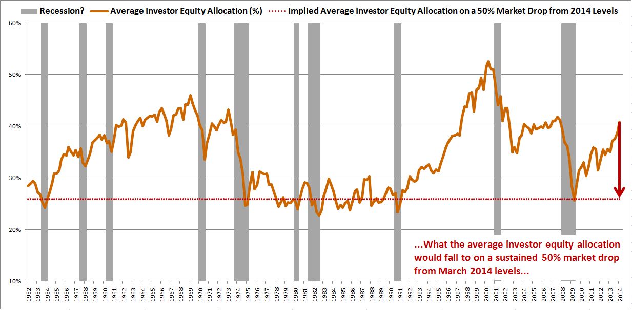
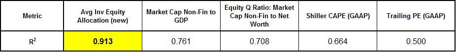
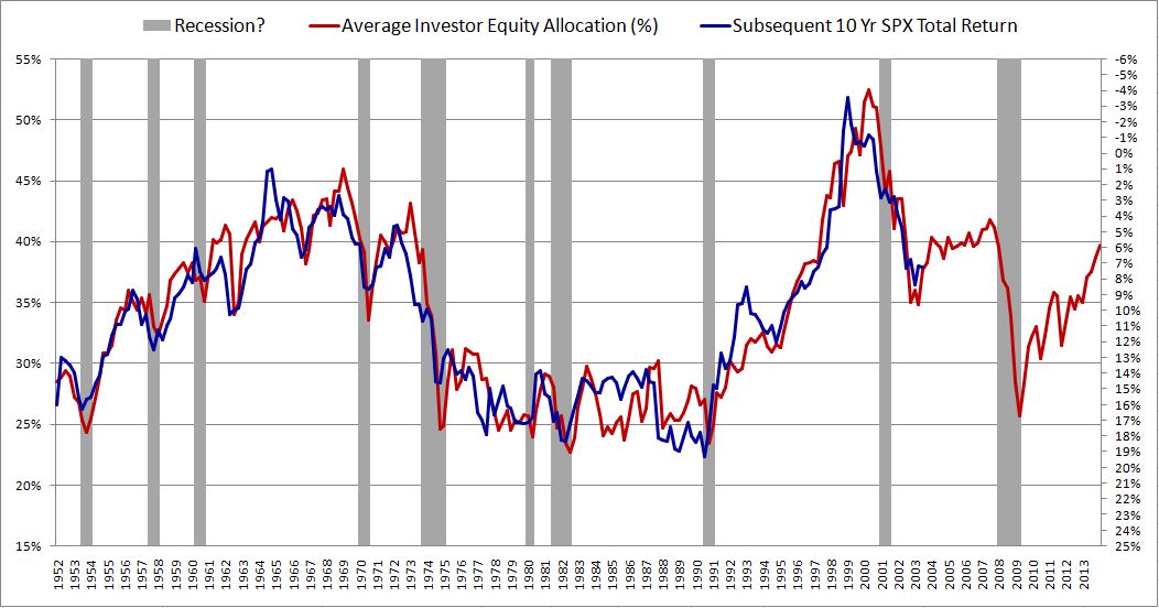
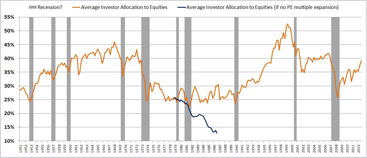
Consider the following chart, which shows the average investor portfolio allocation to equities from January 1952 to December 2013:

avginv

The metric in this chart takes no input from any variables traditionally associated with valuation: earnings, book values, profit margins, discount rates, etc.  It consists only of a simple ratio between two numbers that can easily be calculated in FRED.  Yet, as a predictor of future stock market returns, it dramatically outperforms all other stock market valuation metrics commonly cited.  

r2avginv

In this piece, I’m going to do five things.  First, I’m going to explain, in very simple terms, the accounting principles behind the metric.  The explanation will include instructions (with ready-made links) for how to graph the metric in FRED.  Second, I’m going to discuss the dynamics of asset supply, with a special focus on equities.  Third, I’m going to challenge the conventional framework for understanding the relationship between valuation and stock market returns.  Fourth, I’m going to introduce a new framework, one that relates stock market returns to equity asset supply.  Fifth, I’m going to present a scatterplot of the predictive performance of the metric alongside other metrics, and discuss what the metric is currently forecasting for U.S. equity returns.  I’m going to conclude by briefly touching on the question of whether or not the current U.S. stock market is “overvalued.”

Accounting Principles: Cash, Bonds, Stocks

To begin, let’s arbitrarily divide the universe of financial assets into three categories: (1) cash, (2) bonds, and (3) stocks.  By “cash”, I mean bank deposits and circulating currency.  By “bonds”, I mean any certificate of obligation to repay borrowed cash–commercial paper, bills, notes, bonds, etc.  By “stocks” (or “equity”), I mean shares of ownership in a corporation (public or private).  Note that these definitions are intentional simplifications.

Financial markets function on the following principle.  For every unit of every financial asset in existence, some investor somewhere must willingly hold that unit in a portfolio at all times.  By “investor”, I mean whoever owns wealth.  There are intermediaries–hedge funds, mutual funds, pension funds, financial advisors, etc.–that help investors allocate wealth.  But these entities are not the actual investors–their clients are.

The financial market is the place where investors decide–via trades–who will hold what units of what assets.  Note that cash, as an asset, is special in that respect.  It is the medium through which trades occur.  Investors can only switch from one stock or bond to another stock or bond by going through cash.  The going rate of exchange (bid or offered) between a unit of an asset and cash is the market price of the asset.

At the margin, if no investor can be found that wants to hold a given unit of a given asset at the prevailing market price, then the market price will fall until a willing holder is found.  With respect to shares of a stock or bond, the application is straightforward.  If no one wants to hold a given share at $100, then we try $95.  Still no takers?  Then we try $90, then $85, then $80, and so on.  We continue until some investor emerges that finds the share sufficiently attractive to hold at the offered price.  The concept applies analogously to cash–if no investor wants to hold cash, then the price that is bid on everything else will rise until everything else becomes so expensive and unattractive that some investor somewhere capitulates and agrees to hold cash instead.  Measured in terms of other assets, the price of cash falls.

The “supply” of an asset is the total market value of it in existence–the total number of outstanding units times the market price of each unit.  Put differently, supply is the amount of the asset available to be held in investor portfolios–the amount available for investors to allocate their wealth into.  In aggregate, investors have to want to hold the total supply of each asset in existence in their portfolios.  If there is too much supply of a given asset relative to the amount that investors want to hold in their portfolios, then the the market price of the asset will fall, and therefore the supply will fall.  If there is too little supply of a given asset relative to the amount that investors want to hold in their portfolios, then the market price will rise, and therefore the supply will rise.  Obviously, since the market price of cash is always unity, $1 for $1, its supply can only change in relative terms, relative to the supply of other assets.

The Aggregate Investor Allocation to Equities

Now, suppose that we open up every investor’s portfolio and calculate, for each investor, his percent allocation to stocks, bonds, and cash.  My portfolio might be allocated 85% to stocks, 15% to bonds, 0% to cash.  Yours might be allocated 50% to stocks, 20% to bonds, 30% to cash.  And so on.

The question we want to answer is this: what would the average of all of these investors’ portfolio allocations look like, weighted by size?  More specifically, what would the average investor allocation to stocks be?  And how would that average compare to the averages of the past? It turns out that this question predicts the market’s future long-term returns better than any other classic valuation metrics to date developed–price to earnings (P/E), price to book (P/B), price to sales (P/S), CAPE, q-ratio, Market Cap to GDP, Fed Model, etc.

To answer the question, we need to know two things: (1) the total amount of stocks that investors in aggregate are holding, and (2) the total amount of cash and bonds that investors in aggregate are holding.  Mathematically, the total amount of stocks that investors are holding divided by the total amount of everything (stocks plus bonds and cash) that they are holding just is the average investor allocation to stocks.

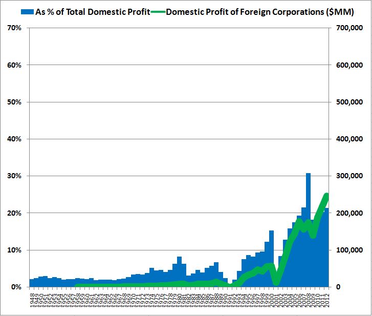
Now, to calculate the total quantity of cash and bonds in investor portfolios, we might think that we can just sum the total quantity of cash and bonds in existence outright–the total amount floating around the economy.  After all, these securities have to be held by investors.  But this approach won’t work.  The reason is that a large portion of the bonds in existence are actually held by banks, not by investors.  This fact extends to the central bank (the Federal Reserve), which presently owns an unusually large quantity of bonds.  

Fortunately, there’s a convenient way to get around the problem.  Recall that when the Federal Reserve buys bonds (treasury, MBS, etc.), it doesn’t add any net financial assets to investor portfolios.  Rather, it takes bonds out of investor portfolios, and puts newly created cash into investor portfolios.  It changes the cash-bond mix of the assets that investors hold–but not the total amount.

It turns out that private banks do essentially the same thing when they buy assets.  They take the assets out of the hands of investors, and put their own liabilities–in the form of their own bonds or deposits (cash)–into investor hands. (They can also fund purchases with equity sales, but the equity component of a banks balance sheet is small enough to ignore.)

The entities that create net new financial assets (that investors can hold) are not banks, which are just intermediaries, but rather real economic borrowers.  The universe of real economic borrowers consists of five categories: Households, Non-Financial Corporations, State and Local Governments, the Federal Government, and the Rest of the World. When these entities borrow directly from investors, the investors get new bonds to hold. When the entities borrow from banks, the investors get new cash to hold.  That’s because when a bank makes a loan, the money supply expands.  The loan creates a new deposit that didn’t previously exist–some investor must now hold that deposit in his portfolio of assets.

It follows, then, that if we want to get an estimate of the total amount of bonds and cash that investors are holding at any given time, all we have to do is sum the total outstanding liabilities of each of the five categories of real economic borrowers.  Those liabilities either translate into cash that an investor somewhere is holding (if the entity took a loan from a bank, which expands the money supply), or they translate into a bond that an investor somewhere is holding (if the entity borrowed directly from the investor).  Note that the average bond trades close to par (with some above, and some below), so, in aggregate, the value of the liabilities approximates the total market value of the bonds.

Banks don’t generally hold stocks.  So to estimate the total amount of stocks in investor portfolios, what we need to know is the total market value of all stocks in existence.  We end up with the following equation:

Investor Allocation to Stocks (Average) = Market Value of All Stocks / (Market Value of All Stocks + Total Liabilities of All Real Economic Borrowers)

We can get all of the information in this equation from the Flow of Funds report.  The information is also conveniently available in FRED Graph.  A link to the calculated metric is provided here, and to a separately downloadable version of each series, here.  

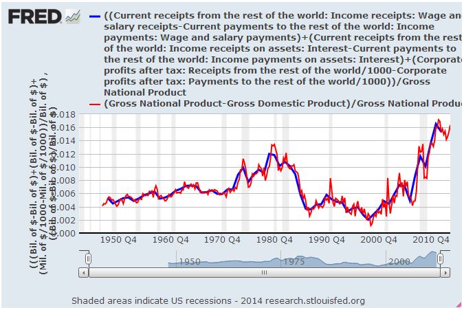
Now, the Rest of the World creates an interesting complication.  Parts of our portfolios are composed of stocks, bonds and cash denominated in foreign currencies (which do not show up in these series and are not being counted, though they should be). But in the same way, some parts of the portfolios of individuals in other countries are composed of stocks, bonds and cash denominated in our currency (which do show up in these series–and are being wrongly counted, given that our goal is to know our own allocations as domestic investors).  As an estimation, it works to assume that the two cancel each other out.

The Unique Dynamics of Equity Asset Supply

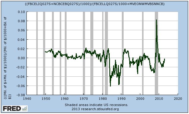
The supply of cash and bonds that investors in an economy must hold perpetually increases with the economy’s growth.  The cash and bonds in investor portfolios are literally “made from” the liabilities that real economic borrowers take on to fund investment–the fuel of growth.

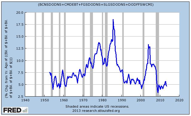
The following chart shows the annual growth of the total liabilities of all real economic borrowers–which, again, is the total supply of cash and bonds in investor portfolios–from 1952 to present.  The growth rate has ranged anywhere from around 5% per year to around 15% per year.  Right now, it’s at the low end of the spectrum.

credit

Trivially, if the aggregate investor is going to maintain a constant portfolio allocation to equities, the supply of equities must grow commensurately with the supply of cash and bonds.  Recall that investors, in aggregate, have to hold all of these assets at all times. It follows mathematically that the ratios of the total supplies outstanding must equal the ratios inside the “average” investor’s portfolio.

The supply of equities can increase in one of two ways: through the issuance of new shares, or through price increases, i.e., increases in the level of the stock market. The chart below shows the corporate sector’s net issuance of new equity, as a percentage of total market value, back to 1950.

equitygrowth

As we see in the chart, the corporate sector is inherently averse to the issuance of new equity.  Each year, it adds very little additional supply, on net.  In various periods since the early 1980s, it’s actually been a net destroyer of equity supply–taking supply off the market through acquisitions and buybacks.

As we explained in our earlier piece on earningless bull markets, because the corporate sector does not issue sufficient amounts of new equity each year to keep up with the continually increasing supply of cash and bonds, stock prices have to rise over the long-term.  If they don’t, stocks will become a smaller and smaller percentage of the aggregate investor portfolio.  Unless investors, on average, want stocks to be a smaller component of their portfolios–because, for example, they increasingly prefer to hold other assets–this outcome will not be allowed.  Stock prices will get pushed up on the growing relative scarcity until the aggregate equity allocation preference is satisfied.

Valuation: Challenging the Conventional Understanding

The total return of an equity security depends on two factors: (1) the change in price from purchase to sale, and (2) the dividends paid in the interim.  Dividends matter, but price is king.  It drives total return.  

Many investors don’t like the fact that price drives total return.  If price drives total return, it follows that total return is a function of the shifting sentiment, preferences and expectations of other people–those who make up the market and “vote” on what the price will be.  Investors don’t want their returns to be subject to the arbitrary “vote” of other people, and so they pretend that as stock market speculators they are actually genuine businessmen who “buy” and “own” companies to hold forever.  They tell themselves that their returns will somehow emerge directly from the cash flows of the underlying businesses, regardless of what the market decides to do with price.

This point of view ignores the fact that it takes decades to recoup an equity investment via dividends, the only cash flows that are ever are actually paid out to buy-and-hold investors.  To claim a return on a stock in any other context, an investor needs someone to sell it to.  The price that other people are wiling to pay is therefore important–supremely important.  Rather than resist this fact puristically, our responsibility as investors is to accept it and work within it, by understanding the behavioral propensities of our fellow market participants, and getting in front of emerging trends in how they choose to allocate their wealth.

Once we agree that price is king, the next question is: how is price determined in a market?  Value mavens tend to think that price is determined through the “rational” application of normative valuation principles, such as “The stock market’s P/E ratio should be 15, plus or minus a few points.  If interest rates are low, add a few points.  If they are high, take a few points off.”  On this view, when the actual P/E ratio is above the appropriate value, disciplined investors sell.  When it’s below that value, they buy.  Through their buying and selling, the price moves to where it “should” be, to “fair value”, given the earnings.  Every so often, emotions disrupt the process, but as with everything, they eventually pass, and the process takes hold again.  Value mavens look for these disruptions as an opportunity to capture excess return.

There’s certainly some truth to this view, but it doesn’t give the whole story. Ultimately, the price of equity is determined in the same way that the price of everything is determined–via the forces of supply and demand.  For any given stock (or for the space of stocks in aggregate), price is always and everywhere produced by the coming together of those that don’t own the stock and want to allocate their wealth into it, and those that do own the stock and want to allocate their wealth out of it.  If there is a different supply sought by the first group than offered by the second, the price will shift until the imbalance equalizes.

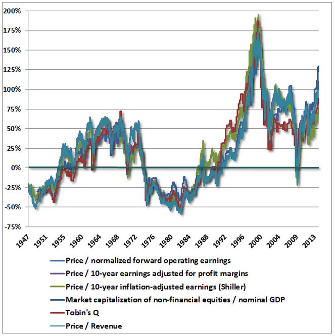
Now, there’s absolutely nothing that says that this process has to equilibriate at any specific valuation.  History confirms that it can equilibriate at a wide range of different valuations.  For perspective, the average value of the P/E ratio for the U.S. stock market going back to 1871 is 15.50.  But the standard deviation of that average is a whopping 8.4, more than 50% of the mean.  One standard deviation in each direction is worth 243% in total return, or 13% per year over 10 years.

The same is true of the popular Shiller CAPE.  Its long-term average is 15.30–but with a standard deviation of 6.5, again almost 50% of the mean.  Over the last 100 years, its value has stretched from as low as 5, to as high as 40–a difference of 700% in total return.  Note that the periods in which it took on depressed values were hardly brief.  It spent the entire decade of the 1940s at bargain basement levels, frequently falling into single digits–this in an environment where interest rates were pinned at zero.

Again, it’s all up to the allocators–they decide how much of their wealth they are going to allocate into stocks, how much exposure they are going to take on.  Their preferences–or rather, their efforts to put those preferences in place, by buying and selling–set the price.  Valuation is a byproduct of this process, not a rule that it has to follow.  In the 1940s, investors decided, for whatever reason–memories of the Depression, a World War that the country might have lost, price controls, high inflation–that they didn’t want large stock market exposure.  The fact that bond yields were meager did little to alter this preference.  And so valuations stayed extremely depressed.  When a vibrant, prosperous peacetime economy emerged in the 1950s, this preference obviously changed, and the biggest bull market in history ensued.

Buy-and-hold is painted as the informed, responsible, pro-American thing to do with a portfolio.  But, in terms of financial stability, it can actually be a very destructive behavior.  Consider the classic buy-and-hold allocation recommendation: 60% to stocks, 40% to bonds (or cash). What rule says that there has to be a sufficient supply of equity, at a “fair” or “reasonable” valuation, for everyone to be able to allocate their portfolios in this ratio?  There is no rule.  

If everyone were to jump on the buy-and-hold bandwagon, and decide to allocate 60/40, but equities were not already 60% of total financial assets, then they would necessarily become 60% of total financial assets.  The excess bidding would not stop until they reached that level.  It doesn’t matter that the associated price increase would cause the P/E ratio to rise to an obscenely high value.  The supply-demand dynamic would force it to go there.  

Now, in the real world, valuation concerns can and do push back on the equity allocation process.  But, outside of extremes, they don’t tend to push back with very much force, at least not on their own.  Let me now explain some of the reasons why. 

We can divide asset allocators into two types: mechanical allocators, and active allocators.  Mechanical allocators are individuals that adhere to a strict allocation formula, regardless of circumstance.  Two examples would be buy-and-hold investors that are always 100% invested (or always 60/40 invested, periodically rebalancing, etc.), and 401K/retirement investors that invest automatically in accordance with a pre-defined program.  These asset allocators follow their processes come rain or shine, therefore they cannot be relied upon to push back against valuation excesses.  Though they are not the majority of the market, they are a significant part of it–their presence makes a difference.

Active allocators, in contrast, dynamically alter their allocations so as to maximize their returns.  How do they try to maximize their returns?  By allocating their wealth into the assets whose returns they consider to be the most attractive, adjusted for risk.  It’s a competitive process–they choose among their options, based on their assessments of what those options are likely to produce.  

Some might interpret this to mean that they look at the earnings yields on stocks, the yields to maturity on bonds, and the yield on cash, and then choose.  Let’s suppose that asset allocation were this easy–just find the asset class with the highest yield, risk-adjusted, and allocate into it.  We would still have to answer the question: what is the future yield (at the current price) of each asset class, adjusted for risk?  To answer this question with respect to cash is hard–we have to estimate future short-term interest rates.  With respect to bonds, even harder–we have to estimate credit risk.  With respect to stocks, the hardest of all–we have to estimate forward earnings.   

To estimate forward earnings for stocks, we have to answer difficult questions about the future: What will the trajectory of nominal growth be? How will profit margins evolve? Who can answer these questions with a significant degree of empirical confidence, enough to be a contrarian that consistently fights the market’s trends?  Very few people, and therefore the answers to the questions end up reducing to biased reflections of prevailing mood, extrapolations of recent experience.  When the mood is high, and when recent experience has been positive, investors embrace optimistic assessments of what the future holds–therefore, equities look cheap, attractive.  The market gets the opposite of the valuation pushback that it needs.  When the mood is low, and when recent experience has been negative, investors embrace more pessimistic assessments of what the future holds–therefore, equities look expensive, unattractive.  Again, the market gets the opposite of the valuation pushback that it needs.

It turns out that even if fundamental questions about the future yields of cash, bonds, and equities were resolved, asset allocation still would not be as simple as choosing the security that offers the highest yield (risk-adjusted).  The goal, again, is to maximize return. Return is not the same thing as yield.

Granted, if a security is held to maturity, or, in the case of equities, for an infinite period of time, the return will mathematically converge on the yield (provided, in the case of equities, that all earnings are eventually distributed as dividends).  But who among us buys bonds to hold to maturity, or stocks to hold forever?  Most investor time horizons are not on the order of decades, centuries or infinity, but on the order of days, months and years–a few days (the time horizon of a swing trader), a few months (the expiration date on a portfolio manager’s grace period with clients, at which point they will start leaving if things aren’t working), or a few years (long-term value investors playing with their own money).

To know the return of a security on a daily, monthly, or yearly time horizon, it’s not enough to know what the yields are.  You need to know how the price is going to change.  Given future cash flows (which we’ll assume you’ve accurately estimated), this requires knowing what the future valuation will be.

To illustrate, suppose that the P/E multiple on stocks is 20, the 10 year bond yield is 2%, and the rate on cash is 0%.  Suppose further that the earnings of each of these securities are going to remain constant.  Can you say which security will offer the highest return over the next few years?  You might say stocks–the earnings yield is 5%, a healthy 3% more than bonds. The “premium” between the two is meaningfully higher than the historical average.  But that doesn’t tell you what the return of stocks will be.  If the investment mood sours ever so slightly over the next few years, and the market concludes that a P/E of 17 is more “appropriate” than a P/E of 20, the return will be negative–making stocks significantly less attractive than the other available assets, despite the higher earnings yield.  

The only way that you can know what the future valuation of stocks will be–so as to estimate future returns–is to apply some conception of what’s fair, appropriate, reasonable, normal.  But the range of what can be rationalized as fair, appropriate, reasonable, normal is extremely wide, too wide to be useful, and far too wide to provide reliable pushback against a supply-driven market advance.  Any number that is chosen will likely be nothing more than a reflection of the prevailing allocation preference–the prevailing appetite to be in or out of the asset class, based on primordial “hunches” for where things are headed, themselves just manifestations of recency bias.  Once again, the market will not get the valuation pushback that it needs.

Ultimately, valuation is a learned perception, learned through a process of social and environmental reinforcement.  The part of it that is not learned is just a crude manifestation of the behavioral bias of anchoring–judging the attractiveness of a price (or a ratio) by comparing it to the price (or ratio) that one is “accustomed” to seeing.  Ironically, it is anchoring, not “valuation discipline”, that keeps the market from doing crazy, bubbly things.  People don’t like to pay higher prices tomorrow than they could have paid today, or sell for lower prices today than they could have sold for yesterday.  That’s true regardless of what any valuation metric says.  

To illustrate, suppose that you spend a significant amount of time in an environment where the average valuation is 25 times (or more).  You acclimatize to that valuation, it becomes your anchor, what you are used to seeing.  All of the “pundits” that you watch on TV tell you that it’s normal.  All of your friends, your fellow investors, say that it’s normal.  Most importantly, whenever you’ve bought at or below that valuation, it’s worked–the market has rewarded you with a positive outcome.  And so you’re comfortable buying at that valuation.

Obviously, in such an environment, you will come to perceive 25 times earnings as a perfectly “appropriate” price for the market–a “fair” multiple.  If given an opportunity to buy the market at a lower price–for example, 20 times–your reward circuitry will fire off, creating an appetite to lock in the “bargain”, jump on the “big gains” that it is offering.

But now switch the P/E in the example from 25 to 15.  Suddenly, the same P/E of 20 will make you feel like you’re overreaching, exposing yourself to danger, buying too high. “Gee, what if the P/E falls back to 15, where it usually is, what I’m used to seeing–I’ll lose 25% in one move!  I can’t afford that.”

Because valuation is a learned perception, driven by anchoring and by social and environmental feedback, it tends to follow the market.  As valuations rise in a bull market, prior anchors wear off, and people get accustomed to higher valuations–over time, the valuations stop feeling “high”–making room for them to go even higher.  Their perceived appropriateness gets reinforced–socially, in the market discussion, and environmentally, through the incredibly powerful feedback of actually making money.  In a long, slogging bear market, the opposite occurs.  Everything gets driven downwards.

To illustrate, consider the example of the most recent cycle.  There was a time, before the crisis, when we talked about trailing P/Es of 18 or 19 times earnings as reasonable–maybe even a bargain, relative to the bubble that we had previously come out of.  If we thought the trailing P/E was too high in the summer of 2007, we were told to ignore it–because the market was still very cheap on forward estimates (themselves just a reflection of the optimism).

Then, we had the Great Recession, a massive, negatively-reinforcing series of economic events–completely unrelated to stock market valuation, mind you–that shattered everyone’s equity world view.  We suddenly found ourselves seriously debating whether 10 times trailing recessionary earnings was appropriate.  We were supposedly in a “new normal”, which, we feared, implied structurally lower valuations.

The crisis eventually abated, and the economy entered a recovery.  But people still had to work off their fear conditioning and their anchoring.  As the market rose, the discussion shifted to whether 12 times was appropriate.  Then, 14 times.  Now, 17 times.  The anchor, the goalpost, has continued to move with the market.  Pretty soon, the discussion will come full circle again, and we will be asking ourselves whether 18 or 19 times is appropriate.  And, if the cycle isn’t cut short by externalities, as it was the last time, we may one day find ourselves discussing the appropriateness of 25 times–which has been debated before in market history (a few years before the market proceeded to go to 40).

The drivers of this recurring pattern are obvious: not some innate “sense” of “fair value”, but anchoring and the social-environmental reinforcement of the market cycle itself.  The perception of valuation is not capable of creating persistent, reliable resistance to the market cycle because it is an evolving function of the market cycle.  At extremes, it can push back–but it can’t push back when it falls within the very wide range of what can be rationalized, which is where it usually falls, and where it is now.

Ultimately, we should be skeptical of claims that investors are innately hardwired to act in a certain way in response to any specific concept, argument, or data point–whether it be “valuation”, or anything else.  Investors elicit behavioral responses to these types of informational inputs, but the responses are not innate.  They are learned from the environment through a process of conditioning and reinforcement.

Investors attend to concepts, arguments, and data points, etc. as a means to an end–the end of predicting what the return will be, which, in practice, means predicting where the price is headed.  If investors already have a hunch for where the price is headed–which they often do–they will choose to embrace whatever concepts, arguments, data points, etc. fit that hunch–or they’ll just ignore the “mumbo jumbo” altogether, and go with their “feel.” Similarly, if they are just using the constructs to save face in social debate–to avoid having to admit to themselves and to others that they are wrong–they will jump on whatever concepts, arguments, data points, etc. show that they are right (and ignore everything else). 

When investors don’t have a hunch for where prices are headed, and are genuinely trying to use concepts, arguments, data points, etc. to assess what to do, the ensuing assessment ends up being something inherently insecure, subject to constant feedback and molding from the market–responsive to the result, and ditched when no longer working.

You might confidently think, for example, that “good jobs number” means “the recovery is picking up steam”, and that you should increase your equity risk–but if the market starts consistently telling you that this is wrong, by its actual result, you will be affected by the feedback.  You may eventually find yourself pulled to function in accordance with the opposite rule, that “good is bad.”  “Maybe I shouldn’t rush to increase my exposure here.  Maybe these good jobs numbers will lead the Fed to tighten–maybe that’s why the market is selling off.  Oops.”

Admittedly, when enough people grab onto and act on concepts, arguments, data points, etc., they can become powerful forces that drive market outcomes, especially when they have a basis in reality that gives them credibility and forces people to believe them.  The reflexivity of price confirmation increases their allure and persuasiveness, which causes more people to latch onto them, which fuels further price changes, therefore more price confirmation, and so on in a feedback loop that continues until reality pushes back.

However, it’s hard for valuation to pick up steam in this way, because unlike other themes that might move markets, it has no objective basis–it’s a personal opinion, easy to dismiss. It represents a resistance to what the market itself is doing–and is therefore already on the road to being disconfirmed simply by the fact that it is being raised.  If valuations are too high, then why are we where we at them?  Why aren’t we falling?  Absent some kind of confirmation or feedback, the theme can’t go anywhere.

Outside of cyclical downturns in which profits themselves plunge, valuation never enters the discussion as a surprise, an “insult”, but rather is only introduced gently, gradually, as the market advances–usually by those who are not part of the advance.  Market participants therefore have time to acclimatize to it as a theme.  It can’t produce the kind of shock and surprise that would catch people offsides and provoke mounting, reflexively self-fulfilling reactions. That’s why it usually takes a recession–or some kind of noxious catalyst–to unwind a valuation excess.  The excess alone can’t correct itself.

In the tech bull market, the overvaluation theme had a hard time pushing back even when index P/Es were in the 30s and 40s.  People talked about overvaluation, they worried about it.  But then they kept watching the price go up–so what do you do?  You don’t tell the market that it’s wrong, you trust your environment, you go with the flow.  In the end, it took a tight Fed, a recession with falling earnings, a slew of corporate bankruptcies and scandals, unfamiliar accounting changes that led to further earnings plunges, a terrorist attack, a war in the Middle East, and so on, to finally get the market moving reliably in the downward direction, so that the valuation excess could be corrected.

Asset Supply:  A New Framework for Thinking About Equity Returns

Value mavens will tell you that the market’s P/E ratio (either simple trailing twelve months, or Shiller CAPE) is inversely correlated with future returns over the long-term.  A high P/E ratio implies low future returns, a low P/E ratio implies high future returns.

But what makes this true?  What is the force that brings about the inverse correlation? Recall that we said that equity total return is a function of price return and dividend return.  We can aribtrarily separate price return into the part that comes from Earnings Growth, and the part that comes from the change in the P/E multiple.  Leaving the math intentionally imprecise, we end up with the following equations:

(1) Total Return = Price Return + Dividend Return

(2) Price Return = Price Return from P/E Multiple Change + Price Return from Earnings Growth (Realized if P/E Multiple Were to Stay Constant)

Combining (1) and (2):

(3) Total Return = Price Return from P/E Multiple Change + Price Return from Earnings Growth (Realized if P/E Multiple Were to Stay Constant) + Dividend Return

Now, suppose that the market has a P/E ratio of 100.  Why does it have to produce a low or negative return?  If corporate earnings are growing at the rate of nGDP, say 6%, and the P/E ratio stays at 100, then the return will be 6%–a perfectly healthy number.

Value mavens will respond that the P/E ratio cannot stay at 100.  It mean-reverts over the long-term.  Its mean-reversion is the basis for its inverse correlation with long-term future returns.  If you buy at a price below the normal P/E range, you will get the dividend return, plus the return from earnings growth, plus the boost from multiple expansion. Thus your return will be higher than normal.  Conversely, if you buy above the normal range, you will get the dividend return, plus the return from earnings growth–but those two gains will then be offset by losses from multiple contraction.  Thus your total return will be lower than normal.

The problem with this construction, of course, is that it doesn’t model the real reasons that stock prices, in aggregate, change.  Stock prices don’t change because market participants choose to assign stocks different P/E multiples.  Rather, they change because the eagerness of the aggregate investment community to allocate wealth into stocks rises or falls.  More investors try to “put money to work” than try to “take money off the table”, and vice-versa.  In the presence of the imbalance, the price has no choice but to change.

As equity investors, we talk a lot about asset allocation.  It’s essentially the most important aspect of portfolio management–how we’re allocated within the space of individual stocks and bonds, and across the space of assets in general.  I’m 85% equity, 15% cash/bonds. You’re 50% equity, 50% cash/bonds. Joe over there is 100% equity, 0% cash/bonds, etc.  

What’s funny is that we never think to ask: how is it possible for all of us to get to within a reasonable range of these preferred allocations at the same time?  After all, we’re trading a limited supply of things amongst each other.  The answer, of course, is that the supply, properly understood, automatically shifts to meet our allocation preferences via the changes in price that we cause when we try to put those preferences in place–that is, when we buy and sell at the margin.  In bull markets, we frequently find ourselves searching for opportunities to put our allocation preferences in place–our equity exposures are rarely as high as we would like them to be.

I therefore propose a new way of framing equity total returns.  Take the previous equation, and substitute “Aggregate Investor Allocation to Stocks” and “Increase in Supply of Cash and Bonds” for “P/E Multiple Change” and “EPS Growth.”  We then have,

(1) Total Return = Price Return + Dividend Return

(2) Price Return = Price Return from Change in Aggregate Investor Allocation to Stocks + Price Return from Increase in Cash-Bond Supply (Realized if Aggregate Investor Allocation to Stocks Were to Stay Constant)

Combining (1) and (2),

(3) Total Return = Price Return from Change in Aggregate Investor Allocation to Stocks + Price Return from Increase in Cash-Bond Supply (Realized if Aggregate Investor Allocation to Stocks Were to Stay Constant) + Dividend Return

In the previous way of thinking, the earnings grow normally as the economy grows.  If the multiple stays the same, the price has to rise–this price rise produces a return.  When the multiple increases alongside the process, the return is boosted.  When it decreases, the return is attenuated.  The multiple is said to be mean-reverting, and therefore when you buy at a low multiple, you tend to get higher returns (because of the boost of subsequent multiple expansion), and when you buy at a high multiple, you tend to get lower returns (because of the drag of subsequent multiple contraction).

In this new way of thinking, the supply of cash and bonds grows normally as the economy grows.  If the preferred allocation to stocks stays the same, the price has to rise (that is the only way for the supply of stocks to keep up with the rising supply of cash and bonds–recall that the corporate sector is not issuing sufficient new shares of equity to help out).  That price rise produces a return.  When the preferred allocation to equities increases alongside this process, it boosts the return (price has to rise to keep the supply equal to the rising portfolio demand).  When the preferred allocation to equities falls, it subtracts from the return (price has to fall to keep the supply equal to the falling portfolio demand).

Now, instead of saying that the P/E multiple is mean-reverting, we say that, for a given set of environmental contingencies–e.g., history, culture, demographics, etc.–the equity allocation preference is mean reverting.  It rises in expansionary parts of the cycle, as people become more optimistic about the future and more eager to maximize what they see as attractive returns (“Kelly, we believe in this bull market, we’re fully invested, our clients are fully invested.”–something you hear frequently on CNBC these days), and it falls in contractionary parts of the cycle, as people become less optimistic about the future and more concerned about protecting themselves from losses (“Maria, we’re cautious here, we’ve raised cash, we want to see signs of stabilization before we deploy it.”–something that you heard frequently on CNBC in ’08 and early ’09).

If you buy in periods where the investor allocation to equities is low, you will get the dividend return plus the price return necessary to keep the portfolio equity allocation constant in the presence of a rising supply of cash and bonds, plus the price return that will occur when equity allocation preferences return to more normal levels.  You will get in front of the equity supply squeeze of the next bull market, when risk appetite and the associated desire to be invested in equities recovers.  Thus your return will be higher than normal.  This is what happened to investors in the 1980s.

If you buy in periods where the investor allocation to equities is high, you will get the dividend return plus the price return necessary to keep the portfolio equity allocation constant in the presence of a rising supply of cash and bonds, but then you will have to subtract the negative price return that will occur when equity allocation preferences fall back to more normal levels.  This is what happened to investors in the 2001-2003 bear market.

This way of thinking about stock market returns accounts for relevant supply-demand dynamics that pure valuation models leave out.  That may be one of the reasons why it better correlates with actual historical outcomes than pure valuation models.  

It can explain, for example, the earningless bull market of the 1980s.  Unbeknownst to many, earnings were not rising in the 1980s bull market.  They actually fell slightly over the period–which is unusual.  But prices didn’t care–they skyrocketed.  The P/E ratio ended up rising well above 20, despite interest rates near 10%–a valuation disparity never before seen in history.  Valuation purists can’t explain this move–they have to postulate that the “common sense” rules of valuation were temporarily suspended in favor of investor craziness.  

But if we look at what investor allocations were back then, we will see that investors were already dramatically underinvested in equities.  If prices hadn’t risen, if investors had instead respected the rules of “valuation” and refrained from jacking up the P/E multiple, the extreme underallocation to equities would have had to have grown even more extreme.  It would have had to have fallen from a record low of 25% to an absurd 13% (see blue line in the chart below, which shows how the allocation would have evolved if the P/E multiple had not risen).  Obviously, investors were not about to cut their equity allocations in half in the middle of a healthy, vibrant, inflation-free economic expansion–a period when things were clearly on the up.  And so the multiple exploded.       

aggr

Now, recognize that this framework leaves plenty of room to acknowledge the relevance of classical valuation considerations.  Disparities in valuation–between equities and their own history (the valuation levels investors are anchored to, accustomed to seeing, that they consider to be “normal”) and between equities and other asset classes (bonds and cash)–can certainly cause investors to want to change their allocations and exposures, especially when the disparities are significant and can’t be dismissed or rationalized away.  If such a change unfolds, prices will rise or fall accordingly.  But if such a change doesn’t unfold, then prices are not going to respond.  Nor “should” they.  

In a way, the metric already offers a rough estimation of classical valuation.  If the average investor allocation to equities is abnormally low, then prices are probably abnormally low–the market’s probably cheap.  Likewise, if the average investor allocation to equities is abnormally high, then prices are probably abnormally high–the market’s probably expensive.  And so an investor that is value-sensitive can still use the metric as a way of assessing the market opportunity.

Comparing the Metrics on Performance

r2avginv

The following chart is a scatterplot of the new metric.  The y-axis is 10 year SPX total return, the x-axis is the average investor equity allocation.  The solid red line is the current value of the metric.  Note the excellent fit.  

linearavg

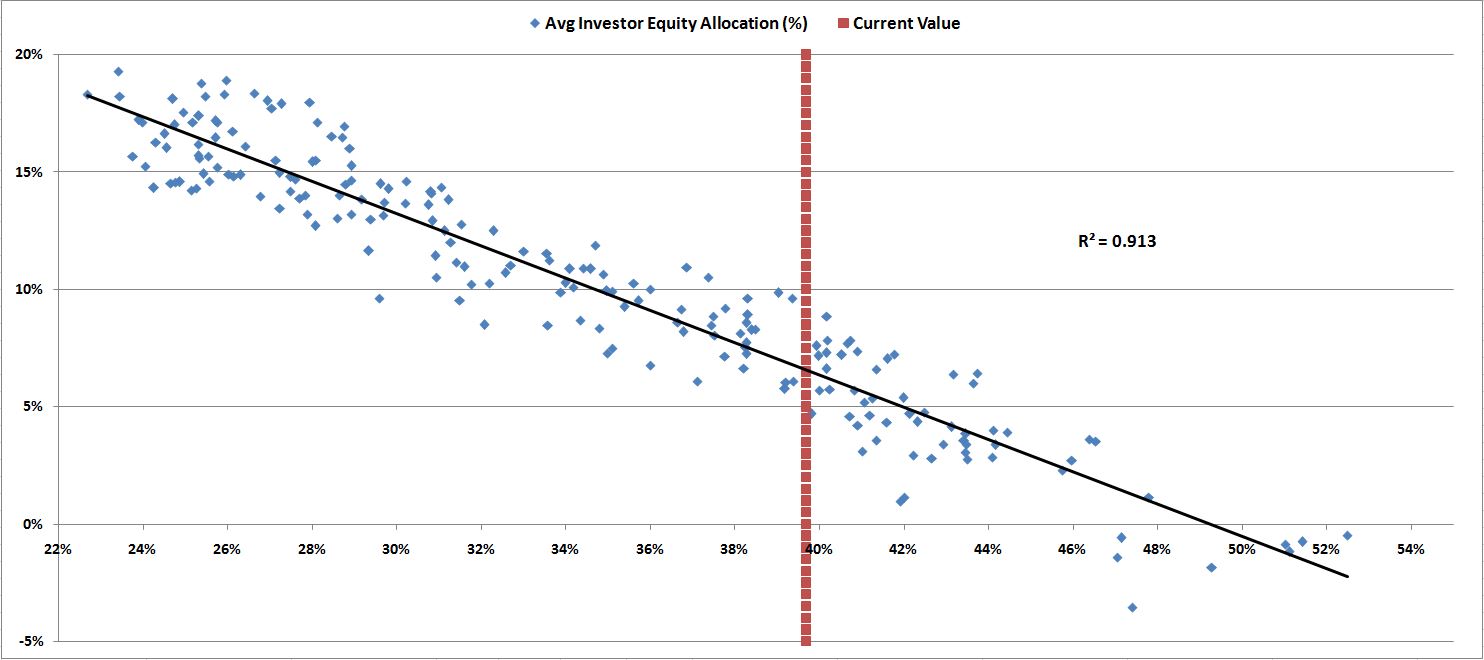
Right now, at its current value, the metric suggests a future 10 year nominal total return for equities of around 6%.  Historically, whenever the market was at the current level, the low end of the return was a tad less than 5%, and the high end was around 9%.

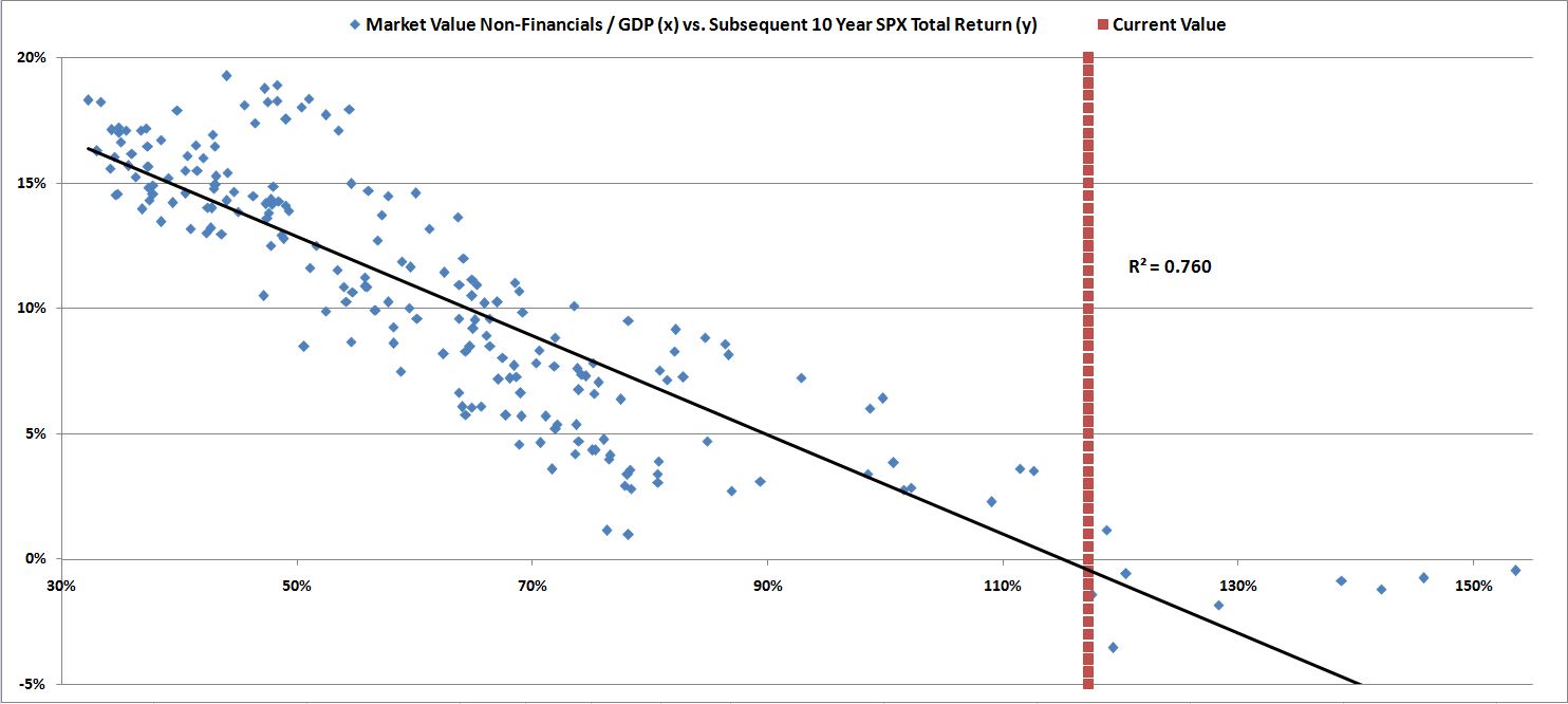
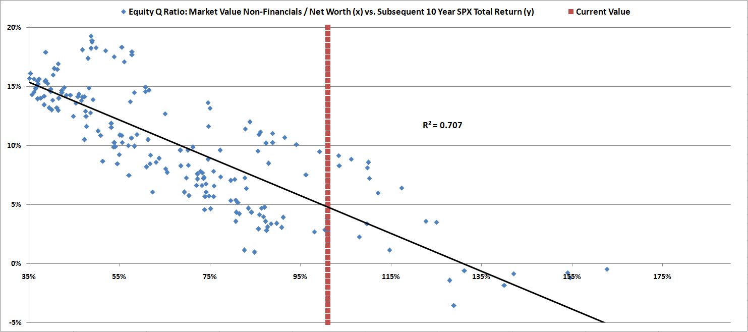
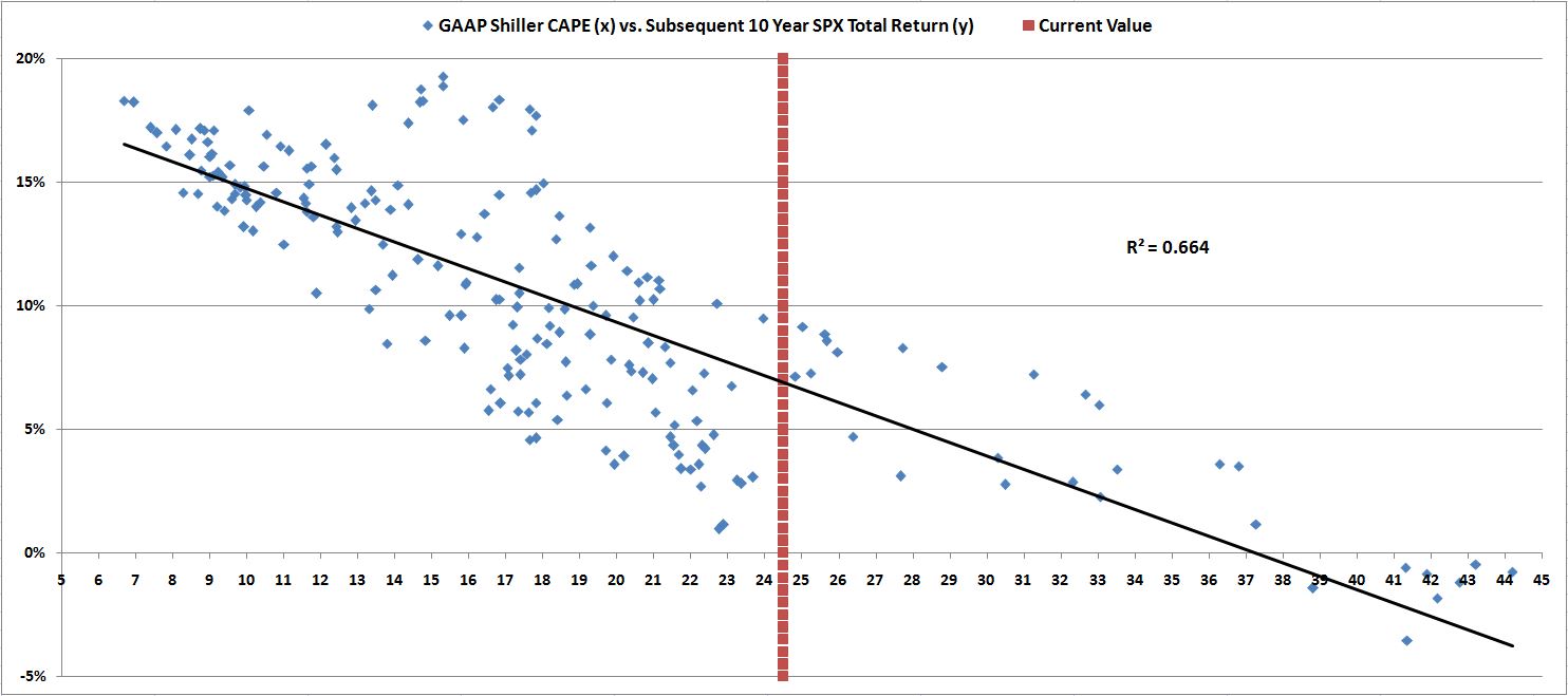
The following charts show scatterplots of the other metrics.  It’s not even worth speculating on what returns they are suggesting right now, because the fits are atrocious, especially in the current valuation range.  The Equity Q-ratio, for example, puts the market’s current future 10 year returns anywhere from as low as 2% to as high as 9%.  The Shiller CAPE puts the returns anywhere from as low as 0% to as high as 10%–with an ironic bias to the upside.  Market Cap to GDP puts returns anywhere from -3% to 2% (which is why it has become fashionable among bears).

linearmvalgdp

Equity Q

linearshiller

linearpe

In our earlier piece, we pointed out that the classic Shiller CAPE wrongly labeled the March 2003 market as significantly overvalued, and the March 2009 market as barely below fair value (an epic, inexcusable blunder).  We pointed out that one advantage of the pro-forma CAPE, which tried to eliminate accounting inconsistencies, was that it correctly identified the market’s attractive valuation in these periods.  It called March 2003 a decent value, and March 2009 a screaming buy.

It turns out that like the pro-forma CAPE, this metric also called 2003 and 2009 correctly.  It signaled the March 2003 market as a reasonable buy, and the March 2009 market as a screaming buy, on par with levels seen at the secular low of the last bear market, 1982.  

avginv

A Note on “Overvaluation”

There’s a raging debate right now between bulls and bears over whether the U.S. stock market is presently overvalued.  The debate rages on because the term is poorly defined.  What, precisely, does it mean to say that something is “overvalued”?

When we say that the stock market is “overvalued”, we might mean that it’s currently valued more expensively than it typically has been in the past.  Over its history, the U.S. stock market has offered, on average, some expected total return–say 8% to 10%.  But now it’s priced for 5% or 6% (using our metric).  So it’s “overvalued.”  

Fair enough, bulls shouldn’t disagree.  There are tons of reasons why the present stock market is unlikely to produce the 8% to 10% returns that it has produced, on average, throughout history.  On almost every relevant measure, it’s starting out from a higher-than-average level. 

The more important question, however, is this: why should the stock market offer investors the average historical return right now?  If, over the next 10 years, bonds are offering investors 2.8%, and cash is offering them less than 1%, why should stocks be priced to offer them 8% to 10%?  

How would that even be sustainable?  If equities were offering an 8% to 10% return, we would all choose to allocate the bulk of our portfolios into them, rather than languish in the ZIRPY nothingness of bonds and cash.  There obviously isn’t enough equity supply for all of us to allocate in that way, and so the price would get pushed up, and the expected return pulled down–very quickly.

Now, it’s a mistake, obviously, to make an assessment of valuation based strictly on a comparison between the yields of stocks and bonds, as the Fed Model suggests we do.  The yield of an equity security, again, is not the same as its return.  You can buy the market at 33 times earnings–a 3% earnings yield–but your return over the next 10 years isn’t going to be 3%.  It will probably be 0% (or less), as the market contracts from the obscene valuation at which you bought it.  If you were to try to justify the stock market’s price by comparing its 3% yield to the 10 year bond yield at 1%, touting the healthy risk premium (2%–greater than the historical average), you would obviously be making a huge mistake.  The real risk premium on your stock investment would be negative–you would end up with a loss.

But if you properly estimate long-term equity returns using other methods–for example, the method I’ve proposed, which puts the future return for the stock market at 5% to 6%–then it makes perfect sense to assess the “appropriateness” of the current valuation through a process of comparison with the investment alternatives.  In the current case, the alternatives of cash and bonds are offering much less than 5% to 6%–so there’s a decent risk premium in place for equities.  The market is not “overvalued”–it doesn’t “belong” at a lower valuation.  To the contrary, it’s priced where it should be, given the alternatives. Investors have done their jobs properly, leaving no easy arbitrages to exploit. 

Now, if bears want to argue that it’s unwise to lock in 5% to 6% equity returns right now (or even 3% or 4%), because the market cycle will eventually produce selloffs in which greater returns are made available, my response would be: who said anything about locking anything in?  Let’s time the market–as bears seem to want to do.  I’m all for that approach.

But timing the market doesn’t mean boycotting it until it hands you, on a silver platter, the high returns that you’re demanding.  After all, there’s an excellent chance that it won’t hand them to you–there’s no reason it has to.  General societal progress–particularly in the area of economic policymaking–reduce the odds that it will.  Rather, timing the market means monitoring for the types of processes that tend to cause markets to sell off–capturing equity returns except when there are signs of those processes emerging. “Valuation”–at least in the range that we’re currently at–is not one of the processes that cause markets to sell off (or, for that matter, that stop markets from selling off).  So stop worrying about it.

Big selloffs usually occur in association with recessions.  That’s where market timers make their money–by anticipating turns in the business cycle.  A hint to bears: if you’re calling for a recession right now, in this monetary environment, you’re doing it wrong.

Posted in Uncategorized | Comments Off on The Single Greatest Predictor of Future Stock Market Returns