A common criticism of Professor Robert Shiller’s famous CAPE measure of stock market valuation is that it fails to correct for the effects of secular changes in the dividend payout ratio. Dividend payout ratios for U.S. companies are lower now than they used to be, with a greater share of U.S. corporate profit going to reinvestment. For this reason, earnings per share (EPS) tends to grow faster than it did in prior eras. But faster EPS growth pushes up the value of the Shiller CAPE, all else equal. Distortions therefore emerge in the comparison between present values of the measure and past values.
To give credit where it’s due, the first people to point out this effect–at least as far as I know–were Professor Jeremy Siegel of Wharton Business School and his former student, David Bianco of Deutsche Bank. Siegel, in specific, wrote about the problem as far back as late 2008, during the depths of the financial crisis, when the Shiller CAPE was steering investors away from a market that he considered to be extremely cheap (see “Jeremy Siegel on Why Equities are Dirt Cheap”, November 18, 2008, link here).
In a piece from 2013, I attempted to demonstrate the effect with two tables, shown below:
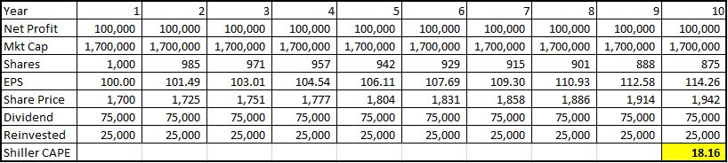
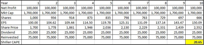
The tables portray the 10 year earnings trajectories and Shiller CAPE ratios of two identical companies that generate identical profits and that sell at identical trailing-twelve-month (ttm) P/E valuations. The first company, shown in the first table, pays out 75% of its profit in dividends and reinvests the other 25% into growth (in this case, share buybacks that grow the EPS by shrinking the S). The second company, shown in the second table, pays out 25% of its profit in dividends, and reinvests the other 75% into growth.
As you can see, even though these companies are identically valued in all relevant respects, they end up with significantly different Shiller CAPEs. The reason for the difference is that the second company reinvests a greater share of its earnings into growth than the first company. Its earnings therefore grow faster. Because its earnings grow faster, the act of “averaging” them over a trailing 10 year period reduces them by a greater relative amount. Measured against that trailing 10 year average, the company’s price, appropriately set in reference to its ttm earnings, therefore ends up looking more expensive. But, in truth, it’s not more expensive–its valuation is exactly the same as that of the first company.
The following chart illustrates the effect:
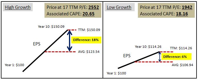
To summarize the relationship:
- Lower Payout Ratio –> Higher Earnings Growth –> Higher CAPE, all else equal
- Higher Payout Ratio –> Lower Earnings Growth –> Lower CAPE, all else equal
Now, how can we fix this problem? A natural solution would be to reconstruct the CAPE on the basis of total return (which factors in dividends) rather than price (which does not). But that’s easier said than done. How exactly does one build a CAPE ratio–or any P/E ratio–on the basis of total return?
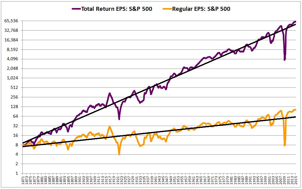
Enter the Total Return EPS Index, explained here and here. The Total Return EPS Index is a modified version of a normal EPS index that tells us, hypothetically, what EPS would have been, now and at all times in history, if the dividends that were paid out to shareholders had not been paid out, and had instead been diverted into share buybacks. Put differently, Total Return EPS tells us what earnings would have been if the dividend payout ratio had been 0% at all times. In this way, it reduces all earnings data across all periods of history to the same common basis, allowing for accurate comparisons between any two points in time.
Crucially, in constructing the Total Return EPS, we assume that the buybacks are conducted at fair value prices, prices that correspond to the same valuation in all periods (equal to the historical average), rather than at market prices, which are erratic and often groundless. To those readers who continue to e-mail in, expressing frustration with this assumption–don’t worry, you’re about see why it’s important.
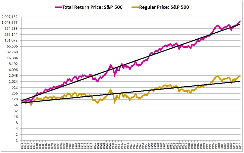
The following chart shows the Total Return EPS alongside the Regular EPS from 1871 to 2015. In this chart and in all charts presented hereafter, the index is the S&P 500 (and its pre-1957 ancestry), the values are appropriately inflation-adjusted to February 2015 dollars, and no corrections are made for the effects of questionable accounting writedowns associated with the last two economic downturns:
Now, if all S&P 500 dividends had been diverted into share buybacks, then the price of the index would have increased accordingly. We therefore need a Total Return Price index–an index that shows what prices would have been on the “dividends become buybacks” assumption.
Calculating a Total Return Price index is straightforward. We simply assume that the market would have applied the same P/E ratio to the Total Return EPS that it applied to the Regular EPS (and why would it have applied a different P/E ratio?). Multiplying each monthly Total Return EPS number by the market’s ttm P/E multiple in that month, we get the Total Return Price index.
In the chart below, we show the Total Return Price index for the S&P 500 alongside the Regular Price, from 1871 to 2015:
Generating a CAPE from these measures is similarly straightforward. We divide the Total Return Price by the trailing 10 year average of the Total Return EPS. The result: The Total Return EPS CAPE.
Shiller himself proposed a different method for calculating a CAPE based on total return in a June 2014 paper entitled “Changing Times, Changing Valuations: A Historical Analysis of Sectors within the U.S. Stock Market: 1872 to 2013” (h/t James Montier). The instructions for the method are as follows: Use price and dividend information to build a Total Return Index. Then, scale up the earnings by a factor equal to the ratio between the Total Return Index and the Price Index. Then, divide the Total Return Index by the trailing ten year average of the scaled-up earnings. In a piece from August of last year, I tried to build a CAPE based on Total Return using yet another method (one that involves growing share counts), and arrived at a result identical to Shiller. The technique and charts associated with that method are presented here.
It turns out that both of these methods produce results identical to the Total Return EPS CAPE method, with one small adjustment: that we conduct the buybacks that form the Total Return EPS at market prices, rather than at fair value prices as initially stipulated. The following chart shows the three types of Total Return CAPEs together. As you can see, the lines overlap perfectly.
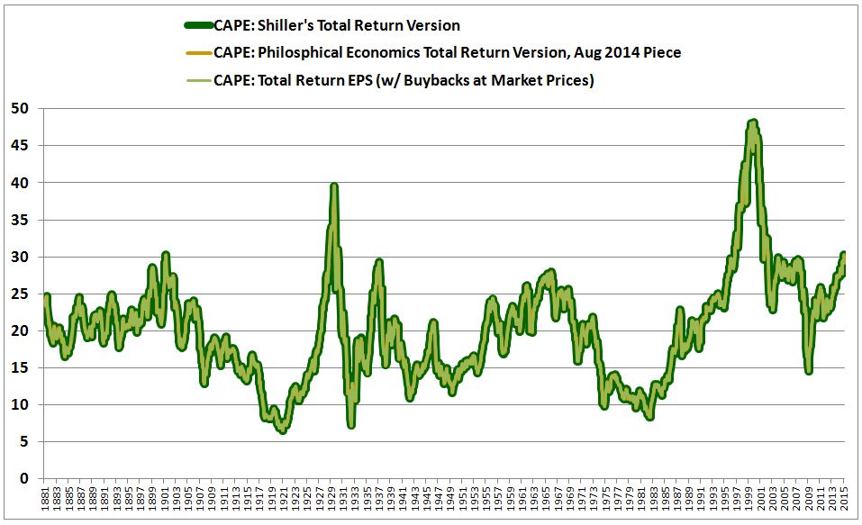
The three different versions of the CAPE overlap because they are ultimately doing the same thing mathematically, though in different ways. Given that they are identical to each other, I’m going to focus only on the Total Return EPS version from here forward. I’m going to refer to the version that conducts buybacks at fair value prices as “Total Return EPS (Fair Value) CAPE”, and the version that conducts buybacks at market prices as “Total Return EPS (Market) CAPE.” I’m going to refer to Shiller’s original CAPE simply as “Shiller CAPE.”
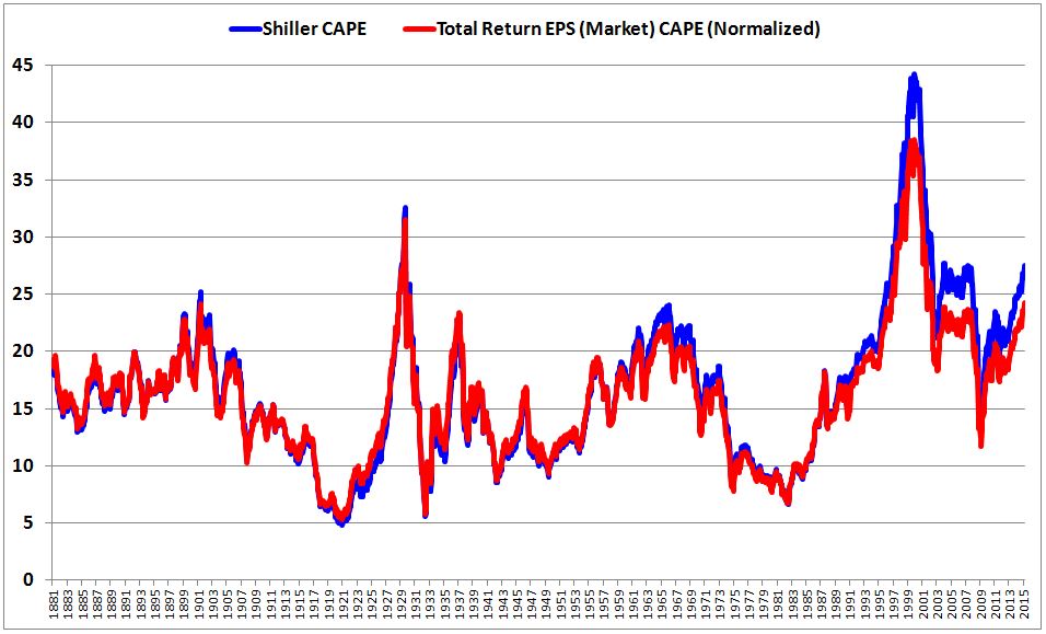
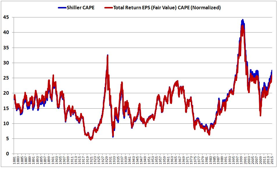
The following chart shows the Total Return EPS (Market) CAPE alongside the Shiller CAPE, with the values of the former normalized so that the two CAPEs have the same historical average (allowing for a direct comparison between the numbers).
(Note: in prior pieces, I had been comparing P/E ratios to their geometric means. This is suboptimal. The optimal mean for a P/E ratio time series is the harmonic mean, which is essentially what you get when you take an average of the earnings yields–the P/E ratios inverted–and then invert that average. So, from here forward, in the context of P/E ratios, I will be using harmonic means only.) (h/t and #FF to @econompic, @naufalsanaullah, @GestaltU_BPG)
The current value of the Shiller CAPE is 27.5, which is 93% above its historical average (harmonic) of 14.2. The current value of the Total Return EPS (Market) CAPE is 30.3, which is 71% above its historical average (harmonic) of 17.8. Normalized to matching historical averages, the current value of the Total Return EPS (Market) CAPE comes out to 24.2.
At current S&P 500 levels, then, we end up with 27.5 for the Shiller CAPE, and 24.2 for the Total Return EPS (Market) CAPE, each relative to a historical average of 14.19. Evidently, the difference between the two types of CAPEs is significant, worth 12%, or 250 current S&P points.
But there’s a mistake in this construction. To find it, let’s take a closer look at the chart:
From the early 1990s onward, the Total Return EPS (Market) CAPE (the red line) is significantly below the Shiller CAPE (the blue line), suggesting that the Shiller CAPE is overstating the market’s expensiveness, and that the Total Return EPS (Market) CAPE is correcting the overstatement by pulling the metric back down.
What is driving the Shiller CAPE’s apparent overstatement of the market’s expensiveness? The obvious answer would seem to be the historically low dividend payout ratio in place from the early 1990s onward. All else equal, low dividend payout ratios push the Shiller CAPE up, via the increased growth effect described earlier.
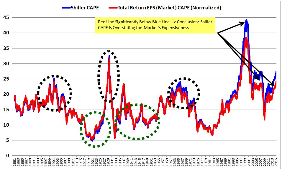
But look closely. Whenever the market is expensive for an extended period of time, the subsequent Total Return EPS (Market) CAPE (the red line) ends up lower than the Shiller CAPE (the blue line), by an amount seemingly proportionate to the degree and duration of the expensiveness. Note that this is true even in periods when the dividend payout ratio was high, e.g, the periods circled in black: the early 1900s, the late 1920s, and the late 1960s. If the dividend payout ratio were the true explanation for the deviations between the Shiller CAPE and the Total Return EPS (Market) CAPE, then we would not get that result. We would get the opposite result: the high dividend payout ratio seen during the periods would depress the the Shiller CAPE relative to the more accurate total measures; it would not push the Shiller CAPE up, as seems to be happening.
The converse is also true. Whenever the market is cheap for an extended period of time, the subsequent Total Return EPS (Market) CAPE (the red line) ends up higher than the subsequent Shiller CAPE (the blue line), by an amount seemingly proportionate to the degree and duration of the cheapness. We see this, for example, in the periods circled in green: the early 1920s and the early 1930s through the end of the 1940s. The deviation between the two measures is spatially small in those periods, but that’s only because the numbers themselves are small–single digits. On a percentage basis, the deviation is sizeable.
The following chart clarifies:

So what’s actually happening here? Answer: valuation—not the dividend payout ratio–is driving the deviation. In periods where the market was cheap in the 10 years preceding the calculation, the Total Return EPS (Market) CAPE comes out above the Shiller CAPE. In periods where the market was expensive in the 10 years preceding the calculation, the the Total Return EPS (Market) CAPE comes out below the Shiller CAPE. The degree above or below ends up being a function of how cheap or expensive the market was, on average.
The following chart conclusively demonstrates this relationship:
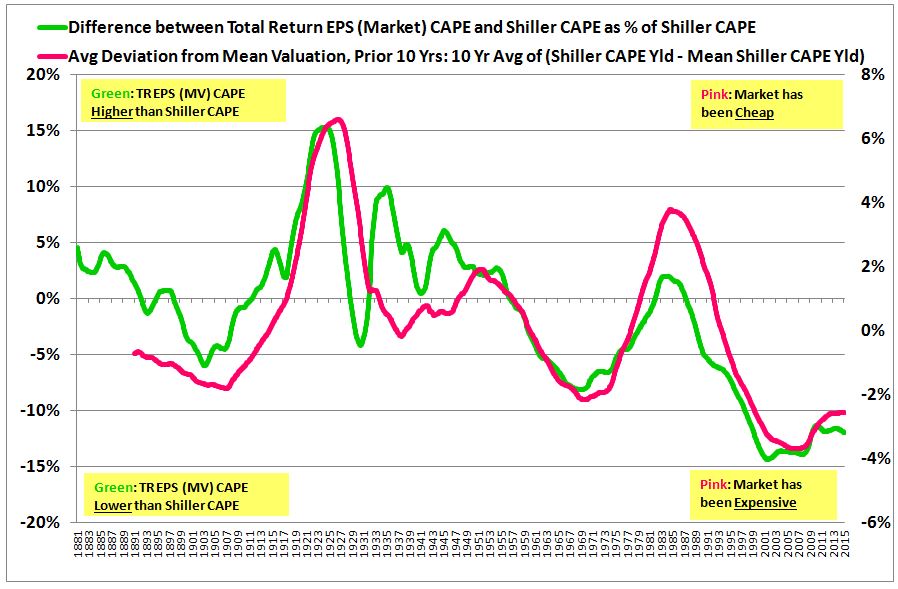
The bright green line is the difference between the Total Return EPS (Market) CAPE and the Shiller CAPE as a percentage of the Shiller CAPE. When the bright green line is positive, it means that the red line in the previous chart was higher than the blue line; when negative, vice-versa. The pink line is a measure of how cheap or expensive the market was over the preceding 10 years, on average and relative to the historical average. When the pink line is positive, it means that the market was cheap; when negative, expensive. The two lines track each other almost perfectly, indicating that the valuation in the preceding years–and not the payout ratio–is driving the deviation between the two measures.
What is causing this weird effect? You already know. The share buybacks associated with the Total Return EPS (Market) CAPE are being conducted at market prices, rather than at fair value prices. The same is true for the dividend reinvestments associated with Shiller’s proposed Total Return CAPE and with the version I presented in August of last year; those reinvestments are being conducted at market prices. That’s wrong.
When share buybacks (or dividend reinvestments) are conducted at market prices, then periods of prior expensiveness produce lower Total Return EPS growth (because the dividend money is invested at unattractive valuations that offer low implied returns). And, mathematically, what does low growth do to a CAPE, all else equal? Pull it down. Past periods of market expensiveness therefore pull the Total Return EPS (Market) CAPE down below the Shiller CAPE, as observed.
Conversely, periods of prior cheapness produce higher Total Return EPS growth (because the dividend money is reinvested at attractive valuations that offer high implied returns). And what does high growth do to a CAPE, all else equal? Push it up. Past periods of market cheapness therefore push the Total Return EPS (Market) CAPE up above the Shiller CAPE, as observed.
Looking at the period from the early 1990s onward, we assumed that the problem was with the Shiller CAPE (the blue line), that the low dividend payout ratio during the period was pushing it up, causing it to overstate the market’s expensiveness. But, in fact, the problem was with our Total Return EPS (Market) CAPE (the red line). The very high valuation in the post-1990s period is depressing Total Return EPS (Market) growth (the expensiveness of the share buybacks and dividend reinvestments shrinks their contribution), pulling down on the Total Return EPS (Market) CAPE, and causing it to understate the market’s expensiveness.
The elimination of this distortion is yet another reason why the buybacks and dividend reinvestments that form the Total Return EPS (or any Total Return Index used in valuation measurements) have to be conducted at fair value prices, rather than at market prices. Conducting the buybacks and dividend reinvestments at fair value prices ensures that they provide the same accretion to the index across all periods of history, rather than highly variable accretion that inconsistently pushes up or down on the measure.
Now, a number of readers have written in expressing disagreement with this point. To them, I would ask a simple question: does it matter to the current market’s valuation what the market’s valuation happened to be in the distant past?
Suppose, for example, that in 2009, investors had become absolutely paralyzed with fear, and had sold the market’s valuation down to a CAPE of 1–an S&P level of, say, 50. Suppose further that the earnings and the underlying fundamentals had remained unchanged, and that investors had exacted the pummeling for reasons that were entirely irrational. Suppose finally that investors kept the market at the depressed 1 CAPE for two years, and that they then regained their senses, pushing the market back up to where it is today, in a glorious rally. In the presence of these hypothetical changes to the past, what would happen to the current value of a Total Return EPS CAPE that reinvests at market prices? Answer: it would go up wildly, dramatically, enormously, because the intervening dividends that form the Total Return index would have been invested at obscenely low valuations during the period, producing radically outsized total return growth. What does high growth due to a CAPE? Push it up, so the CAPE would rise–by a large amount.
Is that a desirable result? Do we want a measure whose current assessment of valuation is inextricably entangled in the market’s prior historical valuations, such that the measure would judge the valuations of two markets with identical fundamentals and identical prices to be significantly different, simply because one of them happened to have traded more cheaply or expensively in the past? Obviously not. That’s why we have to conduct the buybacks and reinvestments that make up the Total Return EPS at fair value.
The general rule is as follows. When we’re using a Total Return index to model actual investor performance–what an individual who invested in the market would have earned, in reality, with the dividend reinvestment option checked off–we need to conduct the hypothetical reinvestments that make up the Total Return index at market prices. But when we’re using a Total Return index to measure valuation–how a market’s price compares with its fundamentals–then we need to conduct the hypothetical reinvestments at fair value prices.
The following chart shows the Total Return EPS CAPE properly constructed on the assumption that the buybacks and reinvestments occur at fair value prices:
As you can see, the deviation between the two measures comes out to be much smaller. Normalized to the same historical average, the current value of the Total Return EPS (Fair Value) CAPE ends up being 25.9, versus 27.5 for the original Shiller CAPE. The difference between the total return and the original measures comes out at 5.7%, a little over 100 current S&P points (versus 12% and 250 points earlier).
Surprisingly, then, properly reinvesting the dividends at the same valuation across history more than cuts the deviation in half, to the point where it can almost be ignored. As far as the CAPE is concerned, when it comes to the kinds of changes that have occurred in the dividend payout ratio over the last 144 years, there appears to be little effect on the accuracy of Shiller’s original version. The entire exercise was therefore unnecessary. Admittedly, this was not the result that I was anticipating, and certainly not the result that I was hoping to see. But it is what it is.
It turns out that Shiller was right to reject the dividend payout ratio argument in his famous 2011 debate with Siegel and Bianco:
“Mr. Shiller did his own calculation about the impact of declining dividends on earnings growth and concluded that it is marginal at best, not meriting any adjustment.” — “Is the Market Overvalued?”, Wall Street Journal, April 9th, 2011.
If the subsequent foray into Total Return space caused him to change that view, then he should change it back. He was right to begin with. His critics on that point, myself included, were the ones that were wrong.
Now, this is not to suggest that we shouldn’t prefer to use the Total Return version of the CAPE over Shiller’s original version. We should always prefer to make our analyses as accurate as possible, and the Total Return version of the CAPE is unquestionably the more accurate version. Moreover, even though the changes in the dividend payout ratio seen in the U.S. equity space over the last 144 years have not been large enough to significantly impact the accuracy of the original version of the CAPE, the differences between the payout ratios of different countries–India and Austria, to use an extreme example–might still be large enough to make a meaningful difference. Since the Shiller CAPE is the preferred method for accurately comparing different countries on a valuation basis, it only makes sense to shift to the more accurate Total Return version. Fortunately, that version is simple and intuitive to build using Total Return EPS.
Admittedly, there is some circularity here. In building the Total Return EPS Index on the assumption of fair value buybacks, we used the Shiller CAPE as the basis for estimating fair value. If the Shiller CAPE is inaccurate as a measure of fair value, then our Total Return EPS index will be inaccurate, and therefore our Total Return CAPE, which is built on that index, will be inaccurate. Fortunately, in this case, there’s no problem (otherwise I wouldn’t have done it this way). When you run the numbers, you find that the choice of valuation measure makes little difference to the final product, as long as a roughly consistent measure is used. You can build the Total Return EPS Index using whatever roughly consistent measure you want–the Total Return CAPE will not come back appreciably different from Shiller’s original. What drove the deviations in the earlier charts were not small differences in the valuations at which dividends were reinvested, but large differences–for example, the difference associated with reinvesting dividends at market prices from 1942 to 1952, and then from 1997 to 2007, at prices corresponding to three times the valuation.
Now, there are other ways of adjusting for the impact of changing dividend payout ratios. Bianco, for example, has a specific technique for modifying past EPS values. As he explains:
“The Bianco PE is based on equity time value adjusted (ETVA) EPS. We raise past period EPS by a nominal cost of equity estimate less the dividend yield for that period.”
I cannot speak confidently to the accuracy of Bianco’s technique because I do not have access to its details. But if the method produces a result substantially different from the Total Return EPS CAPE (which it appears to do), then I would think that it would have to be wrong. When it comes to changing dividend payout ratios, the Total Return EPS CAPE is airtight. It treats all periods of history absolutely equally in all conceivable respects, perfectly reducing them to a common basis of 0% (payout). Because it reinvests the dividends at fair value (the historical average valuation), every reinvested dividend in every period accretes at roughly the same rate, which corresponds to the actual average rate at which the market has historically accreted gross of dividends (approximately 6% real).
If our new-and-improved version of the CAPE is appropriately correcting the dividend payout ratio distortions contained in the original version, then the deviation between our new-and-improved version and the original version should be a clean function of that ratio (rather than a function of other irrelevant factors, such as past valuation). When the dividend payout ratio is low, our new-and-improved version should end up below the original version, given that the original version will have overstated the valuation. When the dividend payout ratio is high, our new-and-improved version should end up above the original version, given that the original version will have understated the valuation.
Lo and behold, when we chart the deviation between the two versions of the CAPE alongside the dividend payout ratio, that is exactly what we see: a near-perfect correlation (91%), across the full 134 year historical period.
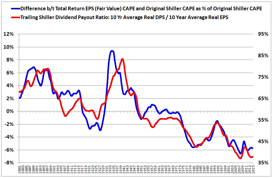
The blue line shows the difference between our new-and-improved version of the CAPE and the original version. The red line shows the trailing Shiller dividend payout ratio, which is the 10 year average of real dividends per share (DPS) divided by the 10 year average of real EPS. We use a Shillerized version of the dividend payout ratio to remove noise associated with recessions–especially the most recent one, where earnings temporarily plunged almost to zero, causing the payout ratio to temporarily spike to a value north of 300%.
The fact that the two lines overlap almost perfectly indicates that the deviation between our new-and-improved version and the original version is a function of the factor–the dividend payout ratio–that is causing the inaccuracy in the original version, rather than some other questionable factor. That is exactly what we want to see. It is proof positive that our new-and-improved version is correcting the distortion in question, and not introducing or exploiting other distortions (that, conveniently, would make the current market look cheaper).
Now, to be clear, the secular decline in the dividend payout ratio seen across the span of U.S. market history has not substantially affected the accuracy of the original Shiller CAPE. However, it has substantially affected the trend growth rate of EPS. So, though it may not be imperative that we use the Total Return version of the CAPE when measuring valuation, it is absolutely imperative that we use the Total Return version of EPS when analyzing earnings trends and projecting out future earnings growth.
We are left with the question: if the distortions associated with the dividend payout ratio are not significant, then why does the Shiller CAPE show the U.S. equity market to be so expensive relative to history? We can point to three explanations.
- First, on its face, the market just is historically expensive–even on a non-Shiller P/E measurement. Using reported EPS, the simple trailing twelve month P/E ratio is roughly 20.5, which is 53% above its historical average (harmonic) of 13.4. Using S&P corporation’s publication of operating EPS, the simple trailing twelve month P/E ratio is 18.8, which is 40% above that average.
- Second, the accounting writedowns associated with the 2008-2009 recession are artificially weighing down the trailing average 10 year EPS number off of which the Shiller CAPE is calculated. Prior to 2014, this effect was more significant than it is at present, given that the 2001-2003 recession also saw significant accounting writedowns. The trailing 10 year average for the years up to 2014 therefore got hit with a double-whammy. That’s why the the increase in the Shiller CAPE in recent years has not been as significant as the increase in market prices (since December 2012, the CAPE is up roughly 30%, but prices are up roughly 50%). 2014 saw the 2001-2003 recession fully drop out of the average, reducing the CAPE’s prior overstatement.
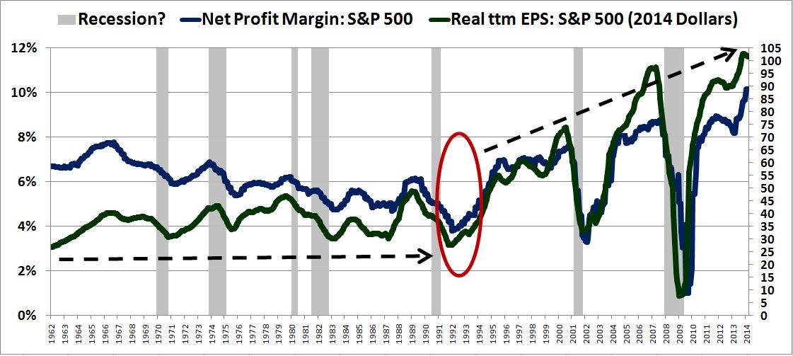
- Third, as the chart below shows, real EPS growth over the last two decades–on both a regular and a Total Return basis–has been meaningfully above the respective historical averages, driven by substantial expansion in profit margins. Recall that high growth produces a high CAPE, all else equal.
These last two factors–the effects of accounting writedowns and the effects of profit margin expansion–will gradually drop out of the Shiller CAPE (unless you expect another 2008-type recession with commensurate writedowns, or continued profit margin expansion, from these record levels). As they drop out, the valuation signal coming from the Shiller CAPE will converge with the signal given by the simple ttm P/E ratio–a convergence that is already happening.
We conclude with the question that all of this exists to answer: Is the market expensive? Yes, and returns are likely to be below the historical average, pulled down by a number of different mechanisms. Should the market be expensive? “Should” is not an appropriate word to use in markets. What matters is that there are secular, sustainable forces behind the market’s expensiveness–to name a few: low real interest rates, a lack of alternative investment opportunities (TINA), aggressive policymaker support, and improved market efficiency yielding a reduced equity risk premium (difference between equity returns and fixed income returns). Unlike in prior eras of history, the secret of “stocks for the long run” is now well known–thoroughly studied by academics all over the world, and seared into the brain of every investor that sets foot on Wall Street. For this reason, absent extreme levels of cyclically-induced fear, investors simply aren’t going to foolishly sell equities at bargain prices when there’s nowhere else to go–as they did, for example, in the 1940s and 1950s, when they had limited history and limited studied knowledge on which to rely.
As for the future, the interest-rate-related forces that are pushing up on valuations will get pulled out from under the market if and when inflationary pressures tie the Fed’s hands–i.e., force the Fed to impose a higher real interest rate on the economy. For all we know, that may never happen. Similarly, on a cyclically-adjusted basis, the equity risk premium may never again return to what it was in prior periods, as secrets cannot be taken back.